


Houzz Tour: Classical Meets Contemporary in an Italian Apartment
This Turin home juxtaposes restored 19th-century frescoes with updated seating and a lofted platform bed

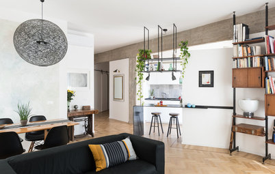
This apartment in Turin, Italy, was part of a larger unit in a building dating to 1870. The space was split in two and renovated by architect Jacopo Rossetti, who respected its classic original elements while placing them in a dialogue with modern features. The result is an elegant apartment characterized by contrast: antique against modern, white against gray, wood against iron.
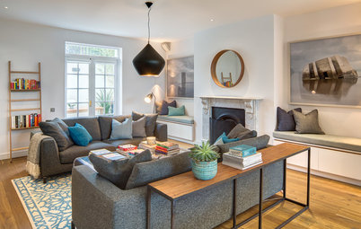
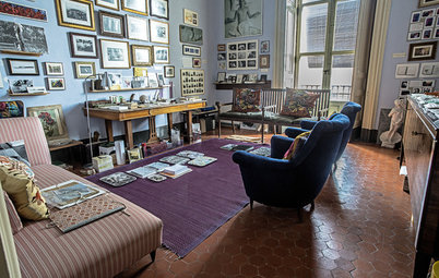
The 474-square-foot living area contains the kitchen and living room. Four French windows, each with an exquisitely crafted frame, define the sofa area. “I cleaned and repainted them,” Rossetti says, “opting to keep the original frames and the original structural elements.”
The original herringbone flooring was sanded and refinished. The ceiling fresco, another original detail, was restored by students from Turin’s fine arts academy. “I asked them to restore the art while maintaining a sense of its age,” Rossetti says.
“To brighten up the space, I chose simple white fixtures that would blend in as much as possible. Positioned like this, they allow the light to rise upward and enhance the ceiling,” he says.
Sofa: Ikea; wall light: Area38 collection, Casa della Lampadine
Rossetti went for a black radiator so that it would resemble iron and contrast with the wood.
The door on the left leads to the storage room. Before the renovation, it led to the bedrooms, which are now in another part of the home. Rossetti repainted it.
Radiator: CV25, Tube
The door on the left leads to the storage room. Before the renovation, it led to the bedrooms, which are now in another part of the home. Rossetti repainted it.
Radiator: CV25, Tube
Before. This is what the storage-room door and the fireplace next to it originally looked like.
A white bench now underscores the fireplace and runs the length of the wall. “I didn’t want a shelving unit in front of the sofa. We were looking for something that wouldn’t draw attention, so I had the carpenter make a simple white bench instead,” Rossetti says. “I made a [fireplace] frame out of plaster and iron, which would add to the fireplace and echo the French windows. I chose to leave the plaster rough to maintain the feeling of age.”
Find a carpenter
Find a carpenter
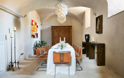
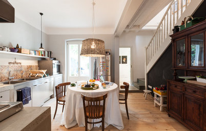
Perpendicular to the sofa are the kitchen and the dining table. The carpenter welded the walnut tabletop to iron legs, based on Rossetti’s design.
Rossetti also designed the kitchen. “I was looking for a solution that would make it look like a living room. Since the environment is unique, I did not want the appliances to be visible. I placed a shelf above the kitchen countertop to look like a bookcase because I wanted to avoid the look of a kitchen per se. This is also why I thought about how I could hide everything. The dish rack is in a removable drawer on the right of the cabinet, and to the left of the elements is a panel that rotates 180 degrees to hide the oven. It can be opened with a touch. The [vent] is integrated into the induction stove, drawing fumes downward and pulling them into the flue behind the countertop.”
The cabinetry is walnut to match the floor, and the countertop is black granite. Finally, to differentiate the kitchen from the rest of the open room, Rossetti chose a dark oak baseboard.
Cooktop: NikolaTesla, Elica
The cooktop’s round vent is visible on the right.
The frame around the kitchen window is new. “I created an imitation of the molding around the four window frames in the sofa area out of plaster and iron to make everything uniform since it is a single room,” Rossetti says.
The ceiling trim copies the trim in the sofa area too. An LED light strip provides indirect light.
The wooden boards used for the kitchen floor also date to 1870 and came from the adjacent apartment.
See photos of the adjacent apartment after its renovation
See photos of the adjacent apartment after its renovation
The white cabinet at the far end of the kitchen hides the fridge and pantry. The original arched doorway leads to the bedrooms and bathrooms.
The bedrooms are on the left, and the bathrooms are on the right, surrounded by mirrors.
“The original entrance, as was standard for the upper-class houses of that era, was a generous [215 square feet],” the architect says. “I chose to divide it in half, keeping one part for the entryway and using the other part for bathrooms. I put mirrors next to the bathrooms to create the feel of a larger space.”
“The original entrance, as was standard for the upper-class houses of that era, was a generous [215 square feet],” the architect says. “I chose to divide it in half, keeping one part for the entryway and using the other part for bathrooms. I put mirrors next to the bathrooms to create the feel of a larger space.”
Before. Here’s the original view from the entryway.
Before. And here’s the entryway seen from the dining room.
The built-in bookcase in the background decorates the entryway, shown on the right and around the corner.
Before. This is what the space the bedrooms now occupy looked like before the renovation.
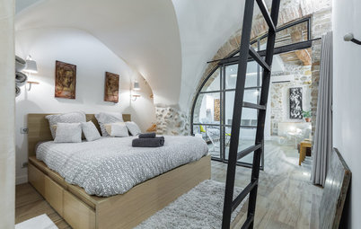
The iron structure at the top of this photo of the master bedroom is the bed.
“I chose to put it in a loft because those who enter the house must cross the hallway to get to the living room, passing in front of the bedrooms,” Rossetti says. “I did not want the beds to be visible, as I think that, since the hallway has a dead end, the doors of the bedrooms should be kept open so that it can seem more spacious and brighter,” he says.
“I chose to put it in a loft because those who enter the house must cross the hallway to get to the living room, passing in front of the bedrooms,” Rossetti says. “I did not want the beds to be visible, as I think that, since the hallway has a dead end, the doors of the bedrooms should be kept open so that it can seem more spacious and brighter,” he says.
The master bedroom measures about 180 square feet. The flooring and the fresco are original. The art students uncovered the painting from beneath layers of dirt collected over the century, which can be seen in the “before” photos. The bed in the loft is made of fir and iron, raised on a framework to allow light to pass underneath.
The other bedroom (not pictured) is a bit smaller but has the same design.
The other bedroom (not pictured) is a bit smaller but has the same design.
The floorboards in the bathroom were purchased from a shop that sells reclaimed flooring. They were sanded so that the finish would match the rest of the apartment as closely as possible.
The ceiling in this room is about 8 feet high. “I was able to create an area with a metal-hinged trapdoor to be used as a storage room. I then closed it off with wood panels. I chose fir because it is cheaper than oak or walnut,” Rossetti says.
Shower tray: Fiora
The ceiling in this room is about 8 feet high. “I was able to create an area with a metal-hinged trapdoor to be used as a storage room. I then closed it off with wood panels. I chose fir because it is cheaper than oak or walnut,” Rossetti says.
Shower tray: Fiora
Like the kitchen counter, the vanity countertop is black granite. The backsplash and shower walls are covered with ceramic mosaic tiles that are about three-quarters of an inch square.
As in the rest of the house, the color scheme here alternates between bright white and elegant gray.
Mosaic tile: Appiani; sink: Ceramica Flaminia; browse similar sinks
As in the rest of the house, the color scheme here alternates between bright white and elegant gray.
Mosaic tile: Appiani; sink: Ceramica Flaminia; browse similar sinks
For the smaller bathroom, Rossetti deliberately designed a vanity that resembles the kitchen cabinets. It houses the washer-dryer. Above the vanity, where a mirror would normally be, the architect put a window to the entryway and then mirrors on both sides of it.
Although the walls are gray throughout the apartment, the ones here are slightly darker. “This room is a smaller, more intimate space, so darker colors seemed more appropriate,” Rossetti says.
The architect also installed a false ceiling made of iron and fir. “It is lower on the left because that side leads to the [central] hallway, and I wanted it to be the least imposing possible. In contrast, I kept the full height on the right to make that area feel more comfortable.”
Sink: Ceramica Flaminia
Find an architect for your renovation
More home tours: Apartments | Small Homes | Colorful Homes | Contemporary Homes | Eclectic Homes | Farmhouses | Midcentury Homes | Modern Homes | Ranch Homes | Traditional Homes | Transitional Homes | All


Who lives here: A young couple
Location: A residential district in Turin, Italy
Size: About 1,400 square feet (130 square meters); two bedrooms, two bathrooms
Architect: Jacopo Rossetti of Officina 8A
Cost: About $870 per square foot, excluding furniture