


Before and After: Bright New Look for a Chopped-Up Bungalow
The walls come down in a 1940s house to let in the light and give a family in British Columbia room to hang out together

New Layout Opens Rooms to the Light
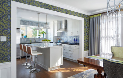
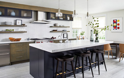
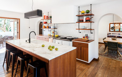
After. With the walls between the kitchen, dining room and living room gone, the bungalow’s new floor plan has some breathing room yet proportions that maintain a cozy feel. This photo is taken from the living room area.
Original wood floors. The darker flooring around the island marks the original footprint of the kitchen. You may have noticed in the previous photo the carpeting in the hallway, living room and, yes, even the kitchen. Ripping it out revealed original hardwood floors in Douglas fir (the darker flooring surrounding the island) and oak (the rest of the space).
“Back in the 1940s, people would splurge on oak for the more formal rooms of the house,” Coulson says. “But the kitchens were small, closed-off sculleries — second-rate rooms — so they would use less expensive Douglas fir wood in there.” Designers today celebrate the beauty of Douglas fir, and here it serves as an accent that tells a story about the original floor plan of the house.
Maximizing natural light. A new window over the sink and a new glass door to the back deck let in the light. And glass upper-cabinet doors reflect it and keep a more open feel in the room than solid doors would have.
A Kitchen Past Its Prime
Before. The kitchen was closed off from the other rooms and the cabinets, hardware, appliances and countertops were long past their glory days. And, as we saw earlier, the floor was carpeted, wall to wall.
Before. The kitchen was closed off from the other rooms and the cabinets, hardware, appliances and countertops were long past their glory days. And, as we saw earlier, the floor was carpeted, wall to wall.
New Palette Offers Pleasing Contrast
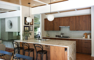
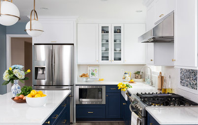
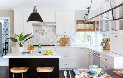
After. “One of the homeowners is very artistic and creative and they made most of the design choices, like this Prussian blue on the cabinets,” Coulson says. Crisp white subway tiles and paint provide a stark contrast to the dark blue-gray base cabinetry, while maple butcher-block countertops warm things up.
Pro’s go-tos. Coulson’s experience helped the couple with several decisions, including his over-the-kitchen-sink window choice. It extends all the way down to counter height and slides open. “I practically insist upon this with clients,” Coulson says. “The way the sill extends the countertop adds depth, and it’s very easy to operate over a sink.”
The reeded glass on the upper cabinets is another material he consistently recommends to his clients. “There’s so much to like about it. The verticality of the pattern helps make low ceilings feel higher. It works well with Shaker cabinetry and it’s a classic — it’s something you see in 1940s homes as well as in new homes,” he says. The glass partially obstructs the view into the cabinets — a nice touch that relieves homeowners from any pressure to keep contents looking perfectly styled and organized.
Key detail. Also worth noting is the flat crown molding that creates an easy transition between the top of the upper cabinets and the ceiling. It’s a clean, modern way to top off cabinets.
Wall and upper cabinet paint: Simply White, Benjamin Moore; base cabinet paint: Slate Tile, Sherwin-Williams
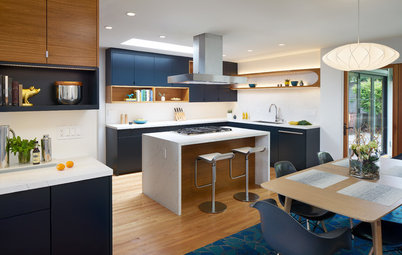
Local materials. One of the choices that meant the most to the homeowners involved a field trip to Matrix Marble & Stone, a large quarry on Vancouver Island. (Bonus: “The owners are Italian and also have one of the sweetest vineyards on the island,” Coulson says.) The couple chose a gorgeous slab of West Coast Mist marble in a honed finish, which has gray veining with hints of blue tones in it.
Key detail. “This was a very specific slab,” Coulson says. If you look closely at the photos, you’ll see they had the slab cut so that the veining pattern runs across the island diagonally. In a room full of crisp corners and rectangles, this movement in another direction is compelling. The butcher-block perimeter counters let the island counter be the star.
Refrigerator challenge. You can’t quite see it in this photo but you can in the plans below: The double-door refrigerator bumps up against a wall on the left side, so the team had to notch the wall to create clearance for the left door to open. “Unless you’re dropping about $10,000 on a refrigerator, generally their doors do not have hinges that articulate on themselves which prevents what I call ‘hinge binding.’ This is when the open doors pinch against adjacent walls or cabinetry,” Coulson says. “I see this all the time with homeowners — you have to allow a few inches on adjacent walls or surrounds for the refrigerator doors to open properly.”
Find black metal pendant lights
A Narrow Passage to the Dining Room
Before. There was a standard doorway between the kitchen and dining room. Coulson removed the wall on the left and opened the spaces to each other.
Before. There was a standard doorway between the kitchen and dining room. Coulson removed the wall on the left and opened the spaces to each other.
Original Cabinetry Worth Preserving
Before. Though the modest home didn’t have a lot of architectural details, this built-in bar cabinet in the original dining room was a keeper.
Before. Though the modest home didn’t have a lot of architectural details, this built-in bar cabinet in the original dining room was a keeper.
Family-Friendly Dining Area
After. The dining room is now a cozier eat-in area for the family of four, where the parents in the kitchen can keep their eyes on the kids when they’re eating or playing at the table. Molded plastic chairs lend the Mad Men midcentury look and play off the darker blue of the kitchen cabinets.
New built-in. In what was an awkward alcove next to the existing built-in bar, Coulson and his crew added new cabinetry in the same style. “The original bar niche had a Douglas fir counter, so we repeated that on the new cabinets. And Douglas fir is a vernacular material in this area so it was a good choice,” Coulson says. Like the marble quarried on the island, the wood choice ties the design to the locale. The countertop provides serving space and the rest of the cabinets have room for items such as linens, serveware and more bar accessories.
This area is completely open to the living room now (this photo was taken from the middle of the living room), so that view influenced the design. The homeowners chose a light fixture composed of five glass globes that don’t obstruct the view too much.
Browse small kitchen tables
Key detail. This display niche where a small closet used to be also opens up the space. It provides a nicer journey toward the back of the house than the original narrow hallway did.
Dated Bathroom Needed an Update
Before. The home’s one bathroom, which hadn’t been touched in years, didn’t reflect the family’s style.
Before. The home’s one bathroom, which hadn’t been touched in years, didn’t reflect the family’s style.
A Refreshed Look and More Storage
After. The homeowners found this mahogany vanity, and an acrylic top with an integrated sink keeps a clean look. Simple white subway tile with a black pencil trim plays second fiddle to the eye-catching cement tile floor. A curved beveled mirror conceals a medicine cabinet.
After. The homeowners found this mahogany vanity, and an acrylic top with an integrated sink keeps a clean look. Simple white subway tile with a black pencil trim plays second fiddle to the eye-catching cement tile floor. A curved beveled mirror conceals a medicine cabinet.
Floor Plans
Before. This is the whole house. The front door is at the bottom center, the living room is to the right and the kitchen and dining room are in the back right corner.
Before. This is the whole house. The front door is at the bottom center, the living room is to the right and the kitchen and dining room are in the back right corner.
After. Here you can get an idea of the walls that were removed to open up the space. The display niche is near the center of the plan, to the right of the bathroom.
After. Here’s a closer look at the kitchen and eat-in areas. The door to the back deck is top center. Basement stairs are in the top right corner.
Takeaways
More
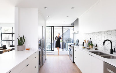
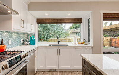
Find Your Dining Style: 9 Strategies for Eat-In Kitchens
See more Before and Afters
Takeaways
- If you’re in an older home with wall-to-wall carpeting, there’s a good chance it’s been protecting lovely old floors for years. Take a peek.
- Extend kitchen windows to counter height so you can take advantage of the extra depth offered by the windowsill. This is a good spot for small potted herbs to sit.
- If you want glass-front cabinets but don’t want to feel pressure to keep them perfect, consider reeded or another type of opaque glass.
- When you can use local materials, it makes your home feel special and tied to a place. It doesn’t have to be marble — it can be something made by a local artisan such as a stair railing or table, a painting by a local artist, or something as simple as incorporating locally found objects.
- Small details count: Think about how a pattern in your stone will run and how your cabinets will meet your ceiling.
- When you’re refrigerator shopping, make sure the doors will clear adjacent walls or surrounds.
More
Find Your Dining Style: 9 Strategies for Eat-In Kitchens
See more Before and Afters


Rooms at a Glance
Who lives here: A couple and their two toddler sons
Location: Victoria, British Columbia
Size: Kitchen with new eat-in area is about 232 square feet (22 square meters)
Designer: David Coulson Design
This 1940 stucco bungalow in Victoria, British Columbia, just missed having the open floor plan that became so popular a few years later. The house was full of “little closed-off rooms and long hallways,” says David Coulson, owner of a design-build firm on Vancouver Island. The layout wasn’t functioning well for his clients, a couple and their two young boys. The creative couple wanted a light and bright open space with nods to midcentury modern style — one that reflected their “Dwell magazine meets Mad Men” tastes — where they could keep an eye on the kids.
Coulson took down walls, repaired the original floors, replaced windows and doors and renovated the kitchen, dining room and bathroom to open them up and let in the light. The homeowners also paid homage to their Vancouver Island locale with some local materials.
A Warren of Small Rooms
Before. This photo shows the original view from the front door. The kitchen was a straight shot down a long hallway. The room to the right is the living room. A small, closed-off dining room is behind the living room.