


Houzz Tour: Studio Apartment Becomes a Colorful Haven
Bold hues and smart architectural changes bring big style to a small space
Becky Harris
June 21, 2018
Houzz Contributor. Hi there! I live in a 1940s cottage in Atlanta that I'll describe as "collected."
I got into design via Landscape Architecture, which I studied at the University of Virginia.
Houzz Contributor. Hi there! I live in a 1940s cottage in Atlanta that I'll describe... More
Photos by Donna Griffith
Apartment at a Glance
Who lives here: Barbara Milner-Mangoni, founder and principal of South Hill Interiors, and her 2-year-old son, Marshall
Location: Toronto
Size: 550 square feet (51 square meters); one bedroom alcove, one bathroom
This studio apartment became a haven for designer Barbara Milner-Mangoni and her young son, Marshall, during a transitional time in their lives. After a separation, mother and son moved into “this little corner” of a large Arts and Crafts house she owns in Toronto. The house is divided into rental units, and this studio apartment embraced them like a nurturing hug while they regrouped and rebuilt.
Paris and Notting Hill Inspire a New Look
The unit was dark and dated, having undergone renovations over the years that had not preserved the details of the original Arts and Crafts architecture. There were 1970s parquet floors, the spaces within the compact unit didn’t flow in a pleasing way, the kitchen was outmoded and, due to renovations by past owners, architectural details were lacking.
So that it would be a home where she and Marshall would thrive, and where she could entertain friends and meet with clients, Milner-Mangoni made it cheerful, comfortable, functional and colorful. Inspirations included classic Parisian apartments and eclectic homes in London’s Notting Hill. “I love the way Parisian apartments have all of the old ornate architectural features, and they just work with them even when they add contemporary style,” she says. “And I enjoy the style of eclectic Notting Hill homes that have interesting color and style combinations, vintage things thrown in and a lived-in look.”
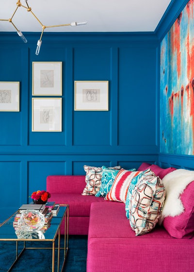
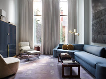
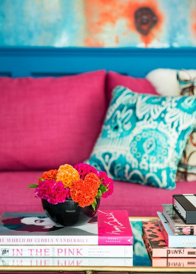
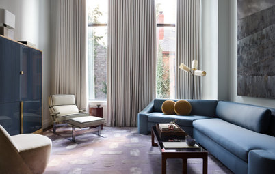
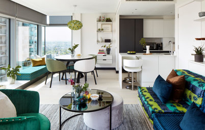
In the Living Room: Millwork and a Splash of Color
To bring in that Parisian architectural feel and honor the home’s style, Milner-Mangoni had millwork added to the walls of the living room. And she decided on a deep, saturated blue as a jumping-off point, inspired by the Notting Hill look she liked.
The raspberry pink pullout sofa came along soon after, adding a dazzling color that plays brilliantly off the peacock hues of the walls. But she also knew that the walls needed a big break from so much blue. Rather than spending big bucks on a piece of art large enough to accomplish this, she found a wallpaper mural by Carl Robinson.
She turned the piece horizontally from its intended orientation, and it was practically a perfect fit for the size of the wall. To give the illusion that it actually was a perfect fit, she had a few extra trim pieces added to the sides to create a frame that fits right in with the other millwork.
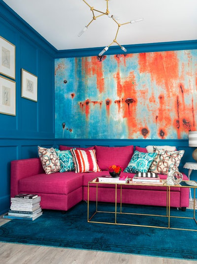
Thrifty living room finds. An overdyed vintage Persian rug from Ikea has hues that match the wall color. The elegant brass coffee table with the mirrored top was another big budget saver. While it originally retailed for $1,000, she got it on clearance for $99 because of a crack in the mirrored top. “I figured that probably would have happened eventually anyway and that I could always replace the mirror,” she says. The small figure studies are a find from a favorite Toronto consignment shop, Of Things Past.
A lighting splurge. By using Ikea pieces and hunting for other bargains, the designer had money left over in the budget and used it where she could make the biggest impact: on an eye-catching light fixture. Local Toronto artisans at Lampcage made it custom for her. “I encourage people to have a healthy light budget — after all, it’s the jewelry of the room,” she says. “You won’t regret it. Even if you’re in a rental, you can take it with you when you go.”
Wall paint: Deep Ocean, Benjamin Moore; mural: Wallquest; sofa and rug: Ikea; see more pink sectionals
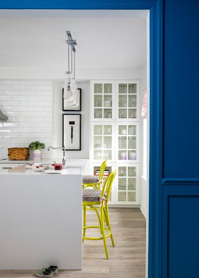
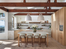
In the Kitchen: A Welcoming Entry
To open up the apartment, Milner-Mangoni enlarged a 30-inch opening in this wall. This meant that the kitchen had to provide a pleasing view from the living room. “I like to design kitchens that aren’t so clearly defined as kitchens. While cooking is a part of it, kitchens also have become our entertainment hubs,” she says.
She provided a pleasing view by forgoing upper cabinets and installing a tower of glass-front cabinets instead. The bright room draws people in when she entertains. “This was a bit of a risky move, but it forced me to edit and to keep it tidy. I’ve always been a fan of white china and linens. While color would work, the white and clear glass keep it breezy,” she says.
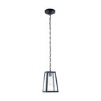
Pendant lights: Union Lighting
To open up the apartment, Milner-Mangoni enlarged a 30-inch opening in this wall. This meant that the kitchen had to provide a pleasing view from the living room. “I like to design kitchens that aren’t so clearly defined as kitchens. While cooking is a part of it, kitchens also have become our entertainment hubs,” she says.
She provided a pleasing view by forgoing upper cabinets and installing a tower of glass-front cabinets instead. The bright room draws people in when she entertains. “This was a bit of a risky move, but it forced me to edit and to keep it tidy. I’ve always been a fan of white china and linens. While color would work, the white and clear glass keep it breezy,” she says.
Pendant lights: Union Lighting
Kitchen layout. The kitchen was a full renovation, but she laid it out in a way that would not require any major plumbing changes, a big cost saver. While there wasn’t room for an island, there was plenty of room for a peninsula, so she used that to set up a spot for the sink and dishwasher as well as an entertaining hub. This required only a slight adjustment in the existing plumbing.
See How Peninsulas Can Get You More Storage and Countertop Space
See How Peninsulas Can Get You More Storage and Countertop Space
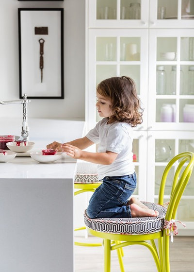
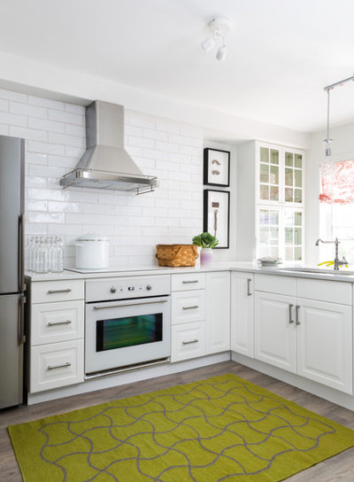
More smart kitchen savings. The bargain hunting continued in the kitchen. The cabinets, appliances and quartz countertops are from Ikea, and the stools, originally from Crate & Barrel, were a steal of a Craigslist find. While the designer was not specifically looking for citrine, it was a color she liked that worked swimmingly with the saturated blue in the living room. The savings left her with money in the budget to add seat cushions in a geometric pattern with piping and ties in a chinoiserie print.
Browse colorful counter stools
Browse colorful counter stools
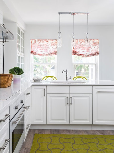
The window treatments are made of the same fabric as the piping on the seat cushions. They add a splash of color and print to the crisp white walls.
Flooring. The flooring in the kitchen and throughout the apartment looks like wood but is a luxury vinyl. This material is less expensive and feels softer underfoot than hardwood flooring. It is also water resistant, so it stands up to the inevitable trekking in of Toronto snow.
Quartz countertop: Aurora Snow, HanStone, Ikea
5 Reasons Vinyl Flooring Might Be Right for You
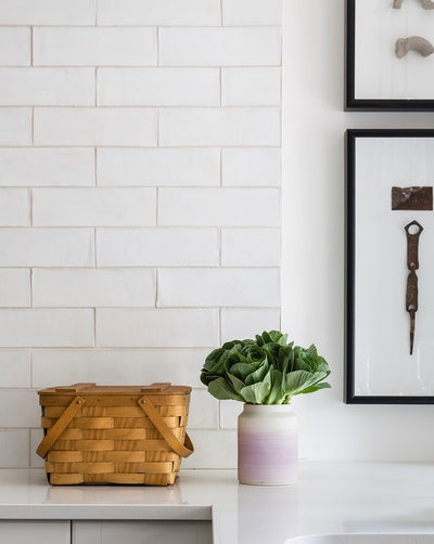
Personal touches. Milner-Mangoni used two shadow boxes to frame family heirlooms that she displays in the kitchen. The upper shadow box contains some ancient Roman pottery that has been passed down through her family; the lower shadow box contains the door hinge and number plate from her grandmother’s house in Ankara, Turkey. The backsplash tiles are handmade elongated subway tiles.
In Her Son’s Room: Toddler Art on the Walls
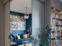
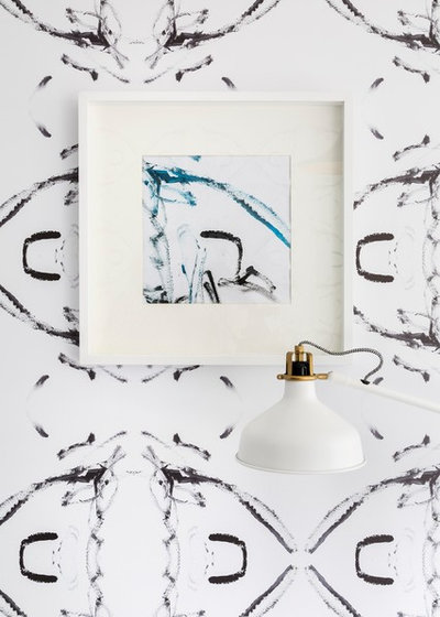
As interesting as all that was, the bedroom alcove has the biggest surprise. Ever since Milner-Mangoni met some people from Digital Print Specialties at a trade show, her wheels were turning on how to use the creativity their services offered. Since the alcove was to serve as her son’s room, she wanted to use some of Marshall’s artwork to create a unique print for the walls, window treatments and bedding. This framed piece is part of a larger painting he made. She sent the company high-resolution scans of several of his pieces, and they sent different samples where they took a portion of it and repeated it to create a print.
As interesting as all that was, the bedroom alcove has the biggest surprise. Ever since Milner-Mangoni met some people from Digital Print Specialties at a trade show, her wheels were turning on how to use the creativity their services offered. Since the alcove was to serve as her son’s room, she wanted to use some of Marshall’s artwork to create a unique print for the walls, window treatments and bedding. This framed piece is part of a larger painting he made. She sent the company high-resolution scans of several of his pieces, and they sent different samples where they took a portion of it and repeated it to create a print.
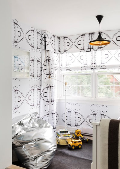
“I love the layer-upon-layer look,” the designer says. The walls are covered in a digitally printed paper from the artwork, and the window treatment fabric continues the print. The three large pillows on the bed also sport the print in the same scale, while the duvet cover is a larger-scale version. An area rug and a beanbag chair provide Marshall with soft spots to play.
Storage. In addition to the drawers under the daybed, there is storage built into the sectional under the chaise area, plus a large antique armoire that was not photographed. She also has a storage area in the basement of the building.
Storage. In addition to the drawers under the daybed, there is storage built into the sectional under the chaise area, plus a large antique armoire that was not photographed. She also has a storage area in the basement of the building.
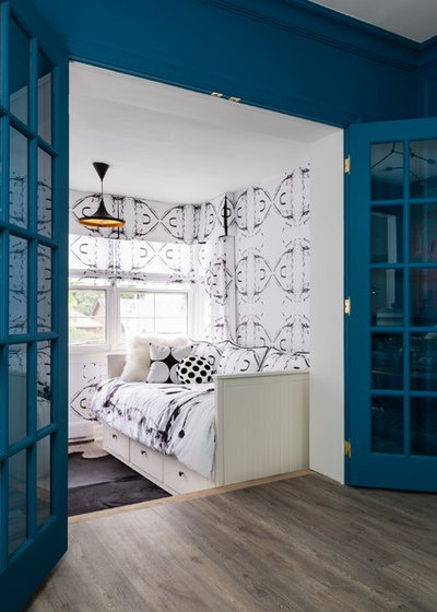
Another new element is the pair of French doors that now provide some separation between the living room and the bedroom when needed. Brass hardware on the doors plays off the brass interior of the graphic black pendant light in the bedroom.
Find a designer in your area
Find a designer in your area
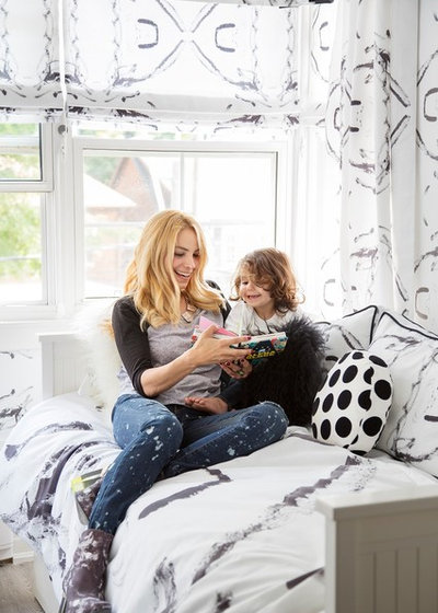
Here are Milner-Mangoni and Marshall cuddled up on the daybed. While this isn’t intended to be their forever, everyday home, it will serve them in the years to come — she owns several income properties that she plans to renovate in the same neighborhood. As they move around during flips and renovations, the studio will remain a welcoming place where they can land. And they’ll still be in the same area as Marshall’s school and the nearby rec center, library and parks they love to frequent.
Takeaways
More home tours: Apartments | Small Homes | Colorful Homes | Contemporary Homes | Eclectic Homes | Farmhouses | Midcentury Homes | Modern Homes | Ranch Homes | Traditional Homes | Transitional Homes | All
Takeaways
- If previous renovations have erased a historic home’s original architectural details, consider adding them back in.
- Bold color can work in a small space.
- A wallpaper mural is an impactful, less expensive alternative to a large framed piece of art.
- Fabulous lighting is worth the splurge.
- Special family items can be displayed in shadow boxes.
- Wallpaper and fabric digital printing is a wonderful opportunity for creating special design elements in your home.
More home tours: Apartments | Small Homes | Colorful Homes | Contemporary Homes | Eclectic Homes | Farmhouses | Midcentury Homes | Modern Homes | Ranch Homes | Traditional Homes | Transitional Homes | All


KA Builders is a dedicated and innovative remodeling company based in the heart of your city. With our years of... Read More
What are you working on?

Related Products

Peabody Landscape Group was founded in 1979 by Douglas & David Peabody. Our commitment is to carefully listen and... Read More
Related Stories
Contemporary Homes
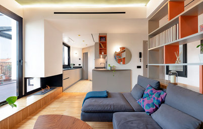
Houzz Tour: Boston Pied-à-Terre Designed for Evenings
By Becky Harris
A designer found on Houzz infuses a condo with a sultry vibe inspired by supper clubs and luxe boutique hotels
Full Story
Homes Around the World
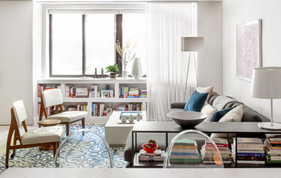
Houzz Tour: Once-Bland Rental Now a Welcoming Home
By Kate Burt
A designer found on Houzz transforms a plain city apartment using color, texture and space planning
Full Story
Contemporary Homes
Houzz Tour: Museum-Inspired Moments in a Beachfront High-Rise
By Becky Harris
A couple’s love of art guides these designers toward a warm neutral color palette and rich textures
Full Story
Contemporary Homes
Houzz Tour: Two Small New York Apartments Become One
By Becky Harris
An architect combines a one-bedroom and an adjacent studio apartment to create a colorful and functional home
Full Story
Homes Around the World
Houzz Tour: Family Says No to Relocating in Favor of Remodeling
An architect helps a family in Rome bring light, color and natural materials into their apartment
Full Story
Homes Around the World
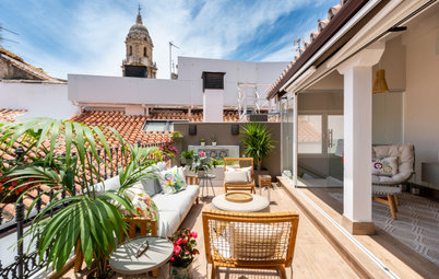
Houzz Tour: Spanish Penthouse Opens Up to City Views
By Isabel Núñez
A renovation brings in light and connects an apartment to its expansive balcony and sweeping views of Barcelona
Full Story
Contemporary Homes
Houzz Tour: Family Friendliness for a Manhattan Apartment
By Becky Harris
A designer creates multifunctional, bright and playful spaces for a couple and their two toddlers
Full Story
Homes Around the World
Houzz Tour: Neutral Decor Lets Period Features Shine
The simple, contemporary decor of this Spanish apartment complements its gorgeous stained glass and cement tile
Full Story
Homes Around the World
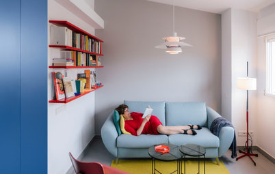
Houzz Tour: Colorful Spanish Apartment for Tapas and Relaxing
An architect found on Houzz uses bold color and small-space solutions to create a joyful pied-à-terre for a retiree
Full Story
Homes Around the World
Houzz Tour: Subtle Elegance Meets Period Features
By Elen Pouhaer
A designer found on Houzz pairs contemporary furniture with stunning traditional design in Paris
Full Story
Tiny and beautiful !
Love the clever solutions/design of this small place. Would’ve liked to see a sketch of the floorplan as it sounds like they landed on a layout that functions really well. I use to own a 425 sq ft studio built in 1920s and it in no way seemed this spacious!
I love, love, love these spaces. I’m a fan of more muted colours, and design: however, in this rare instance, the colour palette is soothing, and cohesive. It feels like the inside of a jewel box.