


‘Broken-Plan’ Addition Contains a Hideaway Office
A family in England builds out to gain an open living area with a workspace that can be closed off behind folding doors
Sarah Warwick
June 10, 2018
Houzz Contributor. I'm a freelance journalist and editor writing for nationals, magazines and websites. A serial house revamper, I love great design, beautiful interiors and practical solutions.
Houzz Contributor. I'm a freelance journalist and editor writing for nationals, magazines... More
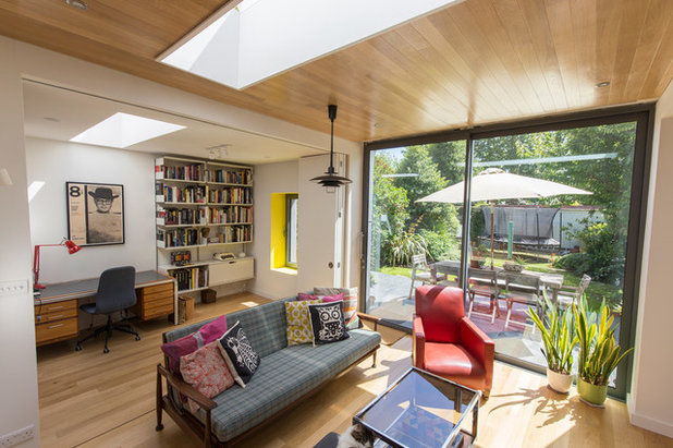
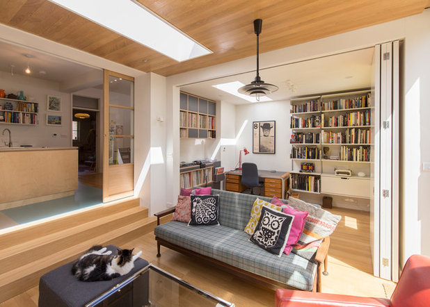
Creating family living space with a great connection to the yard is a reason many of us add on, but for the owners of this semidetached four-bedroom house in southeastern England, taking an office out of a bedroom was an equally important aspect of their home improvement.
“Bringing it downstairs and making it more accessible while keeping it private was the [goal],” says architect James Thompson, who designed the addition with Andy Parsons. Their solution? Folding doors that can separate work and living areas or stay open to maximize the space.
“Bringing it downstairs and making it more accessible while keeping it private was the [goal],” says architect James Thompson, who designed the addition with Andy Parsons. Their solution? Folding doors that can separate work and living areas or stay open to maximize the space.
Photos by James Thompson
Addition at a Glance
Who lives here: A couple and their two children
Location: Hove, England
Size: About 270 square feet (25 square meters)
Architects: Andy Parsons and James Thompson of Yelo Architects
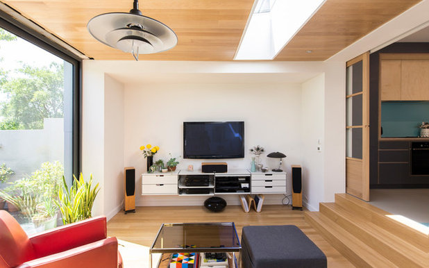
“There’s another living space at the front of the house,” says Thompson, “but the extension was for the family to share, and it was to be more of an entertaining space.”
The addition is open to the yard through sliding doors. “We could get a slimmer frame and more [glass] than with bifolds to provide good views to the garden,” he says.
Addition at a Glance
Who lives here: A couple and their two children
Location: Hove, England
Size: About 270 square feet (25 square meters)
Architects: Andy Parsons and James Thompson of Yelo Architects
“There’s another living space at the front of the house,” says Thompson, “but the extension was for the family to share, and it was to be more of an entertaining space.”
The addition is open to the yard through sliding doors. “We could get a slimmer frame and more [glass] than with bifolds to provide good views to the garden,” he says.
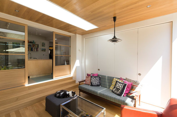
The addition has two large skylights that funnel in light. “They’re deeply recessed, so you almost see the timber ceiling as a flush roof,” Thompson says.
The architects used oak to line the ceiling since the homeowners liked the idea of wood textures. “They wanted an underside to the extension to differentiate it from the existing kitchen and make it new,” Thompson says. The floor is engineered oak, selected for its durability.
Read about engineered wood flooring
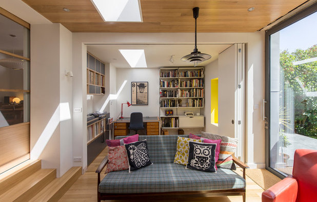
The new home office is on one side of the addition. “It’s a tangible space that allows for an open-plan layout but can be closed off for private work,” Thompson says.
Unlike the oak ceiling in the living area, the office ceiling is painted, distinguishing the separate zones.
Folding doors divide one area from the other. They stack against the wall when open living is desired.
Unlike the oak ceiling in the living area, the office ceiling is painted, distinguishing the separate zones.
Folding doors divide one area from the other. They stack against the wall when open living is desired.
When the doors are closed, they separate the office from the seating area. This kind of “broken plan” combines the light and spaciousness of an open plan with the possibility for privacy.
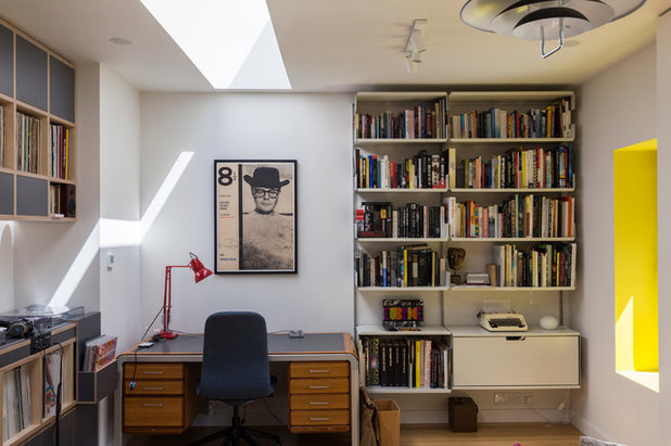
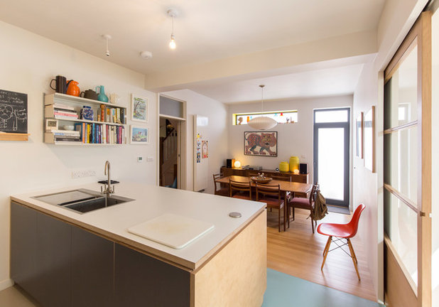
To the left of the desk is recessed wall-hung shelving. It’s made of marine-grade plywood and finished in gray Formica to link with the kitchen cabinets.
The storage to the right is also mounted above the floor, contributing to the addition’s spacious modern look.
The storage to the right is also mounted above the floor, contributing to the addition’s spacious modern look.
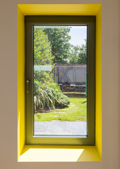
The yellow window recess is a fun homage to the architectural practice’s name – Yelo – and makes a feature of the window. The window’s powder-coated gray aluminum frame gives it a contemporary look.
Steps leading from the living area up to the kitchen mark the position of the original rear wall of the early-20th-century house. “The garden level was [16 inches] lower than the finished floor of the existing house,” Thompson says. The level change separates the spaces neatly. “It worked in our favor,” he adds.
Again, the architects recommended wall-hung units since letting more flooring show contributes to a spacious effect.
Again, the architects recommended wall-hung units since letting more flooring show contributes to a spacious effect.
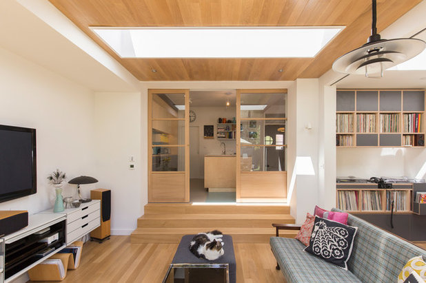
Glass-panel pocket doors divide the living area in the addition from the kitchen in the original house, allowing the spaces to be closed off or fully opened.
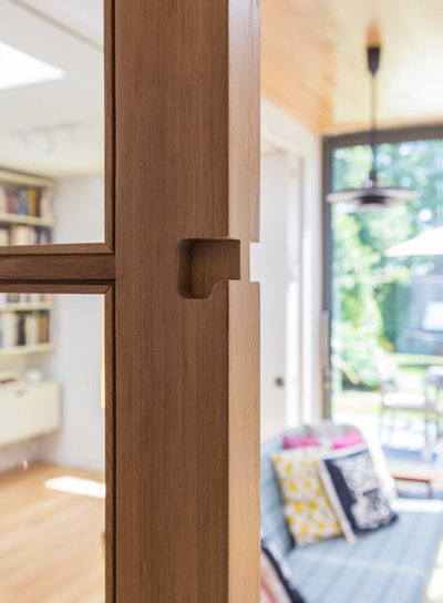
The doors to the kitchen have recessed handholds. “Throughout the extension, all the doors have hidden handles to make things contemporary and avoid a utilitarian look,” Thompson says.
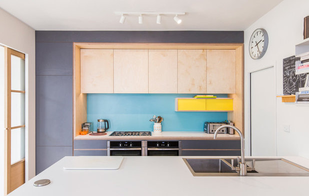
The kitchen was relocated from a different part of the house, so it now has garden views and benefits from the light introduced via the sliding doors. It’s in the corner of an L formed by the living space on one leg and the dining room on the other, so it also makes taking food to either area convenient.
The architects drew up the kitchen layout, and a cabinetmaker built the units from marine ply. Formica on the door and drawer fronts introduces modern blocks of color. Gray links the cabinetry to the windows, while the yellow unit and the blue backsplash add bright accents to the otherwise muted color scheme.
The architects drew up the kitchen layout, and a cabinetmaker built the units from marine ply. Formica on the door and drawer fronts introduces modern blocks of color. Gray links the cabinetry to the windows, while the yellow unit and the blue backsplash add bright accents to the otherwise muted color scheme.
The dining area is now in the spot where the kitchen used to be. A new door leads out to the side of the property. “We didn’t want access to the [trash cans] through the new extension,” Thompson says.
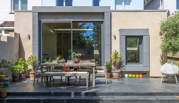
The architects wanted a patio area to act as a transition from the addition to the yard and to provide a place for dining and seating. In gray slate, it complements the windows. A wall built on one side acts as an enclosure. “The original house is finished in a blue [plaster], so we chose a creamy [plaster] here,” Thompson says. This addition finish continues on the new wall.
Zinc coping surrounds the windows. “The owners wanted something modern that contrasted with the [plaster],” Thompson says. “It bulks out the frame and makes a defined edge.”
More
Read other stories about additions
Find a pro to design your addition
Zinc coping surrounds the windows. “The owners wanted something modern that contrasted with the [plaster],” Thompson says. “It bulks out the frame and makes a defined edge.”
More
Read other stories about additions
Find a pro to design your addition


Our unparalleled customer service and expert craftsmanship cannot be beaten. Contact us today to schedule a free... Read More
What are you working on?
Related Products
Related Stories
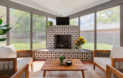
Porches
Porch of the Week: Catching a Breeze in Austin, Texas
By Becky Harris
The new screened-in space has a beautiful fireplace as a focal point and includes lounging and dining spaces
Full Story
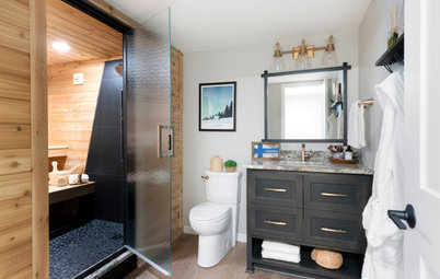
Bathroom of the Week
Bathroom of the Week: Spa Feel With a New Sauna and Shower Area
A design-build team helps a Minnesota couple upgrade their basement bathroom for family enjoyment and relaxation
Full Story
Before and Afters
Renovation Revives a Ranch Home’s Midcentury Modern Vibe
By Becky Harris
Two architects open up the floor plan, create an indoor-outdoor feel and bring a house back to its midcentury roots
Full Story
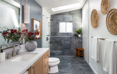
Bathroom of the Week
Bathroom of the Week: Bright and Open in a Light-Filled Addition
A design-build pro adds a bathroom suite with spa-like amenities, a clean, contemporary style and lots of breathing room
Full Story
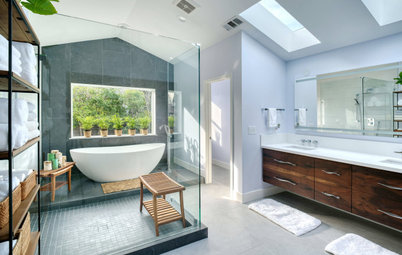
Bathroom Design
Bathroom of the Week: Spa-Like Addition With a Modern Earthy Look
A designer and a builder create an en suite bath with a spacious curbless shower, a skylight and an inviting palette
Full Story
Additions
Family-Friendly Addition Opens a House to the Backyard
By Becky Harris
A design-build firm expands a kitchen and adds a family room, screened-in porch and master suite
Full Story

Kitchen Design
Blue, Wood and Brick Bring Charm to a London Kitchen
A smart layout turns an uneven floor into an advantage and creates a compact yet cheerful space
Full Story
Houzz Tours
Happy Compromises for a Minimalist and a Maximalist
By Becky Harris
A Toronto architect makes the most of narrow rooms with a renovation
Full Story
Kitchen Design
Kitchen of the Week: Bright Addition for a Tudor-Style Home
By Becky Harris
An architect couple in Bend, Oregon, tie their new kitchen to their 1927 house with thoughtful details
Full Story
Kitchen Design
A Sophisticated Kitchen for an Open-Plan Addition
Smart cabinetry and luxurious finishes give a London cooking, dining and living space enduring style
Full Story
I was starring at those big white folding doors, thinking - why not put up some flat artwork or paint a design on those doors. They look like canvas just waiting for inspiration to strike! LOL
It would have been nice to see before & after floorplans to understand the structure.
This type of solution is really the solution to the whole open/closed floor plan debate, and i hope more builders incorporate it in the future.