


Kitchen of the Week: Classic Feel, Modern Sparkle
A marble mosaic backsplash, cool metallics and a new layout give a family a light, bright and airy kitchen

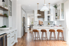
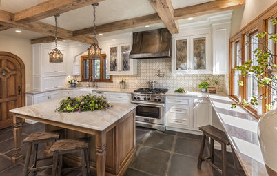
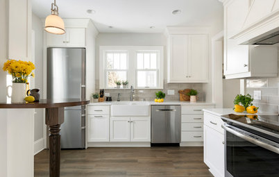
Layout. Dalrymple flipped the kitchen around, bringing the work area over to the space that received the most natural light and placing the wet bar and eat-in space at the other end. She set up a classic work triangle. That’s a panel-front refrigerator-freezer on the left, the sink is just out of view to the right and the island provides space for prep work.
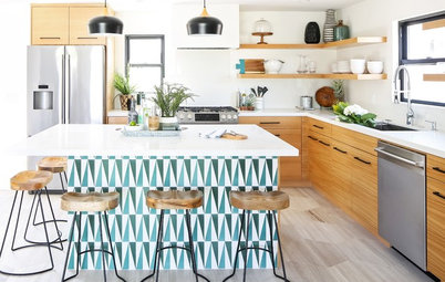
Island. “The island gives them tons of storage and seating,” the designer says. It is 3 feet by 7¾ feet. Not wanting to make the kitchen all white, the clients opted for a pleasing blue for the island. “We used a blue wash so that it wouldn’t be this hulking anchor in the middle of the room, and to let some of the wood grain show through,” Dalrymple says. “The color is a nice quality but not too saturated.”
The warm wood stools add another modern touch. With two young boys often sitting here, the designer found a practically indestructible fabric from Perennials. “You can literally pour bleach on this fabric and it won’t harm it. Yet it’s still very soft and feels like cotton linen — it’s very family-friendly,” she says.
Because the island was custom-built, they were able to add flourishes like the fluted legs and the X-details on the seating side. These details play off the backsplash tile pattern. Andy Sutherland of NH Woodworks served as the general contractor and custom cabinetmaker on the project.
Lighting. In addition to recessed lights, there are polished nickel lanterns over the island. Their clear glass profiles don’t weigh down the room.
Lantern: Darlana, Visual Comfort; Counter stools: Article; browse modern counter stools
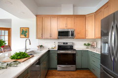
Windows. To make the most of the natural light, Dalrymple moved the sink and the rest of the work area under the only exterior wall in the room and put in new windows that add more light. Previously, this end of the kitchen was an eat-in area.
Tip: Use casement windows that crank open over a kitchen sink so they are easy to open.
Sink. The sink is a traditional apron-front fireclay farm sink. The designer stuck with the classic finish of polished nickel for the faucets and hardware. This material plays off the stainless steel on the stove and glints of stainless steel in the wet bar backsplash. (We’ll get there in a minute). There’s a trash-recycling pull-out cabinet to the left of the sink and a panel front dishwasher to the right. And there’s an appliance garage on the bottom of the tower on the right.
Counters. The counters are classic Carrara marble, but their mitered edge profile is a modern touch. Dalrymple recommends a 2-inch-thick counter for a strong presence; here you can see the pleasing scale it has in relation to the island.
Splurges versus savings. While the tile and countertops were splurges, the couple decided to forgo fancy cabinetry inserts to save money. Instead they opted for deep drawers along the lower cabinetry for cookware.
Wall and trim paint: White Dove, Benjamin Moore; sink: Shaw’s Original, Rohl; faucet: Kohler; hardware: Baldwin
Floor plan. Here you can see how the kitchen and dining room relate to one another, as well as how the kitchen relates to the mudroom. Dalrymple flipped the existing eat-in and work areas for the remodel. She left room for an eat-in area across from the wet bar. (The family is still waiting for the perfect kitchen table).
The kitchen opens to the family room off the top right corner. “This kitchen is in the middle of the house and serves as the true heart of the home,” she says.
The kitchen opens to the family room off the top right corner. “This kitchen is in the middle of the house and serves as the true heart of the home,” she says.
Kitchen “after.” This is the same wall seen in the previous photo; the hammered stainless steel bar sink is located about where the range had been. The center of the kitchen now has a wet bar on one side and space designated for a new eat-in area across from it. On the right side of the sink are refrigerated beverage drawers; to the right is a wine fridge. This makes it easy to come in and grab a drink without bumping into whoever is cooking. The cabinets on the right serve as the pantry.
There’s a small peek into the dining room on the right side of this photo. The wet bar is well-located to serve the kitchen, the future eat-in area and the dining room when the couple entertains. The half column you see is structural; Dalrymple brought up half walls on either side of the opening to the dining room to camouflage what had been two awkwardly scaled freestanding structural columns.
Faucet: Kohler
Backsplash. When she found this Carrara marble backsplash with star-shaped glints of stainless steel embedded in it, the designer knew she’d found just the tile to give the room some sparkle and to play off the hammered stainless steel wet bar sink. And glassware reflects the light through the clear glass upper cabinet doors.
Backsplash tile: New Ravenna; browse beverage refrigerators
Backsplash tile: New Ravenna; browse beverage refrigerators
Mudroom “after.” Dalrymple gave each family member their own cubby complete with space for shoes, coats, bags, scarves, hats and more. The cubbies have a built-in bench that brings warm stained maple into the room. The cabinets at the top have antiqued mirror doors that repeat the X-detail we saw on the kitchen island. The new tile is a gray matte porcelain that works well with colors used in the kitchen. Dalrymple also helped them choose a new exterior door that lets in more light.
“Because they don’t have a coat closet, I put as many hooks in each cubby as possible,” she says. There are triple hooks at the back of each cubby and double hooks on either side. Tongue and groove paneling adds depth to the cubbies.
She also gave them a command central landing zone via a tower with room to sort the mail, additional storage space and space for charging devices. The side of the tower that faces the door has a door that opens to a shallow cabinet where they hang their keys.
Takeaways
Read more stories about kitchen design
Find a cabinetry pro
She also gave them a command central landing zone via a tower with room to sort the mail, additional storage space and space for charging devices. The side of the tower that faces the door has a door that opens to a shallow cabinet where they hang their keys.
Takeaways
- Balance out a vent hood by flanking it with upper cabinets.
- Freshen up a traditional style by using classic finishes and materials with subtle modern touches worked in. Here those are the geometric mosaic tile, 2-inch-thick mitered counter edges and modern counter stools.
- Use a casement window over a kitchen sink so it’s easy to open.
- To lighten up a dark accent color, try a wash rather than solid paint.
Read more stories about kitchen design
Find a cabinetry pro


Kitchen at a Glance
Who uses it: A couple and their two young boys
Location: Wellesley, Massachusetts
Size: 325 square feet (30 square meters) plus a mudroom
Designer: Nikki Dalrymple of Acquire
After a complete renovation, this once-dark kitchen in Wellesley, Massachusetts is light, bright and sparkling with glints of stainless steel, glass and marble. The style of the new kitchen is a careful transitional balance between traditional and modern. “My clients wanted a classic look, but their tastes also skew more modern,” says interior designer Nikki Dalrymple.
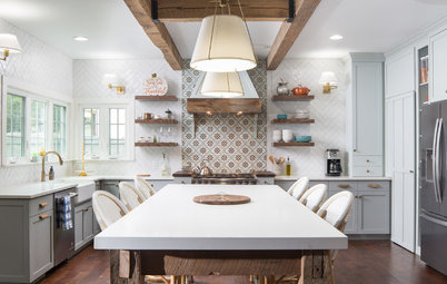
Backsplash. An elegant mix of Carrara and Thassos marbles compose a graphic geometric mosaic tile backsplash in the kitchen. This mix of classic materials in a fresh, clean-lined pattern sets the tone for the room.
Range hood. The designer custom-designed a graceful vent hood in plaster and wood. Note the seamlessness between the top of the hood and the crown molding detail on the wall and upper cabinets. “I like to flank a hood like this with upper cabinets to make it feel more built-in,” she says. She provided plenty of counter workspace on either side of the range.
Backsplash tile: Artistic Tile