


An Open-Plan Kitchen That’s Ready for Company
Cohesive materials and a new layout help create an attractive cooking, dining and entertaining space for a young family

Before. “The 1960s ranch had good bones, but my clients wanted it to be family-friendly and work for entertaining,” Hope-Kennedy says. This “before” photo shows the hodgepodge look I spoke of, and it can work just fine in a kitchen that’s closed off from other rooms. But viewed directly from the family room, the composition of a hulking stainless steel refrigerator and block of black wall ovens within the cream cabinets was not focal-point worthy. Also worth noting is the bulky banquette that partially blocked the windows on the right. Just out of view on the left, the wall contained a bar area that wasted a lot of space. The dining room is located through the opening on the left.
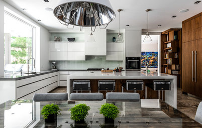
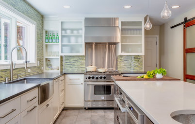
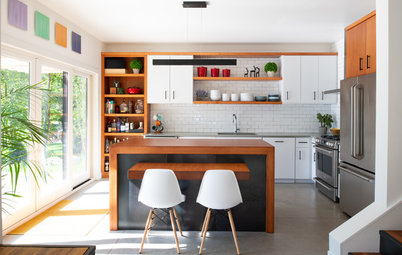
Family room view. Now the view from the family room to the kitchen is a stunner. The neatly arranged horizontal lines of the kitchen give the eyes a place to rest — the line of the island counter, the line of the pencil trim tile along the backsplash, the line of the upper cabinets and the line of eye-catching, oversize copper globe pendant lights. And most of the appliances are hiding on a new appliance wall to the left.
Flooring: Because her clients have two little kids, they opted for durable, easy-to-maintain surfaces wherever they could. “They wanted something that would stand up to the wear and tear of kids and dogs. This European white oak engineered flooring is great for that,” Hope-Kennedy says.
Cabinetry. The cabinets are also very durable. They are high-pressure laminate (HPL) veneers that look like wood grain. This adds a layer of texture to this view and suits the family room side. “I added walnut accents around the cabinets to keep them from looking too cold and sterile,” she says.
Metal finishes. The designer maintained a careful balance of mixed metals in here. She used brass cabinet hardware for warmth. For the faucet, she chose a brushed stainless steel to fit in with the appliances. But it’s the shiny copper of the pendant lights that’s the star. “We wanted to go for something oversized in here,” she says.
Flooring: La Maison; sofa: Pottery Barn; Kite chair: Huppé; backsplash: Lucian Glass Premium in Glossy Oxygen, Ann Sacks; cabinets: Nevamar veneers; hardware: Emtek; counter stools: Blu Dot; See more counter stools
Fireplace wall. Hope-Kennedy planned the fireplace built-ins around her client’s specific stereo and gaming equipment. She chose walnut to tie them into the kitchen. She chose a modern large-format tile for the tile surround — its coloring plays off some of the hues of the kitchen cabinet veneers.
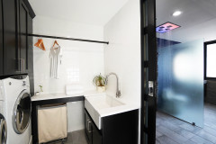
Laundry room door. If you look closely, you’ll notice a door that blends in with the family room wall (right) that leads to the laundry room. Hope-Kennedy replaced an existing door that stuck out visually with a plain one painted to match the walls. It is almost completely concealed thanks to her use of invisible hinges called Soss hinges. This keeps the wall looking clean and uninterrupted.
Island. The island provides a pleasing transition between the two spaces and is key for entertaining from a serving and gathering standpoint — it’s right next to the bistro table so guests can sit at both and interact. There’s a wine cooler and a beverage refrigerator and other entertainment supplies stashed on this side of the island. Because this is a main prep area, there is a drawer outfitted for herbs and spices in here as well. The other side of the island has cabinets concealed thanks to touch-latch doors. They provide storage for items they don’t use every day.
Wall paint: Imagine .06, Yolo; trim paint: All White, Farrow & Ball; fireplace surround: Artistic Tile
Appliance wall. Before, this area was a space-wasting bar. Now it holds the wall ovens, refrigerator (left) and a pantry for food and small appliances (right). In order to maintain the clear countertops, Hope-Kennedy recommends a pantry outfitted with doors that pocket or open 180 degrees, then installing a countertop and outlets inside for small appliances. “It gives you easy access to the things you need every day like a coffee maker, but you don’t have to look at them out on the counters,” she says.
Counters. The countertops are porcelain slabs that look like Calacatta marble. Their white color is a crisp contrast to the cabinetry, while the gray veining picks up on colors found in the veneers. The product allowed the vein patterns to seamlessly continue down the sides of the island’s waterfall counter (if you look closely at the bottom right corner of this photo you can see this).
Tile. The more traditional spouse was pleased by the brick tile that wraps around the walls on either side of the focal wall and the intricate Moroccan shape of the glass backsplash tiles. Hope-Kennedy extended the porcelain partway up the backsplash, then placed a ceramic pencil trim tile between the two. The pencil tile has a bronze color to it that ties it into the warmer finishes like the walnut accents and brass hardware.
Lighting. “This is a long room but a small kitchen, so we wanted something with a big presence,” she says. The oversize copper globe pendants bring in warmth, reflection and shine that draws the eye.
Counters: Calacatta, Marmi, Maxfine; Copper Shade pendant lights: Tom Dixon
Bistro area. One of the best features of the existing kitchen was its eat-in nook tucked into the bay window. Hope-Kennedy replaced the existing banquette because it partially blocked the windows and because it felt like a bulky booth in a restaurant. A new floating banquette bench gives the area a light and open look that the old one lacked. The cushions are a faux leather that is stain-resistant and easy to wipe down. An oval pedestal table reflects the light, and the inside of the pendant light carries brass over to this part of the room. Pillows and Roman shades bring in some light pattern and a few pops of color that let the views outdoors take center stage.
Baseboards. Here you can get a peek at some of the new millwork. “Old baseboards are usually too short,” Hope-Kennedy says. A taller, flatter style befits the room’s new contemporary look.
How to create a focal-point-worthy kitchen
More
12 Ways to Divide Space in an Open Floor Plan
Find a kitchen designer
Baseboards. Here you can get a peek at some of the new millwork. “Old baseboards are usually too short,” Hope-Kennedy says. A taller, flatter style befits the room’s new contemporary look.
How to create a focal-point-worthy kitchen
- From the very first planning stages, consider the view into the kitchen from the adjacent room.
- Choose a material for the back of the island that will work with the adjacent space.
- Connect spaces within open floor plans through colors, finishes, materials, flooring and hardware.
- Outfit drawers for things like herbs, spices and oils near the range/prep areas so you won’t be tempted to let those things clutter up your counters.
- Create an appliance wall off to the side that will make the view less “kitchen-y.”
- Use panel-fronts on appliances that match the cabinetry to camouflage them for a seamless look.
- Plan tucked-away spaces for small countertop appliances, like a pantry or pantry cabinet outfitted with a counter and outlets or an appliance garage.
- Pick lighting that works well with both spaces.
More
12 Ways to Divide Space in an Open Floor Plan
Find a kitchen designer


Kitchen at a Glance
Who lives here: A young couple with two small children
Location: Lafayette, California
Size: Kitchen, including bistro area: 295 square feet (27 square meters); kitchen and family room total: 690 square feet (64 square meters)
Designer: Studio SHK
This Northern California family’s newly renovated kitchen is a brilliant example of creating a cohesive look between spaces within an open floor plan. When your kitchen is a focal point in full view of another room, you want it to be something nice to look at, not a hodgepodge of bulky appliances with cluttered countertops. After all, who wants to think about clearing off countertops when you’re trying to relax by the fire and watch a favorite show? After working with interior designer Sherry Hope-Kennedy, this family’s new kitchen and family room flow together and suit both of the homeowners’ distinct tastes.
Style. It’s a common story — he likes modern and contemporary and she likes things more traditional with lots of white. Hope-Kennedy helped guide this couple to a compromise that was anything but wishy-washy. The overall style is crisp and contemporary for him, while the porcelain slabs that look like Calacatta marble and traditional tile selections make her happy.
Scope of work. The kitchen was a down-to-the-studs remodel. The family room renovations included a new fireplace surround and built-ins, a new laundry room door, new flooring and new millwork.
Layout. “My clients love to entertain and we wanted a circulation pattern that would flow for that,” Hope-Kennedy says. Guest can linger at the kitchen island, take a seat in the bistro area or continue to the family room sofa or out the doors to the play area and pool. The dining room is located behind the kitchen. In terms of function, the space is a classic work triangle, with the wall ovens, refrigerator and pantry all concentrated on one wall and the range and sink on the other. The island serves as prep space between the two. She also placed lower cabinets outfitted for everyday glasses, china and silverware within reach of the dishwasher for easy unloading.