


Houzz Tour: An Experience of Space in Denmark
Taking a big-picture approach, architects use contrasting colors and materials to change the mood from room to room

Taking charge of the planning themselves, Martin and Mette, pictured, turned what was once an 861-square-foot summer cottage into a spacious 1,959-square-foot home over the course of a decade. Keeping to a fairly moderate budget was a priority.
“The construction cost per square foot was low. We were successful in part because we found some materials which were not very spectacular or especially nice in themselves but that worked surprisingly well when they were used the right way and in larger areas,” Martin says.
“The construction cost per square foot was low. We were successful in part because we found some materials which were not very spectacular or especially nice in themselves but that worked surprisingly well when they were used the right way and in larger areas,” Martin says.
Well-thought-out lighting is a huge part of this effect. “That way, there is no need for expensive materials. Light usually plays the most important role, so whether the floor is expensive wood, a cheaper variety or raw concrete becomes less important,” he says.
The ability to prioritize and be selective is also vital. “You do not need to have expensive materials everywhere. Avoid focusing on every single detail from the start, because if you do, the costs will add up. Think in general terms: What is the most important thing for each room?”
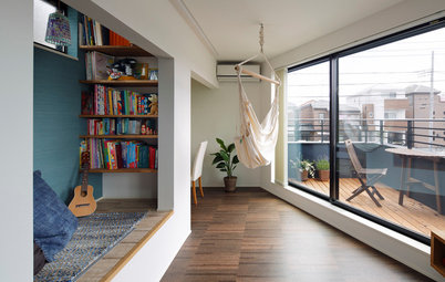
A mini atrium is the focal point of the house. “It is not really a useful space, just a ‘hole’ in the house. But it lets the sunlight in and ventilates,” Martin says. It was originally an outdoor courtyard formed by three sides of the U-shaped house.
Incredible light pours into the house through this square glass-framed well. “The inner patio is the visual center of the house. It is see-through, so you get a sense of what is happening in other parts of the house, and for me, that is a great quality,” he says.
The ability to prioritize and be selective is also vital. “You do not need to have expensive materials everywhere. Avoid focusing on every single detail from the start, because if you do, the costs will add up. Think in general terms: What is the most important thing for each room?”
A mini atrium is the focal point of the house. “It is not really a useful space, just a ‘hole’ in the house. But it lets the sunlight in and ventilates,” Martin says. It was originally an outdoor courtyard formed by three sides of the U-shaped house.
Incredible light pours into the house through this square glass-framed well. “The inner patio is the visual center of the house. It is see-through, so you get a sense of what is happening in other parts of the house, and for me, that is a great quality,” he says.
Here is a view from the kitchen, in an addition to the home, into the original structure. The hall is to the right, and the atrium is on the left.
The white bedroom is on the opposite side of the atrium from the entrance.
“The bedroom is an interior room with no windows other than the one to the patio. But even though there is only light from one side, it seems bright and welcoming precisely because it is all white,” Martin says.
“Being in such an undisturbed space invites you to be mentally purified before going to sleep. Lying there looking out on the green plants and being in touch with the season and the weather in such an intense way makes me really happy. Sometimes the moonlight illuminates everything through the patio window — it is absolutely magical.”
The resulting simplicity of the space was also part of the design philosophy. Martin suggests that homeowners “look at the big picture and consider carefully which details are really important. Take advantage of simplicity, aim for surprises with contrasts and remove anything redundant.”
The bedroom’s all-white palette sets the tone for the rest of the house, not through its color — it is the only all-white space in the home — but because it demonstrates the consistent approach with which each room is executed.
“It is one of the central ideas of this house to create [spatial] experiences and transitions that create a kind of tension that shifts you into a different state of mind depending on which room you are in,” he says. “The house is completely black on the outside, but everything in the bedroom is white, and when you go from the bedroom into the wood-paneled living room, not only the experience of the space, but [also] the experience of the materials, is completely different.”
“It is one of the central ideas of this house to create [spatial] experiences and transitions that create a kind of tension that shifts you into a different state of mind depending on which room you are in,” he says. “The house is completely black on the outside, but everything in the bedroom is white, and when you go from the bedroom into the wood-paneled living room, not only the experience of the space, but [also] the experience of the materials, is completely different.”
The bathroom is in the original part of the house.
“The bathroom might look simple, but a lot of work has been put into it. In fact, I think that is the room we spent the most time planning because we weren’t really sure how to deal with it best,” Martin says.
The very deep window seat was a particularly successful solution. The Wienbergs got the idea when they were making room for a wall-hung toilet to the right of the sink (not pictured).
“Instead of just creating a small customized solution by bringing part of the wall behind the toilet forward, we chose to bring the whole wall forward so that it makes one clear line. At the same time, this gave us the opportunity to create the deep niche with seating below the window and a built-in niche with a mirror and a shelf over the sink. In this way … we didn’t have to install any extra shelves,” he says.
The tiles throughout the bathroom are made of a composite material purchased from Stark, a Danish hardware store. They aren’t much to look at in themselves, “but because we have used them all over the space, they actually look really good,” Martin says.
“It is almost like being inside a block of stone — safe and homogeneous. Lying in the lovely warm water of the bathtub, relaxing and looking out on all the greenery, it can hardly get any better.”
“It is almost like being inside a block of stone — safe and homogeneous. Lying in the lovely warm water of the bathtub, relaxing and looking out on all the greenery, it can hardly get any better.”
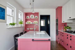
When you walk down the three steps into the kitchen, contrasts in color and materials come to the forefront.
“The main elements here are the solid concrete floor and the kitchen island,” Martin says.
The materials highlight the general cleanliness and function of the room, just as they do in other parts of the house, but the effect is different here.
“The island is from Ikea, while the steel fronts have simply been glued to some MDF-boards and attached to the whole. We think the steel offers some really nice reflections that complement the cast-concrete floor,” he says.
Custom countertop: bordpladen.dk; wall cabinets: Svane Køkkenet
The couple created a neutral contrast to the island with the white rear wall.
Two table lamps, one at each end of the island, provide light. “My wife is quite sensitive to light, and I am not really crazy about pendants or spotlights in a kitchen. They are OK as work lights, but when you use ordinary lamps as a primary source of light, like here, the atmosphere in the kitchen becomes much homier and cozier,” Martin says.
Lamps: Artemide
Looking at the overall design of the relatively large kitchen-dining area, some people may think that a disproportionate amount of space was allotted to the island and its clearance, compared with the dining area.
Martin explains that this was a conscious choice. “There are never many people eating here on workdays, and when we do have a lot of visitors, we set up a longer table in front of the island. So the arrangement of this room is really about how we live our everyday lives, and we like the fact that it is a little smaller and more intimate than normal, rather than, for example, a long table with eight chairs, which would be the standard solution.”
Martin explains that this was a conscious choice. “There are never many people eating here on workdays, and when we do have a lot of visitors, we set up a longer table in front of the island. So the arrangement of this room is really about how we live our everyday lives, and we like the fact that it is a little smaller and more intimate than normal, rather than, for example, a long table with eight chairs, which would be the standard solution.”
With so many hard materials, like concrete and steel, acoustics can be a problem. The couple solved this in part by installing curtains that stretch beyond the window frames.
“They hang from the ceiling to the floor and are wide enough to wrap around the whole room. When we have a smaller group — for example, on New Year’s Eve — we pull the curtains all the way around, decorate with a bit of light and set a beautiful table. Something happens when you close everything up: You create completely different scenery, almost like a backdrop. The room is more powerful when you can change the atmosphere,” Martin says.
“They hang from the ceiling to the floor and are wide enough to wrap around the whole room. When we have a smaller group — for example, on New Year’s Eve — we pull the curtains all the way around, decorate with a bit of light and set a beautiful table. Something happens when you close everything up: You create completely different scenery, almost like a backdrop. The room is more powerful when you can change the atmosphere,” Martin says.
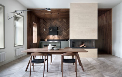
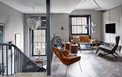
The most spectacular room in the house is undoubtedly the wood-paneled living room in the addition. Again, the couple chose consistent eye-catching materials to create contrast.
“We wanted to create a room that is different from the others. For example, in contrast to the bedroom, the living room is very outward-facing, not only in extension and in height, but also in terms of materials. We used wood to create substance and a natural interaction with the green environment outside,” Martin says.
“We wanted to create a room that is different from the others. For example, in contrast to the bedroom, the living room is very outward-facing, not only in extension and in height, but also in terms of materials. We used wood to create substance and a natural interaction with the green environment outside,” Martin says.
At first, the couple considered lighter wood, such as birch laminate.
“But when we had to select the windows, we could not find anything matching in light wood. So we found some wooden frames in oak and then found these boards of laminated MDF, which are actually so standard that you can buy them at DIY retailers. When we saw it together with the solid veneered wood we wanted to use for the windows, we immediately saw how well they matched — it was very homogeneous,” he says.
“But when we had to select the windows, we could not find anything matching in light wood. So we found some wooden frames in oak and then found these boards of laminated MDF, which are actually so standard that you can buy them at DIY retailers. When we saw it together with the solid veneered wood we wanted to use for the windows, we immediately saw how well they matched — it was very homogeneous,” he says.
The decor in the multifaceted, asymmetrical living room was carefully designed to echo and enhance its functionality.
“It has been organized and furnished in such a way that people are forced to sit together. If the walls had been parallel, people would be sitting directly in front of each other, but this way, they sit in a group. This automatically makes the atmosphere more informal, which was a conscious choice,” Martin says.
“It has been organized and furnished in such a way that people are forced to sit together. If the walls had been parallel, people would be sitting directly in front of each other, but this way, they sit in a group. This automatically makes the atmosphere more informal, which was a conscious choice,” Martin says.
The built-in “floating” sofa bench encircling almost the entire room invites both children and adults to be social.
“We often see that when children come into the room, they run all the way around the bench, while adult guests quite naturally feel like lying on it,” Martin says. “It is super cool to have a room where guests feel that the space allows them to lie down just because they want to — and when guests are lying down, everything is informal from the start.”
The custom bench has storage space underneath the seats. The large pillows were made to order at Brdr. Petersen.
The warm living room offers contrasting views into the bedroom and the kitchen-dining area.
The living room’s wood paneling continues up to the second-floor office.
The floors on the second story are also oak. “Because we used oak so consistently, the surfaces have become one in a way that produces a very tranquil effect,” Martin says.
There is little artwork and decoration on the walls in the Wienbergs’ home. The wooden walls are decorative in themselves, so this was partially a deliberate choice, but not entirely.
“I think we both thought that we would just [put the pictures up] when we got to it. But when you see this room, it is really difficult to bring yourself to put nails into the wall. All in all, there are many expressive items that I think fit well with the space, such as the pink chair and the lights,” he says.
He points out that the large and well-placed windows act like artwork to a great extent.
Armchair: Hay
Martin says the aesthetics of two countries in particular had a huge effect on the design of the home.
“We have traveled quite a lot in Japan, and we have lived in Finland. It is probably primarily the Japanese houses that have inspired us. They are the source of the consistency that we have tried to introduce into the rooms, and they often have wooden decor,” he says.
“We have traveled quite a lot in Japan, and we have lived in Finland. It is probably primarily the Japanese houses that have inspired us. They are the source of the consistency that we have tried to introduce into the rooms, and they often have wooden decor,” he says.
The original summer cottage had only one level. “But when we saw the house and realized that we would be allowed to build another floor, we went up on the roof and discovered that we could see to the horizon on all sides and that the view is very green,” Martin says.
This helped convince the couple to buy the house and build an extra floor with a large terrace, making full use of the maximum permissible structural height of just over 27 feet.
“Not many people know that we have a rooftop terrace, because it is not visible from outside and is furnished with short chairs. Moreover, it is sheltered, and you see no houses from there, only trees. So it is easy to imagine that you are all alone in the middle of the forest. It is absolutely amazing,” he says.
The exterior facade maintains the themes of simplicity and contrast. “The original house was also covered with black wood on the exterior, but it needed a loving hand, which is why all the black wood was replaced. We also covered the extension with pine, painted black. You could say that the original character of the black wooden cottage in the middle of the greenery has been preserved,” he says.
It may seem strange to create a home that is so full of contrasts. However, Martin believes that a lot of other people could benefit from thinking creatively when they build and renovate.
“If I could give some good advice to people, I would tell them to rely on their own feelings of what is right instead of thinking, ‘It has to be completely white or we won’t be able to resell it.’ If you trust that it is OK to make it more personal, then I am sure you will create a house with greater value overall.… So have the courage to believe that what you feel and think is right instead of sticking to what is standard,” he says.
More home tours: Apartments | Small Homes | Colorful Homes | Contemporary Homes | Eclectic Homes | Farmhouses | Midcentury Homes | Modern Homes | Ranch Homes | Traditional Homes | Transitional Homes | All


House at a Glance
Who lives here: Architects Mette Wienberg of Wienberg Architects and Martin Wienberg of Friis & Moltke, and their 10-year-old son, Oscar
Location: Højbjerg district of Aarhus, Denmark
Size: 1,959 square feet (182 square meters)
During the renovation of their 1942 home about 3 miles south of the center of Aarhus, Denmark, Mette and Martin Wienberg incorporated quite a few out-of-the-box ideas. For example, the house has an asymmetrical oak-paneled living room reminiscent of a limited-edition cigar box, a bedroom that’s white from floor to ceiling and a small atrium at the center of the house to bring in natural light. Perhaps even more impressive is the fact that every room was designed with a focused color scheme that contrasts various spaces in the home for a striking effect and a curated overall experience.