


Decorating Guides
Not a Fan of Purple? These 7 Shades Might Change Your Mind
Ultraviolet isn’t the only way to go. These subtle variations can bring elegance and style to your home

Through my work as an interior designer, I’ve found that many people have a staunch position on the color purple. Some clients love it; others have a definite dislike. But when I introduce my clients to purple hues against, say, a navy background, their view of purple as a loud grapelike color shifts. Suddenly, lilac and deep eggplant show a more elegant character, giving my clients a different perspective.
Purple isn’t just a vibrant color that’s hard to match or that comes in shiny unappealing fabrics. Nor is every purple as bold as Pantone’s color of the year, Ultra Violet. Many purples are elegant and subtle. With purple products making their way into home decor, here’s a primer on how to use seven purple colors attractively throughout your home.
Purple isn’t just a vibrant color that’s hard to match or that comes in shiny unappealing fabrics. Nor is every purple as bold as Pantone’s color of the year, Ultra Violet. Many purples are elegant and subtle. With purple products making their way into home decor, here’s a primer on how to use seven purple colors attractively throughout your home.
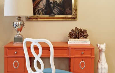
What to combine it with. Eggplant is surprisingly versatile and looks terrific with darks, neutrals and even brights. For a jewel-toned palette, coordinate it with navy, emerald green or magenta. For a lighter and airier feeling, layer pale neutrals such as whites and grays around a featured eggplant wall, textile or piece of accent furniture. Finally, splashes of bright yellow or pink look fabulous with this dark and sexy purple.
2. Plum
Plum is a dark pinkish purple with a magenta undertone. Its subtle dark fuchsia character has less blue or gray than eggplant, making it a bit more vibrant and certainly eye-catching.
How to use it. This deep, jewel-toned purple steals the show. If you choose to use it on a large surface like a wall or your kitchen cabinets, it will be the feature of the room. If you’re less committed, use plum sparingly as an accent color on textiles and accessories.
Paint color: Wicked, C2 Paint
What to combine it with. Similar to eggplant, plum has a regal character that makes it the perfect companion to other jewel tones like emerald green, to classic darks like charcoal and navy, and to select brights like fuchsia and yellow. Contrast its deep hue against a neutral background of grays or whites, or add to its rich personality by layering it with a darker wood.
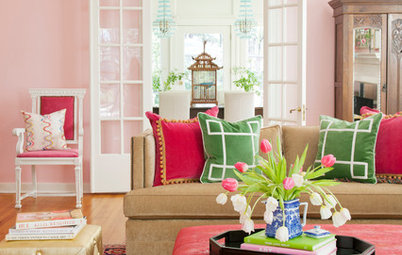
3. Mauve
Marvelous mauve is a light to medium purple with a pink undertone. Its purple cousin is lavender, but mauve has less blue and reads much warmer.
How to use it. Mauve’s light to medium tone makes it a versatile color in both dark spaces and sun-filled rooms. It’s also terrific for covering all the walls in a room or just a stylish accent piece.
Paint color: similar to Mauve Finery, Sherwin-Williams
What to combine it with. A warm hue, mauve is compatible with practically any color of wood or metal. It is a fabulous contrast to black or navy and strikes a pleasant contrast against a pale or white backdrop. Colorful brights like chartreuse, yellow or magenta also complement this fashionable purple.
4. Lilac
Lilac is a pale purple with a hint of pink. It falls somewhere between lavender and mauve, having less of a pink undertone than mauve and being less blue than lavender.
How to use it. Lilac is a sunny purple that you can use on a large element, such as a wall, or a small accent, such as a lounge chair. Its pale but cheery character can brighten a dark space or lighten up dark furniture.
Find purple accent chairs
What to combine it with. Lilac can be used with almost any wood, light or dark. It also looks fantastic with dark colors like navy, black or charcoal. It complements yellow, pink, other purple or blue hues and, of course, shades of white.
Paint color: Hazy Lilac, Benjamin Moore
Paint color: Hazy Lilac, Benjamin Moore
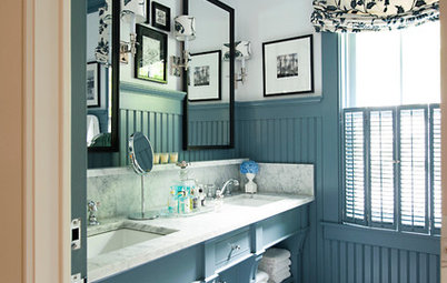
5. Lavender
True lavender is a bluish purple with medium to light intensity. It has much less pink and a bit more gray in it compared with its relatives mauve and lilac.
How to use it. Lavender is a lovely purple that adds color to a room without overwhelming it. Its bluish hue with a dash of gray makes it versatile and appropriate for use on all walls of a room, as an accent and everything in between.
Paint color: Brassica, Farrow & Ball
What to combine it with. Most colors, from bright reds and ruby-burgundy to navy and black, play nicely with lavender. Even yellows and oranges, in both pastel and vivid hues, look great with lavender. Ebony and natural pale woods also mix well with this easy-to-match purple.
Paint color: Potentially Purple, Sherwin-Williams
Paint color: Potentially Purple, Sherwin-Williams
6. Amethyst
Amethyst is a medium-toned purple that offers a bit of vibrancy, as shown here, or takes on a smoky character, as seen in the next photo.
How to use it. Amethyst’s vibrant nature makes it a terrific statement color in a room. You can showcase this alluring purple on your walls, accent furniture or textiles to create an elegant and stylish vibe. Because of its medium tone, it can be used in both light and dark rooms without being too dominant.
Paint color: Passion Plum, Benjamin Moore
What to combine it with. Amethyst looks fabulous with grays of all shades, navy, pinks and all colored metallics. Try balancing your amethyst hues with pale ivories and whites.
Wall covering: grasscloth; find grasscloth wall covering in many colors
Wall covering: grasscloth; find grasscloth wall covering in many colors
7. Purple Mist
Have you ever looked at a color and been unsure whether it was purple or gray? Well, I’m calling that hard-to-pinpoint shade purple mist. I think of it as a calm, neutral grayish purple.
How to use it. Just like gray, purple mist can function as a neutral either subtly or showcased all around a room. It’s a versatile and pale hue that can brighten a dark room while adding a touch of color. When used on a bedroom’s walls and accessories, purple mist conveys a sense of peace.
Paint color: Elephant Gray, Benjamin Moore
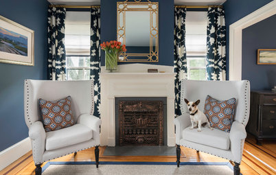
What to combine it with. Similar to gray, purple mist works well with almost any color, from pastels to brights. These grayish-purple accent chairs complement the vivid colors of the artwork and accessories while maintaining a balance to the other gray and wood colors layered throughout the room.
More
Pantone Picks a Purple for Its 2018 Color of the Year
Will These 10 Colors Be Big in 2018?
Find an interior designer to help with your color palette
More
Pantone Picks a Purple for Its 2018 Color of the Year
Will These 10 Colors Be Big in 2018?
Find an interior designer to help with your color palette
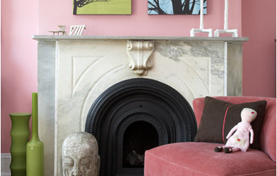
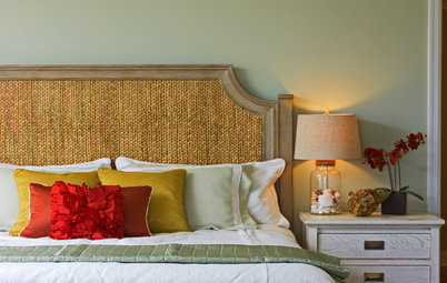

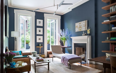


A rich purple with a bluish-gray base, eggplant is a deep, dark jewel tone with a classic feel.
How to use it. Bold eggplant works best as an accent color to give a room character without overwhelming it. When using this deep hue on a feature wall, choose a room with good natural light or an abundance of warm light from various light fixtures. For a subtler approach, try accenting just with eggplant-colored textiles or accessories.
Paint color: Pelt, Farrow & Ball