


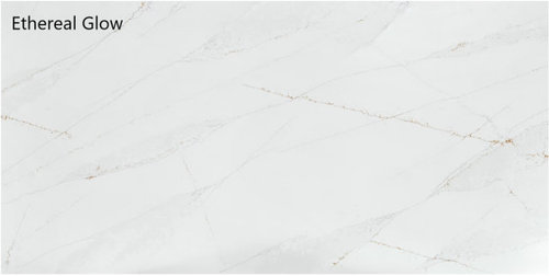
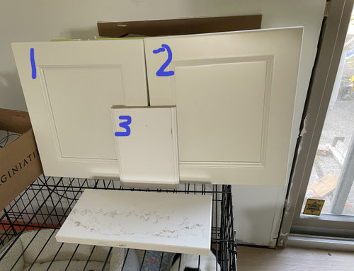
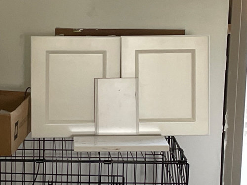
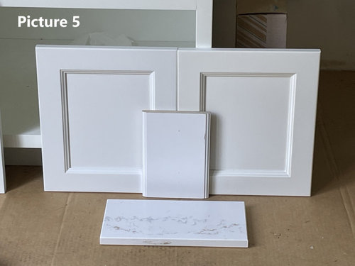
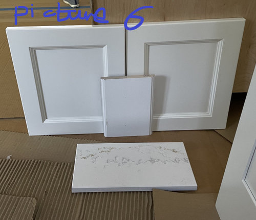
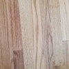
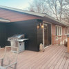
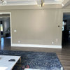
Need help on deciding countertop and cabinet color
fisherpurdue
10 months ago
last modified: 10 months ago


Featured Answer
Sort by:Oldest
Comments (12)

fisherpurdue
10 months agoRelated Discussions
need help deciding on dark or light countertop for vantiy?
Comments (1)I love what you've done so far. The marble makes it very timeless, but stacking the tiles as you did introduces a contemporary feeling that appeals to me. It seems you have a warm, dark floor tile, and everything else is really primarily white. Since you have texture on the floor (the "wood" grain) and on the walls (the "marble" veining), I would think you don't want to go too busy with your countertop material. I've had trouble finding granite that is internally consistent, except for some of the very dark granites, like absolute black or black galaxy, etc. And I don't think I would like that with your other choices. Other stones with more movement will clash with your marble. I know it's more costly, but I would go with a white or gray quartz (like Caesarstone Blizzard or Pebble), the white should go with the other whites you've already chosen and the gray should match the veining in your wall tile. If you vanity is small enough, you might be able to find a remnant of the quartz, which would make it less expensive. I look forward to seeing pics of your completed bathroom. Good luck!...See MorePlease help choose Colors/Stain Gray Cabinet Butcher Block Counter top
Comments (6)I would love to see how it turned out. We're doing a very similar renovation. So far our walls are alabaster and we've only purchased lower cabinets. I painted them Mindful Gray (BM). We just purchased our counter tops yesterday and they are unfinished butcher block. So now I'm panicking on what stain to use on them (our floors are Allen + Roth Russet Oak Laminate). I don't want the floors & counter tops to be too matchy and I'm considering just oiling them without staining. So many decisions!...See MoreUgly kitchen tiles! Need advice for cabinets and counter top color.
Comments (3)Marija - your picture didn't post , a common problem these days on Houzz, sigh. Just add it to the comment section. Be sure to give the photo time to turn from the greyish pic in transition to the full color version before clicking the submit button. Uploading takes the system a bit of time. Good luck!...See MoreQuartz? What color? Counter top and oak cabinet help?
Comments (16)I have a question for you guys. Is it too outdated to have a cointibayoon do the quartz for the badksplash(only the 4inches) without having to add any other back splash? I worry about making my kitchen Look too busy and having a hard time matching colors , so i was hoping to just install a quartz counter top with that extra 4 inch lip without doing any other backsplash . That is assuming my counter top isn’t too bland . Also, can I get away with a gray? What about the Silestone calacatta gold ? Are the speckled quartz outdated ? Thanks! My floor has to be changed because it’s got a lot of holes and pkaces that are showing the underneath black rubber. it also has stains . My dream is to have white cabinets , a Taupe counter top(warmer gray like), and wood floors . If calacatta gold form Silestone , Bianco drift from Caesarstone , cambria Torquay , or viatera “sol” would work with white or warm cabinets , I’d pick one of those maybe. It’s a small kitchen, and I don’t have a huge budget .. but I do want to make a big enough change beginning with the counter tops that were never sealed properly, flooring, (and our back wall behind the sink that needs to be replaced ) . Thanks, again. I like honesty ....See Morefisherpurdue
10 months agofisherpurdue
10 months agofisherpurdue
10 months agofisherpurdue
10 months ago
Melisa
10 months agoHU-751230613
last month


Related Stories
SMALL KITCHENSMore Cabinet and Countertop Space in an 82-Square-Foot Kitchen
Removing an inefficient pass-through and introducing smaller appliances help open up a tight condo kitchen
Full Story
LATEST NEWS FOR PROFESSIONALS10 Top Kitchen Design Trends for Cabinets, Countertops and More
See the latest colors, styles and materials for popular kitchen features from the 2024 U.S. Houzz Kitchen Trends Study
Full StoryDATA WATCH10 Top Kitchen Design Trends for Cabinets, Countertops and More
See the latest colors, styles and materials for popular kitchen features from the 2024 U.S. Houzz Kitchen Trends Study
Full Story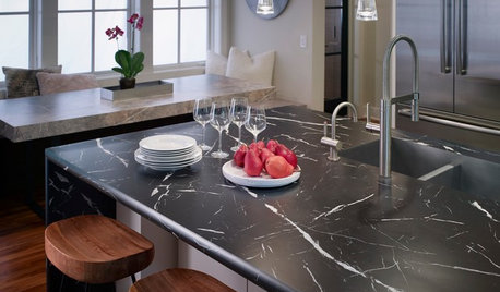
KITCHEN DESIGNNew Looks for Cabinets and Countertops Emerging in 2019
Dark colors, wood patterns and thin surfaces are a few of the trends seen at the recent Kitchen & Bath Industry Show
Full Story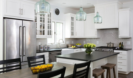
KITCHEN MAKEOVERSWhite Cabinets and Black Countertops Make a Winning Combination
The new pairing replaces dark cabinets and beige countertops for a bright and airy modern update
Full Story
BEFORE AND AFTERSSee How Refaced Cabinets Brighten This Dated Kitchen
By updating the cabinets, countertop and backsplash, designers help a homeowner create a fresh, modern style on a budget
Full Story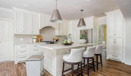
KITCHEN MAKEOVERSKitchen of the Week: Creamy White Cabinets and More Openness
A designer helps an empty-nest couple transform their 1980s kitchen with a lighter palette, an island and an airy layout
Full Story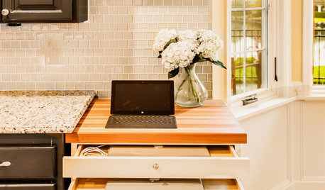
THE HARDWORKING HOMEA Hidden Charging Cabinet Corrals and Juices Family’s Electronics
The Hardworking Home: Laptops, phones and tablets now have a safe space in this kitchen, keeping the countertops uncluttered
Full Story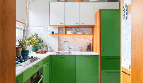
KITCHEN CABINETSHow to Design a Kitchen With Green Cabinets
See how these 9 countertop, hardware, backsplash and flooring combinations work with green cabinets
Full Story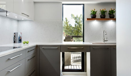
KITCHEN CABINETSThe Pros and Cons of Upper Kitchen Cabinets and Open Shelves
Whether you crave more storage or more open space, this guide will help you choose the right option
Full Story

Susan Davis