


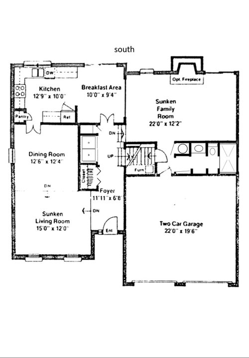
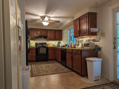
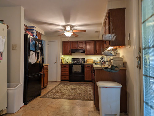
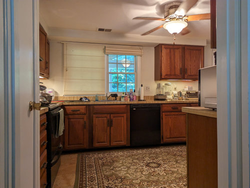
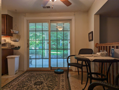
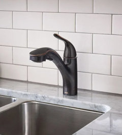
Kitchen design advice
kl23
11 months ago
last modified: 7 months ago

Featured Answer
Sort by:Oldest
Comments (175)

RedRyder
7 months agoRedRyder
7 months agoRelated Discussions
need kitchen design advice please!
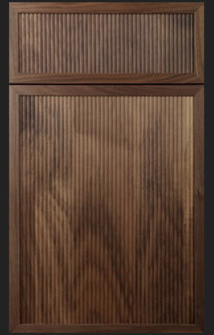
Comments (1)Hello! I'm designing custom kitchen cabinets. Part will be painted and part will be Walnut. The cabinet drawers and doors will be full overlay MDF, basically like the style in the attached photo. The designer just asked if I want the doors with sharp 90 degree edges or slightly curved. What is usually done in kitchens like this? Is there more damage with sharp angles? Thank you!!...See Moreneed kitchen design advice
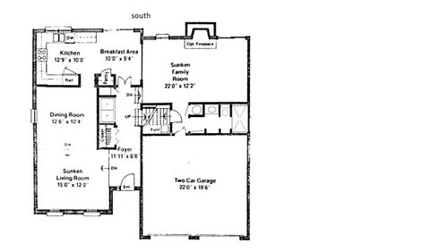
Comments (3)Older homes, for all their charm and grace, can be tough due to the chopped up spaces. It is a little hard to visualize the floorplan from the photos. If you have a measured floor plan (graph paper or computer generated) I think you will get lots of responses. Also good to know up front what your goals and general budget is ($20k, $50k, $100k, infinite?). Like, if you have a growing juicing hobby and need massive fresh food storage, or maybe you bake cakes as a side biz and need two ovens plus room to decorate them. I love your trim, btw, it is so beautiful....See MoreTiny Mountain House Kitchen Design Advice Sought
Comments (47)@Dana If they are painting your cabinets with sprayer equipment, it's really not a huge step to take it to the level of a two-part finish to add decades of longevity to your cabinetry finish as compared to lacquer. A lacquer/enamel is something that would appropriate for furniture that sees light use. In your kitchen, you have more fluid and chemical resistance needs as well as just plain traffic which would be better served with the chemical resistance and hardness that the 2-part finish adds. A professional preparation and refinishing job were you to need one runs about $7,000 USD on average, so getting a durable finish from the start can really be a savings on down the line if you plan to still be living in this home within 7 to 10 years. Additionally, it can be heartbreaking to see white cabinets turning yellow fairly early on with a lacquer/epoxy oil-based coating, which they will to some degree or another over the years. You can learn a lot about finishes and also find suppliers for 2-part waterborne Milesi paint from this Facebook group: https://www.facebook.com/groups/diycabinetrefinishing Sayerlack is a Sherwin Williams industrial brand that is a competitor to Milesi. Their 2-part waterborne finishes are leading within the industry as are Milesi's and would certainly be available anywhere in the United States. A supplier within the Facebook group I mentioned above will also ship Milesi anywhere within the United States....See Morekitchen design advice!
Comments (1)get the hood in...get the splash installed since you've decided. Youll have to choose a grout shade and how the hood looks [metal?] vs. trimmed in the [wood ?] can have an impact on what final touches you desire. Herringbone tile outcomes vary depending on size / and exact pattern of the tile / grout contrast/ once its laid. It can end up busy...or not so much......so I'm just saying wait a bit. Just off hand I think I'd get more details w pendants and bar stools as opposed to mix n match w cab pulls...Your space is bigger than inspir picture so bringing focus forward to island w lighting and stools makes the most sense to me. You wont be space constrained with stools......the amt of comfort and use at the island can be considerable if you so desire. I like the tufted look....they seem cozy for real use not just transient. totally different w a leather? and warmer color ..still works w black..... textural warm fabric [still subdued.] ....kinda nice and inviting....See More
kl23
7 months agokl23
7 months agokl23
7 months agokl23
7 months agokl23
7 months agokl23
7 months agoRedRyder
5 months agokl23
5 months agoRedRyder
5 months agokl23
5 months agokl23
5 months agokl23
5 months agokl23
5 months ago
ilikefriday
5 months agokl23
5 months agokl23
5 months agoilikefriday
5 months agolast modified: 5 months ago
A M
5 months agolast modified: 5 months ago
OhNat
5 months agoOhNat
5 months agokl23
5 months agoilikefriday
5 months agolast modified: 5 months agokl23
5 months agokl23
5 months agokl23
5 months agoilikefriday
5 months agokl23
5 months agoRedRyder
5 months agoilikefriday
5 months agokl23
5 months agokl23
5 months agoRedRyder
5 months agokl23
5 months agoRedRyder
5 months agokl23
5 months agokl23
5 months agoilikefriday
5 months agokl23
5 months agoRedRyder
5 months agoRedRyder
5 months agokl23
5 months agoRedRyder
5 months agokl23
5 months agokl23
5 months agokl23
2 months agoRedRyder
2 months agokl23
2 months agokl23
last month


Related Stories
DECORATING GUIDES10 Design Tips Learned From the Worst Advice Ever
If these Houzzers’ tales don’t bolster the courage of your design convictions, nothing will
Full Story
TASTEMAKERSBook to Know: Design Advice in Greg Natale’s ‘The Tailored Interior’
The interior designer shares the 9 steps he uses to create cohesive, pleasing rooms
Full Story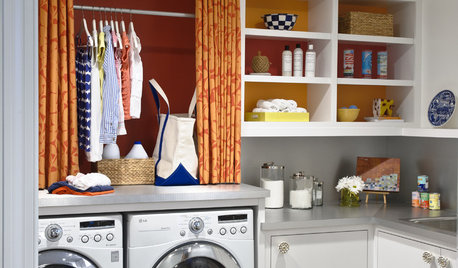
REMODELING GUIDESContractor Tips: Advice for Laundry Room Design
Thinking ahead when installing or moving a washer and dryer can prevent frustration and damage down the road
Full Story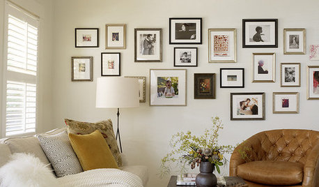
LIFEEdit Your Photo Collection and Display It Best — a Designer's Advice
Learn why formal shots may make better album fodder, unexpected display spaces are sometimes spot-on and much more
Full Story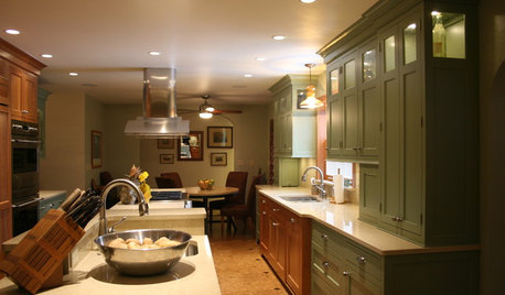
KITCHEN DESIGNSmart Investments in Kitchen Cabinetry — a Realtor's Advice
Get expert info on what cabinet features are worth the money, for both you and potential buyers of your home
Full Story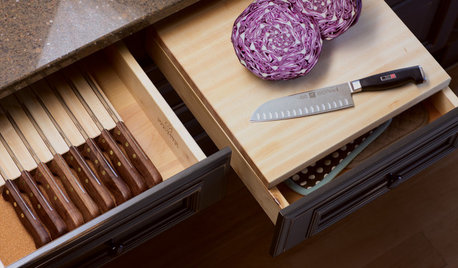
KITCHEN STORAGEKnife Shopping and Storage: Advice From a Kitchen Pro
Get your kitchen holiday ready by choosing the right knives and storing them safely and efficiently
Full Story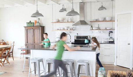
LIFEGet the Family to Pitch In: A Mom’s Advice on Chores
Foster teamwork and a sense of ownership about housekeeping to lighten your load and even boost togetherness
Full Story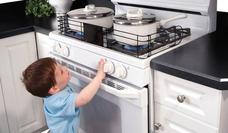
HEALTHY HOMEHow to Childproof Your Home: Expert Advice
Safety strategies, Part 1: Get the lowdown from the pros on which areas of the home need locks, lids, gates and more
Full Story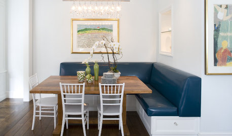
Straight-Up Advice for Corner Spaces
Neglected corners in the home waste valuable space. Here's how to put those overlooked spots to good use
Full Story
DECORATING GUIDESDecorating Advice to Steal From Your Suit
Create a look of confidence that’s tailor made to fit your style by following these 7 key tips
Full Story
rebunky