


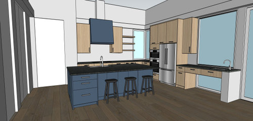
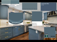
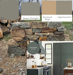
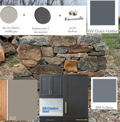
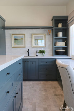
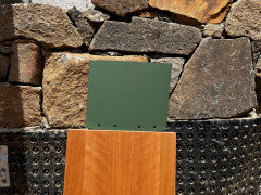
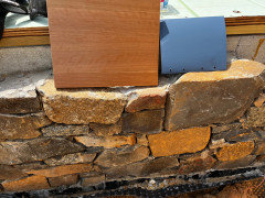
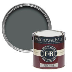
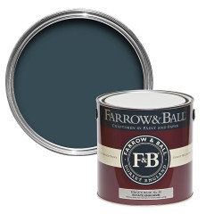
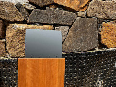
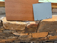
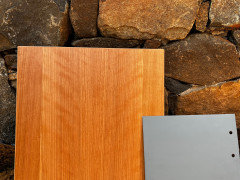
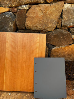
Cherry cabs and what color painted island?
2rickies
last year
Featured Answer
Sort by:Oldest
Comments (51)

kandrewspa
last year2rickies
last yearRelated Discussions
Are these cabs cherry? Paint? Glaze? Med.brown gel stain?
Comments (18)I think I would try changing out the hardware and painting the background wall color above the cabs something dark like a rich chocolate brown. Or a deeper green. That would allow the lighter cabnets to really pop and take center stage. If that doens,t make enough of a change in the room for you then glazing may just be the right thing to do. I think with those cabs glazing could well be the answer your looking for if they were done with a base color thats opposite on the color wheel it would really help to cut the orange your not liking and glazing would be a easier option than a major allover color change. To get a solid color change that matchs on that many cabs would be more difficult then a glaze. I would def. try painting that upper background color first though. I think it would give that kitchen the pop of color it needs to really stand out....See MoreNew kitchen photos, custom cherry cabs
Comments (49)2boyz, you asked if we still like our Ark floors. We are really happy with the way the floors look but we have a golden retreiver so our floors are scratched. The scratches have not damaged the finish, they are more like dents in the wood, but if you look at the right angle you can see them. The scratches from our dog on our old oak floors were much more evident because the flooring had a gloss to it. Our Ark flooring does not have a sheen to it and the slight distressing helps to hide the scratches, but I know they are there! We don't have any areas where the wood has chipped and you see a lighter, unstained color. I love the width of the planks, the color, the very slight bevel but I believe there is just no way to avoid scratches on hardwood floors. So, yes I still am happy with my Ark flooring!...See MoreWhat color should we paint our trim with alpine white cab?
Comments (1)http://www.countryliving.com/homes/renovation-and-remodeling/waterfront-living-0705#slide-1 or gustavian grey/blue would look super with your choices....See MoreColor for walls and backsplash with this granite and cherry cabs?
Comments (1)Spectacular granite! Do you have a photo of cab finish and style? I'd probably stay away from green. I think it will set off that granite better if you don't have green. I'd want to have backsplash decided before paint since the paint is the easier to change. Would you consider a matching granite backsplash, or a pale one with inset pieces of the same granite?...See MoreAndrew
last year2rickies
last year
cpartist
last year2rickies
last yearlast modified: last year2rickies
last year2rickies
last year2rickies
last yearlast modified: last year
Sherry Brighton
last yearlast modified: last year2rickies
last yearSherry Brighton
last year2rickies
last year2rickies
last yearcpartist
last yearOtter Play
last year PRO
PRODiana Bier Interiors, LLC
last year2rickies
last year- PRO
Diana Bier Interiors, LLC
last year 2rickies
last year2rickies
11 months agolast modified: 11 months ago- PRO
Diana Bier Interiors, LLC
11 months ago 2rickies
11 months ago2rickies
11 months ago
just_janni
11 months ago
K M
11 months ago2rickies
11 months ago
Karenseb
11 months ago PRO
PROBeth H. :
11 months ago


Related Stories
KITCHEN DESIGN10 Gorgeous Green Paints for Kitchen Islands and Cabinets
Pros share which green shades they used to take these islands and cabinets to the next level
Full Story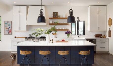
KITCHEN ISLANDS8 Blue Paint Colors to Consider for a Kitchen Island
Discuss these appealing shades with your kitchen pro to see which one might be right for you
Full Story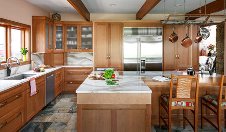
KITCHEN OF THE WEEKKitchen of the Week: Cherry Cabinets and 2 Islands Wow in Indiana
Warm wood cabinets, a reconfigured layout and wave-pattern countertops complement the home’s wooded surroundings
Full Story
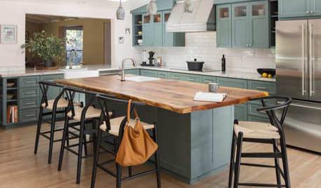
KITCHEN MAKEOVERSBefore and After: 5 Kitchens With Contrasting Wood Islands
Pros, including one found on Houzz, pair wood-finished islands with painted cabinets for a pleasing look
Full Story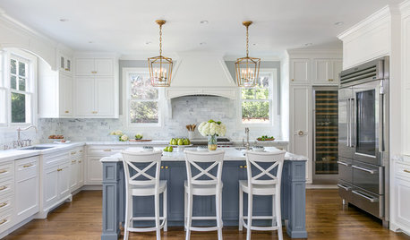
KITCHEN ISLANDS7 White Kitchens That Make the Case for Painting the Island
See how designers inject color into otherwise white kitchens by painting this middle-of-the-room feature
Full Story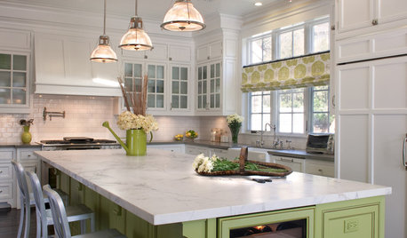
KITCHEN ISLANDS9 Kitchen Islands That Look Gorgeous in Green
Whether soft and sage-y or loud and lime-like, green is a natural choice for an island accent
Full Story
KITCHEN MAKEOVERSKitchen of the Week: Hand-Painted Range Hood and Classic Finishes
A designer puts hardworking materials, repurposed features and personal touches to work in her own charming kitchen
Full Story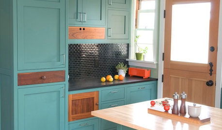
KITCHEN CABINETSKitchen Cabinet Color: Should You Paint or Stain?
Learn about durability, looks, cost and more for wooden cabinet finishes to make the right choice for your kitchen
Full Story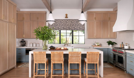
KITCHEN CABINETSPainted vs. Stained Kitchen Cabinets
Wondering whether to go for natural wood or a painted finish for your cabinets? These pros and cons can help
Full Story
COLOR12 Tried-and-True Paint Colors for Your Walls
Discover one pro designer's time-tested favorite paint colors for kitchens, baths, bedrooms and more
Full Story


Diana Bier Interiors, LLC