


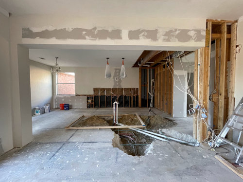
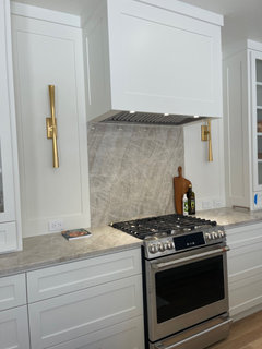
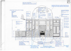
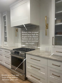
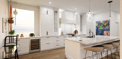
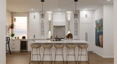
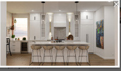
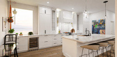
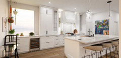
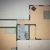
Option 1 or Option 2 for Kitchen Layout?
Shazia
last year


Featured Answer
Sort by:Oldest
Comments (539)

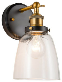
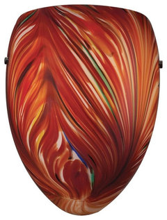
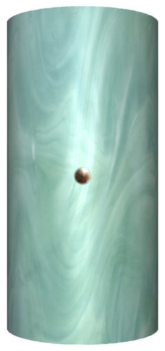
Shazia
2 months agolast modified: 2 months agoRelated Discussions
Layout choices Option 1
Comments (2)Me too Donna...but my DH says it's boring......See MoreLayout Feedback: design option 1
Comments (8)Its a 3200 sq foot house which is really too small for us but we love our neighborhood (lots of friends, close to work) the school (top rated public gifted magnet school which is IN the actual neighborhood) where our oldest just started kindergarten. So we'd really like to move to a bigger house but right now we are thinking to stay for the time being, making the compromises becuase the neighborhoods great and we are almost done with the mortgage. So that is our psychology. I surf GW, then realtor.com, then GW. Once I sign a remodeling contract, the decision will be made. I know 3200 doesnt sound small, I grew up in a 2000 sq ft house I thought was big so who knows what happened to my perspective. We have very little storage space b/c we finished the walk out basement with a dining area, rec room, full kitchen, full bath and bedroom. Our nanny lives down there and the only storage is a walk thru area between the nannys bedroom and her bathroom- it has two huge racks on the wall with bins on it. That is our only other alternative for the washer dryer- but I have to weight it against losing one of those racks and having to sort of be in her space to laundry. She wouldnt mind, but it feels inconvienant to me. Otherwise I've checked all the walls and spaces and there is no where to put the W/d (which are huge front loaders). Even my garage, I have to turn sideways to walk by my car- and my husband is a fanatic about keeping cars in the garage. My friend has the same house and just did a remodel and also searched in vain for another spot and came up empty. She said she felt like she had a ton of more space after her remodel with bigger cabinets. So, I agree the pantry space is not great. I do feel like I am going to throw out a bunch of stuff when I remodel. I have like 10 pie pans for example- dishes I dont use- etc. all must go. I'm going to be ruthless. I hope I end up with a little more room than I have now and I have a hall bath remodel Im doing too that I might be able to pack some additional storage into (on bath forum) but overall I think I could live in my space today (and do) esp. if I got rid of some of my dups and do-not-use items. Then again I am making my window a foot bigger so I will lose a cabinet there. Wine bottles we have a pottery barn bar in the living room that holds about 20 wine bottles and a stand alone rack in the dining room that holds a few then we also have a large sideboard in the dining room where we sometimes stash cases of wine if we buy a lot. We dont collect wine (except for about 5 bottles)- we drink it! But maybe I will ax the warming drawer in the island if I go with the AGA PRo+ range which converts to a sort of warming oven with the divider in. That is a big question mark for me. How would I move the microwave to an upper? That is sort of interesting- do you have any pictures of that? Is it like an open shelf with a smaller top above? If I do ax my warming drawer, my island will need a 24 inch cabinet for the sink. A 24 inch for the micro with a drawer under and then I am left with either a 36 inch space (drawers?) or two 18 inch cabs (that'd be dumb right?) Re: the hutch, does anyone think it ruins the hutch look to use one of the bottom sides for a wine fridge? Should I try to get it in the island? (forcing me to that 2-18 inch cabinets noted above). Thanks for the responses, I really need a sounding board!...See MoreKitchen remodel-option 1 vs option 2 & any advice?
Comments (5)I like Option 2, but with the fridge on the opposite wall. As it is, the leg opposite the sink has a lot of counter without a purpose. With the fridge moved, you can add drawers next to the DW for dish storage, and possibly uppers. I would move the sink to the right, so you can prep in front of the window, and add a super susan in the corner. On the new fridge wall, you can add deep cabinets, both upper and lower, so the fridge doesn't stick out so far. This gives you more storage and more counter space....See MoreCan I replace 32 1/2 inch double sink with 31 1/2 single? Options?
Comments (6)This is what that sink is going to look like: Your reveal will be off a tad too. Small tradeoff....See MoreShazia
2 months agoShazia
last month
herbflavor
last monthlast modified: last month
rebunky
last month PRO
PROJAN MOYER
last monthlast modified: last monthShazia
last monthrebunky
last monthkl23
last month- PRO
JAN MOYER
last month Shazia
last monthrebunky
last monthrebunky
last monthlast modified: last monthShazia
last monthAnnKH
last monthShazia
last monthrebunky
last monthkl23
last monthkl23
last monthShazia
last monthShazia
last monthAnnKH
last monthShazia
last monthShazia
last month PRO
PRORabbitt Design
last monthShazia
last monthShazia
last monthrebunky
last monthrebunky
last month- PRO
JAN MOYER
last monthlast modified: last month rebunky
last monthlast modified: last month- PRO
JAN MOYER
last month Shazia
last month
dani_m08
last monthlast modified: last monthdani_m08
last monthrebunky
last monthrebunky
last monthlast modified: last monthShazia
last monthShazia
last month- PRO
Rabbitt Design
last monthlast modified: last month kl23
last monthdani_m08
last monthShazia
last monthhazwe
last month- PRO
JAN MOYER
last monthlast modified: last month Shazia
last monthShazia
last monthrebunky
last monthlast modified: last monthhazwe
last month


Related Stories
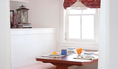
KITCHEN DESIGNKitchen Banquettes: Explaining the Buffet of Options
We dish up info on all your choices — shapes, materials, storage types — so you can choose the banquette that suits your kitchen best
Full Story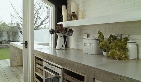
KITCHEN COUNTERTOPSKitchen Counters: Concrete, the Nearly Indestructible Option
Infinitely customizable and with an amazingly long life span, concrete countertops are an excellent option for any kitchen
Full Story
KITCHEN COUNTERTOPSKitchen Counters: Plastic Laminate Offers Options Aplenty
Whatever color or pattern your heart desires, this popular countertop material probably comes in it
Full Story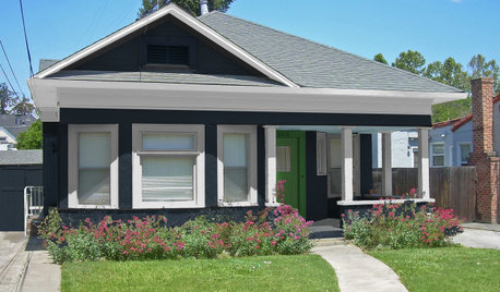
EXTERIOR COLOR5 Exterior Palette Options for 1 Modest Bungalow
Bold and bright, or soft and subtle: See this home get a virtual color makeover
Full Story
COLORChoosing Color: 6 Striking Options for 1 Fabulous Fireplace
A painted-brick fireplace gets a virtual wash of new color, turning it dark and dramatic or bold and bright
Full Story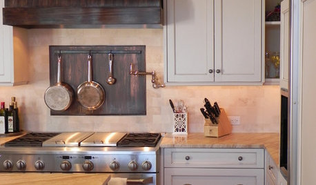
KITCHEN BACKSPLASHESKitchen Confidential: 8 Options for Your Range Backsplash
Find the perfect style and material for your backsplash focal point
Full Story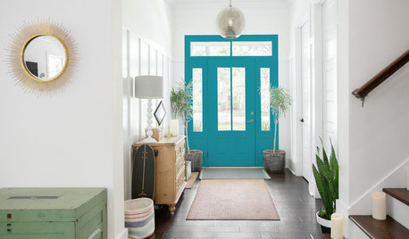
COLORChoosing Color: 5 Fun Options for 1 Sunny Entryway
See how adding a touch of uplifting paint to an all-white entry perks up the personality of a home
Full Story
REMODELING GUIDES10 Terrific Pass-Throughs Widen Your Kitchen Options
Can't get behind a fully closed or open-concept kitchen? Pass-throughs offer a bit of both
Full Story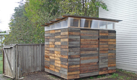
STORAGE2 Weeks + $2,000 = 1 Savvy Storage Shed
This homeowner took backyard storage and modern style into his own hands, building a shed with reclaimed redwood and ingenuity
Full Story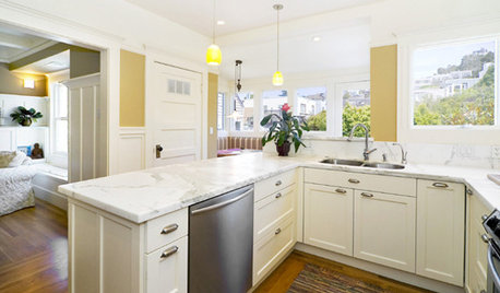
KITCHEN DESIGNKitchen Layouts: Ideas for U-Shaped Kitchens
U-shaped kitchens are great for cooks and guests. Is this one for you?
Full Story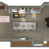

JAN MOYER