


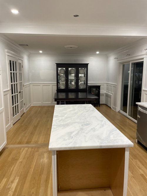
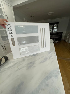
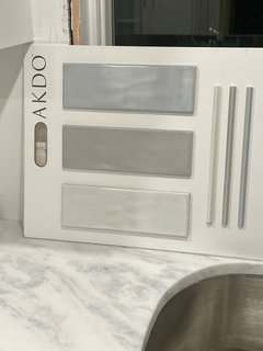
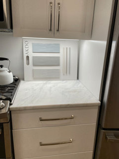
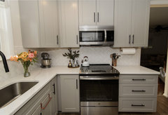
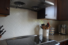
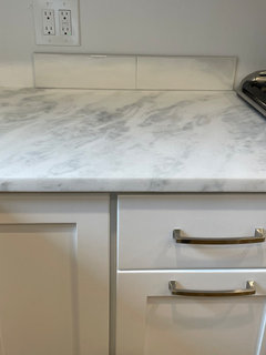
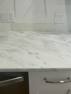
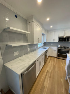
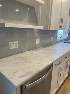
Backsplash ideas for remodel
gtdj519
last year
last modified: last year
Featured Answer
Comments (151)

herbflavor
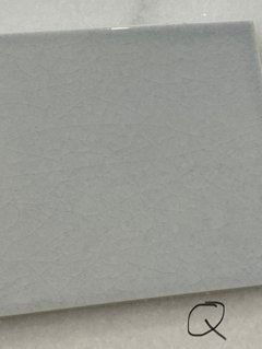
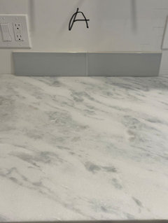
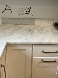
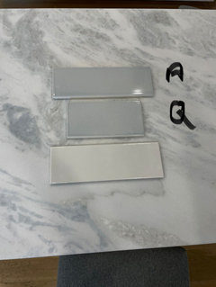
last yeargtdj519
last yearRelated Discussions
Backsplash on top of granite 4in backsplash
Comments (5)Bill has posted some pictures of this before. I found some in what I believe to be a portfolio of his. Personally I believe it can work, but I much prefer to tile the whole backsplash and did just that in our remodel. My contractor tried to get me to do the 4 inch only or tile above it, but I didn't like the look. There is one advantage to the 4" backsplash. Granite/quartz creates a very tight dirt and liquid (essentially) impervious corner where the wall and counter meet. If you use tile that corner won't be quite as straight, neat or "impervious", but I don't think it's much of an issue. - Jim Here is a link that might be useful: Some 4...See MoreTo backsplash or not to backsplash...that is the question
Comments (23)cigi, in our last house the previous owner installed tumbled marble in a mauvish tone which IMO looked awful with the St Cecilia granite. Even though the tile was expensive, I tore them off and left the 4" granite backsplash, patched and painted the rest of the wall. The sink was the only working area as the cooktop was on the island. No problem with water as I used BM Aura, but Pittsburgh Paint's Manor Hall Timeless is just as good with a more flat look and lifetime warranty. I'm pondering the issue for my current redo. In various houses I've had paint, wallpaper, white tile with abalone inserts, plain white tile. Right now I'm weighing white tile with a beautiful insert, just paint with no granite backsplash since this area has only a counter but no cooking/wet functions, paint with granite backsplash, or a simple glass tile backsplash with listello over it a la Chinchette. I'm attaching a photo from Chinchette's beautiful kitchen (hope she doesn't mind seeing hers cited as a great example) which shows the last option. In any event, I echo others' advice to not worry about that decision immediately unless you absolutely love a certain look. Just use good paint. Here is a link that might be useful:...See MoreBacksplash? No backsplash? What kind of backsplash?
Comments (25)didn't have time to read all the answers. I have no backsplash and have never regretted it...been over 6 yrs. It is painted with BM matte...which has ceramic in it. It is as beautiful now as it was when first painted. I love the fact that I can showcase other things ...art etc in my kitchen and no competition. Also if I ever want to change it is as quick as a paint brush...expense is minimal..paint only ! All in all I think it is serene as you point out . Here is one pick. Since I have a lot of high heat cooking in my kitchen..built in deep fat fryer as well as gas cook top I can definitely speak to the longevity of paint only. c ( more at this album )...See MoreI have been remodeling our kitchen. I need help with backsplash ideas.
Comments (11)This is the most peacefilled spa kitchen like I have ever seen. You have done so great with your choice of paint and counters and cabinet colors. It was obviously made for this tone of tile. I love what Claire suggests, but for some reason am growing weary of the thousands of grout lines in backsplashes this past few years, and I am sure they are easier to install for the crew that works it, but isn't this just a beautiful picture? https://www.houzz.com/photos/waikiki-chic-2-contemporary-kitchen-hawaii-phvw-vp~32466 and with a bit of texture: https://www.houzz.com/photos/waikiki-chic-2-contemporary-kitchen-hawaii-phvw-vp~32465 and with your paint: you will see the tile color in painted wall on the left and your paint choice hue(very close to it) on your right in this sitting area...https://www.houzz.com/photos/waikiki-chic-1-contemporary-living-room-hawaii-phvw-vp~32464 Enjoy looking at all the photos in this set I hope the link works!...See Moreherbflavor
last year
rebunky
last yeargtdj519
last yearherbflavor
last yearlast modified: last yeargtdj519
last yearMartha Edwards
last yeargtdj519
last yeargtdj519
last yearmaddox921
last yeargtdj519
last yearlast modified: last yeargtdj519
last yearlast modified: last yeargtdj519
last yearlast modified: last yeargtdj519
last yeargtdj519
last yeargtdj519
last yearlast modified: last yeargtdj519
last yearlast modified: last yeargtdj519
last yeargtdj519
last year
J Mig
last yeargtdj519
last yearlast modified: last yeargtdj519
last yearrebunky
last yearlast modified: last yeargtdj519
last yearlast modified: last yeargtdj519
last yearmaddox921
last yeargtdj519
last yeargtdj519
last yeargtdj519
last yearlast modified: last year


Related Stories
KITCHEN DESIGNIdeas for Refreshing Your Kitchen Without Remodeling
These 8 updates don’t require a big financial investment — just some creativity and a little DIY know-how
Full Story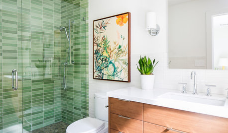
BATHROOM DESIGNTry These Bathroom Remodeling Ideas to Make Cleaning Easier
These fixtures, features and materials will save you time when it comes to keeping your bathroom sparkling
Full Story
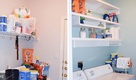
REMODELING GUIDESGreat Idea! 11 Reader Remodeling Moves You Might Want to Steal
Thinking of adding storage or personalizing a room? These details from readers’ renovation projects may do the trick
Full Story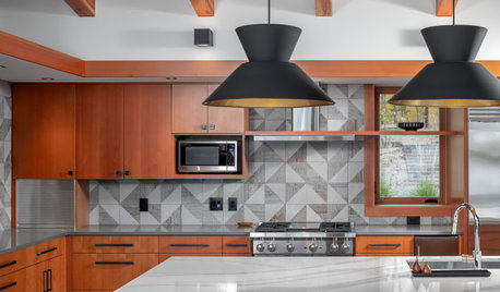
NEW THIS WEEK5 Beautiful New Backsplash Ideas
See how a quartz slab, a playful pattern, simple subway tile and other elements can create a breathtaking backsplash
Full Story
REMODELING GUIDESHow to Remodel Your Relationship While Remodeling Your Home
A new Houzz survey shows how couples cope with stress and make tough choices during building and decorating projects
Full Story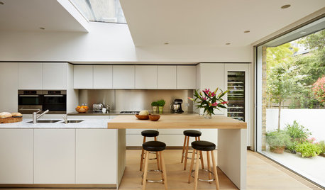
MATERIALSKitchen Ideas: How to Choose the Perfect Backsplash
Backsplashes not only protect your walls, they also add color, pattern and texture. Find out which material is right for you
Full Story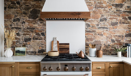
KITCHEN BACKSPLASHES20 Eye-Catching Kitchen Backsplash Ideas
Get ideas for dazzling tile looks, striking slab setups and other designs from these stylish kitchen makeovers
Full Story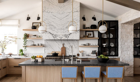
KITCHEN BACKSPLASHESNew This Week: 6 Stylish Kitchen Backsplash Ideas
Marble slab, pink ceramic tile, blue-green glass tile and other materials make bold statements
Full Story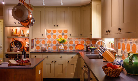
KITCHEN DESIGNIn This Kitchen Remodel, the Old Backsplash Stays
A North Carolina couple keep their cheerful handmade Italian tile as they upgrade practically everything else
Full Story
chloebud