


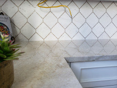
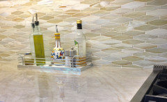
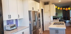
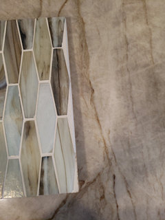
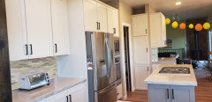
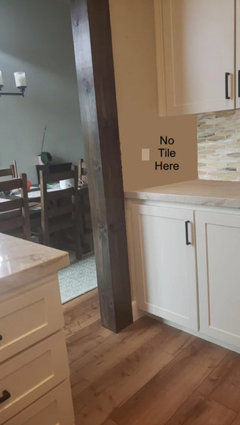
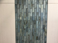
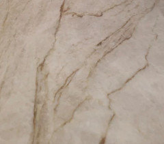
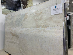
Backsplash against Taj Mahal - how busy?
cecnolan
last year

Featured Answer
Sort by:Oldest
Comments (34)

Fori
last year
A D
last yearRelated Discussions
Next up: Backsplash with Taj Mahal
Comments (17)I finally chose my countertop slabs last week, and they are Taj Mahal, but it’s not like most of the TM I’ve seen. It has veins of white quartz and lots of criss-crossing lines. It was so stunning in person that I was able to easily let go of my Cristallo Quartzite on hold at another slab yard. I’ve carefully read through all of the threads concerning what backsplash to use with TM, and today I found this tile measuring 3” x 12” by DalTile, at Home Depot. It’s so inexpensive, and it matches my SW Alabaster paint perfectly! I was leaning toward a more hand-made look for my tile, but this will be the one if I don’t find something better, and I’ll install it in a herringbone pattern. The TM sample doesn’t look much like my slabs, but it did match the grayish tones in them. I’m thankful for all of the input, because I probably would have chosen something with more of a pattern, and the TM needs to be the star!...See MoreTaj Mahal counter back edges hidden under backsplash be SEALED?
Comments (1)Would the backsplash thinset or grout seep into the cut back edges of the countertops?...See MoreNeed backsplash ideas for taj mahal counters and dark wood cabs
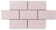
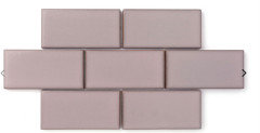
Comments (4)The Taj is the star. Go back to the drawing board for a plain and simple tile, and DON'T SELECT IT until your Taj is installed. Don't try to make two stars. No.n.e of your selections to now....See MoreHow can I break up a busy backsplash?
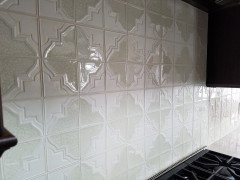
Comments (17)M Miller, I see what you're seeing, but I think it's an optical illusion created by the reflection of the tile backsplash onto the granite. The line that looks like the bottom of a 4-inch counter material backsplash (when you look at the edge of the photo) actually instersects the sink. As pencil tiles go, I wouldn't find this one all that offensive ON ITS OWN, or in a different setting. The problem here is the pairing with the granite, and the wonky proportions of backsplash height and window height, which the valance just exacerbates. I think you've gotten a number of good suggestions for improving the situation....See Morerainyseason
last year
K R
last yearcecnolan
last year
lucky998877
last yearclt3
last yearchispa
last yearchispa
last yeardan1888
last year
cawaps
last yearchispa
last yearcecnolan
last yearcecnolan
last year
rebunky
last yearlast modified: last yearColleen Bozarth
last yearcecnolan
last yearcecnolan
last yearcecnolan
last yearColleen Bozarth
last yearlucky998877
last yearrebunky
last yearlast modified: last year
eam44
last yeaream44
last yearclt3
last year
Doreen Woods
last yearchispa
last yearcecnolan
last yearchispa
last yearlast modified: last yearrebunky
last yearlast modified: last yearclt3
last yeaream44
last yeaream44
last year


Related Stories
MOST POPULARBattle of the Backsplashes: Glass Mosaics vs. Natural Stone
Read about the pros and cons — and see great examples — of these two popular kitchen backsplash materials
Full Story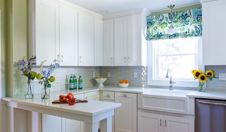
INSIDE HOUZZWhat’s Popular for Kitchen Counters, Backsplashes and Walls
White is the top pick for counters and backsplashes, and gray is the most popular color for walls, a Houzz study reveals
Full Story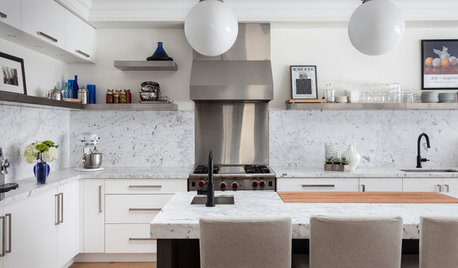
KITCHEN BACKSPLASHESWhy You Should Embrace a Solid Slab Backsplash
The effect is stunning, and yet the cost can be minimal. Here’s what to know about using full slabs of stone in your kitchen
Full Story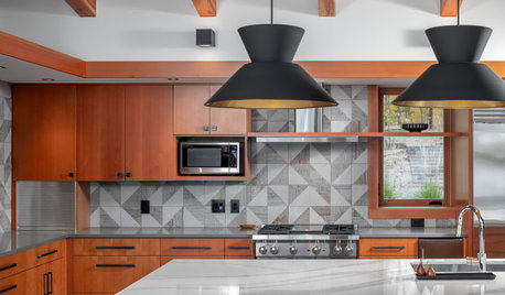
NEW THIS WEEK5 Beautiful New Backsplash Ideas
See how a quartz slab, a playful pattern, simple subway tile and other elements can create a breathtaking backsplash
Full Story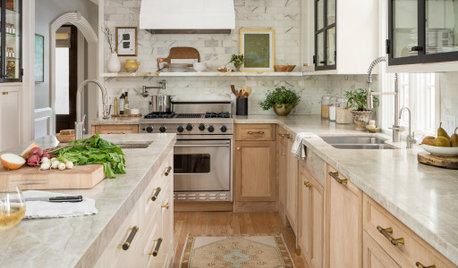
KITCHEN MAKEOVERSKitchen of the Week: Refaced Cabinets and Fresh Style
A Houston designer updates her kitchen with materials and methods that create bright new style on a budget
Full Story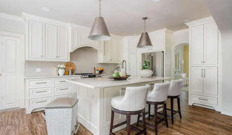
KITCHEN MAKEOVERSKitchen of the Week: Creamy White Cabinets and More Openness
A designer helps an empty-nest couple transform their 1980s kitchen with a lighter palette, an island and an airy layout
Full Story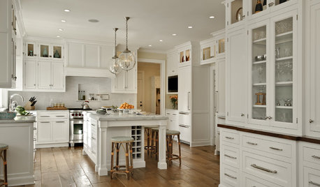
KITCHEN DESIGNDream Spaces: 12 Beautiful White Kitchens
Snowy cabinets and walls speak to a certain elegance, while marble counters whisper of luxury
Full Story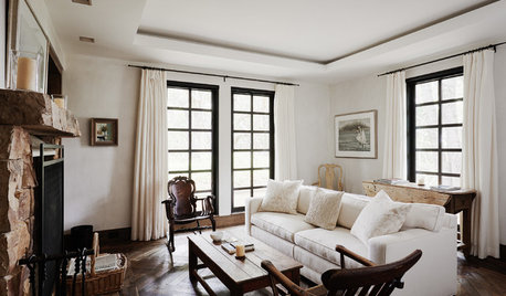
HOUZZ TOURSHouzz Tour: A Mindfully Built Coastal Retreat in California
Ancient Indian building principles inform a 70-acre family haven on the Central Coast
Full StoryBEFORE AND AFTERSA Casual Gray Kitchen Effortlessly Blends Looks and Functionality
Durable, family-friendly finishes and cool tones help this San Diego kitchen keep a laid-back profile
Full Story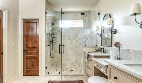
BATHROOM MAKEOVERSBathroom of the Week: An Open Feeling in 125 Square Feet
A designer helps an Oklahoma couple lose a tub, expand a shower and add a soothing palette of tans, taupes and creams
Full StorySponsored
Columbus Area's Luxury Design Build Firm | 17x Best of Houzz Winner!

clt3