


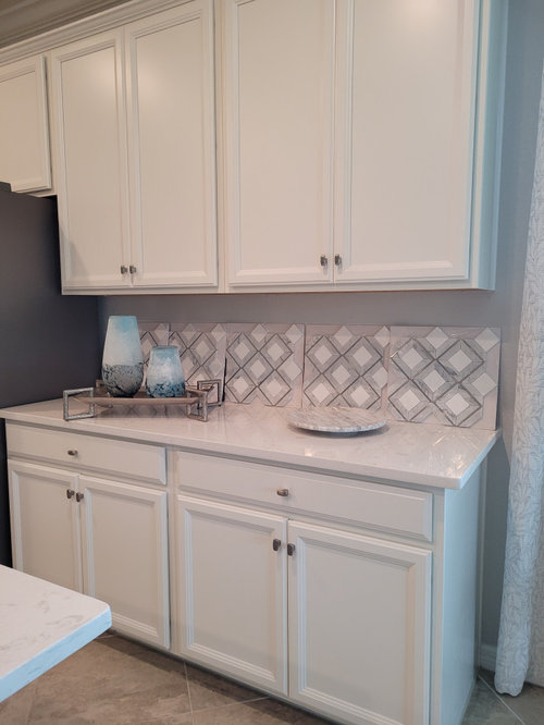
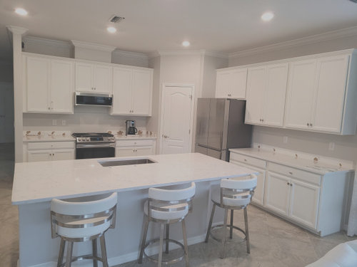
Too white Kitchen . Too wrong Choice : Torquay. White, white white
User
last year
last modified: last year

Sort by:Oldest
Comments (53)
Related Stories
KITCHEN DESIGNHow to Keep Your White Kitchen White
Sure, white kitchens are beautiful — when they’re sparkling clean. Here’s how to keep them that way
Full Story
HOMES AROUND THE WORLDHouzz Tour: A White-on-White Home Radiates Scandinavian Charm
Pale woods, black accents and an abundance of white shine in this Australian-Swedish family’s renovated row house
Full Story
MOST POPULARMust-Try Color Combo: White With Warm Off-White
Avoid going too traditional and too clean by introducing an off-white palette that brings a touch of warmth and elegance
Full Story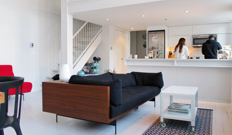
HOUZZ TOURSMy Houzz: Color Hits the Spot in a White-on-White Scheme
Bright red furniture strikes a dramatic pose against snowy walls and floors in a Montreal loft
Full Story
COLORDiscover White’s Surprising Power to Energize Every Room
Using white in different ways gives you limitless options for light, color and creativity
Full Story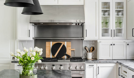
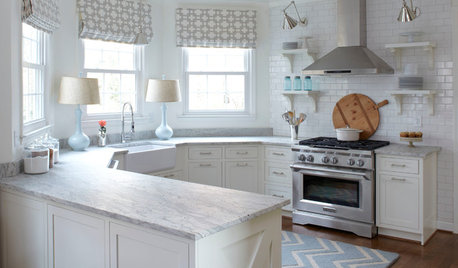
KITCHEN MAKEOVERSKitchen of the Week: Stylish White Kitchen With Improved Storage
A designer found on Houzz helps a North Carolina couple create bright transitional style with hardworking cabinets
Full Story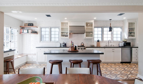
KITCHEN OF THE WEEKKitchen of the Week: Graphic Floor Tiles Accent a White Kitchen
Walls come down to open up the room and create better traffic flow
Full Story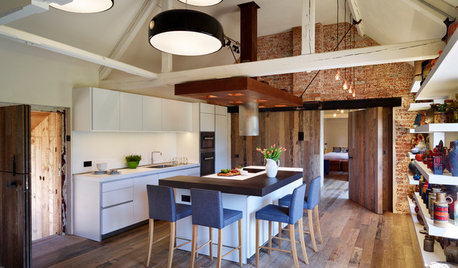
KITCHEN DESIGNKitchen of the Week: Crisp White Kitchen in a Rustic Barn Setting
This beautiful barn conversion walks the line between rustic style and contemporary edge
Full Story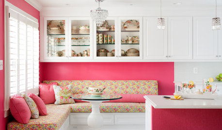
KITCHEN OF THE WEEKKitchen of the Week: A Punch of Pink for a White Kitchen
A homeowner shows her love of pink in bold walls that impart a cheerful vibe
Full Story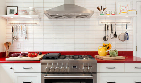
KITCHEN DESIGNKitchen of the Week: Red Energizes a Functional White Kitchen
A client’s roots in the Netherlands and desire for red countertops drive a unique design
Full Story


Julie R.
demolition
Related Discussions
Need a soft white to off white for cabinets..too many choices
Q
Is BM White Dove going to be too white?
Q
White Antique kitchen cabinets -- backsplash too white?
Q
Would a white kitchen table/chairs make everything TOO white?
Q
kandrewspa
chispa
mbfisher3
Fori
Sherry8aNorthAL
KW PNW Z8
mxk3 z5b_MI
HU-380369063
UserOriginal Author
Mrs Pete
latifolia
shirlpp
kelli_ga
Jennifer K
jqueen3
Beth H. :
UserOriginal Author
UserOriginal Author
Beth H. :
UserOriginal Author
UserOriginal Author
Beth H. :
Beth H. :
UserOriginal Author
UserOriginal Author
RedRyder
Beth H. :
Amanda Smith
Julie R.
Beth H. :
Julie R.
Beth H. :
UserOriginal Author
shirlpp
tangerinedoor
chispa
George
UserOriginal Author
Jennifer K
UserOriginal Author
Jennifer K
gladdygirl
shayvet
RedRyder
Beth H. :
olgarobin
Beth H. :
shayvet