


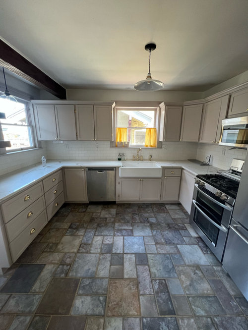
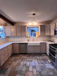
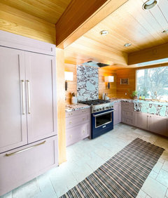
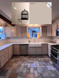
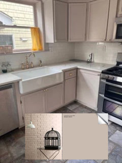
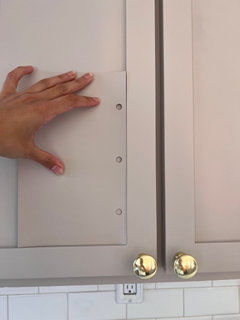
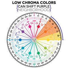
how to salvage slightly mauve kitchen cabinet color?
Mctania
last year
last modified: last year
Featured Answer
Sort by:Oldest
Comments (95)

everdebz
last yeardan1888
last yearRelated Discussions
Can my kitchen floors be salvaged?
Comments (6)Some things Ive been contemplating as Im going thru same process w my old fir with same old black blotches and water stains: Red or rust (or any color) paint applied to floor (sanded or rubbed off strategically so it looks reminiscent of worn floor and so grain is still visible The general finishes gel stains / milk paints/ glazes look like they could achieve same effect or maybe nicer but haven't yet experimented with them. Would need clear top coat over. Dark gray or charcoal colored stain - poly over. If you were to stain or color the wood, I like that the diagonal wood pattern would continue into the kitchen, which is pretty unusual (at least around here - never seen that before). OTOH - people who are buying a modest but well-renovated house would probably expect and be happy with vinyl - some might worry that they would have to baby a wood floor and f reak out if anything spills....See MoreCabinet color question & salvaging old cabinets for reno
Comments (36)amberm145, that would be one of my most thrilling points! Traditional, flesh eating strippers don't do anything with stain. However.... [insert drum roll] If you put a coat of Citristrip on your stripped wood, it will such the stain right out of the grain. See my pictures above. And we're talking a very dark, 1920s door with tons of paint and clear coats on it. and I have not sanded a speck on the 15 doors I've worked on, nor the kitchen cabinets I've done, other than to brush off the dried Citristrip as I mentioned above. The golden oak cabs I did got very light natural wood, too. I was able to ceruse them with a vinegar (I choose ume plum vinegar, just because I had it) and then a very thinned wash of Varathane 'Sunbleached'. I wanted them to stay light. I love that I don't have to sand....See MoreStart of 'Salvaged' Kitchen remodel...
Comments (149)mary_ruth, thank you, I'm sorry I haven't replied sooner. I mentioned that I'd like to make curtains to hide the baking supplies in the glass cabinets. I did another budget blitz by using wooden dowels (Restore, 10 cents each) and a 6yd curtain panel from a clearance outlet ($5.00) Total: $5.80. It's a long, thin 'swaggy' type, in a silky, iridescent green--very close to the green cabinet color. Last year I used a small piece of the panel to make toss pillows for the window seats. I use another of the $5.00 panels for a table cloth for large gatherings--it covers three 6ft long tables, with white sheets underneath for the drop. LOL, I'm getting my money's worth of that bargain! I posted these on a thread in the Kitchens forum, along with the observation that I kinda miss seeing the jumble behind the glass. :[...See MoreHelp me salvage parts of this kitchen
Comments (29)Your cabinets appear to be Maple, not Oak. Or even a natural cherry. They are gorgeous and well suited to your vision. Natural wood is becoming more and more popular so you are actually well ahead of the “trend.” The stone surrounding your little fireplace is gorgeous. Soapstone would be a perfect countertop and would coordinate well with your black appliances. It is a “soft” look, vs. the hard look of granite. You might look into leathered countertops to soften their shiny surface. What a beautiful kitchen with much potential! Keep us posted!!!...See More
Lori Sawaya
last yearlast modified: last yearMctania
last yearMctania
last yearpalimpsest
last yearlast modified: last yearMctania
last yearpalimpsest
last yearlast modified: last yeareverdebz
last yearMctania
last yearMctania
last year
spagano
last year PRO
PRODiana Bier Interiors, LLC
last yearlast modified: last yearpalimpsest
last year- PRO
Diana Bier Interiors, LLC
last year Mctania
last yearpalimpsest
last yearMctania
last yearMctania
last yearMctania
last year- PRO
Diana Bier Interiors, LLC
last year 
grapefruit1_ar
last yearlynzy1
last year
apple_pie_order
last year
rebunky
last yearlast modified: last yearUser
last yearMctania
last yearMctania
last yearpalimpsest
last yearLori Sawaya
last yearlast modified: last yearMctania
last yeareverdebz
last yeareverdebz
last yearlast modified: last yearMctania
last yeareverdebz
last yearlast modified: last yeareverdebz
last yearlast modified: last yeareverdebz
last yeareverdebz
last yeareverdebz
last yearLori Sawaya
last yeareverdebz
last yearlast modified: last yeareverdebz
last yearlast modified: last yeareverdebz
last yearlast modified: last yeareverdebz
last yearlast modified: last yearhappyleg
last yeareverdebz
last yearlast modified: last yeareverdebz
last yeareverdebz
last yearlast modified: last yeareverdebz
last yearKendrah
last year


Related Stories
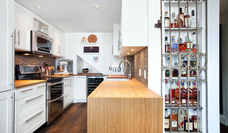
KITCHEN DESIGNKitchen of the Week: Salvage Meets High End in Vancouver
Reclaimed fir floors and a salvage-yard gate cozy up to choice appliances in a warm and sophisticated Canadian kitchen
Full Story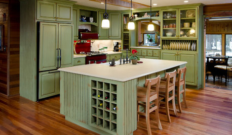
MOST POPULARHow to Reface Your Old Kitchen Cabinets
Find out what’s involved in updating your cabinets by refinishing or replacing doors and drawers
Full Story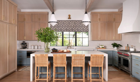
KITCHEN CABINETSPainted vs. Stained Kitchen Cabinets
Wondering whether to go for natural wood or a painted finish for your cabinets? These pros and cons can help
Full Story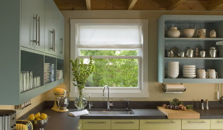
MOST POPULAR8 Great Kitchen Cabinet Color Palettes
Make your kitchen uniquely yours with painted cabinetry. Here's how (and what) to paint them
Full StoryWHITE KITCHENSWhite Cabinets Remain at the Top of Kitchen Wish Lists
Find out the most popular countertop, flooring, cabinet, backsplash and paint picks among homeowners who are renovating
Full StoryKITCHEN CABINETS11 New Kitchen Cabinet Ideas You’ll See More of This Year
Black, high-gloss, embossed and other new cabinet looks are popping up in homes
Full Story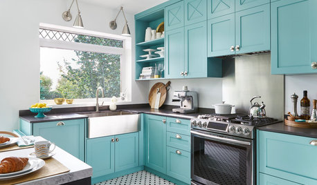
SMALL KITCHENSTeal Cabinets and Custom Details Create a Bright, Fun Kitchen
Bold color, a graphic wallcovering and small, thoughtful details bring big character to this 130-square-foot space
Full Story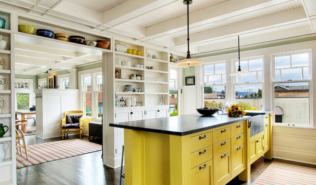
KITCHEN DESIGNHow to Lose Some of Your Upper Kitchen Cabinets
Lovely views, display-worthy objects and dramatic backsplashes are just some of the reasons to consider getting out the sledgehammer
Full Story
KITCHEN DESIGNKitchen of the Week: Green-Gray Cabinets and a Pass-Through
A designer updates a closed-off kitchen with more openness, improved storage and subtle French country details
Full Story
KITCHEN DESIGNChoose Your Kitchen Cabinet Glass
Textured? Frosted? Seeded? Find the cabinet glass style that will set off your kitchen to its best advantage
Full Story


MctaniaOriginal Author