SHOP PRODUCTS
Houzz Logo Print
lantern88

Please help with exterior paint color and trim color on historic home!

lantern88
last year
last modified: last year

Hello,

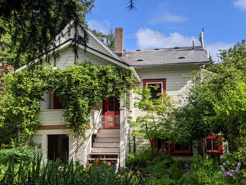
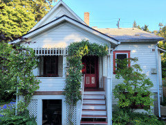
I have been agonizing over paint colors for longer than I want to admit, and since my S/O can't bear to hear about it anymore, I thought I'd ask for some unbiased opinions! My house was built in 1901, and I live in Washington state. The house is currently off-white with pink and red trim (from the previous owner).

Colors I've considered are honestly too numerous to name, but I'm currently trying to decide between Behr Juniper Ash (bluish/greenish/grayish), and various gray/greige colors (Behr elephant skin, fashion gray, dolphin fin, just to name a few). I originally wanted to have two different colors of trim to provide more contrast and give the house more character, as well as to help the window mullions stand out. However, I could not find a color that I liked to go with the Juniper ash. (I've sampled Behr baked sienna, death by chocolate, and rio rust.) Now I'm leaning toward going with a shade of white or off white for all the window trim to keep things simple, and using Behr poppy seed on the front door. I would love to hear your opinions, and I am open to colors not mentioned above!

In my head I keep thinking my house is caught between two personalities - one of a classic and understated cottage (gray, white, and navy/black), and one of a little cottage with unique colors and lots of charm (possibly juniper ash and a contrasting color in addition to white/cream). Please help me decide!


Thanks in advance!

Lantern


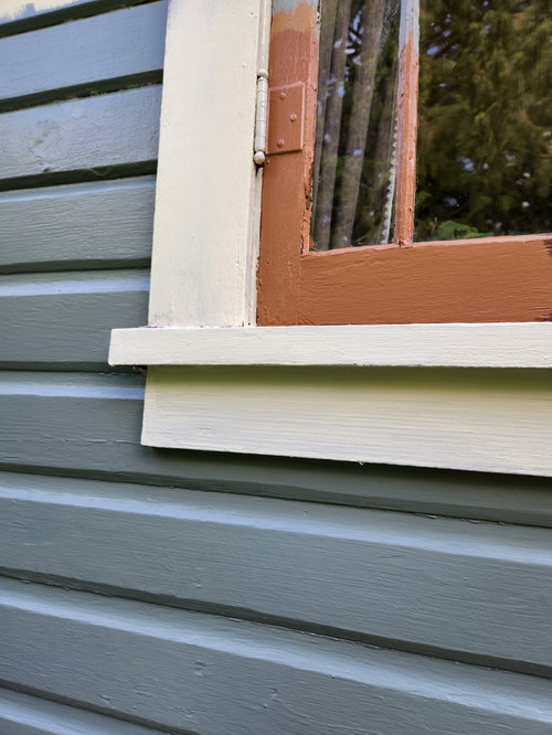
Testing a few colors: Juniper ash and Rio rust


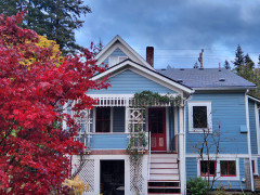
Behr Poppy seed (dark blue black), elephant skin, and fashion gray (the grays are very similar, hard to even see the difference in the photo).


Comments (37)

  • ShadyWillowFarm
    last year

    LOVE the house!!! I would find a beautiful outdoor rug or large doormat for that front porch, and pull some colors from there. And the landscaping needs a good hack. But the house has tons of character, please keep us updated on your progress!!!

    lantern88 thanked ShadyWillowFarm
  • decoenthusiaste
    last year
    last modified: last year

    Definitely go for the charm! Something unexpectedly bright and colorful would be my preference. You'll have to undress it a bit for the painters to do their job. Maybe clear the overgrowth some and add new pix; more ideas may surface when we can actually see more of the cottage.

    lantern88 thanked decoenthusiaste
  • Related Discussions

    Help with exterior house trim color please

    Q

    Comments (13)
    Hi scrappy, I agree you should do mockups for best visualization. In our area, the homes that are similar to yours- most paint their garage doors to match the siding color, and seems the most pleasing. Those that choose to paint their garage doors to match their front doors, most commonly a black or a dark color, end up with a garage that looks llike a big black hole. On my monitor your siding and trim look fine, but it may look alot different IRL. I like it as it, or if it seems mismatched to you, try the white trim idea, but I'd keep the garage door to match the siding and agree to paint the boxes under the windows all one color, no outlining. Also agree your front door/entry would stand out, and look more inviting if you painted it a pretty light/bright color.
    ...See More

    please help with exterior paint color and trim

    Q

    Comments (3)
    I like your current colors as they coordinate with the roof. If you want to change to Sandy Hook Gray it looks like it would also coordinate with the brown roof. Not Rockport though.
    ...See More

    Please help choose exterior paint color for brick house with tan roof

    Q

    Comments (1)
    Oh and I should add that this isn’t how the landscaping currently looks. We had just removed overgrown bushes, which have now been replaced. This is just the only photo I have on hand at the moment.
    ...See More

    Please help me with paint color for my housing exterior!!

    Q

    Comments (9)
    Yes, that is a very peachy orange color. I first thought neutral bone/beige but your photo with the lower stone section seems to have a lot of red tones, even in the darker brick. I'm no expert so i would be relying on sample cards, in various tones, and taping them against the brick to view. Some might obviously not work but those that do might be worth a sample pot painted onto large sheets and go through the process again...
    ...See More
  • Jennifer Hogan
    last year

    I agree with going with the charm, but I am going to give you something to think about that may help you narrow your choices and better your chances of loving the end result.


    Frank Lloyd Wright was the father of organic architecture, fitting the home to the natural surroundings and binding the interior and the exterior by repeating the use of the same materials and colors inside as were in the surrounding landscape and the exterior of the building.


    "The theory is concerned with the idea that all elements belong together: from floor and doors, to furniture and natural surroundings, all components relate to one another creating a ‘unified organism’, hence the name." https://magazine.artland.com/when-form-meets-function-frank-lloyd-wright-organic-architecture/


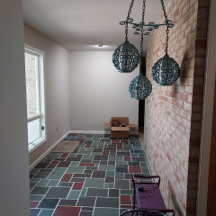
    I have a simple MCM home (not like Falling Waters), but it does use the same brick that is the outside of the house as the feature wall in the entry that is also the 10' fireplace in the living room. The slate floors in the entry are purple red and green slate. The outside of the home also has the same red as the slate in board the and batten detail.


    Falling Waters - notice how the interior and exterior have the same materials and colors.


    My foyer and exterior - note the brick outside the window


    I am re-doing the landscape, but you can see the red siding and detail that is repeated in the flooring.


    I happen to love violet grays, blue greens and reds, so this was the perfect combination for me.


    What colors do you love? What colors do you want on the inside of your home and how can those colors be used to create a harmony between the exterior and the interior?

    lantern88 thanked Jennifer Hogan
  • pleballerina
    last year

    Sherwin Williams has some exterior color schemes on their website-one collection is “American Heritage”. It might help you out-good luck!

    https://www.sherwin-williams.com/homeowners/color/find-and-explore-colors/paint-colors-by-collection/exterior-color-schemes/americas-heritage

    lantern88 thanked pleballerina
  • User
    last year
    last modified: last year

    Personally I think black and white would be lovely. It’s an old house. It looks like it feels tired of being experimented with and could use a break.


    If you aren’t already planning to pull off the major weight of the vegetation you should — and do it carefully. (Likewise, don’t powerwash the house.) So much vegetation right against the house can give you wood eating bugs and moisture issues, especially perhaps in your neck of the woods. Let the house breathe and soak up some sunshine.

    lantern88 thanked User
  • modernfun
    last year

    Since you're agonizing, I will just try to help you out by asking if you could envision the Sage and gray/cream combination in the "American Heritage " Sherwin Williams collection link mentioned above by pleballerina(good job girl!) What do you think? Then, as Shadywillow suggested above, get an outdoor colorful rug to add your own style and favorite colors like that Ash/juniper like colors to tie it all together. What do you think?

    lantern88 thanked modernfun
  • lantern88
    Original Author
    last year

    Thank you all for your comments so far! I am happy that many of you are saying go for the charm/interesting colors! I really love that idea, but am having trouble finding the right colors! I truly love hearing everyone's opinions, and would welcome any specific colors/ideas.


    As for the vegetation - we have gotten much of it under control, although it is a never ending process! Those photos were from last summer (2021). We bought the house the previous December, and wanted to let the gardens do their natural thing for awhile. The previous owner spent considerable time and energy creating the gardens around the house, and we wanted to let everything roll through the seasons to see what all was here. This spring and summer we've been taming everything down, and seeing the error of our ways in wanting to let everything go wild!


    @Jennifer Hogan - thanks for sharing this! I love the idea of organic architecture, but was not familiar with the idea until now. I'll have to do some more reading/exploring on this topic. As for what colors I love and have been using on the interior, it's mostly earthy, subdued natural colors, and my favorite colors are greens, blues, and warm grays. The interior is still a work in progress, and we have many projects already in mind, so I'll have to give thought to creating harmony between the interior and exterior. (We are also working through reglazing all the windows, I'm surprised that wasn't called out from the paint sample pics!)


    @ital mover - I hear you about simple black and white, but my next door neighbor's house is white with black trim, so I don't want to go with the same color scheme. My other neighbor's house is red, so I will be avoiding red, as well.


    Thanks again, everyone!

  • lantern88
    Original Author
    last year

    @modernfun - thanks! I've known from the day I moved into this house that I wanted to change the colors, and for the past year and a half I had actually been leaning toward the sage/cream combo, but without the gold, and with navy blue instead of brown. I tested those colors on my house, but my partner and I both liked the gray/white/navy better than the green/cream/navy combo. Not sure why. But then I couldn't settle on a gray (there are soooo many!), and then I started itching for more interesting colors...and now here I am, still uncertain! But that is definitely a very classic and lovely color combo!

  • apple_pie_order
    last year
    last modified: last year

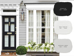
    1- Are there any houses in the neighborhood with that are painted in the sage/cream or gray/white combinations? Use google streetview or walk around. In rainy and cloudy areas, gray houses can look dismal. Flipping the combination to white house with gray trim can be much more attractive on dark days. Or use a wide white trim throughout for emphasis.

    2- It may be easier to decide on colors if you prime the bright trim with white primer, then test your colors. The bright red trim is dominant now.

    3- When the painters do their work, they will need about a foot of clearance between house and shrubs, so keep that space in mind when you start pruning.

    Custom Architecture · More Info


    DS Coastal In The Burbs · More Info


  • elcieg
    last year
    last modified: last year

    You are referring that the house as Historic. Is that just a word you use, or is a dedicated Historic house where you have to present your paint choices to a Historical committee for approval?


    It could very well be that B.M. OC-151 is the window color. Many distributes of windows and cabinets use it as a default white.

  • lantern88
    Original Author
    last year

    @apple_pie_order Thanks! I live in a very small town, but there are several blocks of older homes that I've been checking out, and I've also been exploring the historic neighborhoods of a bigger nearby town. There are two sage/cream houses and a few gray/white houses in my little town, and several in nearby towns. (I can say this easily because those are the ones that always catch my eye, in addition to the colorful and unique ones.) Although it is rainy/overcast much of the year here, there are enough evergreen trees and other plants to brighten things up. I don't feel grey would be dismal, but maybe that's just because I'm used to the weather here. I do love the colors of the grayish-greenish/cream house you posted.


    I have been painting white primer on the red trim for color comparisons, you can see that above in my photos of the juniper/white/rust and gray/white/navy experiments.


    I will be painting it myself (and painted my previous house myself), but I understand that even more of the vegetation will need to be cut back. This weekend I'll try to post an updated photo of the back side of the house with the vegetation more under control.


    Thanks again!

  • MarleneM
    last year

    If you’re leaning gray for siding colour perhaps a mid tone gray with juniper ash for your door and creamy white trim. This is from Benjamin Moore site but similar colour scheme and maybe will help with your decision.

    lantern88 thanked MarleneM
  • lantern88
    Original Author
    last year

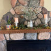
    @elcieg Thanks! I used the word historic because the house is 120 years old. It is not on the Washington Heritage Register (or the national historic register). I am free to choose any color I'd like. I tried to find the original paint colors, but the earliest photo I've been able to find (thanks to the museum in town) was a sepia photo from the 1940's, when the house was already 40 years old. It was definitely white, off-white, or a light color at that time, and the paint chips that have fallen off the house support this. Although I respect the history of the house, I'd love to not have it off-white anymore. I found that when it snows it looks very dingy.

  • lantern88
    Original Author
    last year

    @MarleneM Thanks! That's a very attractive color combo!

  • Ilove MyLife
    last year
    last modified: last year

    Try this combination:

    Lunar Surface - siding

    Rio Rust - window frames

    PPG's Chinese Porcelain for doors


    PPG Chinese Porcelain (Color of the Year in 2019)


    Poppy Seed is too dark for your doors. This Chinese Porcelain color just draws your eye.


    Rio Rust goes better with a lighter gray:


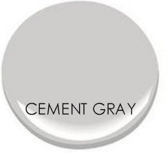
    Lunar Surface is a silver/gray that goes to almost white in direct sun, but has a rich calming effect on overcast days or in shade. Will look for a photo of my newly-painted patio cover in Lunar Surface. It does not show up well on that paint chip photo.


    Use Campfire Ash if you need a little white somewhere, like a lattice.


    Whatever colors you choose, Sherwin-Williams can make the paint in that color. Behr is terrible paint, regardless of what Consumer Reports likes to say.

  • apple_pie_order
    last year

    Thanks for info. SInce you've already primed some windows, go ahead and prime the front windows and around the door frame. The house will look completely different.


    Try making two big sample boards from large (3-4 feet) foamcore pieces. Prop up both by the front window so you can see them when you drive up.

    lantern88 thanked apple_pie_order
  • pleballerina
    last year

    Another source is Benjamin Moore’s Affinity color collection: any color in that collection will go with and/or complement any other color in the line.

    https://www.benjaminmoore.com/en-us/paint-colors/affinity-color-collection

    lantern88 thanked pleballerina
  • Jennifer Hogan
    last year

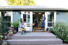
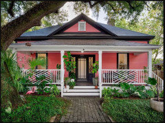
    This is a small house in Oregon that I think has a unique, but very pretty exterior.


    Miller Paint Spacebox | 0493 for the body of their home’s exterior and Plume Grass | 0414 for the trim.


    lantern88 thanked Jennifer Hogan
  • N Johnson
    last year

    Think about what you would like to see in the snow? A brighter green? Light blue? Bring the red back as the front door, use an alabaster trim. The turn of the century was the time when there was a lot of color especially on the West Coast. Move into something happy — yellow with dark green and white?

    lantern88 thanked N Johnson
  • Jennifer Hogan
    last year

    I know you like cool colors, but this has to be one of my favorite exterior colors ever! (SW Begonia)


    lantern88 thanked Jennifer Hogan
  • lantern88
    Original Author
    last year

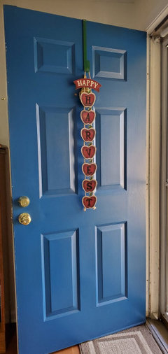
    @Ilove MyLife Thanks for the color suggestions. I'm curious why you think Poppy seed is too dark for my doors? I've really loved the dark door look on houses I've seen in person and online. I'll attach a few pics that I really like.


    Regarding paint brands, I know this is a divisive topic, but I don't like to have one paint company match another's colors. I prefer Benjamin Moore paint, but both BM stores near me are closed on weekends, which is really inconvenient for my current life situation. I was determined to start painting last weekend, and had all of my BM paint swatches picked out, and went to get paint samples Friday evening, and found out they were closed until Monday morning. So I went with Behr, because Home Depot has accessible hours. I painted the exterior of my previous house with Behr, and it turned out beautifully. I know BM and SW are generally preferred, but I'd love to hear more opinions on paint brands.


    Dark door looks I love (my front and back doors both have a lot of glass):


  • lantern88
    Original Author
    last year

    @apple_pie_order Good idea to paint over the red trim on the door. I'll give that a try with my next batch of color samples.


    @pleballerina Thanks for the suggestions! I've been studying both of the sources you recommended for weeks. So many beautiful colors in both, but I just can't seem to find the right combination for my house. I don't know why I'm so indecisive this time, paint colors are usually really easy for me to choose!


    @Jennifer Hogan Thanks for posting the pics! I love that greenish house, and my S/O is a big fan of Miller Paint Co. That house reminds me a lot of a house/color I've had in my favorites folder for awhile:


    It's SW Studio blue green. I don't care for the cream and white trim next to each other, but I like the blue-green.


    And the Begonia house you posted is adorable! I'm definitely looking to get away from all shades of pink and red, but that is really unique. Thanks for sharing!

  • Ilove MyLife
    last year

    @lantern88, I just don't think the dark door creates the focal point for your house. I love dark shutters and had some that were so dark green they were almost black on a previous house. Maybe the final mock-up of your photo will help with this decision. Much better than looking at your paint choices on other houses. Behr has good software for this, btw. Also, your front door is at 90 degrees to the street (isn't it?), so I think a glance or reflection of a brighter color will draw interest to the entrance.


    BM is a great choice, too. If my BM store (sold here at Ace Hardware, I think) were closed for the weekend, my second choice would be SW. Our SW store is open on Saturday and even noon-4 pm on Sunday.


    I used Behr paint from HD for the first painting project at my current house, a small bathroom, and I cursed the drips and lack of depth of the coverage the whole time I was painting. I still see flaws in it. I later mentioned this to my kitchen contractor and he said a friend who was a Behr rep gave him 25 gallons of paint to try (in hopes of future orders), and he returned it to the guy because he said the constant drips were slowing down his work.


    The most important thing, especially with interior paint, is to always buy paint from the same manufacturer so that you get the sheen you expect. Sheen terms are not standard between manufacturers.


    I'm glad you were happy to work with Behr paint, and that the project turned out well.

    lantern88 thanked Ilove MyLife
  • Jennifer Hogan
    last year

    I agree fully with your S/O. I lived on the West Coast and painted my interior with Miller Paint.


    I have painted with Miller, C2, Valspar, SW, Behr and BM, always using a premium line in each brand and nothing compares to Miller. If I could get Miller paint on the East Coast I wouldn't buy or use anything else.

  • lantern88
    Original Author
    last year

    @Ilove MyLife Thanks for that explanation regarding a dark door on my house. You're right that my front door is 90 degrees to the street.


    Also thanks for the Behr paint info. I don't remember a drip problem when I painted my last house's exterior, but that does sound annoying. More to think about, for sure!


    @Jennifer Hogan Thanks, nice to hear another endorsement for Miller Paint. I love that they're local and that they formulate and choose colors specifically for the PNW. I looked at their paint color brochures online last night, and loved some of the combos! It feels like starting from scratch, but we are going to go check out the local store. I'm almost at the point where I'm ready to buy several gallons and not look back! I need to get this started!

  • Ilove MyLife
    last year

    @lantern88, keep searching for the right color and trying large test areas of paint until you are sure of your choice. If you are going to be doing all of that work, you will want to love the color while you are working and for years after.


    lantern88 thanked Ilove MyLife
  • Jennifer Hogan
    last year

    Miller paint also has consultants to help you pick colors.


    lantern88 thanked Jennifer Hogan
  • lantern88
    Original Author
    last year

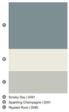
    Just a quick update to say I chose paint colors! I went with Miller Paints (only in the PNW). A for the body of the house, B for the main trim, C for the mullions.

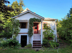
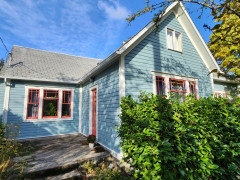
    Also took an updated photo of my house to share for those of you who commented on the vines on the trellises on my house. (Still lots more vegetation to get under control before painting, but it is a constant process!) I'll share an update when the painting is completed, but it will be awhile. I work more than full time, have lots of weekend getaways planned for the summer, and the prep work is going to be incredibly time-intensive (but important)! Just need to get it all painted before the rain starts in the fall. Thank you all for sharing your suggestions and opinions!

    (Please excuse the hose, garden watering was underway!)

  • chloebud
    last year

    Love your colors! I'm guessing the Sparkling Champagne will look much lighter on the exterior. Nice!

    lantern88 thanked chloebud
  • ShadyWillowFarm
    last year

    Can’t wait to see the transformation! The colors you chose are beautiful!!

    lantern88 thanked ShadyWillowFarm
  • Jennifer Hogan
    last year
    last modified: last year

    Can't wait to see it when it is done! Love the colors you picked!


    lantern88 thanked Jennifer Hogan
  • PRO
    lisedv
    last year

    How about something like this with your Juniper Ash, white trim, black accent...


  • lantern88
    Original Author
    last year

    Update! After an unbelievable amount of prep work and painting, I am almost completely finished. When the weather warms up and dries out next summer, there are a few areas I need to touch up, and some window trim to finish, but I wanted to post the before and after pics here for now. I posted the colors I chose a few months ago, but the gray turned out to be much lighter than I expected, and I didn't feel there was enough contrast with the white. After trying many more colors, I ended up with Miller paint in poppy prose on the mullions. I'm not entirely sure how much I like this, but I'm going to see how I feel about it by next summer. I may repaint the mullions black. Thanks again for all of your comments/suggestions!


    Before:


    After:


    Before:


    After:


  • houssaon
    last year

    I love all of the colors you selected, including the poppy prose, which seems so happy. Congratulations!

    lantern88 thanked houssaon
  • ShadyWillowFarm
    last year

    Beautiful!! Love the colors.

    lantern88 thanked ShadyWillowFarm
  • apple_pie_order
    last year

    Beautiful job. You made some great color choices.

    lantern88 thanked apple_pie_order