


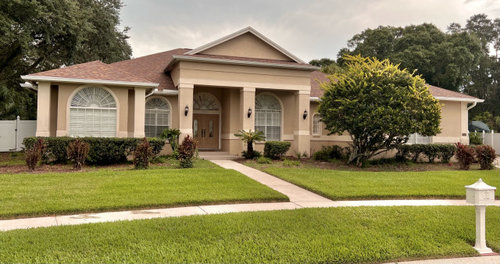
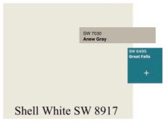
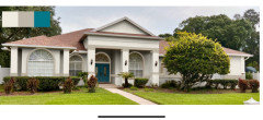
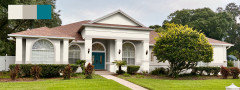
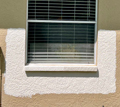
Need help with exterior paint colors on our south Florida home
Michele Lumadue
last year


Featured Answer
Sort by:Oldest
Comments (132)
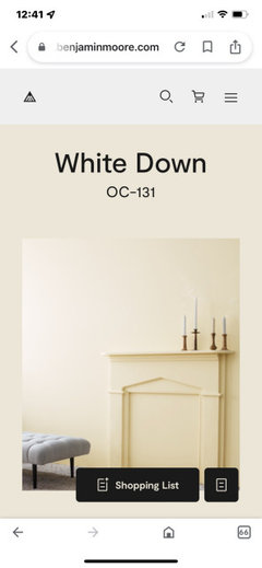
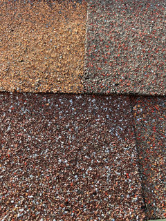
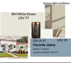
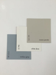
 PRO
PROFlo Mangan
last year- PRO
Flo Mangan
last year Related Discussions
Need help with exterior paint colors for 1920s Florida home
Comments (4)Your house is beautiful. I just painted my new craftsman in SW FL with Sherwin Williams 7726 Lemon Verbena for the hardie siding on top, SW 7733 Bamboo Shoot for the stucco on the first floor and SW 7730 Forestwood for the trim. I just personally love greens for a craftsman house but felt that with the light in FL, the greens had to be a bit cleaner and brighter than what is normally chosen for the rest of the country. (The trim isn't finished being painted.)...See MoreExterior color help needed for Florida house.
Comments (7)Still no definitive answer on the house color. I've been playing around with an online color program and have been able to eliminate some colors. Grays don't look right, Darker Tans and Dark Beiges blend too much with the roof. Blues didn't look right. Not going with stone, but shutters are an option. What is the opinion on this option? Kilim Beige Exterior, Alabaster Trim and Shutters in a shade of blue (Slate Tile pictured)? Open to different shutter colors too (seal skin, . Am I on the right track?? ANOTHER option that I just put together is Downing Straw, Alabaster Trim with Studio Blue Green Shutters (or a similar look). Only problems I see with going this route is the house diagonal from us is very similar to this color (minus the shutters) and husband is saying no to yellow again (2 of our previous houses were yellow)....See MoreUpdating the exterior of my South Florida home
Comments (1)First of all you need to post a picture....See MoreHelp turn this house into a South Florida look! Paint help!
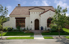
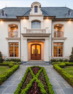
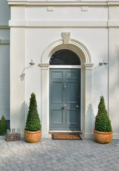
Comments (15)I would consider white with light gray trim, and leave the brick for now. Tons of South Florida homes are white and light gray, but don’t have the red brick. It will look good, maybe farmhouse, but not beachy. As mentioned, you can make it tropical with vegetation. The white would make the color in the vegetation pop. Maybe do a visualization with white paint, light gray trim and tropical foliage with some of the brick colors in the foliage. In the meantime, google images for white South Florida homes, and maybe white Florida Keys homes. I would change the front door too. Maybe do something with the porch rails and floor later. One step at a time. I’m thinking white posts and no rails, but the other decisions once executed will help you figure that out. This one has red brick pavers in the driveway and slate blue accents. This one has a terra cotta roof and looks a little like your pics. This one has a red brick skirt and steps, with rails like yours....See More
Michele Lumadue
last yearMichele Lumadue
last year- PRO
Flo Mangan
last year Michele Lumadue
last yearMichele Lumadue
last year- PRO
Flo Mangan
last year Michele Lumadue
last year- PRO
Flo Mangan
last year Michele Lumadue
last year- PRO
Flo Mangan
last year - PRO
Flo Mangan
last year Michele Lumadue
last year- PRO
Flo Mangan
last year Michele Lumadue
last year- PRO
Flo Mangan
last year - PRO
Flo Mangan
last year - PRO
Flo Mangan
last year Michele Lumadue
last year- PRO
Flo Mangan
last year - PRO
Flo Mangan
last year Michele Lumadue
last year- PRO
Flo Mangan
last year Michele Lumadue
last year- PRO
Flo Mangan
last year 
Tricia Woodworth
last year
pat1250
last yearMichele Lumadue
last year PRO
PROBeth H. :
last yearlast modified: last yearMichele Lumadue
last year- PRO
Flo Mangan
last year Michele Lumadue
last yearMichele Lumadue
last yearMichele Lumadue
last year- PRO
Flo Mangan
last year Michele Lumadue
last yearMichele Lumadue
last year- PRO
Flo Mangan
last year - PRO
Flo Mangan
last year Michele Lumadue
last yearMichele Lumadue
last year- PRO
Flo Mangan
last year Michele Lumadue
last yearMichele Lumadue
last yearMichele Lumadue
last year- PRO
Flo Mangan
last year 
RedRyder
last yearMichele Lumadue
last year
martir
11 months ago


Related Stories
HOUZZ PRODUCT NEWS8 Great Gray Paint Colors for Home Exteriors
Pros share the gray shades they used to complement the architecture of these remodeled and new-build homes
Full StoryEXTERIORS8 Great Gray Paint Colors for Home Exteriors
Pros share the gray shades they used to complement the architecture of these remodeled and new-build homes
Full Story
EXTERIORSHelp! What Color Should I Paint My House Exterior?
Real homeowners get real help in choosing paint palettes. Bonus: 3 tips for everyone on picking exterior colors
Full Story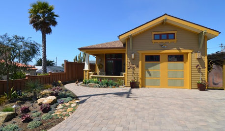
COLOR PALETTESChoosing Color: See This Home Try On 5 Exterior Paint Palettes
Dark and dramatic, or soft and neutral. See how paint color alone can change the look of a home
Full Story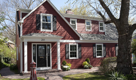
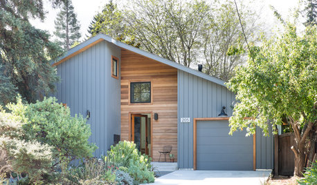
EXTERIORS8 Homes With Exterior Paint Colors Done Right
Get ideas for an exterior palette from these homes that run the gamut from Mediterranean to modern
Full Story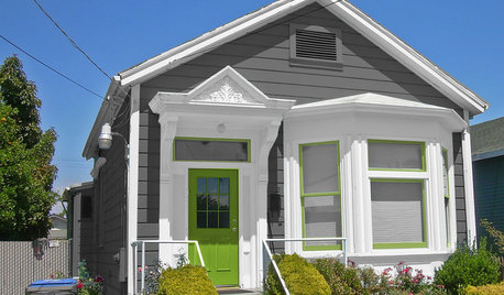
MOST POPULARChoosing Color: See 1 Cute Home in 3 Exterior Paint Palettes
Here’s proof that a little bit of fun color can add a whole lot of flair to your house
Full Story
EXTERIORS10 Wonderful White Paint Colors for Home Exteriors
Pros share the white shades they used to complement the architecture of these remodeled and new-build homes
Full Story
CURB APPEALWhat to Know About Getting Your Home’s Exterior Trim Painted
Learn when it makes sense to change the color of your exterior trim and how much this project might cost
Full Story
ENTRYWAYSHelp! What Color Should I Paint My Front Door?
We come to the rescue of three Houzzers, offering color palette options for the front door, trim and siding
Full Story
EXTERIORSInvigorate Your Home's Exterior With Color
For curb appeal and a knockout first impression, consider paint in shades from subtle to bright for the exterior of your home
Full Story


Flo Mangan