


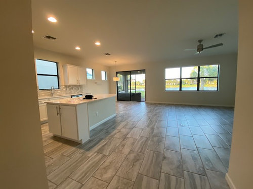
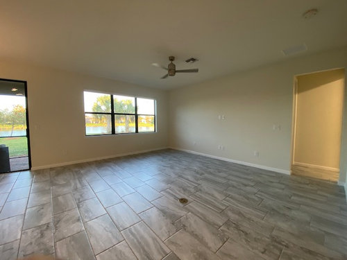
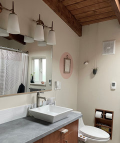
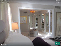
Will Agreeable Gray make this room too dark or will it lighten it up?
2 years ago
last modified: 2 years ago
Featured Answer
Sort by:Oldest
Comments (49)
 2 years agolast modified: 2 years ago
Related Discussions
Lightening up a dark kitchen: Paint suggestions
Comments (11)Very true--I know there are a lot of whites out there. I do like the look of all white kitchens and the possibilities of having a very neutral wall to work with for artwork/window treatments. I don't think I would want to try to match the cabinets, and I am wondering if it is possible to introduce a warmer white. The "Grey Orchard" floor tile does have a lot of color variability--it is not a flat gray. The Pratt & Lambert Nickel reminds me of Sherwin Williams Evening Shadow, maybe? A gray that reads like a blue in certain light? I have that in my bedroom and bath in my non-beach home and love it....See MoreBacksplash to lighten up a dark kitchen?
Comments (15)Thanks for all of the advice, everyone! I took some better pictures of the kitchen in terms of light (see below), although it has no flooring right now. The impetus for the slight remodel is a flood that started two floors above me and ruined all of my hardwood floors, so they're all pulled up and my condo is entirely concrete at the moment other than the kitchen and the bedrooms/bathrooms. That being said, based on your advice, I decided to suck it up and get new counters. I'm going with quartz with a carrara marble look, and I think I'm going to go with a white/frosted white glass tile pattern backsplash. Here's a picture of a cabinet and counter that are similar to mine with the backsplash I'm leaning toward. I'm not totally married to this one, though, so I'd love some input! I'm also including a picture of the flooring I'm leaning toward (although it's a tiny bit redder in person). Now I just need to choose a paint color! Thanks again, everyone, for convincing me that it's worth it to do new counters! Pictures of the kitchen now:...See MoreQuestion on paint palette to warm up Agreeable Gray
Comments (3)Hi Robin, no need to repaint a newly painted room! Sherwin Williams has an online tool that you can see all the colors on a wall to try them out, so does Benjamin Moore (just to get ideas.) Think about adding accents in the coppery, orange tone like in this photo. Also add natural elements for some color and life such as real floor plants. Once you add layers back into the room the starkness will disappear! Good luck! I used your agreeable gray for the walls and snowbound for the trim in this photo....See MoreArabescata Carrara - Very Dark - Can paint lighten up the room?
Comments (5)With the gray tile and gray tub I'd paint the walls a bright white. You may be able to use a very light blue tinted white, but wait until all the other elements are installed to decide. Are you installing glass doors or a shower curtain?...See More- 2 years ago
- 2 years ago
 2 years ago
 2 years ago
- 2 years ago
 2 years ago
- 2 years ago
- 2 years ago
- 2 years ago
- 2 years agolast modified: 2 years ago
- 2 years ago
 2 years ago
- 2 years ago
- 2 years ago
- 2 years ago
- 2 years ago
- 2 years ago
- 2 years ago
 2 years ago
- 2 years ago
- 2 years ago
 2 years ago
 2 years ago
 2 years ago
 2 years ago
 PRO2 years ago
- PRO2 years ago
- PRO2 years ago
- PRO2 years ago
- PRO2 years ago
 2 years ago
 PRO2 years ago
- 2 years ago


Related Stories
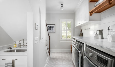
LAUNDRY ROOMSBefore and After: Remodeled Laundry Room Lightens Up
See how shiplap walls, marble countertops and a new glass door brighten this laundry-mudroom combo in Atlanta
Full Story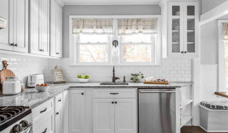
KITCHEN MAKEOVERSKitchen of the Week: Refaced Cabinets Lighten Up the Room
A designer saves her clients time and money by reusing what they already have in their 120-square-foot space
Full Story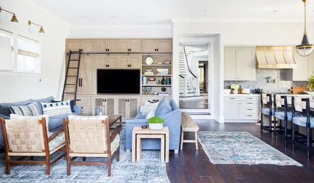
BEFORE AND AFTERSGreat Room Lightens Up to Become a Comfy Hangout
A designer helps homeowners say goodbye to drab finishes and create a beachy, relaxed and upscale feel
Full StoryLIVING ROOMSRoom of the Day: Color Wakes Up a Living Room
A modern blue, gray and orange rug is at the center of a redesign that embraces the homeowners’ art collection
Full Story
DECORATING GUIDESLighten Up — or Brighten Up — With Yellow
You can use this versatile color to create a buttery backdrop, add a zesty accent or make a bold design statement
Full Story
DINING ROOMSColor Feast: When to Use Gray in the Dining Room
The right shade of gray pairs nicely with whites and woods to serve up elegance and sophistication
Full Story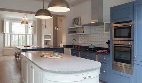
HOMES AROUND THE WORLDTraditional Kitchen Opens Up and Lightens Up
Removing a wall was key to creating a large kitchen and dining space for family life in this London house
Full Story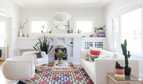
ROOM OF THE DAYWhite-and-Gray Paint Scheme Brightens a New Living Room Layout
The right colors and right-sized furniture and accessories open up entertainment possibilities in a California Craftsman
Full Story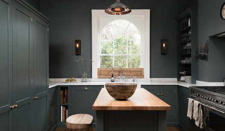
KITCHEN OF THE WEEKDark Gray Sophistication in a Shaker-Style Kitchen
Rich paint used throughout this compact London space helps create a kitchen that’s contemporary and inviting
Full Story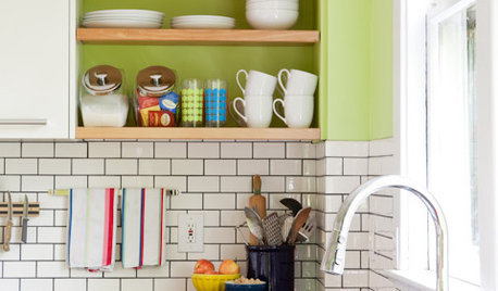
KITCHEN DESIGNSubway Tile Picks Up Gray Grout
Heading into darker territory, subway tile offers a graphic new look for kitchens, bathrooms and more
Full Story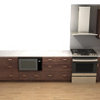

Nidnay