


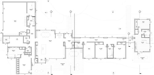
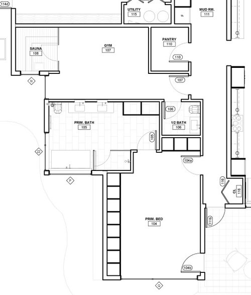
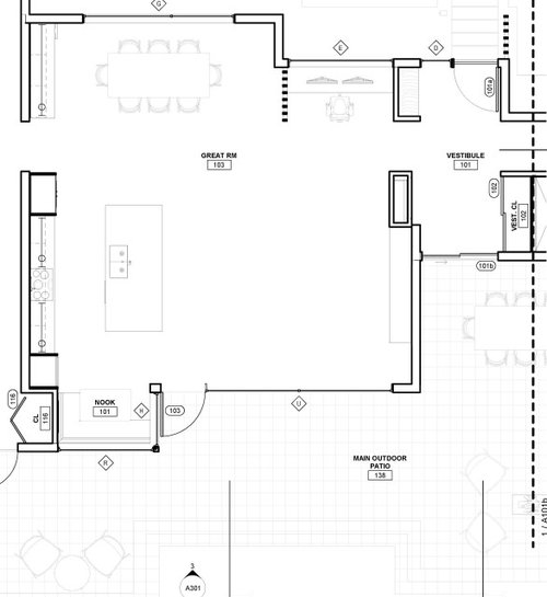
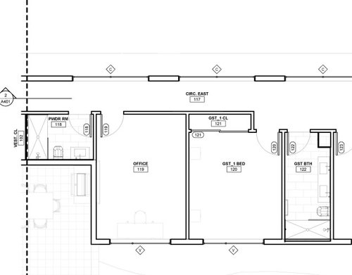
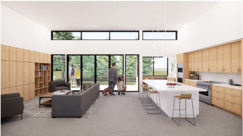
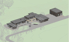
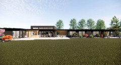
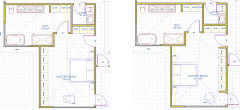
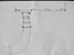
Comments on our modern "long house" design?
tupi2020
2 years ago


Featured Answer
Comments (180)

tupi2020
2 years agoRelated Discussions
Diving in with trepidation - comments on our layout?
Comments (36)Wow, this has been some day. I want to thank everyone here, especially rhome, for your help and support. I went back into the house this evening with a better tape measure and the distance along the wall for the cooktop (new location) is 85". I am fat and happy now. The PM was cool with powering the ovens around the pocket door. I think we can solve the switch problem similarly, maybe by putting a switch on the outside of the refrigerator cabinet. A barn door was something else that occurred to me; we'll have one on the family room side. I prefer a pocket because I think we'll enjoy having some art on that wall in the DR. The house is coming together so fast. The tile guy was here this afternoon to see what we're getting for backsplash and shower enclosure. I can finally see a dim light at the end of this nasty tunnel!...See Moremid-century modern design angst (w. pic)
Comments (22)Seems like we're basically all on the same page, it's just a matter of degrees - how far we want to "express" ourselves with color. Thanks chicagoans for the colorful mock-ups. I think horizontal tile compliments with the grain of our cabinets. Growlery is right, we can get away with some "punch" because of the houses character. I also agree with kaismom that it has to be taken as a cohesive design as far as vertical and horizontal lines go (especially since it's open concept). Sochi- we're north of Victoria BC, and won't be selling for at least 2 years, maybe 4-5 years at most. (Whatever we do will probably be dated in 5 years anyway, right?). I think we are definitely leaning towards the light counter- maybe Caesarstone's "Baja" or "Sierra" which aren't white white, but should read that way if the walls are off-white too. This is Sierra; Then we can try a splash of personality with the backsplash. We tried some whitish granite samples, but even the less busy granites did change the feel of the space. firsthouse, the linoleum glitter is back in some of the quartz colors - some even have little bits of mirror in them! We have looked at the circle penny tiles too. Some of them are beautiful. Jakabedy's tile is great. Is that "Sesshu Silk" stacked brick Sumi-e? I see there are other shapes in the Sesshu series. Now how about where the cabinets meet that angled wall? Any ideas for a shelf or filler? I want to ask about the island too, but I'll start another thread on that. That chandelier is a like a piece of modern art! BTW - Kaismom's Henrybuilt pictures disappeared? Here is a link that might be useful: sumi-e stacked brick tile...See MoreNew kitchen design. Comments?
Comments (25)I'll check out the design dilemma too. Here's a specific question: the range hood is off centre. If I centre it with the island and counter it overlaps with the right hand window (#1). Even if it was smaller so it didn't overlap, there's something that offends me about this placement when you don't just look at the island, but consider the whole room. If on the other hand I centre it between the edges of the windows (#2), well yesterday I hated it, but today I think it looks fine. The last (#3) is where I thought it looked right yesterday, but there's no rhyme or reason to that one, just placed where it look(ed) right. Today I prefer centred between the windows, although only #1 is offensive. Which do you think looks best? Another: These are built off 2d that I actually signed off on. It wasn't until I built them in sketchup that I realized something was off. Things were logically placed, and certainly functional from a cooking perspective. You could see the logic on the 2d and how things lined up, but in 3d the appliances looked like they were having a party and the island wasn't invited. They were that way because I asked for a large window, and large was interpreted as wide and that forced everything to make way. And the island was too big for the room. I reinterpreted it as tall after much effort to re-balance things, then shortened up the island and centred it with the counter. This is my real question: this design is not very symmetric. It has some symmetry, but also much asymmetry. Is it offensively off balance? And if so, what is that strikes you as out of place?...See MoreModern bungalow floor plan comments
Comments (24)The laundry, though. Stacking machines, tucked back in a closet, hard to duct, and where do you sort, fold, have the next load waiting, a basket for the current load waiting? Not only that, everyone has to carry their laundry right through the kitchen. Maybe use some of the ginormous shower for laundry (IS that a shower next to the half-bath?) Totally agree that the laundry isn't "enough" for a family of five. "Waiting loads" need space. Venting is a problem. And no bedroom is convenient to the laundry room, which means extra steps. What's the purpose of that giant shower? It does look like a perfect spot for laundry. The dryer could vent sideways to the backyard. The kids won't mind going through their sibling's party in the basement playroom, to get to the bathroom? Yes, I agree that the bathrooms would be much better placed adjacent to the bedrooms. Why not leave the bathroom where it is ... and bring all three bedrooms over to the side that's currently labeled Exercise, I think that's a bedroom, and storage? That'd allow family room space on the left, just where the stairs end ... and keep all the bedrooms and bathroom to the right. Pocket doors on bathrooms are a mistake. Pocket doors are great for doors that're often left open: pantries, laundries, mudrooms. They're awful for doors that are opened and closed frequently. They break (especially when operated by children, especially in a damp atmosphere like a bathroom), and then the problem is INSIDE the wall, so you need a pro to open up your wall. Only thing we might miss is a utility sink but we are putting one in the heated garage. My wife is a nurse and needs the laundry by the entrance so she can throw her soiled scrubs in as soon as she comes in the door. My daughter is a nurse, and she wants that set-up, so I understand where you're coming from. The problem is that if anything else is already in the wash, she has no place to drop those dirty scrubs. If I were her, I'd also like to see some sort of a hallway /pass through from the garage to the bedroom. That'd allow her to go straight into her own bathroom, where her own clothes and towels and toiletries are stored ... and let her clean up before entering the main house. As it's designed, she has to walk through the kitchen (with food!) before reaching the master bedroom. I get the goal ... but I think it could be executed better. All the windows and the fact that it's basically one room deep. Yes, nice. The kitchen is poorly laid out if you do any sort of cooking. I would highly recommend you post your kitchen and layout in the kitchen forum. This kitchen looks like it's looks over function. Agree. It's a mess from start to finish -- you have plenty of space, but it is laid out oddly. The biggest problem: the single most used item in your kitchen is your sink, and it's placed (literally) around the corner from your main work area. Definitely go to the kitchen forum and talk about function. I do like the pantry, though I'd like it better if it were better positioned nearer the garage ... so it'd be the first part of the kitchen you'd reach upon coming home. Also that between those two bedrooms, there is no sound insulation. There is a reason people put closets between bedroom walls. You could easily place the closets between the two rooms. There is no need for a pocket door between the toilet and the sink. Agree. Divided bathrooms don't help anyone "share" the bathroom. The ceilings are 12ft so the basket could go on top of the machines but good point. I had asked one of the builders we were interviewing about the laundry venting and he didn't have a concern. Concerns about this laundry: - Google tells me that stacked machines are 70-75" tall, so you're talking about storing baskets roughly 6' in the air. I couldn't reach that. Your children, whom I suppose you're teaching to do their own laundry, couldn't reach that. - Because of the weight of stacked machines and the narrow room, pulling these machines out to clean them will be essentially impossible. Failing to clean your dryer vent is a fire hazard. - No, your builder isn't concerned about venting because he doesn't have to keep the vent clean! - I really think that if you go with this minimal laundry closet, you will end up with a permanent pile of clothes on the floor just outside the laundry. Laundry is a constant chore, especially while your kids are young. You need more space, and it needs to be on an exterior wall. Agree about the size of the kids bedrooms. I had thought they were closer to 12' but see that they are shown as 10'10". My kids' rooms are 12x12, and they're ideal ... big enough for a double bed (queen bed fits, but it's tight) plus a dresser and a desk. I would only go smaller IF the kids had really big closets so they wouldn't need the dresser in the room. Do you intend to stay in this house long-term? Consider that at some point your adult children will come to visit ... with spouses. You need at least one bedroom that can hold a queen or king bed so your adult children can be comfortable when they come to visit. Other thoughts: - Your entry hall is very narrow ... only the width of a door. It doesn't seem welcoming. - Similarly, the hallway between the entry and the kitchen ... the one lined with closets ... looks narrow. - I assume you get a lot of snow ... consider those outswing doors to the patio. When the snow's piled up, you won't be able to open them. I'd vote for a set of the new gliding doors -- much nicer than the old 70s sliding doors. - I'd want an exterior door between the master and the patio too. Fire safety ... 'cause the master is far from any exterior door. And it'd just be nice. - The master bath will have so little light. If you bring the garage and theater room "forward" it would at least have the full benefit of the window over the tub. - I like the small desk area. It's in the right place, and it's "just enough". - Consider this: Bump /deepen the laundry room to use the wasted space by the front door ... you still have enough space for hooks behind the door for guest coats ... and you have a small but functional laundry room. Dryer can vent directly outdoors, saving money and making it more safe. Place the (larger) pantry directly behind the kitchen, and give it two doors. This means someone coming in from the garage can go straight to the pantry without cutting through the kitchen's work space ... but you still have the same pantry entry as before. Add a hallway from the garage entrance to the master bedroom. This'll allow your wife to go straight to the bedroom /straight to the bathroom with her dirty scrubs. She never has to walk through the family's living space being "germy". Bump the master bath over to use up that odd little indent ... this means you can now have three windows around the tub, and you'll have much more natural light in the bathroom. The vanity is larger. The oversized shower is moved to the master, where it makes sense. Instead of a toilet-in-a-closet, you have a real half-bath ... this allows you a sink next to your toilet. I'd use this for the master AND for guests (after all, you're not going to store anything private in the half bath anyway), but if you disagree, you could use the new walk-in closet as a second half-bath....See Moretupi2020
2 years agotupi2020
2 years agotupi2020
2 years ago
Architectrunnerguy
2 years agolast modified: 2 years ago PRO
PROMark Bischak, Architect
2 years agotupi2020
2 years agotupi2020
2 years ago- PRO
Mark Bischak, Architect
2 years ago tupi2020
2 years agoLH CO/FL
2 years ago- PRO
Mark Bischak, Architect
2 years agolast modified: 2 years ago 
bpath
2 years agoLH CO/FL
2 years agotupi2020
2 years agotupi2020
2 years agolast modified: 2 years agotupi2020
2 years agotupi2020
2 years agotupi2020
2 years ago- PRO
Mark Bischak, Architect
2 years agolast modified: 2 years agotupi2020 thanked Mark Bischak, Architect tupi2020
2 years agotupi2020
2 years agolast modified: 2 years agotupi2020
2 years agotupi2020
2 years ago
just_janni
2 years ago- PRO
Mark Bischak, Architect
2 years ago tupi2020
2 years agotupi2020
2 years agotupi2020
2 years agolast modified: 2 years ago


Related Stories
ROOM OF THE DAYSleek Open-Plan Design for a ‘Brady Bunch Modern’ House
A remodel gives these Minnesota empty nesters a longed-for great room in their 1970s home
Full Story
LANDSCAPE DESIGNModern Garden Designs for Modern Homes
Link your garden to your home’s clean-lined architecture in a most interesting way
Full Story
APARTMENTSHouzz Tour: Modern Japanese Penthouse Atop a Designer’s Office
Vintage obis, petrified wood, Samurai armbands and antique fans are just a few of the materials that warm this California apartment
Full Story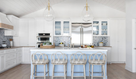
HOUZZ TV LIVEVisit an Interior Designer’s Beautiful Beach House Retreat
Watch and read how Karen Wolf created a relaxing family getaway with a durable coastal style
Full Story
MODERN HOMESHouzz Tour: A Designer’s Art Moderne Home — Emphasis on the Art
Before and after: Colorful art and furniture bring this 1937 Sacramento home up to date while complementing its history
Full Story
TILEWorld of Design: How Modern Geometric Designs Are Reinventing Cement
Intricate and eye-catching, the patterns of today’s cement tiles mark a break with their past while preserving an age-old technique
Full Story
HOUZZ TV LIVETour a Designer’s Glamorous Midcentury Modern Condo
John McClain highlights the stylish pieces and materials that jazz up his Los Angeles home
Full Story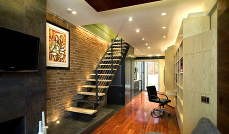
HOUZZ TOURSDesign Lessons From a 10-Foot-Wide Row House
How to make a very narrow home open, bright and comfortable? Go vertical, focus on storage, work your materials and embrace modern design
Full Story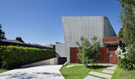
Houzz Tour: A House Built for the Long Term
The designers of this one-of-a-kind home made the most of its challenging location to deliver enduring comfort and style
Full Story
REMODELING GUIDESRibbon Windows: Openness, Privacy and Cool, Modern Design
Long, horizontal windows celebrate Le Corbusier's break with traditional Architecture
Full Story
3onthetree