


Black cube of death or modern pop of anti-color?
tesla66
2 years ago
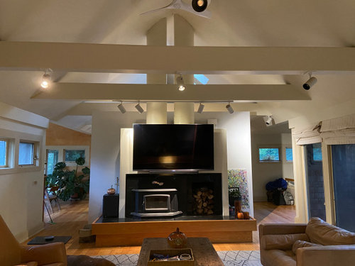
Featured Answer
Comments (10)

tesla66
2 years agoRelated Discussions
Pity me--deer AND black walnuts!
Comments (14)I feel your pain...my dog is just learning about protecting her garden...but I have to be cautious, since she'll just keep going after the deer have left her property...never leaves the block, but she stops to snack on the neighbor kitties food! Anyway, black walnut. Mine is rather mature, but with a pretty vertical habit. Thank goodness it's on the corner of the property, goshdarn it that it's right over the house and fills up my gutters with nuts! And twigs! My philosophy with it has been to plant things I get for free, or nearly free, under it. Toss 'em in, see how they do, no skin off my back if they fail. Also, anything that is potentially invasive...should be hardier, right? Within the drip line: I have 3 roses that are doing rather well, though this is their first season. Two are from someone's overgrown bramble, one was a distressed Drift I got at Lowes...creeper. I have 2 hellebore (Lenten rose) I got off season the first year I lived in the house. They've done splendidly...maybe 3x in size in 4 years? Colorado columbine, artemisia, oenathera (evening primrose), irises, vinca, all looking great. Had a wayward day lily come up this year, and I think the white yarrow was wild...I don't recall planting it. I tried to transplant some pretty colored yarrows, but didn't take care of them, so by no means should their failure dissuade you. I also have a concrete block wall back there that I'm constantly planting creepers and climbers in...the thyme and sedum do great, the clematis is apathetic...but I think there may be other forces at work there. Plenty of folks in my neighborhood have old growth azaleas under theirs...we are Azalea City, and they look great. My biggest loss was a Harry Lauder's Walking Stick (Corylus contorta). It was transplanted in the heat of August (CL find, this lady wanted it out of her yard NOW), and was rather mature. Not sure if the shock or the walnut killed it, but it didn't make it even to winter. I left it in, though, since the bare branches are the most attractive part, and I don't have anything else to go in there yet... Outside the drip line: Lambs ear, lilac, peony (first year), I have an ornamental cherry tree (Kanzan) about 15 feet away, and is seems to be just fine. My modern, hybrid azalea is hanging on, but certainly not thriving. Hope this helps... J...See MoreFeedback on teeny galley modern kitchen plan
Comments (25)The 30" Ikea cabinet is shown in displays and on the ikea site as if it all came as a kit, with two wide deep drawers, and two shallow narrow drawers on top. Everything you get from Ikea is a separate piece. Good to know: you can get a single shallow drawer, full width. This replaces the two narrow drawers that require two front panels and a Filler piece. This is less time to install and less cost to buy. You simply deselect the small drawers, small front panels, and filler piece. Since it's not a kit, you don't have to buy the ensemble and or ask for exceptions to get parts replaced. Here is the shallow drawer: http://www.ikea.com/us/en/catalog/products/10107072 $30 . It's been documented on ikeafans extensively, as the "oven drawer" in the base cabinet. If you have the urge to say you prefer having two small drawers, think again. -- When I went to a Viking showroom and looked at a 24" wide range, I was told it was discontinued. I didn't ask if they meant the one model I was looking at or all the 24" models. If the latter, I think there will still be many available at a discount price. A smaller oven takes less time to warm up. We have a 24"wide wall oven. We are very happy with it. In it we can fit a huge roaster: it's an oval shape, 13"w by 17.75" long with handles in "corners" not at the ends, about 7.5" high. I could fit fair size animals in it but I don't know what size that would be in turkey pound speak, specifically. We have a 24" induction cooktop. We never use four burners. In fact, we could make do with one burner almost all the time, by using pots with strainers, bain-marie tops, double boilers, etc. So now we understand why a three-burner cooktop can be sold without generating any complaints. -- Having one fridge will do the job. A fridge/freezer, all by itself. Having two appliances will change your life. The small LG is high quality at a good price. hth...See MoreNeed help with color palette for our first home!
Comments (24)Sorry - meant to post this earlier, but pesky work calls had to take priority. . . As for choosing a color pallet for your home, again you are looking for harmony. Step 1 - Use poster boards for each room. Add samples of the colors that have to stay. (Can't afford to change or love and won't be changing). This often includes cabinets, countertops, flooring, finishes, appliances, newer furniture that you don't want to replace at this time, art that you love, an area carpet that you love. May also include a fireplace surround or stained glass window. Step 2 - Figure out the colors that make your heart sing. We all have those few colors that just make us happy or sexy or romanic or relaxed when we see them. They bring us joy. Funny how this works - I have found that most people are drawn to colors that look really good on them. These are colors you want in your home. My sisters and I are great examples. Lisa - blond with big blue eyes - decor is country and primary colors are cornflower blue, cream and peach. Susie - olive tone skin, golden brown hair color, brown eyes - looks good in fall colors and muted colors. Home is sage greens, orange reds, muted golds and browns. Betty - light brown eyes, pale skin, hazel eyes - wears a lot of navy and pastels. Bright colors and black make her wash out. Her home colors are light blues, light greens, pastels and tans. Me - I have dark hair, dark eyes and ivory skin. I look great in Red, purple, teals - clear colors. My home decor is dark purples, teals, deep burgundy and taupe. We all picked home colors that look good on us. Didn't think about it when we selected the colors, but it was a natural process. You learn to love what makes you feel good about yourself. Step 3 - adding the colors that you love to the boards. With the colors that must stay, which of the colors that you love can work in each room. This is not your final paint color - it is the basis for your color design. Now think about walking through your home - You can't change the colors that must stay, but you can move the colors that you love around, narrow your selection down to 3 colors that work with what must stay and work with each other (I love purple burgundy and teal. I also love lime green - but eliminated it from my color selections for my house because it doesn't work so well with the other 3 colors.) The three colors that you have selected will be repeated throughout your home. Sometimes using a lighter shade or a slightly more subdued shade or a brighter or darker shade - but the same hue. Step 4 - Find a neutral - This is one of the hardest parts of the process. Finding a neutral that works with everything you have selected. Again, we are looking for a general choice, not the exact color. The basic families are nicely shown by Maria Killam: (Inside colors are the undertones) Hint - red and purple undertones can be much more difficult to work with than the other undertones. Green undertones are probably the easiest to work with. Step 5 - Pulling everthing together. This is where you begin exploring how you want the colors to flow from room to room in your home. Start with your entry - what colors are going to greet you and your guests. Do you want the room to be painted with your neutral or with a color? How bold do you want this first room. What do you want it to say to those who are coming into your home. Safe - paint it neutral and use your furnishings and accessories to add color. Bold - paint the walls orange and placing your sofa and area rug in this room: Now you move from one room to the next - do you want neutral walls or colored? How does it coordinate with the previous room. Will it feel harmoneous as you move from room to room. Using your 3 colors you can use more or less of each color in every room, but always bring a bit of the main color from one room into the next room so that they relate to one another. Think about each room and how you want it to make you and your guests feel. Energized, relaxed, thoughtful, hungry. (Most restaurants use a lot of red and orange colors because they stimulate the appetite. Orange also stimulates social interaction.) Most people use neutral in the main living spaces and hallways, colors in bedrooms, bathrooms, laundry rooms. Dining rooms and kitchens are sometimes color and sometimes neutral. Don't change wall color unless there is an architectural break (The wall ends at a corner or at a post or beam). (Don't try to draw a line down a wall and change colors if two rooms share one wall). Step 6 - Begin selecting wall colors. You really can't see wall color with a tiny sample. You need enough paint to see what it will really look like. I buy samples, but have seen a ton of samples and have a pretty good feel for what I want. If you haven't done this before it can get overwhelming and expensive to buy 100 samples to get to the perfect color. Walls are huge, so a little color goes a long way. It is easy to go too rich, too bright. What looks dull and very neutral on a 2" sample may look very blue or green or pink when you paint a 10'x10'x8' wall. The undertones come to life as we paint larger spaces. As you get to this stage ask more advice on Houzz to help get you close to the perfect color. If you love a color on the 2" sample go about 2 levels more subdued (greyer, muddier) I love the color reviews done by kylie m interiors. You may want to start looking at her blog and videos. https://www.kylieminteriors.ca/ Maria Killam also has some great advice. She is great at explaining undertones. https://www.mariakillam.com/ You can paint your own samples, but this company makes life simple: https://samplize.com/ Let us know how your color scheme is coming along....See MoreOld Rose vs. Modern Rose Fragrance
Comments (74)There IS an "old rose scent". Roses express it in many permutations, that is, with different additions of other scents in more or less quantity. The old rose with the purest "old rose scent" that I have experienced is unidentified from an Indiana farm that was passed down through a number of generations. I gave a rooted cutting to Christopher. I hope that it survived. I am not adept enough at rose classification to say what class it belongs to. It is a once bloomer, medium to light pink, button eye, with about a 2" diameter flower. It is true that the perception of scent differs from person to person yet anyone I have seen who has smelled this rose has been enchanted. I have grown Tiffany, Fragrant Cloud, Blanc Double de Coubert, Rose de Rescht, Reine des Violettes, Souvenir de Claudius Denoyel, Crimson Glory, Chrysler Imperial, Munstead Wood, Proud Land, Autumn Damask (pink), Comte de Chambord, Jacques Cartier, Zephrin Drouhin, etc. and sniffed wild rugosa roses on a beach (clove scent, wonderful but not "old rose"). Also, I have noticed that many of the c. mid 20th century roses with decent "old rose scent" such as Crimson Glory and Chrysler Imperial develop a less pleasing scent as they age. Does anyone else sense this as well? Cath P.S. If you really want to smell the "old rose" scent, buy a vial of true attar of roses. Put the stopper right up to your nose. That medicinal scent is not it. No rose has a scent that concentrated. Then slowly move the stopper away from your nose in increments. You will know it when you smell it....See Moretesla66
2 years agolast modified: 2 years agotesla66
2 years agopalimpsest
2 years agotesla66
2 years agopalimpsest
2 years agotesla66
2 years ago


Related Stories

MODERN ARCHITECTUREModern Design Goes Pop
Designers unveil concepts that pop up and out to offer bold new ways of living in urban environments
Full Story
THE ART OF ARCHITECTUREHouzz Tour: Wild Cats Roam This Amazing Modern Prairie House
Stunning architecture competes for attention with fabulous felines in an eye-popping home near Oklahoma City
Full StoryDECORATING GUIDESThe Case for the Anti-Accent Wall
Go ahead, paint everything the same color (even the trim)
Full Story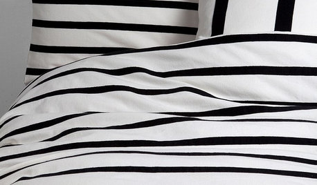
PRODUCT PICKSGuest Picks: A Hot Streak of Black and White Stripes
Cool and collected yet as dramatic as you please, black and white stripes bring a graphic edge to furniture, fabrics and accessories
Full Story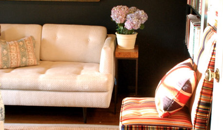
BLACKColor Guide: How to Work With Black
Take a walk on the dark side — your home has nothing to fear with this color when you know how to use it
Full Story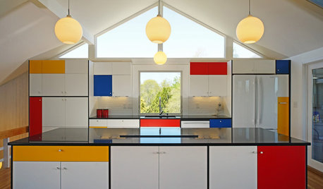
KITCHEN DESIGNKitchen of the Week: Modern Art Inspires a Color-Blocked Look
In a midcentury beach house on Martha’s Vineyard, a redesigned kitchen embraces the look of Mondrian
Full Story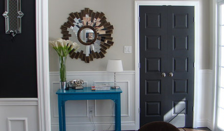
MOST POPULAR11 Reasons to Paint Your Interior Doors Black
Brush on some ebony paint and turn a dull doorway into a model of drop-dead sophistication
Full Story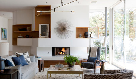
MODERN HOMESHouzz Tour: Earthy Decor Adds Warmth to a Modern Home
Nature-based colors and rustic elements bring a cozier feeling to a minimalist house in Southern California
Full Story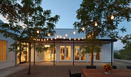
LANDSCAPE DESIGNHow to Design a Modern Farmhouse Outdoor Retreat
Create a delicious outdoor space with a sophisticated menu of modern, minimalist design elements
Full Story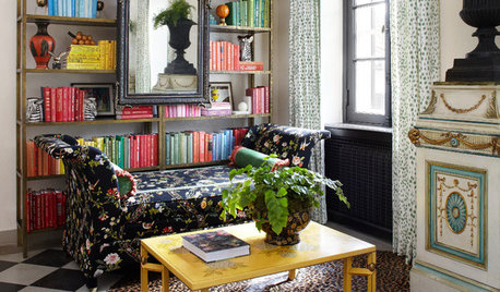
DECORATING GUIDESModern Life Makes Room for Blooms
Vintage florals still look lush and lovely on upholstery, curtains, wallpaper and more
Full Story


apple_pie_order