


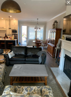
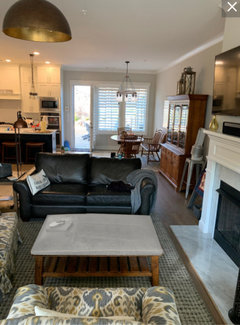
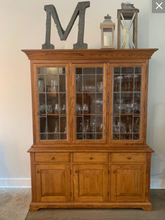
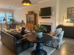
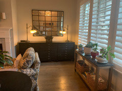
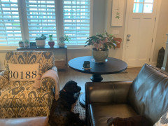
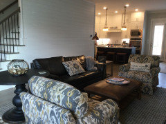
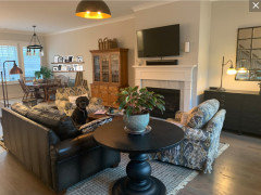
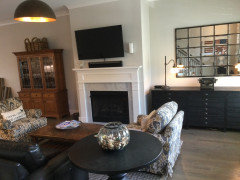
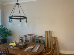
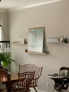
Easiest way to neutralize these orange pieces?
cinmer06
3 years ago


Featured Answer
Sort by:Oldest
Comments (163)

cinmer06
3 years ago
Lisa T
3 years agoRelated Discussions
The Easiest Class of Rose for you to Grow
Comments (68)Hi Lynn: Thank you for the info. on superphosphate. I prefer that over triple-superphosphate, due to higher % of sulfur: Superphosphate provides 20% calcium, 12% sulfur, and 20% phosphorus, with salt index 7.8. You are right that hard water is tough on skin and hair. My kid has curly hair, and it's tangled up from our hard-well water. My skin is always dry. I like drinking our village's water, it tastes sweet, and won the best-tasting water in the county. Using fish-tank litmus strips sold at Walmart, I tested my water, pH over 8. I tested bottled mineral water, its pH is 7.5. A long time ago I had a landlord that bought tons of those Morton water-softener (and drink it too). Her son died young of a stroke at 50 years old. She had 2 strokes, then died right after her son. My husband bought the wrong stuff, Muriate of Potash or potassium chloride, rather than sulfate of potash. Potassium chloride is what we use to de-ice our sidewalk in zone 5a winter. It browned my roses' petals, due to chlorine toxicity .. I found a picture of fertilizer burn that matched with the browning, along with this statement, ""Overfertilization - fertilizer burn can occur when excessive chloride fertilizers (e.g. muriate of potash) or high rates of nitrogen fertilizers (espcially ammonium sources) are applied." No wonder the 6 tomatoes plants in front wilted when I watered them with Muriate of Potash or potassium chloride. High potassium or high nitrogen also induces calcium deficiency (Wikipedia info).... it's not surprising that I got blossom end rots on those tomatoes....See MoreEasiest perennials from cuttings
Comments (36)I love the pinch and poke method and you can do some perrenials that way too. I do it with Autumn Joy, and it doesn't seem to matter when I pinch them, they all just plain root in the ground. I also do Artemesia Powis Castle and it does best with only a small tip cutting, no more than 2--3 inches soft wood and it looks pretty pitiful in the ground for quite a while, but then I notice it perks up into a new plant, does take a while though. Also Lantana same thing, it does propagate easily. I didn't know I could do gardenias, so now I am off to cut some and make new plants. I had no idea they were so easy. Pauline...See MoreOrange/Red Powder Room
Comments (16)Let me say I enjoy your choice of a bold color palette. But my first reaction was negative towards the orange tile, so it comforts me to see you've stepped away from that. I like the countertop color and the glass tile, but the orange tile just doesn't do it for me. I understand what your builder is saying. Perhaps a way to relate the two would be to construct a somewhat traditional wood mirror frame with an inset middle strip of your red glass to jazz it up a bit. The mirror below isn't at all what I'm thinking style-wise, it just had the inner, middle, and outer bands that I wanted to describe. What I'll try to describe may not fit your design ideas...which is perfectly fine, It's your bathroom. But take this mirror below which again, I'm just using for reference because it has three "delineations" to the frame: Replace the inner black and silver decoration with your red glass tile. Replace the inner and outer "gold" detail with inner and outer runs of painted wood trim, painted the same color as the wainscotting. Have the outer wood trim wider than the inner wood trim, and have the outer trim relate in detail in some way to the other trim in the room...the wainscot, the toilet/sink detal, etc. The inner wood rim can be a little more basic, is should be minor to the more major run of outer trim. Hope that makes sense. But again, remember, it's just a mirror. No matter what mirror design you start with, you can easily change it....See MoreNeutral vs. colorful palette
Comments (27)As usual great sound advice from GW members! My home used to look like a Crayola box threw up in it. But not in a bad way - our home is borderline Victorian w/ lots of stained glass so it could handle it. I could not. I still craved color somehow, someway and over the yrs. found my groove. Along w/ some other GW'ers here I too had gone neutral/ greige before RH went gang busters on it. I always had a pop of robins egg blue like on my entry hall ceiling like here (although that has all changed too): I'm also torn between the 2 décor styles in Somethings Gotta Give and It's Complicated but I think I've finally nailed it. My house looks like the two movies got married, had kids and then divorced. All of my walls are painted SW High Reflective White and all of my ceilings are either grey or black (crazy I know) except in my LR which is just super duper tiny. That room is SW Dovetail Gray (or will be once I buy the final gallon). It's the perfect foil to adding the pops of blue and green that I love so much. I have a white slipcovered sofa w/ lots of pillow on it that I swap out seasonally. The base is always robins egg blues to turquoise in varied patterns like trellis patterns and damask patterns along w/ some solids. When I want it 'calmer' I take the green away and add linen and cream pillows, some w/ ikat pattern and some w/ stripes. When I want 'warmer' I add a pillow w/ a smoke blue base that has touches of a wonderful terracotta and mustard and add a pillow or two in those shades for Fall. No, I do not have a elves whipping up pillows in the closet - but I do regularly buy washable pillow covers. Since this is the only LR/Family Room in the house and I want our kids to feel like a part of it, I am adding additional color to one wall w/ our kids artwork and soft colored mats in white frames (the other wall has 3 black and white tree pics in wood frames). Recently I noticed that I am gravitating to adding a more colorful bohemian vibe to this one room as I've lost weight. Like you mentioned you dress in lots of color. I'm down 45 pounds and w/in the past month I've added so much blue and bright green to my once dull black, grey wardrobe and I've honestly found the color creeping into my LR more and more. Especially the play of pattern. I think that this one gray room is perfect for us because while at once calm and sedate it handles a lot of color w/ no sweat. I often refer to BHG magazine for a fair amount of the neutral/ color palette mixes. Here was my jumping off point for satisfying my neutral & color needs in my LR: (All of that red is not for me but I still love the play of color against deep neutral in the above room!) And then our office across the hall has white walls, a black and white photo gallery and a painting in the blues and greens. It has colorful accents here and there. It's a lt 'crisper' feeling. Sort of kind of like this minus the blue chairs: Oh, and the white hallway (w/ black ceiling) between the two rooms has a single row of colorful scenic antique lithographs in various rooms that sort of draws the 2 rooms together. Oh yeah, and we have 2 boys 9 & 6 and a 4yr. old DD. They were another reason I wanted some color. They're vibrant and I wanted them to feel vibrant....See Morecinmer06
3 years agoer612
3 years agoeverdebz
3 years agoLisa T
3 years agocinmer06
3 years ago
urchinsushi
3 years agocinmer06
3 years agocinmer06
3 years agoLisa T
3 years agoer612
3 years agourchinsushi
3 years agocinmer06
3 years agolast modified: 3 years agocinmer06
3 years agolast modified: 3 years ago
Susan Davis
3 years ago
shelleysmith999
3 years agoeverdebz
3 years agoer612
3 years agolast modified: 3 years agoLisa T
3 years agocinmer06
3 years agocinmer06
3 years agocinmer06
3 years agocinmer06
3 years agocinmer06
3 years agocinmer06
3 years agocinmer06
3 years agocinmer06
3 years agocinmer06
3 years agocinmer06
3 years agoLisa T
3 years agocinmer06
3 years agocinmer06
3 years agocinmer06
3 years agocinmer06
3 years ago
dani_m08
3 years agocinmer06
3 years ago
olychick
3 years agocinmer06
3 years ago
Hela Bucco
3 years agoHela Bucco
3 years agocinmer06
3 years agolast modified: 3 years ago


Related Stories
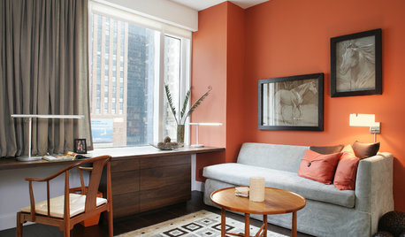
MOST POPULARFalling for Color: 9 Ways With Pumpkin Orange
From racing stripes to accent walls, see how to work this vibrant hue into your home
Full Story
NEUTRAL COLORS10 Ways to Make Your Neutral Palette Shine
Wake up your beige and gray with a rich combination of texture, shape and pattern
Full Story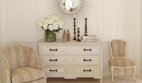
COLOR11 Ways to Spice Up Neutral Palettes
Side with texture and pattern in a neutral room for a look that commits to high sophistication and elegance
Full Story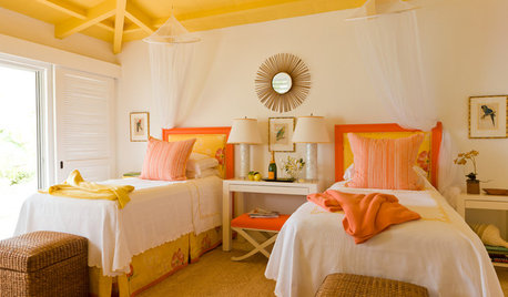
DECORATING GUIDESPaint Color Ideas: 7 Bright Ways With Yellow and Orange
Go with the glow. These sample palettes and room examples show you how to work with two of the happiest hues around
Full Story
COLORBest Ways to Use the Neutral Green Color of 2015
Benjamin Moore’s Color of the Year is soft and natural
Full Story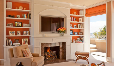
COLOROrange You Glad This Doesn’t Look Halloween-y?
Pops of orange don’t have to stop once trick-or-treating does. Here are some ways to make the bold color work anytime
Full Story
ORANGEGuest Picks: Crushing on Orange
Whether you call it tangerine or persimmon, 20 ways to use Pantone's top hue for 2012
Full Story
COLORFUL KITCHENSAn Old Condo Kitchen Rises Again With a Fiery Orange Backsplash
Bright colors against a neutral backdrop bring light and contemporary style to a Philadelphia condo
Full Story
PRODUCT PICKSGuest Picks: Neutral Tableware Eases Us Into Autumn
Work these pieces in with the flatware, glasses and placemats you already have for fall flair without a major overhaul
Full StorySponsored
Your Custom Bath Designers & Remodelers in Columbus I 10X Best Houzz


cinmer06Original Author