


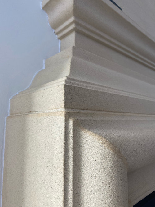
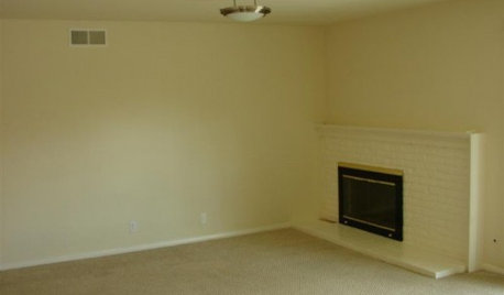
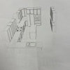
Design Dilemma (Cast Stone Fireplace)
jenimal
3 years ago


Featured Answer
Comments (193)

User
3 years agoUser
3 years agoRelated Discussions
Fireplace stone - Please help with design decision!
Comments (5)mjlb - I love that too! Although I didn't do that on mine, I think it would be an easy update. I also like the sconces on the columns. jakabedy - Oh good, I did something right? Thank you for that. I never really thought of the mini brick as contemporary (maybe the glass, but not the other) ... probably becuase it still has that traditional subway pattern. My main conern is using the same size (whether 1x2, 2x4, or 3x6) for both bs and fp. I also thought that using the smaller tile would provide more variation in the color of the stones, and give a bit of a casual, slightly rustic look????...See Morecast stone mantel?
Comments (7)Thanks kippy, yes my mom is going to make cushions. Pal I guess you're right about the floor but the old fireplace covered the floor corner between the hearth and the wall. So it is unfinished wood. So it would be less work to cover it back up again and I think if I stained/varnished it that it would never look completely right anyway. What do you think of the style I posted? My house is a typical McMansion neo eclectic so it doesn't have a lot of style direction one way or another. Annie everyone I've spoken to about the crown thinks that I would for sure have to do the whole wall over and possibly the whole room if I mess w the crown. And I'm not thrilled with the look right now anyway. Though taking out the rough hewn beams and lion heads lightened things up, the whole space feels so so heavy to me....See More90’s Fireplace remodel design dilemma
Comments (12)I would remove the existing pillars and mantel, they look too crowded against the windows. I would install a clean and simple modern tile around the fireplace. I think you could pull off the TV mounted once you get the pillars and mantel out, install a lower ledge to help protect the TV from the heat of the working fireplace. Lowering the ledge/mantel and with today's TV mounts should allow the TV to be positioned easier for viewing. Do your research on TV mounts, most of todays TV's are super light but block for it in the wall if necessary, particularly if you think you will be moving t he arm mount around often. You will get your depth from the TV and the ledge mantel so dont worry about creating more with trims and moldings. Best of luck!...See MoreWindow Treatment Design Dilemma
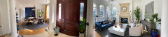
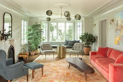
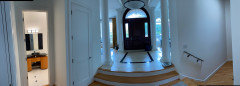
Comments (12)Thanks for the comments everyone. The previous owner had long sheers on the swing rods by the fireplace and back rectangle doors which were decorative only and looked a bit frumpy - especially with the radiators. The original owner (from photos) had heavy large, lined velvet drapes across all three window walls along with hardware on the lower two thirds of each window/door holding permanent sheers across each door and window using a top and bottom rod. If I find the picture, I will post it. It is sort of fun to see. (This is a home that has been in my spouse's family at different generations.) The floor shown is actually the pine subfloor that was under the original horse hair carpet. While the wood is pretty hard given its age at harvesting in the 1930s, it has cracks, splinters, and (in some places) half inch gaps between the boards with light from the basement showing. When the last owner refinished it, they tried filler in the gaps which has been popping out. ddeegw - I would be interested in knowing your thoughts behind not going too cool in the room- especially if the trim is painted a white shade. The intent would be to go into the white family. While I feel bad changing some of the original decor in the home, much is damaged, and the home feels very dark and sort of "dingy/dirty." All of the original light fixtures used that yellow tint glass shade and walls were very yellowy....See Morejenimal
3 years agojenimal
3 years agojenimal
3 years agoUser
3 years agolast modified: 3 years agoUser
3 years agocalidesign
3 years agoUser
3 years agolast modified: 3 years agojenimal
2 years agojenimal
2 years agoUser
2 years agoUser
2 years agoGargamel
2 years agoUser
2 years agojenimal
2 years agojenimal
2 years agojenimal
2 years agojenimal
2 years agoUser
2 years agolast modified: 2 years agojenimal
2 years agojenimal
2 years agojenimal
2 years agocalidesign
2 years agojenimal
2 years agojenimal
2 years agojenimal
2 years agocalidesign
2 years ago PRO
PROBeverlyFLADeziner
2 years agoGargamel
2 years agolast modified: 2 years agoUser
2 years agojenimal
2 years agoGargamel
2 years agojenimal
2 years agojenimal
2 years agojenimal
2 years agoGargamel
2 years agojenimal
2 years agocalidesign
2 years agoplf12652
2 years agocalidesign
2 years agojenimal
2 years agocalidesign
2 years ago
J D
2 years agojenimal
2 years agojenimal
2 years agojenimal
2 years agojenimal
2 years agocalidesign
2 years ago
RedRyder
2 years ago


Related Stories
FIREPLACESDesign Dilemma: Difficult Corner Fireplace
Where to Put the TV? Help a Houzz Reader Set Up His New Living Room
Full Story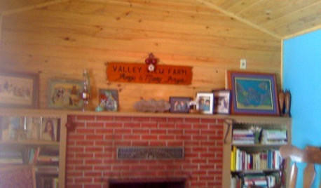
Design Dilemmas: 4 Questions for Houzzers
Brick Fireplaces, Historic Homes, and Tropical Living Room Decor, Oh My!
Full Story
REMODELING GUIDESSurround Your Fireplace With Tile, Brick or Stone
Freshen up your fireplace with a crisp, colorful or dramatic new look
Full Story
FIREPLACESSleek, Beautiful Stone Slab Fireplace Surrounds
Refresh the look of your home's fireplace with a stone slab surround
Full Story
MOST POPULARDesign Debate: Is It OK to Hang the TV Over the Fireplace?
In the spirit of the upcoming political debates, we kick off a series of conversations on hotly contested design topics
Full Story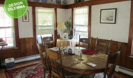
Design Dilemma: Keep or Nix Knotty Pine?
Help a Houzz User Choose a Paint Color for a Cohesive Design
Full Story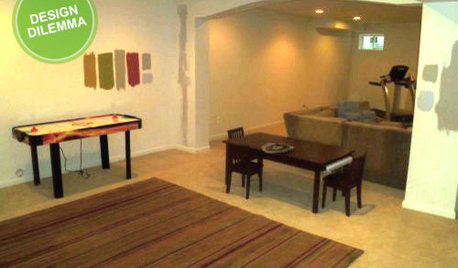
MORE ROOMSDesign Dilemma: The Perfect Basement Lounge
What Color to Paint It? Where to Put the TV?
Full Story
REMODELING GUIDESDesign Dilemma: How Do I Modernize My Cedar Walls?
8 Ways to Give Wood Walls a More Contemporary Look
Full Story
REMODELING GUIDESHave a Design Dilemma? Talk Amongst Yourselves
Solve challenges by getting feedback from Houzz’s community of design lovers and professionals. Here’s how
Full Story
KITCHEN DESIGN11 Must-Haves in a Designer’s Dream Kitchen
Custom cabinets, a slab backsplash, drawer dishwashers — what’s on your wish list?
Full Story
calidesign