


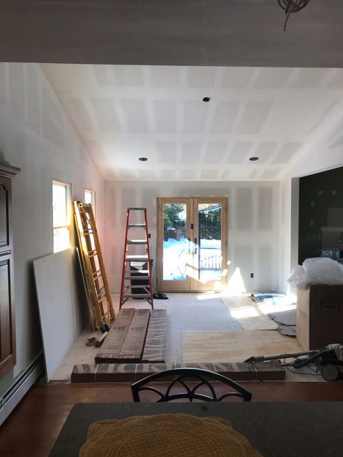
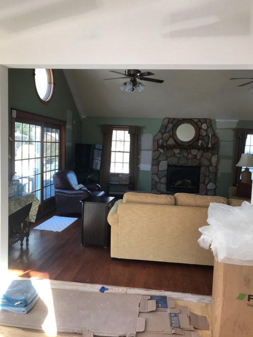
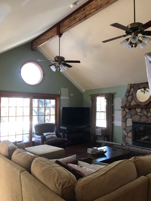
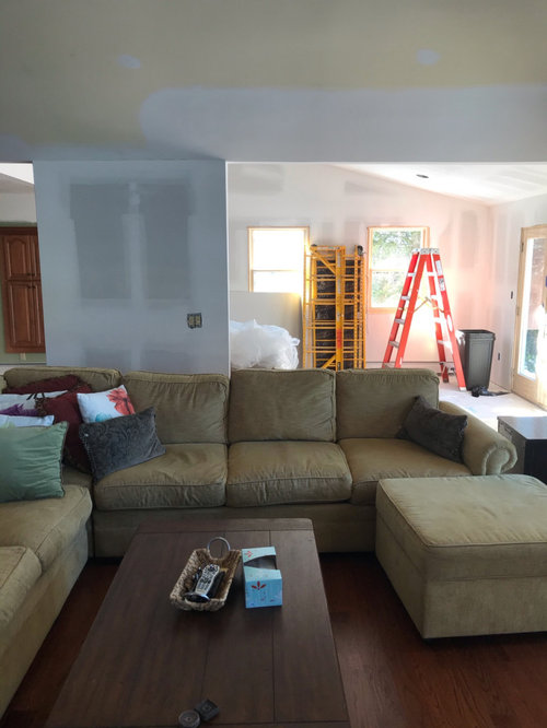
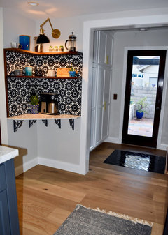
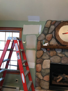
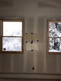
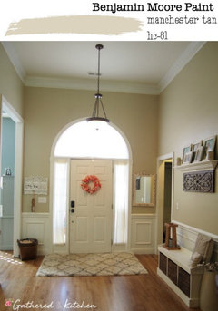
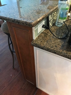
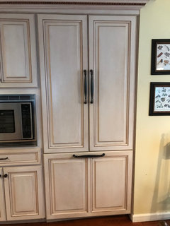
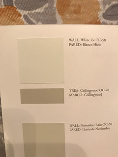
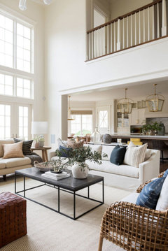
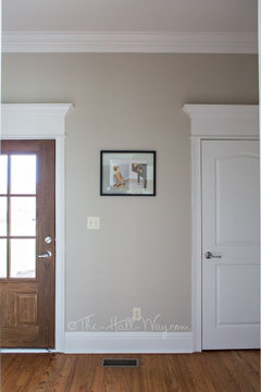
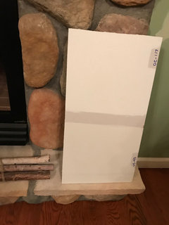
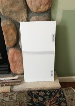
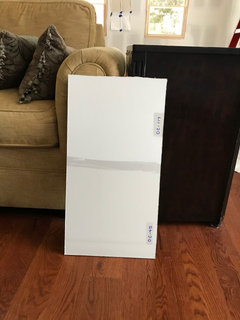
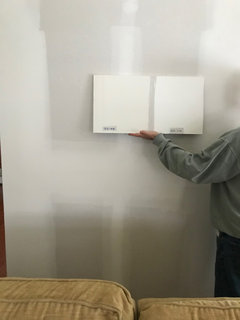
Need help with Ceiling Color with 2 different ceiling heights
dencarson
3 years ago
Featured Answer
Sort by:Oldest
Comments (58)
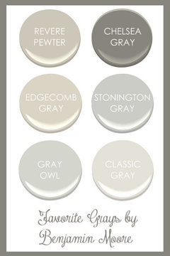
 PRO
PROBeth H. :
3 years agolast modified: 3 years ago
dencarson
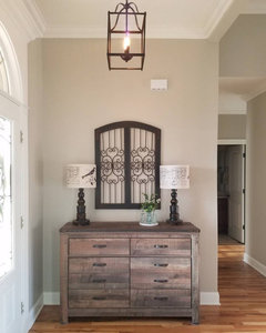
3 years agoRelated Discussions
2 windows, different ceiling distance- how to handle
Comments (5)That's a pretty room. Inside mount shades would be enough - they would give you a crisp, clean look. The post and beam construction is a focal point of the room, so using drapes to dress up the room isn't necessary. And I know you didn't ask, but have you thought about pulling the furniture away from the wall, placing the front legs of the furniture on the area rug?...See MoreCeiling Color for "Different" Ceilings
Comments (3)Ah! Another Van Courtland Blue fan! In the dining room, I'd paint keep the trim white, paint the ceiling the wall color only 50% lighter, and I'd paint the "Wedding cake" a rich crimson, like Sherwin Williams Crimson Red. I think it would be elegant with the light form the chandelier reflecting off of it. If the person you wish to express gratitude to has their email available on their profile page, you can email him or her directly. If not, you can either find them on another thread and then pop in and thank them, or sure, just start one to thank them. This post was edited by Tibbrix on Thu, Aug 28, 14 at 20:10...See MoreDifferent window and door heights for 10ft ceiling
Comments (21)Depending on your choice of trim, the windows/doors might end up different heights regardless. I was thinking about this thread a bit earlier while we were at our build and then looking at some other houses in construction. As I mentioned upthread, we have 10/8 and 9/6'8 ceiling door combinations on the 1st and 2nd. Our HOA doesn't allow for 10' on the 2nd floor :( Part of the difference in the feel is exaggerated by the stairs going upstairs being in the great room which has a 22' vaulted ceiling. Going up the stairs immediately there are 2 doors which feel low. To try and combat that, we added crown to the family room there to try and draw eyes away from the door frames. Will report back if that works! Keep in mind too that the width of the doors can also affect the perceived spatial characteristics. A neighbor has the same issue with transition, but on their 2nd floor they have a 5 foot cased opening with 6'8 doorway. I know it's a 9 foot ceiling but walking through it after the 10/8 below felt like one of the seven dwarves reporting for work at the mine. A mix of heights isn't terribly bad. Our basement has 9.5 and a mix of 8 and 6'8 depending if it's finished/unfinished areas. In large open spaces the 6'8 seems fine, the 8 is nice to define bedroom/office area....See MoreDo I need a different wall color-not painting ceiling
Comments (3)The white up there looks very pink on my monitor, and no, I dont like it with your ceiling. Do you know what the color white is thats on your ceiling? I assume that is flat, I would try to match that, and then use matte, or eggshell sheen on the walls....See More- PRO
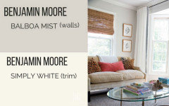
Beth H. :
3 years agolast modified: 3 years ago dencarson
3 years ago- PRO
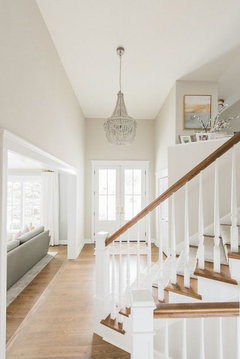
Beth H. :
3 years agolast modified: 3 years ago Marylee H
3 years agodencarson
3 years agohorzz
3 years agodencarson
3 years ago
lwfromny
3 years ago
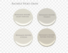
Rachel Lee
3 years agodencarson
3 years agoHU-966718201
3 years agoLynn G
3 years agogolfer32
3 years agoaniluap2
3 years agoHU-770706726
3 years agohorzz
3 years ago
acm
3 years agocalidesign
3 years ago
littlebug zone 5 Missouri
3 years agodencarson
3 years agodencarson
3 years agodencarson
3 years agodencarson
3 years agodencarson
3 years ago- PRO
Beth H. :
3 years ago dencarson
3 years ago- PRO
Beth H. :
3 years agolast modified: 3 years ago dencarson
3 years ago
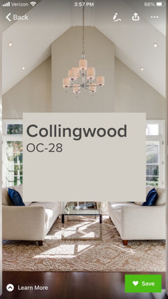
hu818472722
3 years agodencarson
3 years agogolfer32
3 years agodencarson
3 years agodencarson
3 years ago- PRO
Beth H. :
3 years agolast modified: 3 years ago lwfromny
3 years agoHelen Leo
3 years agombartley56
3 years agocalidesign
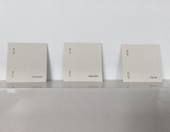
3 years agodencarson
3 years agodencarson
3 years agodencarson
3 years ago- PRO
Beth H. :
3 years ago dencarson
3 years ago- PRO
Beth H. :
3 years ago kristeneff
3 years agodencarson
3 years agokristeneff
3 years agodencarson
3 years ago


Related Stories
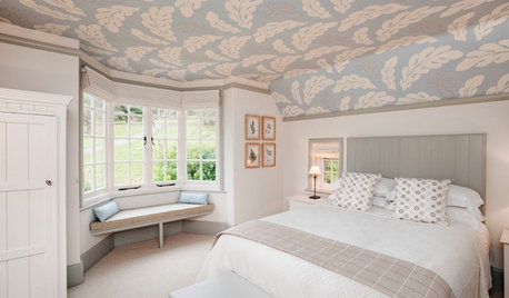
DECORATING GUIDESThe Fifth Wall: Creative Ceilings Take Rooms to New Heights
A plain white ceiling isn’t always the best choice for a room. Consider these options for soothing to stunning effects
Full Story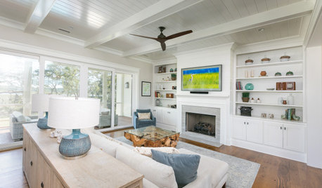
DECORATING GUIDESHow to Choose a Ceiling Fan for Comfort and Style
Houzz pros share what fan size to buy, what blade angle to look for and which type works with your ceiling height
Full Story
DECORATING GUIDESAre Ceiling Fans the Kiss of Death for Design?
Ceiling fans get a bad rap for being clunky and outdated, but these streamlined styles and a bevy of pros beg to differ
Full Story
DECORATING GUIDESDesign Debate: Should You Ever Paint a Wood Ceiling White?
In week 2 of our debate series, designers go head to head over how classic wood ceilings should be handled in modern times
Full Story
DECORATING GUIDES11 Tricks to Make a Ceiling Look Higher
More visual height is no stretch when you pick the right furniture, paint and lighting
Full Story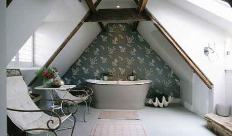
CEILINGSEmbrace Your Low Ceiling With One of These Clever Design Tricks
Don’t let a low ceiling cramp your interior style. Use these ideas to help fool the eye and make more of your space
Full Story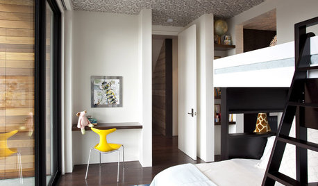
DECORATING GUIDESTop It Off: Wallpapered Ceilings Take the Eye High
Check out these rooms to see the difference a wallpapered ceiling makes
Full Story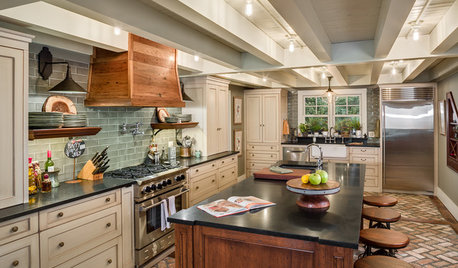
KITCHEN OF THE WEEKKitchen of the Week: ‘Raising’ the Ceiling in a Creative Way
A smart design solution helps a South Carolina kitchen feel more spacious and adds industrial style
Full Story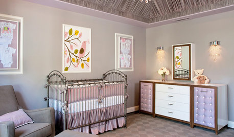
CEILINGSTented Ceilings Raise the Bar
Whimsical or elegant, fabric or paint tenting can take your rooms to new heights
Full Story0
DECORATING GUIDESStandout Ceilings Give Rooms a Lift
Ceilings with mirrors, polka-dot decals and tin tiles help these rooms look pulled together
Full Story

Marylee H