


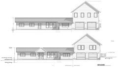
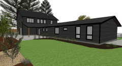
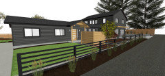
Critique this house layout and appearance
Evan Edstrom
3 years ago


Featured Answer
Sort by:Oldest
Comments (62)

partim
3 years agonoreaster10
3 years agoRelated Discussions
Please critique our house layout
Comments (4)Dekeoboe, That is such a great question!!! How perceptive of you. We spent a lot of time going over that point and feel we'll be okay not building the extra rooms. Most homes have a lot of entertaining space because it's far from the city, so we think our open plan will satisfy that requirement. Even though it seems really odd, based on the other homes in the neighborhood, we don't think having the two bedrooms will be too much of a problem for resale. Having more certainly wouldn't hurt of course. Because most of the residents don't have kids still at home and the lots are large, the future owner would probably build a guest house if they needed more rooms. Thanks for pointing that out because it really does seem weird....See MorePlease critique our house layout
Comments (4)Bmorepanic, thanks a lot for responding! Someone told me the same thing on the building forum, that it's just too light. I agree. You should see it in person, huge, dark.. a real beauty! :) My husband (complete with engineering skills!) is going to work on making this better and I'll repost. I guess I should make a new thread so people won't have to scroll down to see the update. He asked if I needed help and I said 'ooooh no, I'm sure I can do this'.. haha.. I couldn't even figure out how to scan it darker! In the next drawing I'll label the rooms clearly and will add the measurements as you suggest. Should I include all the text again or did I confuse things by sharing too much? Your wonder about the master vs kitchen near the garage is soooo good. I've been struggling with it for quite some time. Orignally the kitchen was drawn where the living room is (the bottom right) but I moved it to where it is a compromise because that was too far. I realize it's still kinda too far. The reason not to put the kitchen by the garage, was twofold. Because the south view (bottom) is so good, we were advised having a hike to the kitchen would be a good trade off because that enables the great room (kitchen/living/dining) to be a third larger with even more windows which will make the room even 'greater'. It also enables us to have the kitchen open to the living room which fits better with our casual lifestyle. I mainly care about having it open because we'll have enough windows regardless. I am planning on having some sort of soft wheeled cart so I can load up at the car and cart in my bags all at once (I love this idea!) with room to store it in the pantry. Oh, yes, the other solution, which we drew up, was moving the garage on the bottom left, on the left side of the entry, but that trade off is that the garage is in prominent view when driving towards our house (down a hill and long driveway). It wouldn't be balanced by seeing the garage next to a bigger house because most of the house will be hidden. Not a bad thing but we were advised not to do it if you can avoid it. So what I have learned, in designing this house is that everything is a give and take because each little things affects something else. I always assumed it would be soooo easy. I have a new found respect for designers and architects. I just thought they made things pretty :) Thanks again... I should have the new and improved version up in a couple of days....See MoreNew constrution kitchen - layout critique welcome - Pic heavy
Comments (26)Thanks for all of the nice encouragement. There are several areas of the kitchen which I feel pretty strongly about, and then there are the ones I am uneasy about. I think the Marcolo / rhome concern of too many steps for something as simple as a bowl of cereal is certainly worth considering, and I am going to work to tighten up those functions which are common for us. I have one of those little "planning desks" in my current kitchen and at any given time it is piled with papers, bills, kids pemission slips, and mail. If I have somebody coming over, I quickly dump it all into a basket which quickly becomes a black hole! My little room behind the cooktop (Rachel's space) is to allow my mess, keep it close by, but keep it out of the kitchen area. I know this little space will be a favorite, and it is really there only to handle a roofline issue. The home planning area, is where I was thinking the kids could do homework --- they would be close by, but not in the loud main room --- I knew it would be darkish, and would have no windows, but that is a bit by design as the computer will not have a glare and the printer and all of that stuff can be tucked away in here. The butler's pantry will likely house the more formal china, and it is where guests can help themselves to wine, beer, drinks and a food buffet, though I think it will mainly function as a bar during parties, and food will likely be on the island. My thinking is the butler's pantry is a good connector to the dining room, and the great room, kitchen and porch. The corridor is wide enough for some milling around, and there will be a sink in there, but the related clean-up area will really be on the island. I'm OK with that. One of the other things that you've all made me consider, is the steps to do things like get cereal. What if the 2 cabinets flanking the kitchen table have a fridge and freezer drawer, coffee maker, mugs, sugar bowl, glasses and bowls on one side. On the other side, what if they have 2 big drawers (size of fridge drawers) filled with the cereal boxes. Silverware is another issue. Would it make sense to keep the daily silverware over by the table? If so, couldn't I just take the silverware basket out of the dishwasher and take it (or have the kids take it) over to that area to empty. In that case, a daily meal (cereal and coffee, and juice) would all be handled right there at the table. Clean-up would involve setting the dishes through the little pass through (I could make this a door, but I think I like the pass-through) and then loading the dishwasher, etc. Not too bad, it only involves the breakfast and clean-up area. Now, things are more complicated for other meals. Setting the table would mean getting plates, etc. out of the "dish pantry" area. In my little baking area, I think the comments are totally on --- I think I need to put uppers here for baking supplies. That would allow me to put drawers below for things like mixing bowls, pans, mixers, etc. The toaster could also go out here as well. I know I have lots lots more to figure out --- but thanks for all of the help thus far. Marcolo, thanks so much for the design and reclaimed wood, etc. encouragement. I have always loved these things and sometimes people look at me like I'm crazy, but I really love them. Good to know that I'm actually going to be current for a little while at least!...See MorePlease critique this kitchen layout
Comments (45)The refrigerator: Since you're building from scratch, you have the choice to do things so that they'll be most efficient. If you go with a counter-depth refrigerator, you'll be forced to choose from a relatively small selection, and you'll pay a premium price for your 'fridge -- not only now, but later when this one needs replacing. Not the best choice. Recessing a refrigerator can work well, but it's going to impact the room behind. I believe the best choice is to go with slightly deeper cabinetry on that wall. It'll probably cost about the same amount as recessing the refrigerator, but you'll get the benefit of a slightly deeper pantry and coffee area. As long as I don't have to lose more than the 6" pullout on the island, it's a definite possibility. I hate paying the premium for the built in fridge and getting less space inside. Would it look silly to keep the counters on that side regular depth and pull out the fridge, coffee station and pantry? Or would I also need to pull out the counters and cabinets along that wall too? And then what would I do about the wall cabinets? Would those get pulled out too? (I'm short and don't want to have to use a stool every time I need something from the bottom shelves.) Designing for the cook, not the walk-throughers: Yes, the kitchen should be designed for the cook ... but the passers-through are still going to walk through, and failing to plan for them will inconvenience the cook. Realistically, you've gotta think about BOTH groups, or the design will fail. That is why I kept the aisle on the fridge side 48" since I figured the majority of the walking through with multiple people would be happening over on that area. By offsetting the cooktop with the sink and ovens I felt I could get away with 42" on the cooking wall/cleanup area. Especially since in the cleanup area, people can push dishes, etc across the island. LOL. The space between the island and the dining table: I suppose this is bouncing off the above thought. 4' between the island and the table isn't enough, especially when you have seating on both sides. You really need 5', and 6' wouldn't be out of the question. I'd lose the sliding doors behind the dining room table ... and I'd install banquette seating against the wall (and, obviously, nice windows above the banquette). This will gain you plenty of space for the walkway without "upping" your square footage. And since you have the same sliding door literally feet away in the living room, no function has been lost. As I replied to you Mrspete in the building a house forum, it's an idea I'm definitely going to look into. One thing I can do so I have easy access to the outdoors from the kitchen without having to go through the living room is to move the door to the back hall down a bit....See More
bpath
3 years agoranchtastic
3 years ago PRO
PROBeverlyFLADeziner
3 years agobpath
3 years agolast modified: 3 years agoUser
3 years ago
bluemarble
3 years agobluemarble
3 years ago
Evan Edstrom
3 years agoEvan Edstrom
3 years agolast modified: 3 years ago
Indecisiveness
3 years agobluemarble
3 years ago
Elaine Doremus Resumes Written
3 years ago
Olychick
3 years agobpath
3 years agoEvan Edstrom
3 years agolast modified: 3 years agoIndecisiveness
3 years ago
cpartist
3 years agopartim
3 years agolast modified: 3 years agobluemarble
3 years agoPRN
3 years agocpartist
3 years agobluemarble
3 years agoSusan L
3 years agopartim
3 years agobluemarble
3 years agolatifolia
3 years ago
tartanmeup
3 years agogrewa002
3 years agolast modified: 3 years agopartim
3 years agoloobab
3 years agobluemarble
3 years ago
Ig222
3 years agobluemarble
3 years agoloobab
3 years ago
Lynne Thomas
3 years agobluemarble
3 years agoK H
3 years agoloobab
3 years agolast modified: 3 years agobluemarble
3 years ago
Missi (4b IA)
3 years agoEvan Edstrom
3 years agobluemarble
3 years agoroccouple
3 years agolast modified: 3 years agojackowskib
3 years agolast modified: 3 years agores2architect
3 years agolast modified: 3 years agotartanmeup
3 years agoK H
3 years ago


Related Stories
HOUZZ TOURSNew Layout and More Light for a Family’s 1940s Ranch House
A Los Angeles designer reconfigures a midcentury home and refreshes its decor
Full Story
ARCHITECTUREHouse-Hunting Help: If You Could Pick Your Home Style ...
Love an open layout? Steer clear of Victorians. Hate stairs? Sidle up to a ranch. Whatever home you're looking for, this guide can help
Full Story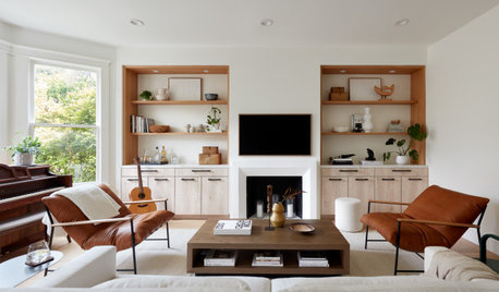
REMODELING GUIDES10 Keys to a Well-Functioning House
Looks are important. But practical matters like layout, storage and lighting directly affect comfort
Full Story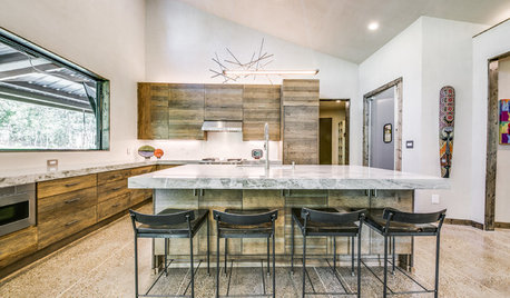
MODERN HOMESHouzz Tour: Builder Moves From Party House to Kid-Friendly Home
A Texas pro designs and builds a one-story home with a safe room and an unconventional layout just right for her family
Full Story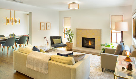
BEFORE AND AFTERSHouzz Tour: Clunky Layout Reworked for a Comfortable Family Home
These before-and-after photos reveal a transformation from chopped-up to spiffed-up
Full Story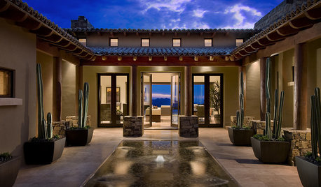
LIGHTINGGreat Compositions: Light and Private Courtyard Houses
Courtyard homes treat you to sun, light, air — and a new way of looking at the landscape
Full Story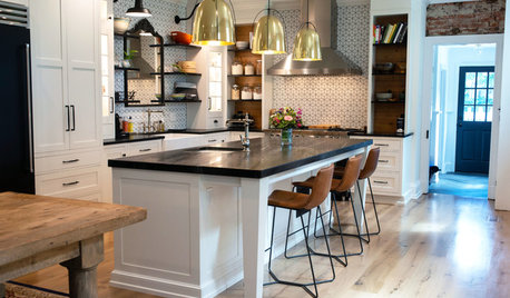
KITCHEN DESIGNKitchen Update Befitting an 1880s Federal-Style House
An interior designer opens up the floor plan and balances old and new in a Pennsylvania home
Full Story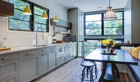
KITCHEN DESIGNKitchen of the Week: More Light, Better Layout for a Canadian Victorian
Stripped to the studs, this Toronto kitchen is now brighter and more functional, with a gorgeous wide-open view
Full Story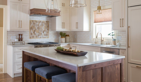
BEFORE AND AFTERSKitchen of the Week: Creamy White, Warm Walnut and a New Layout
Years after realizing their custom kitchen wasn’t functional, a Minnesota couple decide to get it right the second time
Full Story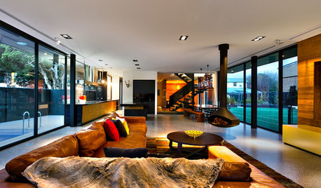
CONTEMPORARY HOMESHouzz Tour: Warm Touches for a House of Grand Proportions
Scandinavian influences ensure character, functionality and easy maintenance in a large family home
Full Story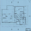


noreaster10