


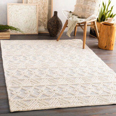
ISO 12x12 Neutral Rug
Sugarcakes2
3 years ago
Featured Answer
Sort by:Oldest
Comments (10)

elcieg
3 years agoRelated Discussions
rug help please!
Comments (12)While either rug could work, from a more practical standpoint, the one on the left I think would hide the dirt much better since you say they live on a farm I think that would be a prime factor. While Overstock doesn't mention the manufacturers of the rugs, I found the ones I ordered made by Safavieh. My experience has been with these rugs at that price point is that they are prone to shedding. The 8x10 I ordered it was a huge problem for several months and I finally put the rug under my bed and it doesn't seem to shed anymore. The smaller runner rug has also shed, though much less and seems to lessen more as time goes by. It is something to definitely think about seriously, though; if you want to take a chance of several months of shedding which looks like you have a dog in the house even if you don't. The fibers would get on my floor and the leather ottoman, on people's clothes if they sat on the floor. You may tell from reviews of your rug if that is a problem or not. When reading reviews, do a search on your rug iso you can check the reviews from different sizes to get as much feedback as you can about the rug prior to purchasing. Ultimately, I ended up replacing the tufted overstock rug in the family room with a more expensive handknotted rug which I purchased also from Overstock. Now that my tufted rugs are done shedding, I'm happy with them but for the first 4-5 mos. I was not. The other option at your mother's price point is to get a snythetic rug which does not shed. Wool, however, is better at repelling dirt and moisture....See MoreLayering rugs
Comments (19)Sounding good. Crowded or wonderfully inviting and interesting? Especially in winter. It's all in how it's done. I'm still trying to figure it out. I do think if you're going to create an inviting coziness at the bottom of the room, you do need to carry it up. Pairing an airy spare look above with a cozily layered look below is likely to do no good for either look. Visual dissonance. In your case, the obvious start would be at the windows. Simple curtain/drapery panels gathered on rods, which would also create a greater feeling of shelter over the winter. (Later, if you wished, you could hang a second, lighter or heavier layer.) Hang them from just above the transoms. Move the chairs at the end of the room in from the windows,and with them deepen the layers of focus in that area. BTW, I do know that, in general, dark colors are easier to layer, but also colors that are similar in value, i.e., degree of lightness/darkness. Very generally speaking, lessening the strength of contrast (on a wall, say) even as the amount of detail increases is a way to make it work. There are various ways to accomplish a layered room beautifully, though. If you find pictures of rooms you love, you can analyze them to figure out how their elements are arranged and why they work....See MoreISO Buffalo Check tie up window treatments or other suggestions
Comments (11)They will do whatever you want and yes, they will give you the amount of fabric to buy as well. They didn’t have a picture of this type of valance on their site and all I had to do was show them a sample pic of what I wanted. I asked for some additional length so there would be more gathering and that was fine. She also gave me some guidence on measuring to make sure they would be perfect. I bought the fabric from Fabric.com (which is owned by Amazon) and had it shipped directly to them. I had to buy quite a bit for mine because of the repeat, but to my surprise, they returned all of the unused fabric to me. There’s more than plenty for a runner so I may be doing the same. Turn around time was faster than expected too. The only thing I want to warn you about is that with the ties, make sure your fabric is just a simple light weight cotton. I chose a heavier tie fabric because it was a perfect match to the cream in the valance fabric but it’s too stiff or heavy and harder to tie. Oh, and you can order fabric samples from Fabric.com, I would recommend doing that just to make sure the check in the fabric is ample and the weight of the tie matieral is good. Here is the other one over the sink....See MoreHow to Determine Undertones of Neutral Paint?
Comments (118)Oh that is such a good question, Jennifer! I love it that you are really thinking about this. The big difference as illustrated on the Sherwin Williams Poised Taupe graphic that you posed (and I made) is the illuminant. We have TWO illustrated - D65 and D50. An illuminant mimics a light source; D65 and D50 are two different colors of light - you can see what they look like on the diagram below. The light is boss. Change the light and you change how the color looks. I used two different illuminants on purpose to demonstrate how a Poised Taupe's hue family shifts based on the light source. So, easyRGB and the NIX are very close 4YR and 5YR - that's an expected and acceptable margin of error. Actually, it's an amazingly tiny margin of error considering we're talking about two different devices measuring two different color chips in two different environments. The Color Muse measurement for Poised Taupe's hue family is 1YR because I measured the color with a D50 illuminant - a different color of light. It SHOULD be different from notations calculated from measurements captured under a D65 illuminant. The point of the graphic I made, the bottom line is Poised Taupe belongs to the Yellow-Red hue family, D65/2° and D50/2°. If Poised Taupe shifts and looks purple-ish or reddish or whatever, then we know the quality of light is not balanced and from that point of knowing, we can develop an informed color strategy for the space. The fact that all three of these notations in this example are so close is a testament to the efficacy and usefulness of these inexpensive hand-held color measurement tools. Being able to toggle between illuminants, like D65 and D50, with these devices is super helpful because it enables the color pro to get two different perspectives on a color. Since every person sees color differently, it's helpful to take a look at color notations from two illuminant perspectives because it helps a color pro anticipate how a color could be perceived differently by different humans. When it comes to color data values, all the dots connect every single time. If there is a disconnect or inconsistency, there's a reasonable reason. Even if that reasonable reason is the human perception of color is a natural phenomenon and shift happens....See More
Sugarcakes2
3 years agoSugarcakes2
3 years ago
Jilly
3 years agolast modified: 3 years ago PRO
PROBeth H. :
3 years agolast modified: 3 years agoSugarcakes2
3 years ago
ldb123
3 years agoSugarcakes2
3 years agoldb123
3 years ago
Related Stories
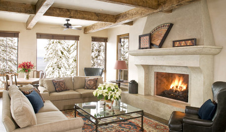
DECORATING GUIDES12 Ways to Work With Rugs for Warmth and Beauty
Try these ideas for rug placement, style and size for a pulled-together look and a great feel underfoot
Full Story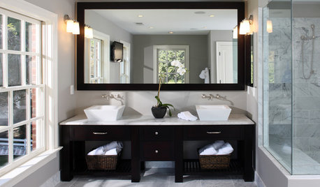
BATHROOM DESIGN12 Tricks for Updating the Bathroom
Give your bath a lift with a fab new mirror, rug, hardware, wall covering or color
Full Story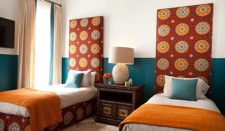
DECORATING GUIDES12 Ways to Celebrate a Fabulous Patterned Headboard
These extravagant bedroom textiles are events unto themselves. Let the revelry begin
Full Story
COLOR12 Tried-and-True Paint Colors for Your Walls
Discover one pro designer's time-tested favorite paint colors for kitchens, baths, bedrooms and more
Full Story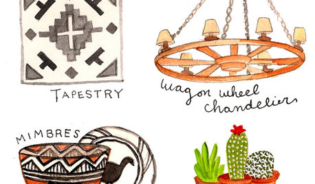
DECORATING STYLES12 Decor Pieces That Kick It Up Southwest Style
Rustle up some desert-style design from kitschy to eye catching with these Southwestern essentials for the home
Full Story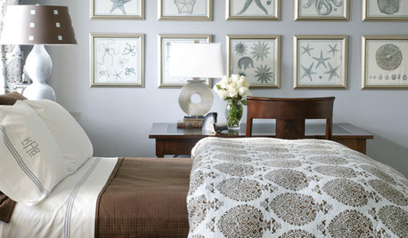
BEDROOMS12 Ways to Turn a Bedroom Into Your Sanctuary
See what you can do to make your bedroom feel more relaxing, comforting and cozy this year
Full Story
MOST POPULAR12 Key Decorating Tips to Make Any Room Better
Get a great result even without an experienced touch by following these basic design guidelines
Full Story
DECORATING GUIDES12 Deadly Decorating Sins
Are your room designs suffering from a few old habits? It may be time to change your ways
Full Story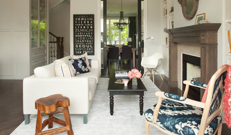
FURNITURE12 Sofa Colors That Won't Box You In
With any of these colors as a base, you can change your decor as often as you change your mind
Full Story
KITCHEN DESIGN12 Ideas for a Knockout Kitchen
Give your cooking space sizzle with color, pattern and materials used in unexpected ways
Full Story

Beth H. :