


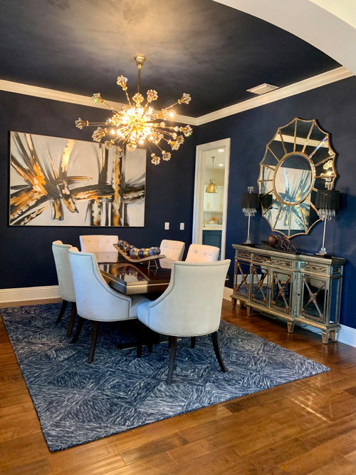
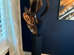
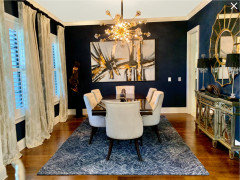
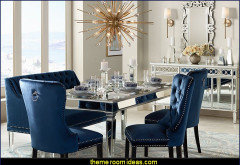
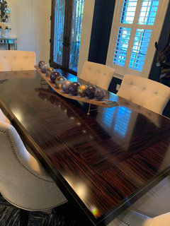
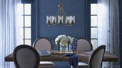
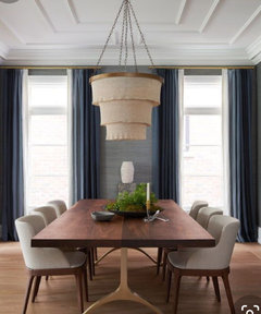
Dining room design dilemma- is the issue the drapes, rug or art?
Sherry
3 years ago


Featured Answer
Comments (39)
Related Discussions
Need art advice- Hollywood Regency meets Art Deco
Comments (8)Hi Blessedbe. I used to live in an incredible Streamlined Deco apartment building built in 1940, with terrazzo floors, glass block walls & steel casement windows with metal Venetian blinds 12 feet wide--the widest made--and although it's been 25 years since I lived there, I still love that sleek look. OK, so you don't mention whether your whole place is, like mine was, actually of the period, or if it's newer construction, and you also don't say whether you're going for an authentic period look--as though your bath might have been decorated during the era & somehow survived intact till now, or whether you're making a room that's about the era & the style. They're two totally different things. Either way, forget Maxfield Parrish & Alphonse Mucha. Both were wonderful artists, but they're both way earlier, and their lush colors & lavishly ornamental style have nothing to do with the slick, high-contrast style typical of late Art Deco that you're after. In fact, when Bette Davis' elegant movie characters were swooning about in sleek penthouses & nightclubs, both Mucha's & Parrish's artwork would have been considered hopelessly old-fashioned, and all that adding them into the mix would do is muddy the concept. Paris & San Francisco, on the other hand, were both sophisticated & up-to-date, with plenty of shops & theatres & apartments & hotels executed in just the glamourous style you're after. In fact, Paris' exhibition in 1937 & San Francsco's in 1939 represent the pinnacle of the style's development just before the dark days of WWII put a sudden end to the party. But watch out if you're thinking about using photos: there are a lot of classic photos of both cities that, like the Mucha & Parrish posters, would only confuse your decor. The Eiffel Tower is too old by half a century to say anything about the Art Deco era, and while the Golden Gate bridge is an icon of 1930s design, neither image would have been used to decorate a bathroom of the period. Nor would a picture of Bette Davis, talented though she was. No, those things--movie star portraits, photos of landmarks of the period, vintage magazine ads for, say, Evening in Paris perfume or Packard automobiles, covers from Fortune magazine or Vogue, colorful fruit crate labels, vintage travel posters featuring the Pan-American Clipper or the 2oth Century Limited--while perfect for a room that's ABOUT the period/style, are all wrong for a bathroom that's meant to look as though it's FROM the same period. OK, maybe a struggling actress or a shopgirl living on the cheap in an efficiency apartment might hang a picture of Bette Davis in her tiny bathroom, but only becasue she could tear it out of a magazine for free and hang it in a ten-cnt frame from Woolworth's. But a wall full of ads & commerical art wasn't likely to appeal to most people, even if they wanted to hang artwork in their baths, which generally, they didn't. For the upper classes--the target audience, after all, for the styles that we call (thanks to Kelly Werstler & Bevis Hiller) Hollywood Regency & Art Deco--the whole point of 1930s baths was Glamour Without Fussiness. That's why they went for rich or striking new materials on the walls--marble, Vitrolite, colored or engraved mirror--and often, strong color in the fixtures: by making beauty inherent in the materials themselves, they could eliminate superfluous ornamental touches. You wouldn't have found pretty crocheted doilies or dainty flower arrangements or frilly curtains in any high-style bathroom of the period. As Belle Watling said in 1939, "It wouldn't be fittin'." So, if you want a true period look but you still want a bit of decoration, you might try adding a stenciled (or taped) border (a zigzag, or a Greek key, or a very-authentic angel-fish-&-bubbles motif in black & one other color--there are lots of possibilities) just above the tiles or just below the ceiling. Stenciled & painted designs are an authentic look, because a border is actually part of the room rather than something in the room. And, on the other hand, if you're doing a room that's not intended in any way to be authentic but one that's, rahter, ABOUT the period, you have a lot more possiblities beyond the obvious cliches. If it's photos you want, look at the striking black-&-white images that Hedrich-Blesing took for the 1933 World's Fair here in Chicago. Their lustrous shot of the Chrysler building at night has gotta be the most drop-dead glamorous photo of the whole century. I think you can buy a reproduction from the Library of Congress. Or check out Ewdard Weston's work, if you don't know it. Once you've seen his voluptuous, suggestive photgraphs of produce, you'll never look at a green pepper the same way again. For Art Deco drawings, look up Hugh Ferris' work. His renderings of Hoover Dam are awesome. For posters, look at the work of A.M. Cassandre, or Joseph Binder, whose graphic work between the wars is some of the most powerful ever. And since this approach is not really authentic for the period, anyway, there's one more image that would fit in just fine with the style & also with the black-&-white scheme you've already got going on: Richard Estes' iconic painting "Drugs" from the Art Institute of Chicago. It's a 196Os piece, but the subject is a classsic late-1930s facade in curved black Vitrolite & bent glass, and I bet the AIC has it in reproduction. I hope this suggests the two different approaches you can take as you finish your room. Be sure to post some pics when you get your room the way you want. Regards, Magnaverde....See MoreDining Room Update - Chandy size and wall art
Comments (60)I agree with your husband: trust your instincts. Sure, you'll have a couple of missteps, but that's to be expected as none of us are static and many of us upgrade as budget permits -- just part of the process of learning about yourself. Fill your home with what you love, however slowly as you need to create your haven, not ours. That being said, your perfect daylight greige is likely affected by the lightbulbs. Try Reveal and add a dimmer if you don't already have one. Lots of candles as everyone looks fab by candlelight and your DR will be wonderful. Next paint job on your agenda in another room, if you want to save a bit of money, try Pittsburgh Paint Manor Hall. Nearly half the price of Aura, and I like the hand ever so much better. I've used Aura for years since it first came out, but I really like Manor Hall better. As far as your chandie/mirror dilemma, I'd opt for round on one and rectangular on the other. Since you already have the mirror and are open to leafing or painting it, then an easy out is a round chandie. Have you looked at any of the antique crystal chandies on Ebay and considered adding a drum shade? But if you truly think you'll love the rectangular chandelier, I've seen some nice ones of Ebay as well as the selection on Overstock. Finally, rather than wed yourself to a color concept for the back of the cabinets, would you consider paper, fabric or even painted panels that you can change when you want? You can easily find just the right striking print or color rather than struggle with paint. Many of us have bought enough samples to paint a house so that's not a route I'd advise. I'm a fan of practical displays until you have the budget to devote to passion collections so add whatever sparkly crystal stemware and candlesticks and any silver pieces you have to the cabinets for the interim. HTH!...See MoreDesign Around #18: The Art of Kitchen Design.
Comments (24)For those who are messing with this challenge, I empathize. This is harder than it at first seems. Once you get the color decisions made, you then have to find products to fulfill it. Ain't easy. Many times they are "close matches" at best, close but no cigar. The discussion on the other thread has run toward a discussion of the difference between using color when creating art and using color when decorating a living space. Color variations allow painters to create spacial dimension within the artwork whereas in color applications in interior decorating, the variations in a color that occur because of light's effects through spatial dimension and object orientation can thwart a color scheme. If that all sounds esoteric, I apologize. It's easier to understand intuitively than to explain. This makes me think about the House Beautiful series of features using paintings or photos to make a color scheme--they draw out a color from each of a number of prominent places in the image. I can't seem to find an example of one of these features in the online site, but subscribers will know what I'm talking about. I bet the editors have to mess around a lot before they choose the actual color scheme, arguing about whether a matched-up color sample is a hair too green or too dark or whatever to play nicely in a multiple color palette. Another issue is whether to copy the artwork's proportional emphasis on each color or merely readjust the proportions. In my case, I'm trying to decide about floor color--the best-color-match product I'd actually enjoy having on a real floor is not a dominant color in the art piece. And unless I decide to use painted cabs I have to work in real wood colors also and that creates another emphasis conundrum also....See MoreDo you put as much thought into your art and accessories as your rug?
Comments (40)"Nobody looks at rugs." They do at my house. Maybe that's because I spend as much time choosing them as choosing art ;) And in looking at my rugs, just as in looking at my art, people see something of my history and who I am. The rugs say that I've spent time in the Middle East and the Indian sub-continent, that I like tribal art, and that I'm not afraid to hang rugs and "rug-like objects" on my walls as art as well as place them underfoot. The art says I've got eclectic taste, like different materials and media, and do not buy art as decor. Some of the first things I bought, over 40 years ago, have been in homes on four continents and there's always been a place for them because they're important to me. Same goes for the "accessories" (and I confess, I'm no minimalist!) I love the shapes and workmanship of a lot of Islamic things - trays, water jugs, even a chapati container. But I've also got a couple of beautiful bowls inlaid with mother of pearl from Fiji, some Greek ceramics, Murano glass, a framed piece of a Hindu temple door, and a Haida carving from my native BC. Essentially, these are the story of my life. None of my things were expensive or are particularly valuable - but they matter to me more than the most perfect Persian silk carpet or the most expensive oil painting because I can tell a story about each one of them....See More
Sherry
3 years agolast modified: 3 years agoSherry
3 years ago PRO
PROCelery. Visualization, Rendering images
3 years agolast modified: 3 years agoSherry
3 years ago
K R
3 years agoK R
3 years ago
shivece
3 years agothomsuz80
3 years agoericalynn523
3 years ago
Carolae
3 years agojck910
3 years ago
George
3 years agoSherry
3 years agoSherry
3 years agoGeorge
3 years ago PRO
PRONorwood Architects
3 years agodi3h1s
3 years ago
Maureen
3 years agoSherry
3 years agoGeorge
3 years agolast modified: 3 years ago
justcallmepool
3 years agopkpk23
3 years ago
nhb22
3 years agolast modified: 3 years ago


Related Stories
DINING ROOMSDesign Dilemma: I Need Ideas for a Gray Living/Dining Room!
See How to Have Your Gray and Fun Color, Too
Full Story
DINING ROOMSDesign Dilemma: My Dining Room Needs Revamping!
Watch a dining-room makeover unfold in the Houzz Questions forum
Full Story
KIDS’ SPACESWho Says a Dining Room Has to Be a Dining Room?
Chucking the builder’s floor plan, a family reassigns rooms to work better for their needs
Full Story
DECORATING GUIDESHaving a Design Moment: The Dining Room
Consider these 14 tweaks to bust your dining room's look out of a matchy-matchy furniture-set slump
Full Story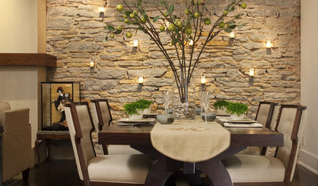
DECORATING GUIDESSingle Design Moves That Make the Whole Dining Room
See which touches elevated these dining spaces from satisfying to sensational
Full Story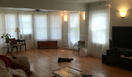
LIVING ROOMSDesign Dilemma: Share Ideas for a Navy Blue Room
Help a Houzz Reader Work With a Bold Choice for the Living Room Walls
Full Story
RUGS10 Tips for Getting a Dining Room Rug Just Right
Is the rug you’re considering the right size, shape and weave for your dining room? Here’s what to keep in mind
Full Story
DECORATING GUIDES5 Ways Art Can Improve Your Room Design
Artwork can bring together the elements of a room by being a focal point, a color inspiration, a harmonizer and more
Full Story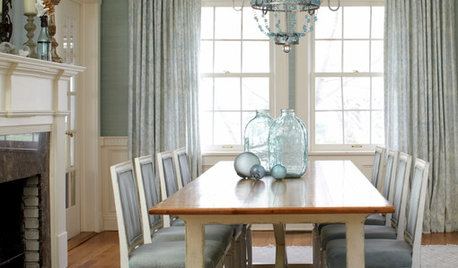
REMODELING GUIDESRoom of the Day: Antiques Help a Dining Room Grow Up
Artfully distressed pieces and elegant colors take a formerly child-focused space into sophisticated territory
Full Story
HOUZZ TV LIVETour 2 Stylish, Eco-Minded Rooms in an Interior Designer’s Home
In this video, San Francisco designer Jennifer Jones shares sustainable choices she made in her living and dining rooms
Full Story


SherryOriginal Author