Comments (31)
dorothymooney
3 years agoIf you like the Farrow and Ball color, have it matched at your Ben Moore store and use it. I have just repainted a bathroom for the THIRD time, and because I finally went with the F&B color, I love it! The F&B colors never "wow" me on the chart, but, trust me, they always look amazing on the wall. Make sure you do at least 2 coats to completely cover the Tissue Pink.
User
Original Author3 years ago@dorothymooney Thanks for the advice - Glad someone else understands the repainting and color selection struggle! Did you use the real F&B color or you got it matched from another brand? I wanted to color match at first but have read that it‘s not always accurate and the color would be slightly different in every can as well. And I was also scared to use F&B (but very tempted due to how amazing the colors are supposed to look), since I read that it’s hard to touch up and the paint chips sometimes. But it’s not like I have a very active household. Ahh, decisions :)
dorothymooney
3 years agoI had it the Farrow and Ball color mixed at Home Depot in their Marquis paint in eggshell finish. Home Depot had the formula for the color I chose, Yeabridge Green. I am the worst at color selection, always trying to match fabric or wallpaper. I now think that is a waste of time. Every time I use a F&B color, I love it. It doesn't have to match exactly. There is something rich looking about the F&B paints. I don't LOVE their colors on the chart, but on the wall, they never disappoint.
Lori A. Sawaya
3 years agoand Tissue Pink was one of the closest BM matches.
A lot of this kind of color information comes from bloggers who don't even own a fandeck.
If they're making any effort to publish correct information, they're either eyeballing paint chips at their kitchen table or eyeballing swatches on line and publishing their best guess opinion.
And we all know by now that it's impossible to render colors accurately online.
If you look at the ΔE number right below the color name, it tells you how close the color is to the target color (Pink Ground).
The colors are listed in order from most similar in color attributes to least similar.
Tissue Pink is fourth on the list with a ΔE of 1.5. That's no where near close.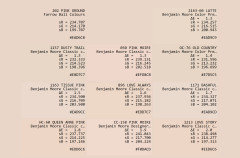
Lori A. Sawaya
3 years agoI wanted to color match at first but have read that it‘s not always accurate and the color would be slightly different in every can as well.
A brand can either color match another brand's color using its own, home paint bases and colorants or it can't.
If they can mix an acceptable match once, it's repeatable it gallon to gallon.
Best way to do a F&B color match is to order a sample can from F&B and paint a swatch. Two, evenly applied coats. Take the sample can and the painted swatch to the store so they can take a shot at mixing a match.Patricia Colwell Consulting
3 years agoNo one can match F&B paint it has more pigment and that is what makes the colors the way they are . Spend the money and get F&B I would never do an office in pink FYI but thats me.
JudyG Designs
3 years agolast modified: 3 years agohttps://www.colorsbykellyhaller.com/farrow-ball-colors-matched-to-benjamin-moore
Anything here for you?gustaviatex
3 years agoSecond the BM Opal suggestion. I used it in a bathroom and currently in my own bedroom. Very luminous and faintly peach. Most new pinks look chalky or even dirty.

User
Original Author3 years agoThank you @Lori A. Sawaya! I used that site a bit before and was always wondering what the ΔE number stands for. From what you say, the closest a match is to 0 (or 1?), the closer it is to the real color? In the screenshot you provided I can see Tissue Pink reads as more gray or mauve compared to Pink Ground. And that‘s a good idea regarding painting a sample to color match - does that lead to more accurate results than the formula they must have for the F&B colors in store? (My BM store said they can recreate any of their colors without samples needed)
User
Original Author3 years agoThank you @gustaviatex - if you have any pictures of Opal, I’d love to see! Did you select it since it’s one of the palest pinks?
Lori A. Sawaya
3 years agolast modified: 3 years agoFrom what you say, the closest a match is to 0 (or 1?), the closer it is to the real color?
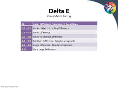
It's the Delta E Scale. For paint colors, anything under 1.0 is worth considering and visual check. And, of course, the lower the Delta E the better. Because it means there's more of a match across more attributes: hue, value, chroma.
The higher numbers on the scale where it says "may be acceptable" is for other industries, not paint and the built environment.
Lori A. Sawaya
3 years agoIn the screenshot you provided I can see Tissue Pink reads as more
Your device decides how to render color. And everyone's device displays color differently.
So that might be a true statement, it might not. Again, it all depends on how accurately your device is able to render color compared to how it looks in real life.
Bottom line, you have to compare physical chips/samples.Lori A. Sawaya
3 years agolast modified: 3 years ago(My BM store said they can recreate any of their colors without samples needed)
I'm sure they did. :)
If you don't have a target for them to match then they can tell you it's a match even if it's not and you'd never know.
If you have a sample of the real stuff, they then have a target to a) work from and b) qualify a match to.
gustaviatex
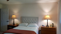
3 years agojenny_12345678 My bedroom has one high window and gets north light so it is dark most of the time. The carpet (very plush and was there when I bought the house) is a blue-gray. The walls were a pale blue and the whole room was depressing. I remembered the BM Opal from when I had used it before and hoped it would lighten up the room. The ceiling is white and I am pretty happy with the change.
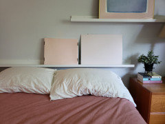
Get Benjamin Moore to mix a quart for you and paint some large white poster boards. Then move them around to different walls during the day. I did that when I was deciding. Opal is the lighter color below; I think the other was SW Faint Coral.
isabellagracepan
3 years agoI have used Farrow and Ball all throughout our home. It is lovely paint and held up very well, even with our three boys! I think there is no comparison to Benjamin Moore. BM has lovely colours, but they lack the creaminess of F&B.
If you do decide to take the plunge with F&B, it is really important to paint a sample before you commit. Because the colours are so creamy and pigmented, they can really change on the walls. I lived with painted samples for a good while before choosing colours, and even from room to room it was remarkable how different the colours could appear. I have both fan decks, but even from those larger samples it was still impossible to predict how the colours would play with the light. Our painters loved the F&B and said that they used much less of it than other brands.
Celery. Visualization, Rendering images
3 years agoBehr Island Hopping M180-1 is an exact match with Pink Ground F&B
https://www.behr.com/consumer/ColorDetailView/M180-1
Less match are Soft Shell BM and Pale Pink Satin BM
User
Original Author3 years agoThank you @l pinkmountain :) I didn’t know Houzz has existed for so long. I’m glad to know someone went through the exact same dilemma! When sampling colours, I really thought I found the perfect muted beige-peachy pink so it was surprising to see the effect of Northern light on the color, the watered down pepto bismol description is accurate. I love your tip of adding more warm pinks & warm tones overall in the room - I think I’ll do that by adding some brass, some peachy-pink wall prints, lighting, warm white curtains, etc. I already changed my work table from a cool beige to a warm wood one yesterday and it really made the a difference in the room!
User
Original Author3 years agoAnd thank you everyone for your help, I looked at all the comments and it was very appreciated!
eastautumn
3 years agoQueen Anne Pink is a little peachier than Tissue Pink but the same LRV (72), so give that a try!
l pinkmountain
3 years agolast modified: 3 years agoHouzz boards used to be called "Gardenweb" and were just discussion boards, not the shopping stuff. They got bought out about five? years ago . . . or four . . .
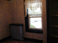
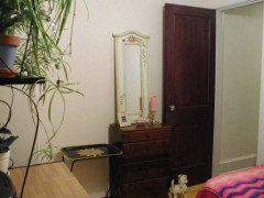
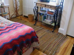
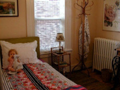
The color I used was BM "Old Country" which is supposed to be a peachy beige. It is on the same color band as "Opal" which is similar but lighter. By all descriptions it should have been perfect. By all online photos on my monitor, it reads warm peachy beige. I rounded up some old photos. I was most upset before I spent the time painting the bright blue radiator to my trim color Antique White, and before I had the reddish pine floors refinished and they turned out golden. I didn't like the color, I'm not a fan of the color gold (I grew up sadly in the "Harvest Gold" era of the mid last century so just never got into it) BUT it toned down the pepto bismol big-time. Also note how the camelish brown in the rug helps. It was an heirloom made by my grandomother. I wasn't crazy about putting it in the room at first but it turned out to be perfect. Also allowed me to display it in the guest room without it getting a lot of wear. The second photo shows the negative side of the color that I didn't like, which is on one wall with one type of light hitting it, and then the other shots are of the other walls, which look totally different . . .
The room is a little goofy decorated I know, a bit of an homage to my youth. When I started dating my now-husband he said the room creeped him out. We have moved and I still have a similar themed small guest bedroom. I live up to my screen name!
eastautumn
3 years agolast modified: 3 years agoI haven't used Queen Anne Pink yet, but as soon as I find the time and energy I plan to use it in our mudroom :) I think it's gorgeous, but it was a touch too peach for our guest room where I was looking for the perfect shade to coordinate with our guest room furniture and rug. I posted this thread about a year ago (with an inspiration picture that I think is Queen Anne at the bottom): Sophisticated Pink Paint Color Suggestions?
I tried a lot of pink paint samples, and Tissue Pink ended up being the right shade for the room which is in our basement and gets only eastern sunlight. A suggestion that helped me was to search for "blush" (as opposed to "pink") paint colors. Pink is tough to get just right, but so beautiful when you find just the right shade for your space.
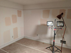
This is what our guest room looked like last year in the midst of my indecision, just before trying Tissue Pink. I wish I had labeled all the samples I tried because I can't remember all of them anymore, but I'm pretty sure Queen Anne is the upper sample on the far left.
This was a blog post that I found helpful, and you might like the color (Valspar's Champagne Glee) she ended up choosing: 9 Best Blush Paintseastautumn
3 years agopinkmountain, I love your room but it would freak my husband out too just because of the doll... He thinks all dolls are creepy ;-D
One of the colors I tried was Old Country as well because it looks perfect in so many pictures, but it went too beige in our basement room.l pinkmountain
3 years agolast modified: 3 years agoI should have gotten rid of her long ago but she has sentimental value. Her name is "Nancy Nurse" and she used to talk and tell you her symptoms when you pressed in her belly button . . . but not after I gave her a bath and rusted out her insides, then she just moaned . . . came with a nurse hat and nurse bag with plastic nurse things like a stethoscope, etc., and little plastic bed . . . I got her the same day my parents got their baby, my little brother. Dad came home with her after visiting Mom in the hospital. One baby for me, one for them . . . my husband said that made the doll even creepier . . . The doorstop is my brother's little Benjy squeaky dog . . . it's like Island of Lost Toys in there . . .
firefly_0011
3 years agoF&B Pink Ground is swatched on my walls, and it is very, very calamine-like, which you are trying to avoid. I dapped some calamine right next to the swatch, and they are identical. Just a heads up...
User
Original Author2 years ago@firefly_0011 it was so surprising to see Pink Ground looking so calamine-like sicne it’s advertised as a peachy pink! What did you end up going with?



l pinkmountain