


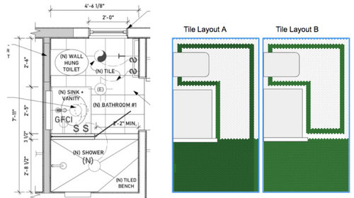
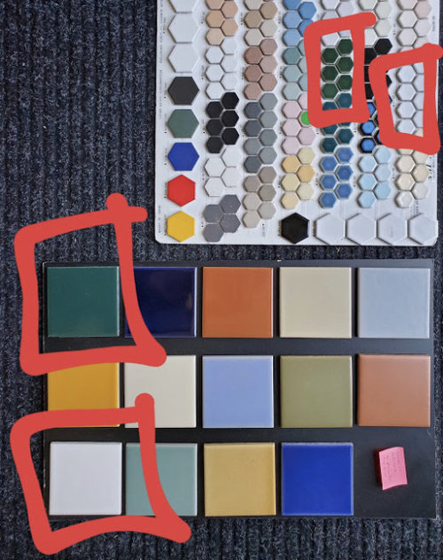
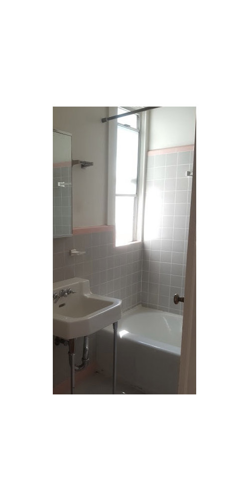
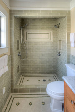
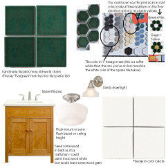
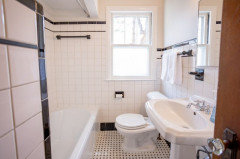
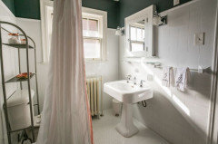
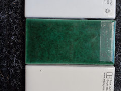
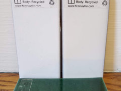
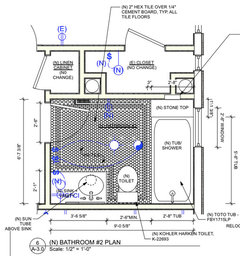
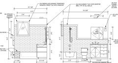
Tile questions: hex floor layout, shower curb, and tile size?
Sarah R
3 years ago
Featured Answer
Sort by:Oldest
Comments (89)
Related Discussions
Tile layout question
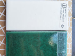
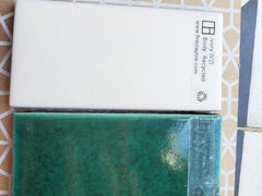
Comments (17)I measured the floor tiles (which are grouted) and 8 tiles spanned exactly 94". I measured the ceiling to floor distance around the room and there were some spots that were 95.25; most were 95. That would require furring to lower the ceiling by 1.25". I saw some Shluter trims that might be an option. One allows for 2" of tile to be inset between 2 sections of 1/2" of metal. I don't know how I would feel about adding that as a design element. Then I thought about adding a strip of wood that matches our cabinetry around under the top row of tile. I like that idea better from a design standpoint and it might be the least costly and schedule busting option other than just having thin rows of tile somewhere. The wood is IPE, used for decking and so very moisture resistant. We were just going to oil it. The wood is dark brown/red. Looks a lot like mahogany. To give every one some idea of the design elements, here is a picture of the tile which has been laid on the floor. To the left of the shower will be a 48" wide bench seat with a tall thin cabinet on sitting on the top of the left side of the bench and running to the ceiling. There will be 2 IPE shelves above the open bench area. The vanity is to the left and spans 7'3". It is a floating vanity - very linear with recessed pulls. I have also posted a picture of the vanity mockup. A freestanding tub sits across from the vanity, in front of the shower. The alcove you see on the left near the back will contain a wall mounted toilet. The one thing that gives me pause about a wood strip would affect the design is that the wall behind the tub (only up to the bottom of the window) will be tiled in a marble mosaic - Also shown below. Some marble pieces contain brown, so this may help tie into the wood. Thoughts on this solution?...See MoreShower floor tile - match charcoal slate floors or white subway walls?
Comments (14)Thank you everyone for your comments! We did a couple sample layouts tonight based on your advice, and we’re going to do the charcoal in the shower floor. If I can’t find a good quartz/etc remnant for the curb, we’ll do the large hex cut in half - with the darker gray grout we’re considering for the floor, I think it will look better than the white grout example I posted. I just can’t believe they are finally starting to do real work in the master bath - so much is changing in the house as a whole, but this is our biggest single room project with all new materials and design elements. Exciting and terrifying all at once!...See Morelarge format shower tile, size and layout?
Comments (3)@Patricia Colwell most likely the niche will be on the right hand wall in the big shower or we will keep the low ledge so all the items are not directly displayed when looking into the room. the model has a super high ledge, ours is about the height of a standard tub edge. for the stall upstairs shower we arent set which wall. its a metal framed home so its where ever one could fit and if it cant we may do a stack of a few corner shelves next to the facet and shower head. also that smaller shower is in a side 'hall' so when you look into the bathroom its to the side. here is a Pic of the layout in the model. you don't see in the shower unless you are using the toilet or getting in it. I hate caddies cause they never stay together or end up rusting. plus i dont want more things taking up room in the shower itself....See MoreShower floor tile size question
Comments (14)alwayscold,, I have cement tiles in my shower on the back wall, and a marble tile floor. If you are willing to accept that the tiles will not always look 'perfect', and will show imperfections, then get what you like. Like I said, I sealed the crap out of my cement tiles prior to install. water beads on top, w/no penetration. It's no different than the marble tile I have on the floor. after install, I used a wrong cleaner and ended up etching my brand new black marble floor tile. (just because something says "green" doesn't mean it's safe for marble!) I called in a marble restoration guy ( these guys can also do your encaustic tiles if need be) and he resurfaced all of that black marble floor. The tiles were honed. After he re-honed them, he applied this sealer. It's been 3 years and water still beads up on the tile. there is no absorption, at ALL! this was how it looked after he left. The marble isn't perfect. ( the light and dark spots you see is due to the skylight directly above) and the wall. If you look closely at the tile you'll see a lot of imprecations. that's the way it's supposed to look. it's hand made. my tile has some cracks (some broke during install) , some have some edges that aren't perfect, and you can see where the black grout has bled into the white portion (I was very careful when I grouted these. ) It's just the nature of these tiles If you want perfection and something that looks perfect years from now, get a diff type of tile!...See More
Sarah R
3 years ago
thinkdesignlive
3 years agolast modified: 3 years ago
J D
3 years agolast modified: 3 years agoJ D
3 years agolast modified: 3 years agoJ D
3 years agoJ D
3 years agolast modified: 3 years ago
Nancy in Mich
3 years agoJ D
3 years agoJ D
3 years agoNancy in Mich
3 years agolast modified: 3 years agoSarah R
3 years agoJ D
3 years agoJ D
3 years agoJ D
3 years agoNancy in Mich
3 years agolast modified: 3 years agoJ D
3 years agoSarah R
3 years agoJ D
3 years agoJ D
3 years agolast modified: 3 years agoJ D
3 years agoJ D
3 years agolast modified: 3 years agoJ D
3 years agoSarah R
3 years agoJ D
3 years agolast modified: 3 years agoJ D
3 years agolast modified: 3 years agoJ D
3 years agolast modified: 3 years agoJ D
3 years agoSarah R
3 years agoGcubed
3 years agoSarah R
3 years agoJ D
3 years agolast modified: 3 years agoJ D
3 years agolast modified: 3 years agoJ D
3 years agolast modified: 3 years agoJ D
3 years agolast modified: 3 years agoJ D
3 years agolast modified: 3 years agothinkdesignlive
3 years agolast modified: 3 years agothinkdesignlive
3 years agoJ D
3 years agoJ D
3 years agoJ D
3 years agolast modified: 3 years agoSarah R
3 years agoSarah R
3 years agoSarah R
3 years agoSarah R
3 years agoSarah R
2 years agolast modified: 2 years ago


Related Stories
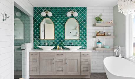
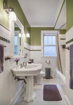
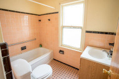
BEFORE AND AFTERSGreen Mermaid Tile and a New Layout Boost a Dated Pink Bathroom
This now-airy Whidbey Island bathroom features a soaking tub, a walk-in shower, heated floors and an expanded water view
Full Story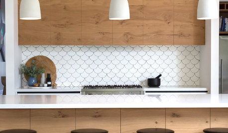
TILELet’s Talk Tile: An Alphabetical Guide to Tile Terminology
Get set for a tile project with this handy glossary of shapes, materials, finishes and more
Full Story
MOST POPULAR10 Tile Layouts You Haven’t Thought Of
Consider fish scales, hopscotch and other patterns for an atypical arrangement on your next project
Full Story
REMODELING GUIDESTop 10 Tips for Choosing Shower Tile
Slip resistance, curves and even the mineral content of your water all affect which tile is best for your shower
Full Story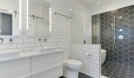
BATHROOM MAKEOVERSBathroom of the Week: High-Contrast Tile and a New Layout
Clever design choices and a wet room layout make good use of space in a compact main bathroom
Full Story
BATHROOM DESIGNConvert Your Tub Space Into a Shower — the Tiling and Grouting Phase
Step 3 in swapping your tub for a sleek new shower: Pick the right tile and test it out, then choose your grout color and type
Full Story
TILEHow to Choose the Right Tile Layout
Brick, stacked, mosaic and more — get to know the most popular tile layouts and see which one is best for your room
Full Story
BATHROOM DESIGNHow to Choose Tile for a Steam Shower
In steamy quarters, tile needs to stand up to all that water and vapor in style. Here's how to get it right the first time
Full Story
BEFORE AND AFTERSBold Tile Solves a Color Question in a Basement Bath
See this Maryland room’s transformation from dark and unused to bright and high-tech
Full Story
BATHROOM DESIGNFloor Tile Options for a Stylish Bathroom
From the countless choices of bathroom tile available, we focus on some of the best looks for the floor
Full Story

J D