


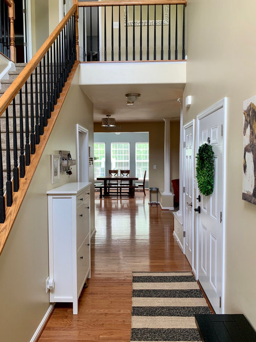
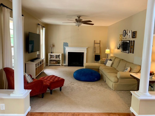
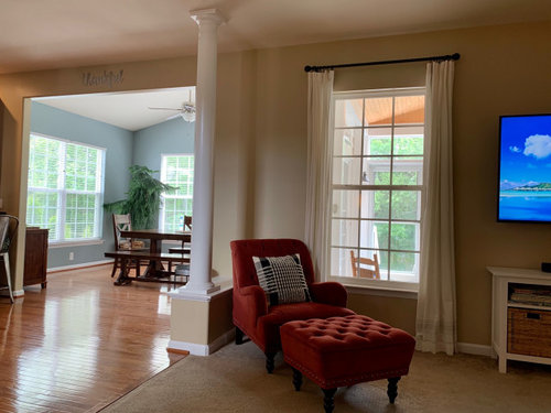
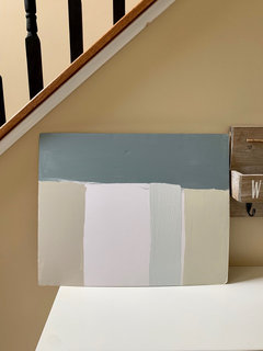
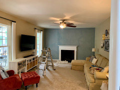
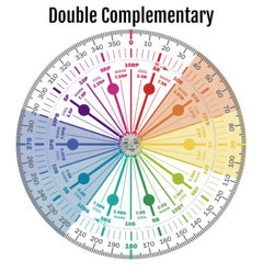
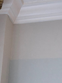
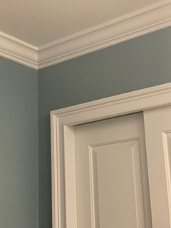
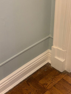
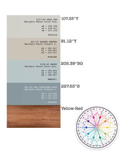
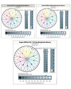
Benjamin Moore Van Courtland Blue - Coordinating colors?
User
3 years ago

Featured Answer
Comments (60)

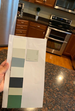
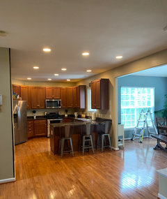
Marylee H
3 years agoUser
3 years agoRelated Discussions
Coordinating Benjamin Moore Colors
Comments (2)Decor4fun, I'm not a good enough visualizer to imagine all of that at once -- at least well enough to give good advice. I will say though that I would try to keep things simple as far as color is concerned because you already have a lot going on with the room flow and angles of your walls. The personal color viewer on the BM site was really helpful for me. We went with Affinity colors too -- harmony and did an accent wall that was interlude. We have a vaulted living room and decided to leave the slanted ceiling the off white color it already is to accent the architecture. Also, we were absolutely shocked at how much darker the color made the room at night. The white walls we previously had reflected a lot of light around the room. Our colors are in the taupe/tan family so we didn't expect that. Also, whatever you do, if you use more than one color in the same family, pick two that are at least one color away from each other on the swatches (not right next to each other), otherwise it looks sort of ridiculous. best wishes!...See MoreClose But Not Quite - Kensington Blue Benjamin Moore
Comments (24)Could you post more photos of the bathroom please. You might be able to do one wall in the darker blue and lighter color on others. But need to see whole space. The shower tiles look white. So a gray on the walls might look dingy so I would match any light color to the white tiles. So two main options. Or a combo of two colors. Don’t use more than two colors with the colorful tile. Love the accent tile....See MoreBenjamin Moore color check
Comments (21)"Join the Kitchen Cabinet Painting Experts FB group and expose yourself to what real world pros do." LOL. No thanks - my paint work that I have done will stand up to damn near anyone calling themselves a "pro" these days. I've been trying to hire painters to finish the trim painting in my home, for 2 months. Can't find a single one that will do the job as it should be done. I'm sure they know how, but they simply will NOT do it. Lots of people talk the talk. Finding the ones that walk the walk is a different story. (I had a custom-made island done, 3 years ago. Fabulous cabinetry - and he loves Advance paint.)...See Moredeck floor board color to match BM Van Courtland Blue
Comments (1)Yes but what color are the rails? And you mean wood stain, right? Why do you want to match the house color...you mean coordinate with it? I can't picture a blue deck. Natural Cedar would be a nice contrast to the blue....See MoreMarylee H
3 years agoUser
3 years agoMarylee H
3 years agoMarylee H
3 years agoUser
3 years agoUser
3 years agoMarylee H
3 years agoUser
3 years agoUser
3 years agoMarylee H
3 years agoUser
3 years agoUser
3 years agoUser
3 years agoUser
3 years agoMarylee H
3 years agoUser
3 years agoMarylee H
3 years agoMarylee H
3 years agoGcubed
3 years agoUser
3 years agoUser
3 years agoUser
3 years agolast modified: 3 years agoMarylee H
3 years agolast modified: 3 years agoGcubed
3 years agoGcubed
3 years agoUser
3 years agoUser
3 years agoUser
3 years agolast modified: 3 years agoUser
3 years agolast modified: 3 years agoUser
3 years agoUser
3 years agoUser
3 years agoUser
3 years agoMarylee H
3 years agoUser
3 years agolast modified: 3 years agoUser
3 years agoMarylee H
3 years agoUser
3 years ago
Lizzie Borden
3 years agocharmingcottager
2 years agoHU-879168933
last year


Related Stories

COLORColor of the Week: April Sky Blue
See how to use this soft neutral hue that’s neither gray nor pure blue
Full Story
FRONT DOOR COLORSFront and Center Color: When to Paint Your Door Blue
Who knew having the blues could be so fun? These 8 exterior color palettes celebrate sunny-day skies to electric nights
Full Story
COLORCooking With Color: When to Use Blue in the Kitchen
Keep your cool. We show you when to nosh around navy or try a taste of turquoise so you can stay relaxed while finishing your kitchen
Full Story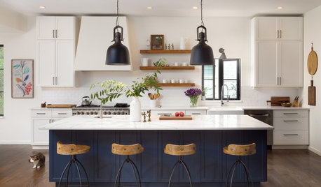
KITCHEN ISLANDS8 Blue Paint Colors to Consider for a Kitchen Island
Discuss these appealing shades with your kitchen pro to see which one might be right for you
Full Story
COLORDuck Egg Blue, the Friendliest Color Around
This appealing hue transcends trends, spans styles and gets along with many other colors. Could it be right for one of your rooms?
Full Story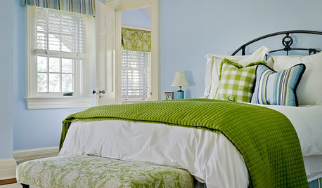
COLOR PALETTESSummer Color Combo: Blue and Green
Consider 10 fresh approaches to the tried-and-true pairing
Full Story
COLORNature’s Color Wisdom: Lessons on Blue From the Great Outdoors
Take some cues from the sea and sky to find a blue to match any taste and mood
Full Story
DECORATING GUIDESHot Color Combo: Cool Blues and Warm Brass
It's trending all over, but navy or royal blue with brass or gold just also might become a new classic pairing
Full Story
DECORATING GUIDESClassic Color Duo: Blue and White
For rooms that exude simplicity and elegance, consider the timeless color combination of blue and white in your interior design
Full Story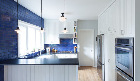
COLORKitchen Color: 15 Beautiful Blue Backsplashes
Blue is the new cool kid on the backsplash block, showing up in shades from pale ice to cobalt
Full Story


Marylee H