


No one has found a *slightly* lighter Agreeable Gray, right?
R H
4 years ago
Featured Answer
Sort by:Oldest
Comments (53)

Marylee H
3 years agoMarylee H
3 years agoRelated Discussions
Agreeable Gray looks Pink???
Comments (26)I think Gray Owl is the winner. It is subtle and similar to my inspiration pic and definitely not pink. I chose another color and now I cannot for the life of me remember the name. It came out a little brighter and slightly bluer/greener. I need to go back to be sure. It was fairly dry but it is a very overcast foggy day, so I might change my mind! I will keep you posted! When I go back I will take better photos. Here is a photo. Photos never show what is reality, so I am not sure this even helps. From left to right Name of blue/gray/green paint I cannot remember Second is Gray Owl Last is the pinkish hue of the agreeable gray (not agreeing with me)...See MoreAccessible Beige and Agreeable Gray together?
Comments (29)Wordly gray and anew gray will make the alabaster molding pop , but anew gray have more contrast. Contrast invites the eye in and is what gives the wow factor. The more contrast the more drama. It gives your room a canvas where the tone is set to decorate and the music begins. Alabaster cabinets are beautiful with contrast when paired with black brushed granites and black matte knobs and handles. Don’t be afraid to contrast your wall color with a deeper chroma. As a designer, I see lots of people going lighter and before you know it the walls are all white. Look at paintings and study the art in museums no one paints an all white painting....See MoreIsland color for agreeable gray kitchen
Comments (9)@Kate Horowitz You have a good eye! You are correct in saying that finding a green to go with agreeable grey is a challenge. All color has a DNA, it's HUE Family, Value lightness/darkness, and Chroma colorfulness/greyness. In theory if the two colors you are trying to pair are similar in one of the parts, they should be harmonious. This is not always true, as beauty is in the eye of the beholder. So you cannot pair by numbers alone and should always see if you think it looks pretty. SW Agreeable grey is part of the Yellow hue family and has a Chroma of 0.74. I found you greens that are either next door in the green-yellow hue family (diad1 relationship) or the green hue family (diad2 relationship). In all cases I tried to keep the Chroma close to Agreeable Grey's to strengthen the relationship. Your picks of SW Retreat, and Pewter Green are good choices. I have included a few others. Hope this helps....See MoreSW agreeable gray vs pure white
Comments (21)LCH is measured at 6504k. Difference between LCH and LRV You use a spectrophotometer to measure both. The spectrophotometer measures the light being reflected off the surface. Both measures use the same standard luminance D65 (daylight) (defined as k=6504.) LRV is measured using a 10 degree standard observer and LCH uses a 2 degree standard observer. (viewing angle). Remember that these color measurements are measuring the various wavelengths of light reflected off a colored surface. It is measuring the actual attributes that are sent to your retina when you look at a color. The study of human perception of color is ongoing. Our brains are incredibly complex. We don't even know if what you were taught was the color "Red" is seen by you the same way as it is seen by me. We were both taught that we call that color "Red", but there is no way to know how our individual brains perceive that color. We do know that individuals all have different sensitivity to color and that our mood (dopamine levels) influences how much color we see. We also know that we view color in context. White next to black looks much brighter than it does next to cream. Measurements are very helpful, but color preference, sensitivity and context have to be evaluated as well. The reason that colors with a hue in the 70s and 80s may look pink or purple when we have a low chroma is that our brains interpret gray and blue very similarly. Add blue to yellow and you get green. Add blue to red and you get purple. In that orange space you may see more purple or pink tones. Pink beige, orange beige, taupe or violet gray. It may look more beige in one light and more gray in another light or more beige when you are happy and more gray when you are sad, or more beige when next to a grayer gray and more gray when next to a truer beige. This is true for every color around the color wheel. The amount of light and quality of light and other colors can play a huge role in selecting whites....See MoreMarylee H
3 years ago PRO
PRODesign Interior South
3 years agosalonva
3 years agoR H
3 years agoMarylee H
3 years agoR H
3 years ago- PRO
Design Interior South
3 years ago 
cawaps
3 years agoMarylee H
3 years agolast modified: 3 years agoR H
3 years agoR H
3 years agoPeaceOfHome
3 years agolast modified: 3 years agoR H
3 years agochiflipper
3 years agoMarylee H
3 years agoMarylee H
3 years agoMarylee H
3 years agoR H
3 years agoMarylee H
3 years agoD Walker
3 years agoR H
3 years agoD Walker
3 years agoR H
3 years agoR H
3 years agoD Walker
3 years agoMarylee H
3 years agodianeski
3 years agoMarylee H
3 years agodianeski
3 years agoMarylee H
3 years agoMarylee H
3 years agodianeski
3 years agoR H
3 years agoR H
3 years agoR H
3 years agodianeski
3 years agoR H
3 years agodianeski
3 years agoR H
3 years agoR H
3 years agoaniela13
3 years agoMarylee H
3 years agoHU-688590269
2 years ago
Bellevue Turner
11 months agolast modified: 11 months ago

Related Stories

GRAYChoosing Paint: How To Pick the Right Gray
Which Version of Today's 'It' Neutral Is For You?
Full Story
KITCHEN DESIGN8 Gray Kitchens That Nail Warmth and Balance
Look to subtle undertones and the right mix of cool and warm tones in your color choices
Full Story
MOST POPULARRethinking Beige in a World Gone Gray
Gray, the ‘it’ neutral of recent years, has left beige in the shade. But is it time to revisit this easy-on-the-eyes wall color?
Full Story
DINING ROOMSColor Feast: When to Use Gray in the Dining Room
The right shade of gray pairs nicely with whites and woods to serve up elegance and sophistication
Full Story
COLORHow to Layer Tones of Gray for Depth and Harmony
Use texture, pattern, contrast and more to create a subtle, sophisticated look with this popular color
Full Story
MOST POPULARWhat’s Your Neutral: Beige or Gray?
A designer shares 10 tips for using the neutral shade that works best for you
Full Story
DECORATING GUIDESColor Guide: How to Work With Charcoal Gray
The most modern neutral, charcoal gray looks great in dining rooms, living rooms and even nurseries. Here's how to use it best
Full Story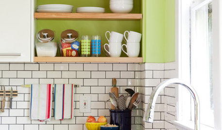
KITCHEN DESIGNSubway Tile Picks Up Gray Grout
Heading into darker territory, subway tile offers a graphic new look for kitchens, bathrooms and more
Full Story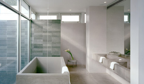
GRAY8 Ways Your Bathroom Would Look Great in Gray
Gray may be a neutral, but it need not be dull
Full Story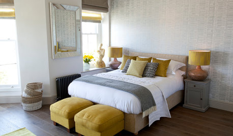
COLOR10 Pretty Ways to Refresh a Gray Palette
Energize your favorite gray shades with pick-me-up accents as fresh as a spring day
Full Story


R HOriginal Author