


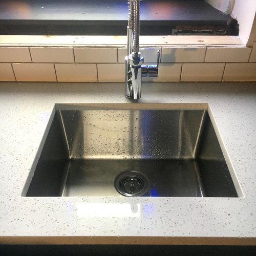
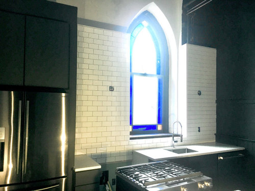
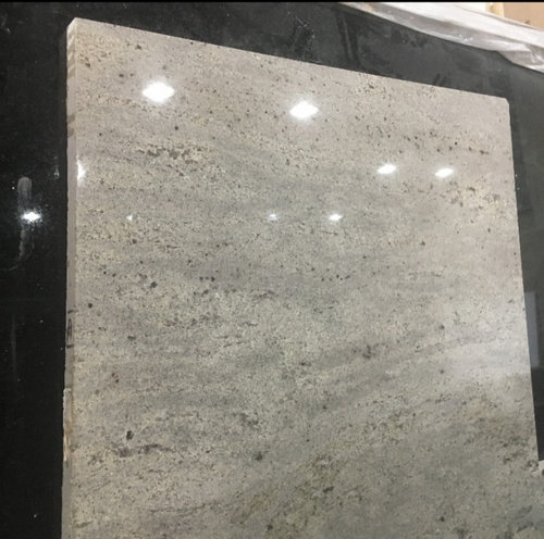
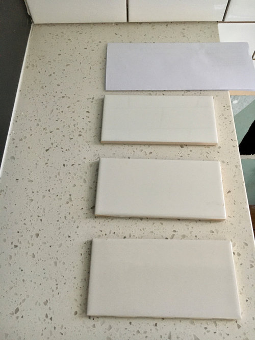
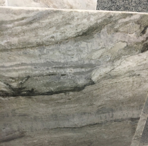
Quartz Counters Color Issue
Joey R.
4 years ago
last modified: 4 years ago

Featured Answer
Sort by:Oldest
Comments (19)

Joey R.
4 years agoJoey R.
4 years agolast modified: 4 years agoRelated Discussions
Seems show worse on light color quartz counter than dark?
Comments (4)Probably, but only because the seam, even if done well in a white quartz counter, will gather dust and gunk, which will turn dark. Eventually, this will stand out against a white counter while it would blend into a dark counter, whose seam is matched dark to begin with. Same idea as with tile and white vs. dark grout. I ave a nice tight seam in my white Caesarstone Blizzard counter. I barely notice it, but I take care to keep it clean. There was a recent post about this, where I posted pics of my seam. Here is a link that might be useful: Another Seam thread...See MoreCambria Quartz Issues
Comments (16)UPDATE: It was fixed. So Cambria sent someone out and the cracks were filled sometime at the end of July/beginning of August. You can't feel or see them now. I mean I know where they were, but if you don't, you'd never see them. Their technician did a wonderful job. I'm extremely happy with their customer service- very professional. And regardless of whose fault it was (theirs or the fabricator), they did right by their customer and fixed it. ETA: And the most important part- no new cracks! That was my biggest worry....See MoreNeed Quartz counter top advice and staining issue
Comments (1)Look at the damage the BKF did to the samples please....See MoreQuartz counter color
Comments (6)“I really thought this wasn't a snarky group, guess I was wrong.” @Cherie Sampson don‘t put that on this group. Your OP didn’t even have a full sentence. You expect advice when all you did was name 3 items out of the air, no context, no explanation, no photos, no discussion of the kitchen, or the style you like. What kind of person expects people to take the time to write advice when she herself can’t take the time to write one sentence? And then you chastise US. Thank goodness there are plenty who come here with questions who are not like that....See More
live_wire_oak
4 years ago
wolfgang80
4 years agoJoey R.
4 years agoJoey R.
4 years ago
Katie B.
4 years agoJoey R.
4 years agoKatie B.
4 years agoJoey R.
4 years agolast modified: 4 years agoJoey R.
4 years agoKatie B.
4 years agolast modified: 4 years agoJoey R.
4 years agoKatie B.
4 years ago


Related Stories
KITCHEN DESIGNKitchen Counters: Stunning, Easy-Care Engineered Quartz
There's a lot to like about this durable blend of quartz and resin for kitchen countertops, and the downsides are minimal
Full Story
KITCHEN DESIGNTop Colors and Materials for Counters, Backsplashes and Walls
Neutral colors and engineered quartz reign in kitchen remodels, according to the 2020 U.S. Houzz Kitchen Trends Study
Full Story
INSIDE HOUZZInside Houzz: The Right Kitchen Counters in Just a Few Clicks
Concrete kitchen countertops eluded this Pennsylvania homeowner until she turned to Houzz
Full Story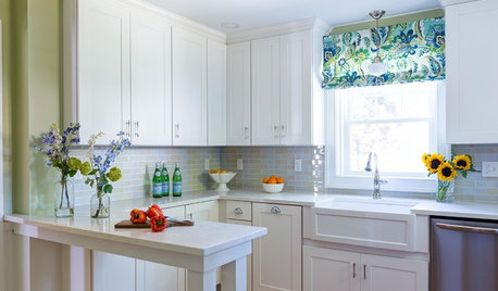
INSIDE HOUZZWhat’s Popular for Kitchen Counters, Backsplashes and Walls
White is the top pick for counters and backsplashes, and gray is the most popular color for walls, a Houzz study reveals
Full Story
KITCHEN COUNTERTOPSQuartz vs. Granite: The Battle of the Countertops
Read about the pros and cons — and see great examples — of these popular kitchen countertop materials
Full Story
KITCHEN COUNTERTOPSWhy I Chose Quartz Countertops in My Kitchen Remodel
Budget, style and family needs all were taken into account in this important design decision
Full Story
KITCHEN COUNTERTOPSWhat’s the Difference Between Quartzite and Quartz Countertops?
Weigh the pros and cons of these popular kitchen countertop materials
Full Story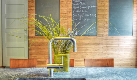
KITCHEN DESIGNKitchen Counters: Durable, Easy-Clean Soapstone
Give bacteria the boot and say sayonara to stains with this long-lasting material that's a great choice for kitchen and bath countertops
Full Story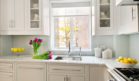
KITCHEN COUNTERTOPSKitchen Counters: Quartzite Offers Strength and Beauty
Eye-catching patterns and a natural pedigree make durable quartzite a popular alternative to granite and marble
Full Story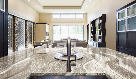
KITCHEN COUNTERTOPSKitchen Confidential: The Case for Quartz Countertops
If you want durability, consistent coloring and a low environmental impact, quartz might be the right material for you
Full Story

Katie B.