


SW White Trim color for BM Ashwood or BM Halo
nancy_nickoley
4 years ago
last modified: 4 years ago
Featured Answer
Comments (21)

nancy_nickoley
4 years agolast modified: 4 years agoRelated Discussions
Ceiling Color - BM Cloud White, Atrium White or SW Pure White?
Comments (2)I have used SW Pure White and really like it. If White Dove has more yellow in it (not sure if it's a creamy white) then you could get away with BM or SW matching Swiss Coffee for the ceiling. It's not a pure white, just a tinge warmer but still very crisp looking....See MoreRedbazel-Did You Paint BM Ashwood?
Comments (1)Hi. Headache tonight poking around on my iPad did a search for my board name and saw your painting question. So funny. I’m guessing that as we are 7 years down the road, you’ve painted... maybe repainted by now? Or wait. Perhaps... you sold your house (with the beautiful Ashwood master bedroom) the next year-then has a small house built and used the builders taupe except for repainting the master in another of Joan’s colors, Titanium, the day you got keys? You loved that house So Much but sold it last year so you could move clear across country, landing in North Georgia where you are doggedly repainting every room in a very blah little house? No? Oh wait. That was me. How are you TTODD and what lovely color is playing backdrop to your ironstone now? Red...See MoreSW Dover White and BM White Dove for trim
Comments (5)I think I remember reading that Alabaster was close to White Dove. Dover White is more creamy yellow. Both are nice colors! We just used White dove for the ceilings and trim in our newly remodeled bedrooms. I really like the color even though we have creamier trim throughout the rest of the house....See MoreSo many whites!! PPG vs BM vs SW and color matching...
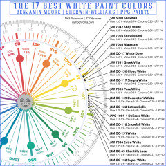
Comments (118)@Lori A. Sawaya Happy Thanksgiving !! I am looking to get some idea before appointment as first time buyer for Kitchen. I am looking for 2 tone kitchen cabinet, Thanks a ton for above thread, upper could be PPG Dedicate white and lower equivalent to BM Hale Navy, would you please help to find equivalent of BM's Hale Navy on PPG, I checked Cavalry & Annapolis Blue both are near to that but I am not sure, if those are accurate. Ceiling : PPG Dedicate White, Trim - PPG Dedicate White , Counter - White & Grey Granite, Cabinet : Upper Fixture : PPG Dedicate White, Lower : BM Hale Navy equivalent., Island : BM HN, South Facing large open concept Kitchen with Family Room, Breakfast Nook : PPG Whiskers equivalent to Agreeable Grey. Attached catalog pages for reference....See Morenancy_nickoley
4 years agolast modified: 4 years agonancy_nickoley
4 years ago PRO
PROLori A. Sawaya
4 years agonancy_nickoley
4 years ago- PRO
Lori A. Sawaya
4 years agolast modified: 4 years ago 
Jennifer Hogan
4 years agoHU-361149640
4 years ago- PRO
Lori A. Sawaya
4 years agolast modified: 4 years ago nancy_nickoley
4 years ago- PRO
Lori A. Sawaya
4 years ago - PRO
Lori A. Sawaya
4 years agolast modified: 4 years ago - PRO
Lori A. Sawaya
4 years agolast modified: 4 years ago EvaElizabeth
4 years ago- PRO
Lori A. Sawaya
4 years ago


Related Stories
TRIMTrim Color Tips: Get Your White Trim Right
Set off wood tones, highlight architectural features, go minimalist ... white trim is anything but standard when you know how to use it
Full Story
MOST POPULARMust-Try Color Combo: White With Warm Off-White
Avoid going too traditional and too clean by introducing an off-white palette that brings a touch of warmth and elegance
Full Story
TRIMWhat Color Should You Paint Your Trim?
Learn the benefits of painting your trim white, black, neutral, a bold color and more
Full Story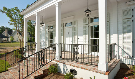
EXTERIORSTake It Outside: How to Use White on Your Home’s Exterior
The right shade of white on walls or just trim will make your house look crisp and clean
Full Story
WHITEDesigner Secrets: 10 Pros Share Favorite Off-White Paints
From creamy white to barely beige, these hues will warm up your room
Full Story
WHITEHow to Pick the Right White Paint
White is white, right? Not quite. See 8 white paint picks for 8 very different effects
Full Story
DECORATING GUIDESDesigner Secrets: 10 Pros Share Their Favorite White Paints
Decorating experts look to these hues when they want a go-to white they can count on
Full Story
COLORColor of the Year: Off-White Is On Trend for 2016
See why four paint brands have chosen a shade of white as their hot hue for the new year
Full Story
WHITEWhat to Know Before You Paint Your Walls White
A coat of white paint can do wonders in one room and wreak havoc in another. Here are tips for using the popular hue
Full Story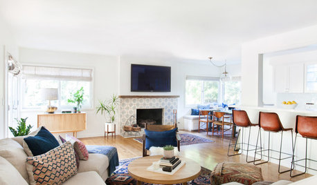
DECORATING GUIDES10 Reasons to Embrace White Walls
Do they strike you as even more boring than watching white paint dry? Consider what makes them the darling of so many
Full Story

Lori A. Sawaya