


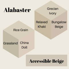
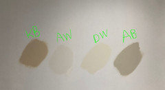
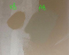
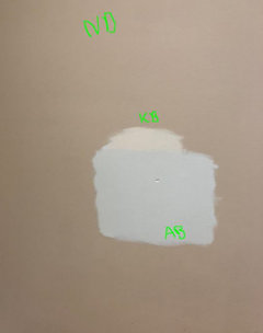
EMERGENCY HELP! I WANT TO CRY!! SW ACCESSIBLE BEIGE IS TOOOO GRAY!
Jamie Schroeder
4 years ago
last modified: 4 years ago
Featured Answer
Sort by:Oldest
Comments (53)

Jamie Schroeder
4 years agoJamie Schroeder
4 years agoRelated Discussions
Accessible Beige and Agreeable Gray together?
Comments (29)Wordly gray and anew gray will make the alabaster molding pop , but anew gray have more contrast. Contrast invites the eye in and is what gives the wow factor. The more contrast the more drama. It gives your room a canvas where the tone is set to decorate and the music begins. Alabaster cabinets are beautiful with contrast when paired with black brushed granites and black matte knobs and handles. Don’t be afraid to contrast your wall color with a deeper chroma. As a designer, I see lots of people going lighter and before you know it the walls are all white. Look at paintings and study the art in museums no one paints an all white painting....See MoreBenjamin Moore’s version of accessible beige?
Comments (10)A few things: if you went to any paint store that sold Benjamin Moore and you asked them to make you something similar to Accessible Beige, they could -- A few similar colors that come up in Ben Moore's color system for accessible beige are: 1. Inner Balance (1522) 2. Stingray (1529) 3. Smokey Taupe (983) 4. Ice Formations (973) 5. Litchfield Gray (HC-173) You can try those colors first, but they vary just a little in terms of their undertones. Benjamin Moore's paints are usually recommended by contractors because of their smooth application, their dry times, and the amount of coating you need versus something from Home Depot (takes 3-4 coats and is thinner). Revere Pewter is nice, definitely on the warm side and a VERY popular home color....See MoreWall color - natural tan or accessible beige?
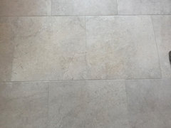
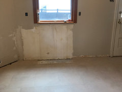
Comments (25)Totally understand the dilemma of trim that “came With the house” repainting trim is expensive If the color on the walls in the pic above the latte pic is natural tan, i don’t mind it. But I do see some green undertones in the natural tan swatch which is why it might be making your trim look yellowish. On the wall in that pic though i see what you mean by bluish dirty gray. I don’t dislike the color, but i see how it’s not what you were going for. By cut it, i mean make it 60%. Tell the Sherwin will people and they‘ll know exactly what you mean. Decreasing the darkness/depth will increase the light reflective value. Accessible beige at full “strength“ will be dark like the latte. You want half strength or 60% accessible beige. Show them the depth of natural tan and tell them you want accessible beige at that depth. they will know better than me what percentage will get you the same depth. They do it for me all of the time. They can make a little 4 dollar can for you to try. Also, off the top of my head, i think sherwin Williams worldly Gray might look nice. Try grab the Sample card of that while you’re in there. It’s a really really pretty color and the right depth....See MoreAccessible Beige looks green in natural light
Comments (4)I agree with you assessment. Accessible Beige is part of the Yellow Hue Family and is actually very close to Yellow-Red, which in turn may show peachiness. But color is seen in context to what is around it, and light is everything. Because you have so much green around outside, your walls are reflecting that green. Apart from repainting with a color that would sit further within the yellow-red hue family, to counter the green, there is not much you can do. I would add more brighter green accents, as that may trick your eye in seeing the walls more grey, but I cannot be certain how much it will help. If you don't want to repaint, embrace what nature has given you. You have been blessed with gorgeous surroundings. You have a stunning room, with incredible bones....See Moreroccouple
4 years agoJamie Schroeder
4 years agoJamie Schroeder
4 years agoJamie Schroeder
4 years agoJamie Schroeder
4 years agoJamie Schroeder
4 years agolatifolia
4 years agoJamie Schroeder
4 years agoJamie Schroeder
4 years agoJamie Schroeder
4 years agoJamie Schroeder
4 years agoJamie Schroeder
4 years agoJamie Schroeder
4 years agoJamie Schroeder
4 years agoJamie Schroeder
4 years agoJamie Schroeder
4 years agolast modified: 4 years agoJamie Schroeder
4 years agolast modified: 4 years agoJamie Schroeder
4 years agoJamie Schroeder
4 years agoJamie Schroeder
4 years agolast modified: 4 years agoJamie Schroeder
4 years agoJamie Schroeder
4 years agolast modified: 4 years agoJamie Schroeder
3 years agoJamie Schroeder
3 years ago


Related Stories

MOST POPULARRethinking Beige in a World Gone Gray
Gray, the ‘it’ neutral of recent years, has left beige in the shade. But is it time to revisit this easy-on-the-eyes wall color?
Full Story
EXTERIORSHelp! What Color Should I Paint My House Exterior?
Real homeowners get real help in choosing paint palettes. Bonus: 3 tips for everyone on picking exterior colors
Full Story
GRAYDesigners Share Their Favorite Light Gray Paints
These versatile neutrals can help create a range of moods in any room
Full Story
DINING ROOMSColor Feast: When to Use Gray in the Dining Room
The right shade of gray pairs nicely with whites and woods to serve up elegance and sophistication
Full Story
COLORHow to Layer Tones of Gray for Depth and Harmony
Use texture, pattern, contrast and more to create a subtle, sophisticated look with this popular color
Full Story
MOST POPULAR50 Shades of Gray
Gray is hotter than ever, thanks to a hit novel full of risks and dark secrets. Tell us: Which paint shade possesses you?
Full Story
DECORATING GUIDESColor of the Week: Decorating With Warm Gray
Tired of tan? Getting gloomy from cool gray? Make warm gray your new go-to neutral
Full Story
EXTERIOR COLORExterior Color of the Week: 7 Ways With Warm Gray
See why this hue can be the perfect neutral for any house
Full Story
KITCHEN DESIGNNew This Week: 3 Stunning White-and-Gray Kitchens
See how the classic color palette works wonders in spaces in a variety of styles
Full Story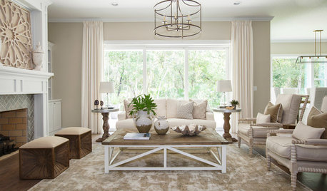
COLORBeige Is Back: Designers Share 10 Beautiful Warm Paint Colors
Enthusiasm for cool grays has waned, and warm neutrals have returned. See which beige and greige tones designers prefer
Full Story


graywings123