


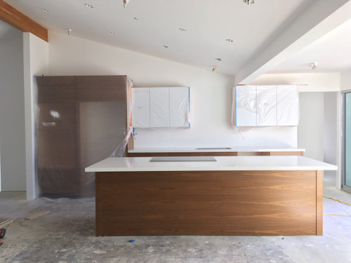
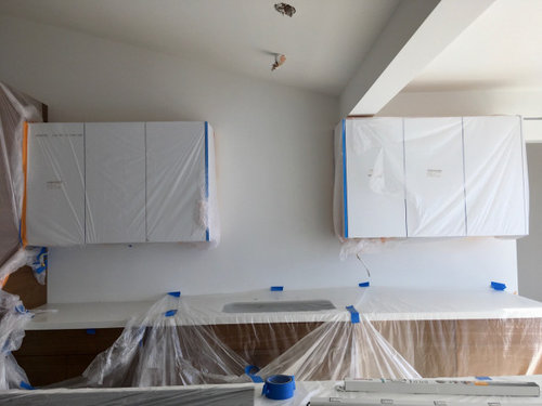
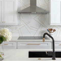
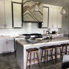
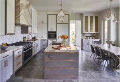
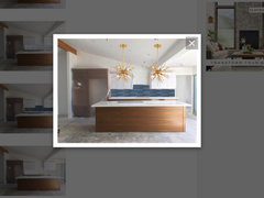
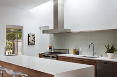
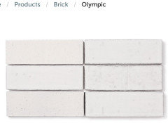
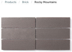
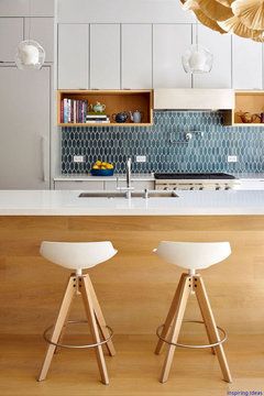
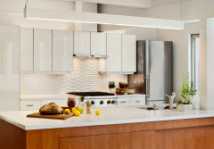
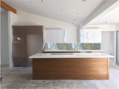
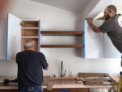
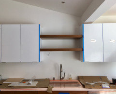
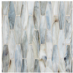
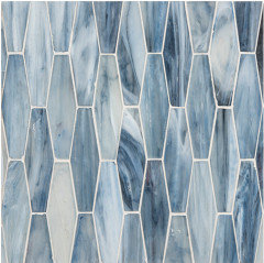
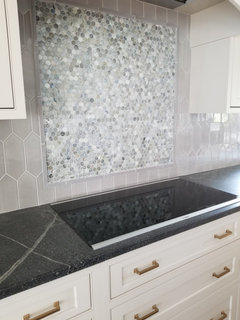
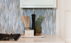
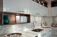
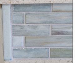
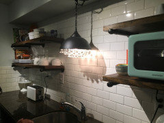
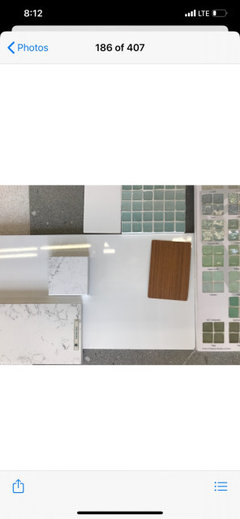
Backsplash behind open shelving? p.s. Is calcite OK behind sink?
Mittens Cat
4 years ago
Featured Answer
Comments (60)

Mittens Cat
4 years agoRelated Discussions
Help pick temporary (10yrs?) backsplash -lots of pics!
Comments (28)Yeah! Cousin came today and put in my 2 new drawers, and adjusted (reinstalled) the top middle drawer in the island vanity so it doesn't have a gap under it (but just barely "pimpled" the front where he tightened the screw too much and it *almost* came through the front! I didn't say anything b/c in taking the front off, I wasn't watching - talking to him- and let the front drop onto the 3 screws I'd already taken out that I'd stupidly laid in front of the drawer on the counter!). Next - drawer liners - all the Merillat drawers are getting worn already, though I expect the solid maple custom bottoms to wear better than laminated (paper) plywood. Sink base looks OK, but I'm buying a new trash can and thinking of setting it inside a dish pan, or at least putting vinyl tile or remnant or something under it - old dish drain board won't work since it's sloped, but maybe upside down? Have smaller can from laundry room there now. I will call laminate guy, but I think we'll end up living with this for 8-10 years since it looks like HD price for this laminate was $29/sf installed - so about $1000. Not worth it - too much else to do. Cousin said it would be months b4 he could do my crown since he's so busy now with landscaper and a big carpentry project someone finally made up her mind on. But maybe he can come back to fix my broken cabinet and install the oak shoe then if I finish it this week. I hate to have the crown sitting in DR all summer, but if he can just cut it roughly to length and do the mitred returns on a couple of pieces I can finish it and have it ready to go any time he's ready. He says (and I agree) finish the baseboards and casing first so when someone walks in my house it looks finished - no one will say anything about not having crown on tops of cabinets. I was only going to do crown 1st b/c I figured I could stain it in unfinished MBA it was so narrow and longest piece is 8ft, but that has changed since he got too busy to do it this week - we had originally scheduled kitchen work for early April. So I'm going to be spending all summer finishing baseboards and casings (not too many left), moving onto doors and window sashes (jambs and sills are all done)....See MoreTime to pick out the backsplash, need ideas quick!
Comments (20)Question--will you really be able to get those Ann Sacks tiles delivered in three weeks? If not (my experience is that some of this stuff takes 4-6 weeks), maybe you could slow down--and wait until all the materials are in. I know what you mean, though b/c we are building and we want to get it all done at the same time so that once we are in, we are done! But, it might be worth just giving it some time. All of that being said, I think either of your choices will be wonderful. I would probably keep it neutral with either marble or cream/white subways....See MoreTo backsplash or not to backsplash...that is the question
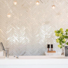
Comments (23)cigi, in our last house the previous owner installed tumbled marble in a mauvish tone which IMO looked awful with the St Cecilia granite. Even though the tile was expensive, I tore them off and left the 4" granite backsplash, patched and painted the rest of the wall. The sink was the only working area as the cooktop was on the island. No problem with water as I used BM Aura, but Pittsburgh Paint's Manor Hall Timeless is just as good with a more flat look and lifetime warranty. I'm pondering the issue for my current redo. In various houses I've had paint, wallpaper, white tile with abalone inserts, plain white tile. Right now I'm weighing white tile with a beautiful insert, just paint with no granite backsplash since this area has only a counter but no cooking/wet functions, paint with granite backsplash, or a simple glass tile backsplash with listello over it a la Chinchette. I'm attaching a photo from Chinchette's beautiful kitchen (hope she doesn't mind seeing hers cited as a great example) which shows the last option. In any event, I echo others' advice to not worry about that decision immediately unless you absolutely love a certain look. Just use good paint. Here is a link that might be useful:...See MoreBudget Backsplash -- Where can I skimp/still have it look decent?
Comments (22)re wallpaper: get the scrubbable stuff. It lasted us for 30+ years, very well. It is a pain to fit it into irregular places, though, so either get a very patient installer OR use a no-match design. Despite my interest in wallpaper, I would also second the idea of using paint and stencils or paint effects. This allows you to do creative things on the cheap. Speaking of creative, punamytsike you are a wonder! What a great result. I bet visitors say that's the most remembered thing in your whole house. There is a thread I had started last spring when I was bummed looking at high-end projects on the GW Kitchens forum. Surely there was someone with a different drummer or two--I was right and some of them made great posts and gave great ideas. You might want to look at it to get some ideas on an affordable scale. For example, here's a paint backsplash from that thread: ____ Here's an idea for you: How about a wooden moulding to use as a finish at the place where wall meets countertop, a backsplash-like camouflage for the irregular area, essentially a heavily-urethaned (for durability) dark-stained horizontal line to match your cabs? It could be elaborate 3-inch or so fancy moulding or simple as quarter-round trim available at any hardware store or HD. This would carry the dark of your cupboards upward and coordinate the two sides of the room and the uppers and lower sections, not cut up the spaces. You could also run a dark wood frame of moulding around the tiled area behind range to finish off that area. Comparatively affordable, very reversible, very DIY. I also prescribe framed art in matching dark stained frames to coordinate everything. Here is a link that might be useful: Modest and Quirky thread...See MoreMittens Cat
4 years agoMittens Cat
4 years agolast modified: 4 years agoMittens Cat
4 years agolast modified: 4 years ago
eam44
4 years agoMittens Cat
4 years agoMittens Cat
4 years agolast modified: 4 years agoMittens Cat
4 years agoMittens Cat
4 years agoMittens Cat
4 years agoMittens Cat
4 years agoMittens Cat
4 years agoMittens Cat
4 years agoeam44
4 years agoMittens Cat
4 years agoMittens Cat
4 years agolast modified: 4 years agoMittens Cat
4 years agolast modified: 4 years agoMittens Cat
4 years agolast modified: 4 years agoeam44
4 years agoMittens Cat
4 years agolast modified: 4 years agoMittens Cat
4 years agoMittens Cat
4 years agoMittens Cat
4 years ago


Related Stories
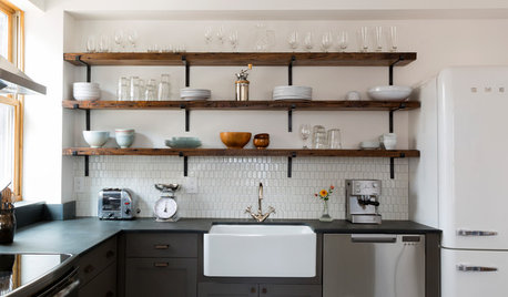
KITCHEN STORAGEShould You Use Open Shelves in the Kitchen?
Two designers make their cases for and against using floating kitchen shelves
Full Story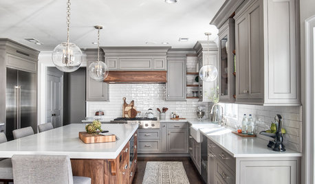
TRENDING NOWThe Story Behind the Most Popular New Photo on Houzz in 2018
The project’s designers and photographer share details about the kitchen that resonated with our community
Full Story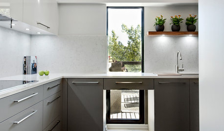
KITCHEN CABINETSThe Pros and Cons of Upper Kitchen Cabinets and Open Shelves
Whether you crave more storage or more open space, this guide will help you choose the right option
Full Story
KITCHEN CABINETSWhy I Combined Open Shelves and Cabinets in My Kitchen Remodel
A designer and her builder husband opt for two styles of storage. She offers advice, how-tos and cost info
Full Story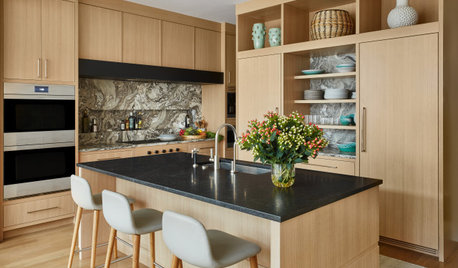
KITCHEN STORAGEStyle Your Open Kitchen Shelving Like a Pro
Follow these do’s and don’ts for arranging items on your kitchen shelves
Full Story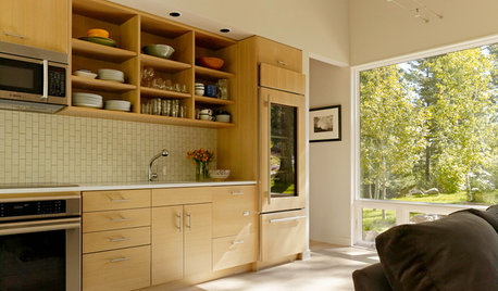
KITCHEN STORAGEPartly Open Shelving: The Case for Doorless Cabinets
Build in some display areas, create a colorful design feature and make better use of awkward spaces with open shelves
Full Story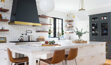
KITCHEN STORAGEWhere to Hang Open Shelves in the Kitchen
Consider these locations for letting in natural light, dealing with a tricky corner and more
Full Story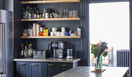
MY HOUZZ9 Kitchens Where Open Shelving Rules
Find out why these homeowners ditched their upper cabinets
Full Story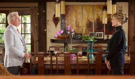
TASTEMAKERSTake a Behind-the-Scenes Tour of Netflix’s ‘Grace and Frankie’
Set decorator Beauchamp Fontaine explains the design decisions behind the home sets featured in the new Netflix series
Full Story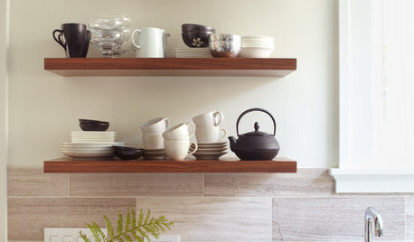
KITCHEN DESIGNHow to Arrange Open Shelves in the Kitchen
Keep items organized, attractive and within easy reach with these tips
Full Story
calidesign