


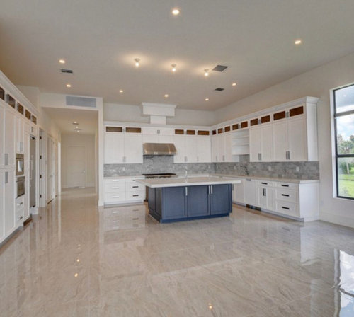
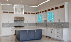
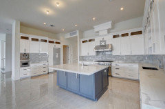
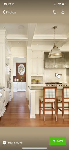
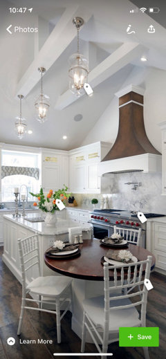
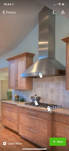
How would you improve this kitchen?
K R
4 years ago
Featured Answer
Comments (46)

K R
4 years ago
wilson853
4 years agoRelated Discussions
Kitchen Design thoughts?
Comments (1)Here is a perspective rendering I did of the kitchen...See MoreLiving room feedback. How would you improve this room?
Comments (43)I've been under the weather for the last few days, so wasn't able to act on any of the additional suggestions until today. Thank you so much to everyone for the feedback, pointing out both the good and the bad. Today I moved a few things around. I decided to concentrate my efforts of lighting, as I think this will help us to enjoy the room more. The new additions are just stand ins, while I look for the right lamps and plants etc. I will also look for better wall art by the love seat and go to Benjamin Moore to look for a warm neutral that's lighter for the walls. I also liked the suggestions to replace the several small accessories with larger ones. And also to try to incorporate the window seat into the room more somehow. I was thinking of trying more colorful cushions on it, to tie it in and make the eye travel back there more. I will keep the points about the tables in mind for when it's time to look at new furniture. Thank you again so much! I feel so much better about this room already! I will start a new thread if/when I have specific questions about lamps or pillows. Thank you!!...See MoreHow would you improve this kitchen design?
Comments (10)Your island will be deeper than 39". You'll have a front overhang of 1" to 1.5", and a back cover, which can be as thin as a cabinet skin, or as thick as a cabinet door if you choose matching panels. I'd plan for at least 41". You'll also need a return panel to support the counter top on the DW end. (If you don't use the slats or solid sides.) In your basic layout I'd center the range on the perimeter cabinets and move the the DW to the left corner of the island. Dishes can be stored in the cabinets across the aisle, which will allow a helper to unload the DW, or gather dishes to set the table, without entering the prep triangle. You will have a wider prep space to the right, and will also have a clear space across from the fridge, to drop groceries to load to fridge and pantry.With a 4'2" work aisle, sink and range back-to-back won't be a problem, and we spend more time prepping beside a sink, than rinsing items in front of it. You have space for tall shallow pantries on the wall opposite the fridge and range, or that could also be shallow base cabs and uppers for a coffee/breakfast center, or a mix of the two. Actually, for greatest efficiency, I'd suggest m/l flipping the layout, to put the fridge closer to the dining table, and closer to traffic from the rest of the house: NKBA guidelines New to Kitchens? Read me first....See Morehow would you improve this dining area?
Comments (0)This area feels dated . The China was my mothers Wedgewood and it is very important to me and it must stay. The glass table makes the area feel larger than it is and gives some relief from all the wood, but I am ambivalent about it. This area is part of an open concept kitchen and the living room is also visible from the kitchen. Thanks for sharing your ideas....See Moreeld6161
4 years ago PRO
PROBeverlyFLADeziner
4 years agobeachem
4 years agoK R
4 years ago
aprilneverends
4 years agolast modified: 4 years agomainenell
4 years agomainenell
4 years ago
acm
4 years agotraci_from_seattle
4 years agofunctionthenlook
4 years agoccwatters
4 years agolast modified: 4 years agoMelissa Vernon
4 years agochiflipper
4 years ago
decoenthusiaste
4 years ago
cpartist
4 years agoartistsharonva
4 years ago
Curious Bystander
4 years agoK R
4 years agochicagoans
4 years agolast modified: 4 years ago
J Williams
4 years agoJ Williams
4 years ago PRO
PROBeth H. :
4 years agolast modified: 4 years agoroccouple
4 years agolast modified: 4 years agoMelissa Vernon
4 years agoMelissa Vernon
4 years agoK R
4 years agoK R
4 years agoD N
4 years agoMelissa Vernon
4 years agoaprilneverends
4 years agolast modified: 4 years agoK R
4 years agodrsaj
4 years agodrsaj
4 years agolast modified: 4 years agoK R
4 years agoRebekah Gibbs
4 years agoartistsharonva
4 years agodrsaj
4 years ago
NYCish
4 years ago
raee_gw zone 5b-6a Ohio
4 years agocat_ky
4 years agoKendrah
4 years ago PRO
PROKLHome Staging, LLC
4 years agolafdr
4 years ago


Related Stories
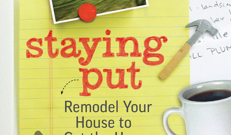
REMODELING GUIDESStaying Put: How to Improve the Home You Have
New book by architect Duo Dickinson shows how to remodel your house to get the home you want
Full Story
SHOP HOUZZShop Houzz: Farmhouse Home Improvement Sale
Up to 70% off barn doors, rustic hardware, apron sinks and more
Full Story0
DECORATING GUIDESImproving a Rental: Great Ideas for the Short and Long Haul
Don't settle for bland or blech just because you rent. Make your home feel more like you with these improvements from minor to major
Full Story
LIFEImprove Your Love Life With a Romance-Ready Bedroom
Frank talk alert: Intimacy and your bedroom setup go hand in hand, says a clinical sexologist. Here's her advice for an alluring design
Full Story
GARDENING AND LANDSCAPINGWant More Party Space? 5 Tips to Improve Indoor-Outdoor Flow
Expand your home's entertaining area without adding on by boosting connections between inside and out
Full Story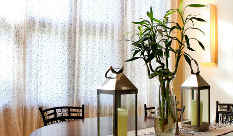
DECORATING GUIDESImprove Your Style Fortune With Lucky Bamboo
Serve this versatile plant straight up or with a twist for auspicious living decor that thrives without soil
Full Story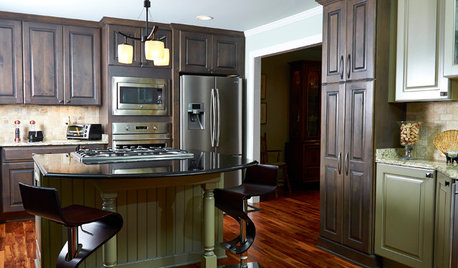
KITCHEN MAKEOVERSKitchen of the Week: Rich Materials, Better Flow and a Garden View
Adding an island and bumping out a bay window improve this kitchen’s layout and outdoor connection
Full Story
MOST POPULARFrom the Pros: How to Paint Kitchen Cabinets
Want a major new look for your kitchen or bathroom cabinets on a DIY budget? Don't pick up a paintbrush until you read this
Full Story
GREAT HOME PROJECTSHow to Add Toe Kick Drawers for More Storage
Great project: Install low-lying drawers in your kitchen or bath to hold step stools, pet bowls, linens and more
Full Story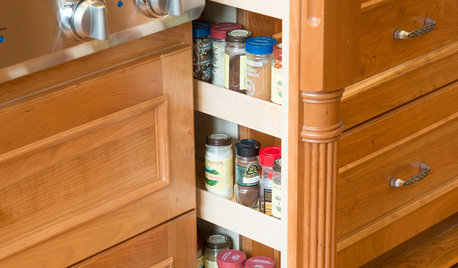
KITCHEN STORAGEHow to Add a Pullout Spice Rack
Keep spices neat and free of kitchen grime by giving them a well-organized home in your cabinets
Full Story


ci_lantro