


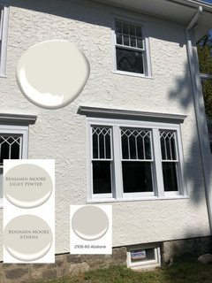
Exterior paint color!
Theresa Pondok
4 years ago
last modified: 4 years ago

Featured Answer
Comments (157)

groveraxle
4 years ago
Luv Seabrook
4 years agoRelated Discussions
Help with exterior paint color to paint brick
Comments (6)I think you should lean towards a light color, actually a whitish in my opinion. I've attached a site that shows different paint colors on brick homes, it might help you decide. Your roof is dark and using a cream light color will bring more balance to the house as it will be more prominent. Brick houses painted...See MoreWhat Exterior Paint Colors would work for us trim,door and base color
Comments (11)Your home is BEAUTIFUL inside! What a wonderful job you have done with it! I love the old wooden floors, the crisp white trim, and your modern furnishings. It is lovely. You have done a great job with it. I like the beige/gray walls inside, as well as the gray tones that you have used. Your home could look wonderful painted a blue/gray color, if you want a change. You could experiment with some color on your porch with large black modern style pots filled with colorful flowers. Your yard, as I see it, is mostly paved. So, if you want to bring color there, too, a planter under your front window (with the awning) would be nice. Trust your judgment AND taste. You have both!...See MoreAdvice requested on exterior paint color(s)
Comments (4)Try something like this to give your home more presence....See MoreNeed help Exterior Paint Colors - Multi Materials, Multi Colors!!
Comments (2)Yea it is confusing with the rendering. Sorry about that! The rendering is simply for house design reference. I notated what material is on what part of the house for help in what color should be put where. I’ve read that you’re supposed to use the same color on the same materials. Not sure if that rule is one to follow or not....See MoreLuv Seabrook
4 years ago PRO
PROFlo Mangan
4 years ago
emmarene9
4 years ago
Theresa Pondok
4 years agoTheresa Pondok
4 years agoTheresa Pondok
4 years agolast modified: 4 years ago- PRO
Flo Mangan
4 years ago cat_ky
4 years agoTheresa Pondok
4 years agoTheresa Pondok
4 years agoTheresa Pondok
4 years ago PRO
PROBeth H. :
4 years ago- PRO
Flo Mangan
4 years ago - PRO
Flo Mangan
4 years ago Theresa Pondok
4 years agoTheresa Pondok
4 years ago- PRO
Flo Mangan
4 years ago Theresa Pondok
4 years ago- PRO
Flo Mangan
4 years ago Theresa Pondok
4 years agoTheresa Pondok
4 years ago- PRO
Flo Mangan
4 years ago - PRO
Flo Mangan
4 years ago Renae Hale
4 years agoLuv Seabrook
4 years agoTheresa Pondok
4 years agoTheresa Pondok
4 years agoTheresa Pondok
4 years agoTheresa Pondok
4 years agoTheresa Pondok
4 years agodoods
4 years agolast modified: 4 years ago- PRO
Flo Mangan
4 years ago Anna (6B/7A in MD)
4 years agoTheresa Pondok
4 years agoTheresa Pondok
4 years agoTheresa Pondok
4 years ago- PRO
Flo Mangan
4 years ago Theresa Pondok
4 years ago PRO
PRODesign Interior South
4 years ago- PRO
Flo Mangan
4 years ago  PRO
PRORL Relocation LLC
4 years agolast modified: 4 years agohoussaon
4 years agoTheresa Pondok
2 years agolast modified: 2 years ago- PRO
Flo Mangan
2 years ago - PRO
Flo Mangan
2 years ago 
RedRyder
2 years ago
H D
2 years ago


Related Stories

EXTERIORSHelp! What Color Should I Paint My House Exterior?
Real homeowners get real help in choosing paint palettes. Bonus: 3 tips for everyone on picking exterior colors
Full Story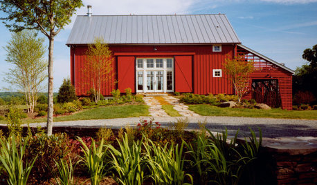
EXTERIOR COLORWhen to Paint Your Home Red
Bring on the energy — with red on its exterior, your home can stir up excitement in any setting
Full Story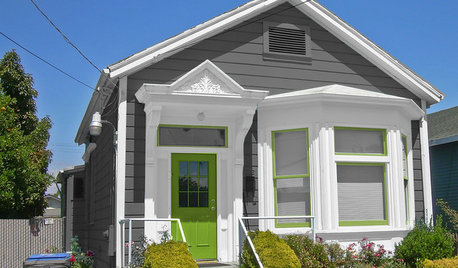
MOST POPULARChoosing Color: See 1 Cute Home in 3 Exterior Paint Palettes
Here’s proof that a little bit of fun color can add a whole lot of flair to your house
Full Story
EXTERIOR COLOR18 Home Exteriors Gone Wild With Color
Technicolor dreams play out beautifully with these exterior paint jobs, showing that color confidence has its rewards
Full Story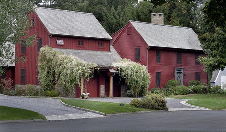
GREAT HOME PROJECTSReady to Repaint Your Home’s Exterior? Get Project Details Here
Boost curb appeal and prevent underlying damage by patching and repainting your home’s outer layer
Full Story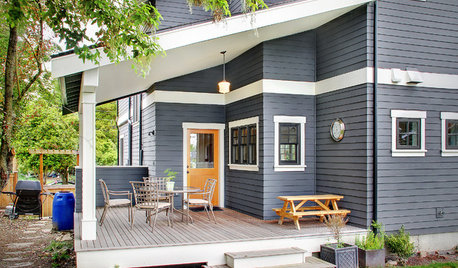
EXTERIORS5 Easy Tips for Choosing Your Exterior Paint Palette
Make your home the talk of the neighborhood — in a good way — with an exterior paint scheme that pops
Full Story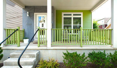
EXTERIOR COLORThe Joyful Exterior: Perk Up Curb Appeal With a Splash of Green
You may not want to douse your whole house with it, but green can work wonders as an exterior accent color
Full Story
EXTERIORS13 Dramatic Exterior Paint Makeovers by Houzzers
See real-life before and afters of home fronts transformed with paint, in wide-ranging colors and styles
Full Story
HOUZZ QUIZHouzz Quiz: What Color Should You Paint Your House?
Is white right? Maybe dark blue-gray? Take our quiz to find out which color is best for you and your home
Full Story
EXTERIOR COLORWhen to Paint Your Home Gray
This perfectly neutral and highly versatile color can create subtle distinctions among exterior architectural elements or stand on its own
Full Story


groveraxle