


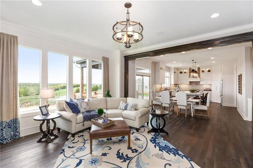
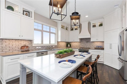
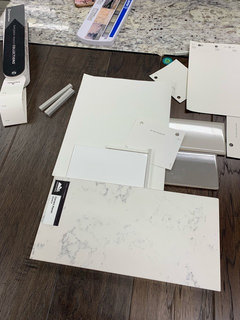
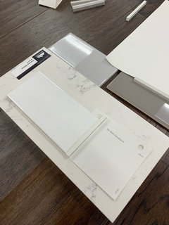
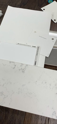
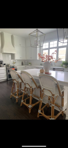
Best white paint color for cabinets/trim in North facing rooms
abbyfaye
4 years ago
Featured Answer
Comments (34)

beckysharp Reinstate SW Unconditionally
4 years agoabbyfaye thanked beckysharp Reinstate SW UnconditionallyRelated Discussions
Paint Color for North Facing Room
Comments (10)I'm also following this thread with interest, living in a north facing ranch with short ceilings and deep eaves in a neighborhood filled with the same. My wants for my redo are to go either with whites/lights (but not pastels, which I don't like much) or more cool/muddied colors, but what really looks best when I am doing drive-bys through my neighborhood are saturated warmer tones like oranges/terracottas, golds or jean looking blues which have gray in them but are strong enough not to look washed out or drab. I went warm last time I painted and loved it, though I went too muted with the gold tones on the west side and it wasn't really quite right - too muddied and almost dirty looking. Quite the dilemma... This post was edited by Steph2000 on Thu, Jan 22, 15 at 12:03...See MorePaint for north facing room? (Beige carpet, cherry red cabinets)
Comments (2)I'd do a gray/green color. The rug is definitely too gray for the wall color that is there now....See MoreExterior color consultant in Omaha?
Comments (11)Yes, I had posted asking for advice but with just a sample of the stone and Lori had commented but not with a specific color, but I'll have to share pics of the house. I will try her. Her answers on paint questions boggle my mind. Should have done it in the first place instead of driving myself "gray-zy"....See MoreWhite paint color for cabinets in a north facing room?
Comments (4)Hi Jennifer! Trim and baseboards are BM Oxford White. I'm thinking about matching it to that but I'm not sure if that will match the Bright White of Cabinets.com or I should just go with Alabaster that is close to BM White Dove. I haven't picked a backsplash or counter yet....See More
abbyfaye
4 years ago
dchall_san_antonio
4 years ago PRO
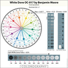
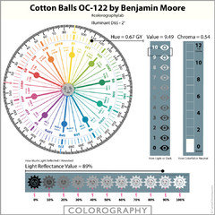
PROLori A. Sawaya
4 years agolast modified: 4 years ago- PRO
Lori A. Sawaya
4 years ago - PRO
Lori A. Sawaya
4 years agolast modified: 4 years ago - PRO
Lori A. Sawaya
4 years agolast modified: 4 years ago - PRO
Lori A. Sawaya
4 years agolast modified: 4 years ago 
Holly Stockley
4 years ago
Abby Mac
4 years agolast modified: 4 years ago PRO
PROJAN MOYER
4 years agolast modified: 4 years agoAbby Mac
4 years agoabbyfaye
4 years agolast modified: 4 years agoabbyfaye
4 years agocalidesign
4 years ago PRO
PROmoico inc.
4 years agoabbyfaye
4 years agoabbyfaye
4 years ago
Carol Bowe
4 years agoabbyfaye
4 years agopattimeli
3 years agoabbyfaye
3 years agopattimeli
3 years agoephillips5
3 years ago
lucky998877
3 years agolast modified: 3 years agoabbyfaye
3 years agomlankala
3 years ago
jen south
6 months ago

Related Stories
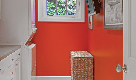
MORE ROOMS8 Colors for North-Facing Rooms
Have a room with little sunlight? One of these vibrant, saturated paint colors will warm it up
Full Story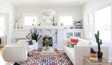
ROOM OF THE DAYWhite-and-Gray Paint Scheme Brightens a New Living Room Layout
The right colors and right-sized furniture and accessories open up entertainment possibilities in a California Craftsman
Full Story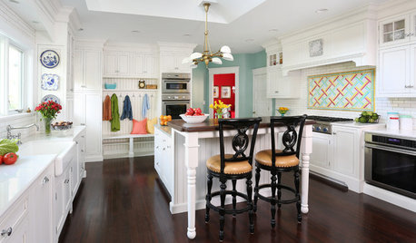
KITCHEN OF THE WEEKKitchen of the Week: Crisp White Cabinets and Room for Family
A Victorian home near Chicago gets an updated kitchen to improve brightness, beauty, function and flow
Full Story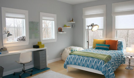
TRIMTrim Color Tips: Get Your White Trim Right
Set off wood tones, highlight architectural features, go minimalist ... white trim is anything but standard when you know how to use it
Full Story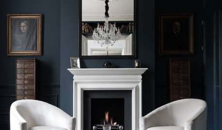
COLORDiscover White’s Surprising Power to Energize Every Room
Using white in different ways gives you limitless options for light, color and creativity
Full Story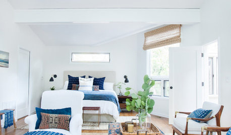
DECORATING GUIDESRoom of the Day: Layers of Exotic Textiles Enrich a White Room
A designer makes the most of an unusual master bedroom layout in a Southern California canyon bungalow
Full Story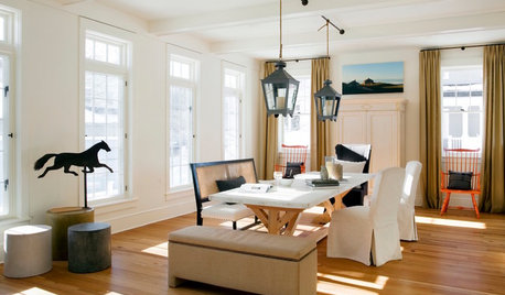
WHITEDesigner Secrets: 10 Pros Share Favorite Off-White Paints
From creamy white to barely beige, these hues will warm up your room
Full Story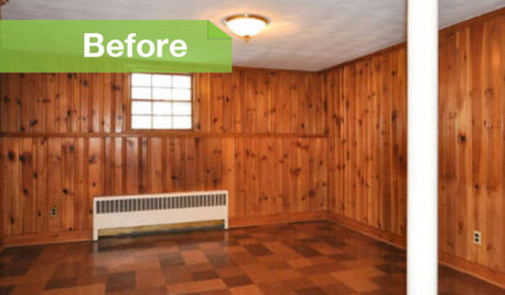
PAINTINGKnotty to Nice: Painted Wood Paneling Lightens a Room's Look
Children ran from the scary dark walls in this spare room, but white paint and new flooring put fears and style travesties to rest
Full Story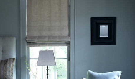
DECORATING GUIDES7 Ways to Paint Your Trim Fantastic, From Classic to Fearless
Give your rooms an edge with a trim treatment that shows attention to detail
Full Story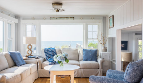
WHITEWhat to Know Before You Paint Your Walls White
A coat of white paint can do wonders in one room and wreak havoc in another. Here are tips for using the popular hue
Full Story


Lori A. Sawaya