


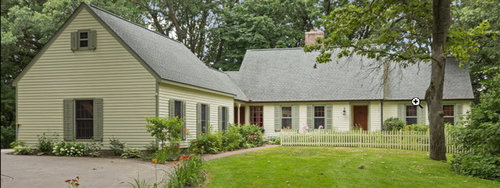
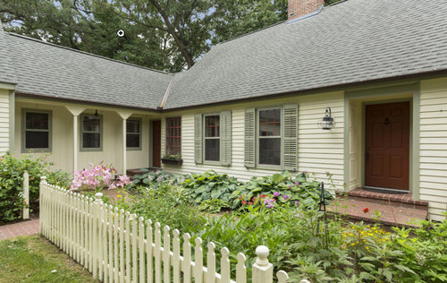
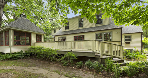
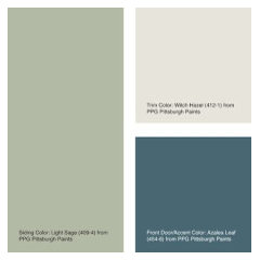
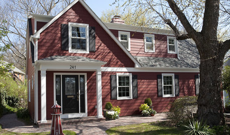
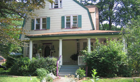
Fairytale Cottage vs. Not... This gal need some exterior paint advice!
nybohouse
4 years ago
last modified: 4 years ago
Featured Answer
Sort by:Oldest
Comments (6)
 PRO
PROSina Sadeddin Architectural Design
4 years agoRelated Discussions
Need Advice about Exterior Paint
Comments (4)Hey Posie, Sorry to be so long on answering...trying to stay ahead of my mowing!! It's kinda hard to tell from the 2 pics...since I can't view-'em side-by-side; and the pics aren't close-up. * 3 yrs. is a little soon for noticeable fading from quality paint though... * I don't know of Monarch paint. What supplier/store did your "painter" use?? If you track this down, you could inquire at that store. Ask a few neighbors, or your paint stores if they know of the brand. * Had you picked out a certain brands' color other than Monarch?? The reason I ask... * Some homeowners painters' will take a chosen brands chip, and have it matched into "cheap-brand-x" paint, and still charge YOU for the higher-price line. * I tint a LOT of paint where I work (NOT HD or a SW/BM store), and periodically, a painter will come in and take some chips (we have ACE-Royal, Ralph-Lauren, & C2). They then leave to have them matched at a store where they get BIG discounts on "entry-level" grade paints. * Since we have a high-end line like C2 (low $40's/gal.), it prob'ly happens more than I'd like to believe! >>> Since you can't locate the painter, I'm guessing this is your situation. >>> Exterior spraying...Takes a practiced hand to do it right. Spraying is usually the "fast & cheap" way out. >>> The best do it the old-fashioned way...by HAND. Coupled with good prep...cleaning/sanding/caulking/priming/TWO brushed topcoats...you should get a decade of good wear. Lemme know what you find out! Faron...See MoreNeed advice on painting exterior concrete wall
Comments (7)We want to paint these walls the same color as the house (egshell, light beige) or at least something close to it Trojan Color Sealer. You can buy color samples. 8 oz. for $8 plus shipping. Mix your own color to 'match' your house, just keep track of ratios so you can duplicate up into larger quantity. The sealer is semi-transparent and you can 'cut' the colors with clear sealer too. They will custom mix the sealer if you have over 15,000 sq. ft. and they mix to any paint chip. They're currently doing a big project at Disney with a special, custom red. Sounds too fun, would love to see that. Your concrete is well aged at 12 years so you don't have to worry about PH. New concrete has a litany of prep procedures so you're kinda lucky there. But the walls do have to be bone dry in order to spray on the sealer and it's a bonus if the walls have a rough vs. very smooth texture. Mike Kornell is who you want to talk to at envirosafe. 1-866-874-8070. Here is a link that might be useful: Trojan Color Sealer...See MoreHelp!!! need advice for cottage kitchen!
Comments (28)Your gray stain is going to be gorgeous and is a great organizing principal to take you where you want to go. Hopefully you'll find a pale, functional stone that'll look great. I'm pretty sure you've briefly considered and set aside (as I did), composite quartz materials such as Silestone and Caesarstone, but they make truly excellent counters, as bulletproof and chef-worthy as any can be. And, of course, they come in a very large number of whites and grays. I personally love, love, love white marbles, especially honed. They are my dream material. I have never wanted a look of newness or perfection in my decor; however, I came to realize the etching problem is so bad, and so ugly to me in glass-shape circles, etc., I just couldn't have marble counters in my kitchen, where all counters get heavy use and lemon juice is much more of a staple than flour. I just counted out of curiosity, and I currently have 8 different vinegars, also used all the time. In any case, I don't know the configuration of your kitchen, but would it lend itself to a mixture of materials? Marble perhaps for a select, mostly decorative position, including an exquisite backsplash perhaps, and stainless steel or a composite material elsewhere?...See MoreNeed advice on Exterior - New Const.
Comments (90)Looks like you will be building a nice home. There is currently a bit too much going on with the finish materials. You could do all brick. But I would also entertain leaving the right side as is and then just leaving the rest of the house with the water table band. It is a nice accent. Then simplify some of the other details, like do away with the shakes just use the clapboard siding with good trim details. We would also remove the metal roofing from the upper most roof areas. Simple and clean usually speaks the loudest....See More PRO
PRORL Relocation LLC
4 years ago
cat_ky
4 years ago
chloebud
4 years agonjmomma
4 years ago
Related Stories
EXTERIORS8 Homes With Exterior Paint Colors Done Right
Get ideas for an exterior palette from these homes that run the gamut from Mediterranean to modern
Full Story
EXTERIORSHelp! What Color Should I Paint My House Exterior?
Real homeowners get real help in choosing paint palettes. Bonus: 3 tips for everyone on picking exterior colors
Full Story
EXTERIORS5 Easy Tips for Choosing Your Exterior Paint Palette
Make your home the talk of the neighborhood — in a good way — with an exterior paint scheme that pops
Full Story
MOST POPULARChoosing Color: See 1 Cute Home in 3 Exterior Paint Palettes
Here’s proof that a little bit of fun color can add a whole lot of flair to your house
Full Story
EXTERIORS13 Dramatic Exterior Paint Makeovers by Houzzers
See real-life before and afters of home fronts transformed with paint, in wide-ranging colors and styles
Full Story
EXTERIOR COLORWhen to Paint Your Home Yellow
Be a cheer leader with this color that captures the sun and radiates a warm welcome
Full Story
PAINTINGBulletproof Decorating: How to Pick the Right Kind of Paint
Choose a paint with some heft and a little sheen for walls and ceilings with long-lasting good looks. Here are some getting-started tips
Full Story
EXTERIOR COLORWhen to Paint Your Home Gray
This perfectly neutral and highly versatile color can create subtle distinctions among exterior architectural elements or stand on its own
Full Story
HOUZZ QUIZHouzz Quiz: What Color Should You Paint Your House?
Is white right? Maybe dark blue-gray? Take our quiz to find out which color is best for you and your home
Full StorySponsored
Industry Leading Interior Designers & Decorators in Franklin County


Anna (6B/7A in MD)