


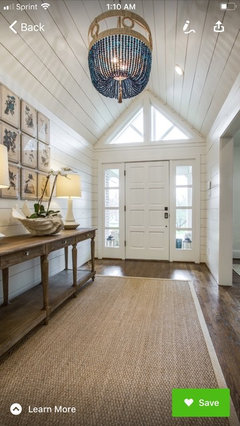
Hale Navy for Foyer w/ Heavy Wainscoating?
generals1992
4 years ago
Featured Answer
Comments (108)

generals1992
4 years agogenerals1992
4 years agoRelated Discussions
Desperately Need Help with Coordinating Colors
Comments (13)I love your room, usually that would be too much wood for my taste but your room has a very warm and inviting feel to it. We too have honey oak cabinets and I've found that the citrus greens seem to work really well with them, much better in my opinion than the sages which tend to look a bit too gray or drab (sorry I know it's a popular color) and the olives which depending on the space can look too heavy. If you're looking for a warm and cheerful green, you may want to consider something with a tad more yellow in it so it will compliment the woodwork more. Some examples would be colors like: Behr Asparagus , Behr Grass Cloth: It's much prettier in person and I've used quite a bit in our own home (pictured below). or BM Perinnial- Another nice green is the color Aunt Jen just used in her living space, Agave, I believe it's Benjamen Moore. I've posted this pic a lot so sorry if you've seen it already, hope it helps. I wish I had a sample of the Grass cloth next to the oak, but we're in the middle of getting a back splash put in and the kitchen isn't painted...yet. Also, since your room is larger, you may want to consider a green that's a shade lighter like SW Rice Paddy also a great color....See MoreMy 50's bay area ranch tour. And I need help with paint :)
Comments (1)nice, very boho. i do not usually do paint....See MoreWhite/off white dining room rug?
Comments (5)IMO you should have done the dark color on the bottom now it makes the walls seem top heavy and also the contrast with a light rug would have worked better . Now please remove those blinds for sure and just use drpes , nice and full and in maybe a faux silk in such a formal room. A rug like this might work with drapes to match the walls...See MoreBedding for Master
Comments (18)You originally wanted fun and not light, due to your dogs, and it’s neither. I also think it could feel washed out due to navy ceiling and your dark furniture. If you are now ok with going lighter, a white duvet cover (try Ikea) is a great choice as it can be soaked in oxy-clean and occasional bleached - add your personality when accessorizing. If you want fun.... https://www.wayfair.com/East-Urban-Home--Comptche-Social-Proper-Proof-of-Life-Duvet-Cover-Set-X114566146-L1221-K%7EW003455035.html?refid=GX441185726308-W003455035_818446793&device=m&ptid=935832207002&network=g&targetid=pla-935832207002&channel=GooglePLA&ireid=58673863&fdid=1817&PiID%5B%5D=818446793&gbraid=0AAAAAD9ISC5wfwakip2GTZY9jDqkMF2ZL&gclid=CjwKCAjwt8uGBhBAEiwAayu_9dW_fbS1xhf7uJQVcJuSCVnE3pw9ydR-XcaJ5RZEVPPibKoyhhWqOhoCPpkQAvD_BwE&piid=818446647&utm_source=pinterest&utm_medium=social https://www.caronsbeachhouse.com/amp/blue-tie-dye-chic-queen-size-duvet-set/ https://www.overstock.com/Bedding-Bath/Deny-Designs-Pineapples-Blue-Duvet-Cover-Set-3-Piece-Set/21487119/product.html?epik=dj0yJnU9MVVfdFVhTXhfdXVOUWVpeWM4Q1JSTm5yWlJCSDA4Sm8mcD0wJm49cmUwYWdMaDNOZVVpbURsMEVNM0x0dyZ0PUFBQUFBR0VQM3VF&utm_source=pinterest&utm_medium=social...See Moregenerals1992
4 years ago
lynartist
4 years ago PRO
PROFlo Mangan
4 years agogenerals1992
4 years agolynartist
4 years agolynartist
4 years ago- PRO
Flo Mangan
4 years ago - PRO
Flo Mangan
4 years ago lynartist
4 years ago- PRO
Flo Mangan
4 years ago generals1992
4 years ago- PRO
Flo Mangan
4 years ago  PRO
PRODiana Bier Interiors, LLC
4 years agolast modified: 4 years ago- PRO
Flo Mangan
4 years ago burdette1020
4 years agogenerals1992
4 years agogenerals1992
4 years ago- PRO
Flo Mangan
4 years ago - PRO
Diana Bier Interiors, LLC
4 years ago generals1992
4 years ago
vandar
4 years agogenerals1992
4 years ago- PRO
Flo Mangan
4 years ago generals1992
4 years agogenerals1992
4 years agoAnna (6B/7A in MD)
4 years agolast modified: 4 years agogenerals1992
4 years agoMaryAnne Smith
4 years ago- PRO
Flo Mangan
4 years ago generals1992
4 years agohollybar
4 years agolast modified: 4 years agogenerals1992
4 years agogenerals1992
4 years ago- PRO
Flo Mangan
4 years ago - PRO
Flo Mangan
4 years ago - PRO
Flo Mangan
4 years ago hollybar
4 years agolast modified: 4 years ago
Tilly Teabag
4 years agolast modified: 4 years ago
Molly
4 years agoMolly
4 years ago
Laura Mac
4 years agohollybar
4 years agolast modified: 4 years agoAnna (6B/7A in MD)
4 years ago- PRO
Diana Bier Interiors, LLC
4 years ago 
wmsimons85
4 years agoGcubed
4 years agoGcubed
4 years ago- PRO
Flo Mangan
4 years ago


Related Stories

COLORExterior Color of the Week: Go Navy!
It’s daring and dramatic, but also a neutral. And it looks fantastic on almost any home
Full Story
DECORATING GUIDESWhat Goes With Dark Wood Floors?
Avoid a too-heavy look or losing your furniture in a sea of darkness with these ideas for decor pairings
Full Story
COLORRoom of the Day: Deep Blue Proves a Hot Hue
Navy takes a New Jersey living room from dull to dashing in the flick of a paintbrush
Full Story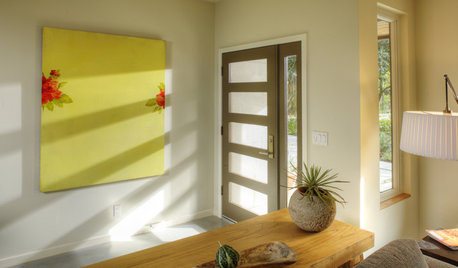
DECORATING GUIDESSmart Solutions for Nonexistent Entryways
Barely enough space to hang your hat? Front door swings past your living room couch? These remedies are for you
Full Story
DECORATING GUIDESFrom Queasy Colors to Killer Tables: Your Worst Decorating Mistakes
Houzzers spill the beans about buying blunders, painting problems and DIY disasters
Full Story
MOST POPULAR6 Kitchen Flooring Materials to Boost Your Cooking Comfort
Give your joints a break while you're standing at the stove, with these resilient and beautiful materials for kitchen floors
Full Story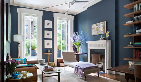
DECORATING GUIDESDesigner Picks: 9 Beautiful Saturated Blue Paints
Bold cobalt, inky indigo and moody midnight are just a few of the hues that can set a dramatic tone
Full Story
MOST POPULARCrowd-Pleasing Paint Colors for Staging Your Home
Ignore the instinct to go with white. These colors can show your house in the best possible light
Full Story
COLOR12 Tried-and-True Paint Colors for Your Walls
Discover one pro designer's time-tested favorite paint colors for kitchens, baths, bedrooms and more
Full Story
DECORATING GUIDESThe Dumbest Decorating Decisions I’ve Ever Made
Caution: Do not try these at home
Full Story


homechef59