


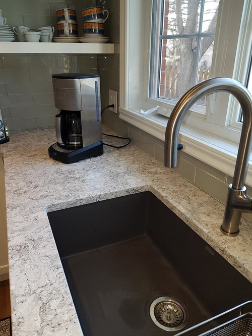
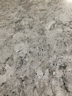
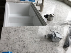
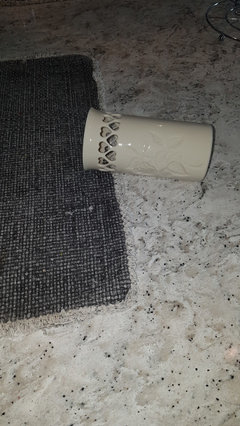
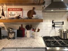
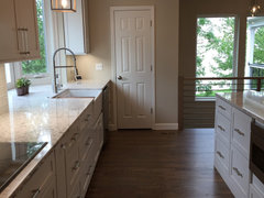
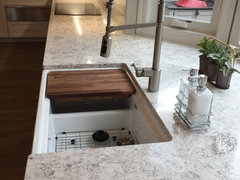
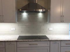
Cambria Pendle Hill
ceeemdee
5 years ago
Featured Answer
Sort by:Oldest
Comments (50)
 PRO
PROCambria
5 years ago
stillpitpat
5 years agoRelated Discussions
Cambria Countertops
Comments (13)Farmhouse501 Thank you for choosing Cambria! You have a stunning space. Here are a few Summerhill installs with a subway tile backsplash: [https://www.houzz.com/photos/downtown-square-contemporary-kitchen-nashville-phvw-vp~35395960[(https://www.houzz.com/photos/downtown-square-contemporary-kitchen-nashville-phvw-vp~35395960) [https://www.houzz.com/photos/cambria-quartz-summerhill-on-grey-cabinets-modern-phvw-vp~45315776[(https://www.houzz.com/photos/cambria-quartz-summerhill-on-grey-cabinets-modern-phvw-vp~45315776) [https://www.houzz.com/photos/sunnylea-kitchen-contemporary-kitchen-toronto-phvw-vp~35469233[(https://www.houzz.com/photos/sunnylea-kitchen-contemporary-kitchen-toronto-phvw-vp~35469233)...See MoreGray cabinets will they stand test of time?
Comments (59)We just picked our colors with our builder this month. I’ve always wanted a kitchen with gray cabinets. But after pairing with our flooring, wall color, carpet, and granite color choices, we decided to go with a cabinet color that’s actually a brown/gray looking stain. The gray with being an open concept home really looked pale and washed out in models we viewed. My husband loves old school stain colors. I would love to chalk paint my whole world. This was a way we both liked our choices. We also chose not to go with any of the backslash choices we were given. In my eye I can not have a patterned backsplash that will compete for attention with the granite. I’m leaning towards a backsplash of white shiplap, or subway tile we will add ourselves...See MoreNeed paint color advice!
Comments (7)Take one of your sofa cushions to the Sherwin Williams store. They have a display with different kinds of lights. Use those lights (the ones most similar to your home) to help you pick color samples that are compatible with your sectional. Then get some sample size paints mixed up. Paint foamcore from the dollar store with the samples. Move them around the rooms, and see which you prefer at different times of day. You don’t want to go through this again!...See MoreDoes anyone have Cambria Summerhill with stained cabinets?
Comments (13)No, It is the same as Summerhill but doesn't have the grey vein running thru it which has the sparkles. When I ordered samples I ordered the 12×12 as it gives you a better sample. If your near Hastings, MN you could come see it installed ὠ9. I have a huge kitchen; I was worried I would get too much gray as stained cabinets is my primary focus. Thus the reason I used both; seeing it now installed. It was a homerun! If I was going with only one and stained cabinets. I would definitely choose PendleHill....See More
M
5 years agolast modified: 5 years agoceeemdee
5 years agoceeemdee
5 years agoM
5 years agoj_leary
4 years ago PRO
PROJoseph Corlett, LLC
4 years ago
DCF-Z6A
4 years agoceeemdee
4 years agoDCF-Z6A
4 years ago- PRO
Joseph Corlett, LLC
4 years ago ceeemdee
4 years agoM
4 years agoj_leary
4 years agoceeemdee
4 years agoj_leary
4 years agoHU-994655304
4 years agolast modified: 4 years agoceeemdee
4 years agoM Franc
4 years ago
Isabel Chavez
4 years agoceeemdee
4 years agoIsabel Chavez
4 years agoJeff Campbell
4 years ago
P McG
4 years agolast modified: 4 years agoP McG
4 years agoceeemdee
4 years agoP McG
4 years agoceeemdee
4 years ago
Emily Hawkins
3 years agoP McG
3 years agolast modified: 3 years agoceeemdee
3 years agoE Lee
3 years agoM Franc
3 years agolast modified: 3 years ago
Debbie Thompson
3 years agoP McG
3 years agoHU-570576495
3 years agoE Lee
3 years ago
Heather P
3 years ago
Julie Schrag
3 years agoceeemdee
3 years agorparvathi
3 years agoJulie Schrag
3 years agoceeemdee
3 years agorparvathi
3 years ago PRO
PROSophiaasajid
2 years ago
Danielle DeSiato
2 years agoceeemdee
2 years ago PRO
PROAuburn University
last year


Related Stories
HOUZZ TOURSMy Houzz: From Dark and Dim to Cheerily Colorful in Pennsylvania
New windows and lively colors combine with updated accents to wake up a 3-bedroom home in Pittsburgh
Full Story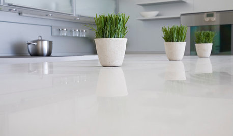
KITCHEN DESIGNKitchen Counters: Stunning, Easy-Care Engineered Quartz
There's a lot to like about this durable blend of quartz and resin for kitchen countertops, and the downsides are minimal
Full Story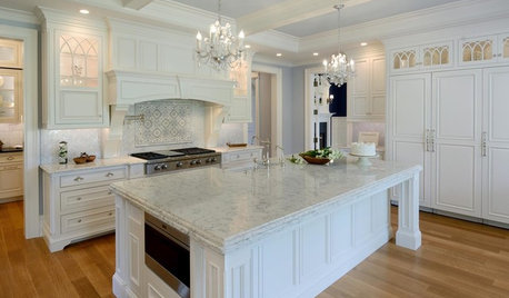
KITCHEN COUNTERTOPSQuartz vs. Granite: The Battle of the Countertops
Read about the pros and cons — and see great examples — of these popular kitchen countertop materials
Full Story
PHOTO FLIP101 Rooms With a Vacation-Worthy View
Give yourself a visual treat with these dreamy landscapes
Full Story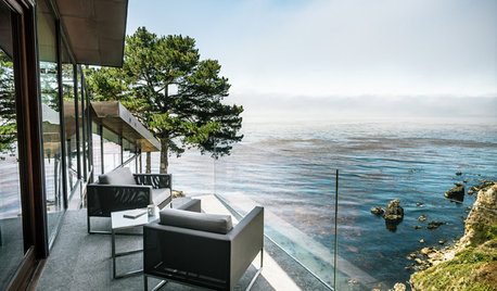
DREAM SPACESHouzz Tour: Hugging the Rocky Cliffs in Big Sur
Cascading down a rugged site and generously encased in glass, this California home takes full advantage of its ocean views
Full Story
KITCHEN COUNTERTOPSKitchen Countertop Materials: 5 More Great Alternatives to Granite
Get a delightfully different look for your kitchen counters with lesser-known materials for a wide range of budgets
Full Story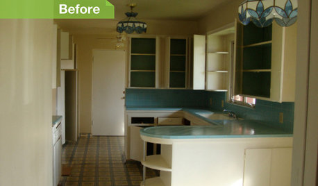
KITCHEN DESIGN24 Dramatic Kitchen Makeovers
From drab, dreary or just plain outdated to modernized marvels, these kitchens were transformed at the hands of resourceful Houzzers
Full Story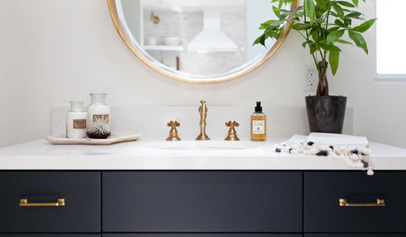
BATHROOM DESIGNBathroom Countertops: The Pros and Cons of Engineered Quartz
See why these designers like engineered quartz for its durability, color options and more
Full Story
KITCHEN DESIGNHouzz Quiz: Which Kitchen Backsplash Material Is Right for You?
With so many options available, see if we can help you narrow down the selection
Full Story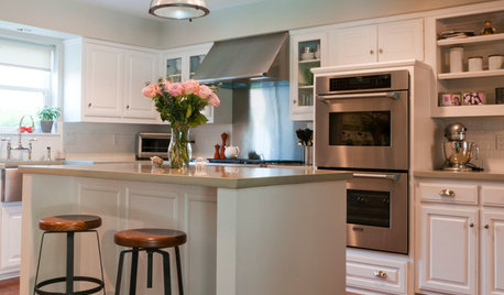
KITCHEN DESIGNShow Us Your Fabulous DIY Kitchen
Did you do a great job when you did it yourself? We want to see and hear about it
Full Story


ceeemdeeOriginal Author