


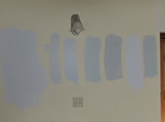
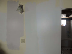
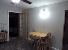
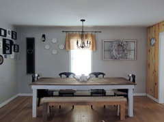
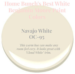
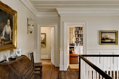
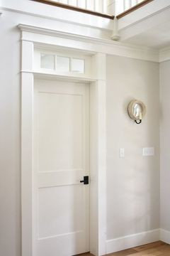
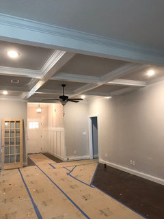
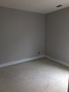
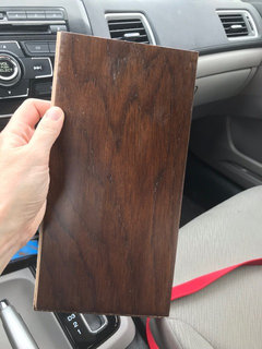
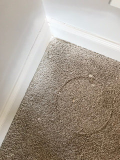
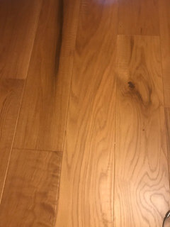
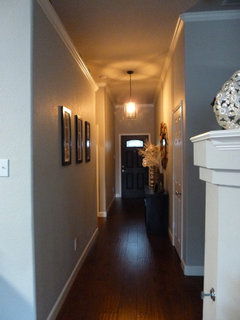
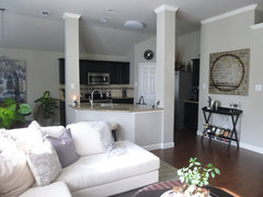
Losing my mind over paint
User
5 years ago
Featured Answer
Comments (73)

User
5 years ago
Amanda Schulz
5 years agoRelated Discussions
I think I'm losing my fridge...and my mind!
Comments (16)Thanks everyone! I've been researching CD fridges all day and haven't found one I can live with yet!!! Couple answers to your awesome questions: @grenhaven - you made me giggle!! The mystery appliance is a wine cooler/beverage center. @sjhockeyfan - yes, the island is 112 inches, including 5 inches of overhang on the side. We may just have to lose that. Also, we don't have the option of customizing our cabinetry to extend out the depth of the fridge. :(. We are building a semi-custom home and have several limitations. @tomatofreak - after hours perusing here, I've learned many people happily live with less than what the experts recommend. But, your experience is exactly the type of information I'm looking for. @annkh - Nope, I have the dining room on other side. But, my GC is recessing all the plumbing stuff!! :) Keep all advice coming, love it!! Would love to see pictures too!! Thanks!!...See MoreI'm losing my mind! All induction cooktop or MY preference: with gas?
Comments (14)Thank you ALL for your responses. Each has helped clarify add'l thoughts I've had and brought up new ones! I THINK I've made a decision about what I need to do. As of this moment, I'm going to buy a 30" black glass induction cooktop - 4 burners. When I want to use one of my non-induction pans, I'm going to use a heavy-duty gas, 12,000 BTU portable unit that runs on Butane (1 hr. of continuous high BTUs usage; 2-3 hrs. for medium)! It's clear that my needs for those won't be often, but it WILL solve most of my issues that were bothering me and I won't have to give ALL of my favorite pans away that I so feared. And I'll still have access to BOTH induction AND gas (my original duel-fuel passion)! The reviews for this particular 12,000 BTU gas unit were outstanding and it's cost is less than $50 for the privilege. I was considering the Bosch Flexinduction or the highly praised (by reviewers) Frigidaire FGIC 3067MB. But, now I've noticed here the Bosch 800 being discussed for less $$ than the Flex if one doesn't need the flexible pods (which I don't, really). Frigidaire has about all the goodies EXCEPT individual burner timers at around $1100 or so with just terrific reviews on amazon - an amazing price point. Can anyone point out some detriments of these three that I may not have noticed or be aware of? What would all of us unknowing people do without all your input and kind help??...See MoreLosing my mind: Granite install is wrong
Comments (90)I am not understanding what OP wants to happen in terms of expectations. Remodeling is frustrating but there seems to be no damage done since the stone wasn't cut and therefore the issue isn't whether OP is going to be forced to accept the stone. It's obvious the stoneyard/installer should refund the deposit and I am assuming will be happy to do so. It seems to be a perfect example of mutual misunderstanding resulting in no contract formation - the classic case regarding the mistake in which ship named Peerless would be used to ship the cargo. Since there was no meeting of the minds, there was no contract :-). It's certainly fun when something that I learned in the first weeks of law school still has relevance in the modern world - I am waiting for a post on caveat emptor and medieval sexual enhancements :-). Ruffles vs Wichelhaus A good example that illustrates what is a mistake in contract law is the case of Ruffles vs. Wichelhaus. There was a contract to ship merchandise on a vessel named Peerless. However, the parties involved had a different understanding of each other. Each party was referring to a different vessel, and therefore, they did not agree when to ship the merchandise. In this case, both parties thought they were in consent until they realized were both misguided about each other’s different meaning. As such, an agreement was not formed since there was no mutual assent between the parties involved in the formation stage of the agreement. Like a unilateral mistake, the best practice to avoid a mutual mistake is to consult an experienced attorney to determine whether a defence of mutual mistake is a viable option for you....See MoreAbout to lose my mind over lighting upgrades
Comments (11)Ok lets recap 1. you said you really didn't need that much light at night, but your last comment says you do. In a small room like this one light bulb is plenty, everyone is so misled by lumens, wattage etc just remember most single-socket fixtures will house 60-100wtt equivalent 2. you said you wanted to stay true to the style of the home but the fan you selected is much more modern than the home, and ceiling fans would really not have been an option then. I also find a floor or table fan to be just as useful in a room this size. 3. You have a lot going on so it is ok to be overwhelmed, bear in mind it is just two ceiling fixtures you are focused on. I think you should look at getting a floor or table fan and a simple flush mount for the ceilings. Shop on lamps Plus, this will give you a website that is really focused on lighting....See More
Jennifer Hogan
5 years ago
lynartist
5 years ago
Rawketgrl
5 years ago PRO
PROJAN MOYER
5 years agolast modified: 5 years ago
kulrn
5 years ago
Alyssa Mintus
5 years ago
Janie Gibbs-BRING SOPHIE BACK
5 years ago- PRO
Patricia Colwell Consulting
5 years ago 
Cyndy
5 years ago- PRO
JAN MOYER
5 years agolast modified: 5 years ago Janie Gibbs-BRING SOPHIE BACK
5 years agoAnnKH
5 years agoUser
5 years agoUser
5 years agoUser
5 years agolast modified: 5 years agoUser
5 years agolast modified: 5 years agoUser
5 years agopartim
5 years agoJennifer Hogan
5 years ago
ILoveRed
5 years agoUser
5 years agoUser
5 years agoUser
5 years ago
Linda
5 years agolast modified: 5 years agoBrenda
5 years agomandapanda75
5 years ago
nuncia57
5 years agoHU-938445158
5 years agokulrn
5 years agoUser
5 years agoUser
5 years agoUser
5 years agoUser
5 years ago
John Chandler
4 years agolast modified: 4 years agoHU-938445158
4 years ago
Victoria
4 years ago
Jennifer Lynn
4 years agolindahambleton
4 years agoUser
4 years agolast modified: 4 years agoJohn Chandler
4 years agolast modified: 4 years ago
Trish Walter
4 years ago


Related Stories
HOUZZ TOURSMy Houzz: Creative Renters Triumph Over the ‘No Paint’ Rule
Not allowed to paint and limited with nails, a design-minded couple uses furnishings and textiles to make their rooms stand out
Full Story
COLORS OF THE YEARWill These 9 Paint Colors Take Over Homes in 2020?
Major paint companies choose colors of the year that are fresh, upbeat and mostly on the cool side
Full Story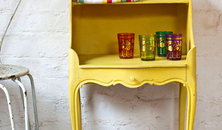
PAINTINGWhat to Know About Milk Paint and Chalk Paint — and How to Use Them
Learn the pros, cons, cost and more for these two easy-to-use paints that are great for giving furniture a vintage look
Full Story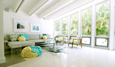
DECORATING GUIDESDesign Debate: Should You Ever Paint a Wood Ceiling White?
In week 2 of our debate series, designers go head to head over how classic wood ceilings should be handled in modern times
Full Story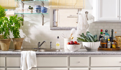
KITCHEN DESIGNKitchen of the Week: Making Over a Rental for About $1,500
Fresh paint, new hardware, added storage, rugs and unexpected touches breathe new life into a Los Angeles apartment’s kitchen
Full Story
LANDSCAPE DESIGNShould You Paint Your Fence Black?
If you’re wondering which color to use for your boundary, here are 7 reasons to go over to the dark side
Full Story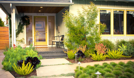
INSPIRING GARDENSBeach Cottage Loses the Lawn for a Stylish Low-Water Garden
Colorful plantings and soft exterior paint colors give a Southern California ranch cottage a fresh new look
Full Story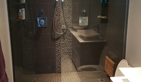
BATHROOM MAKEOVERSRoom of the Day: Master Bathroom Loses a Tub and Gains Sophistication
Pale gray wall paint and a spacious new shower help a dated-looking bathroom achieve spa-like serenity
Full Story
REMODELING GUIDESLose It: What to Do With Leftover Building Materials
See how to properly dispose of your extra brick, wood and paint — or make something cool with it instead
Full Story
EARTH DAYThe Case for Losing the Traditional Lawn
Work less, help the environment and foster connections by just saying no to typical turf
Full Story


DLM2000-GW