


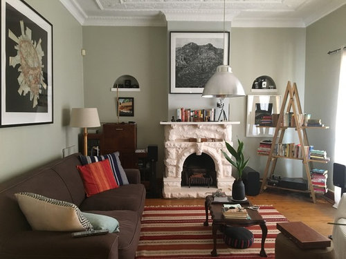
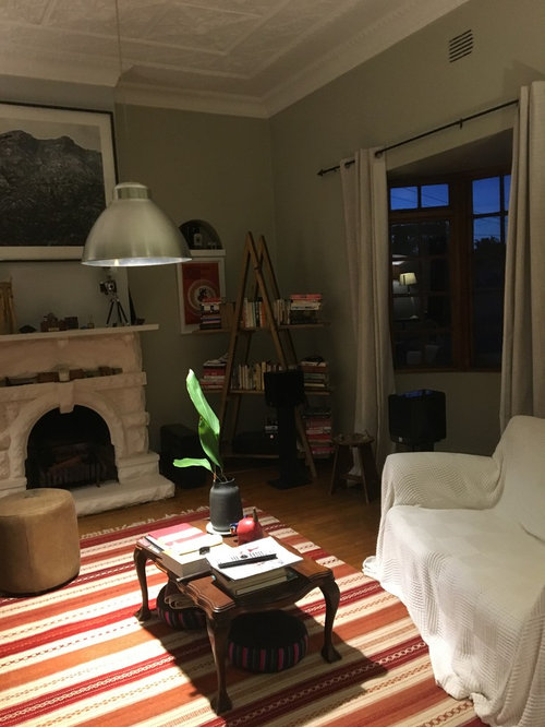
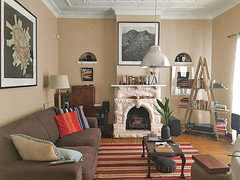
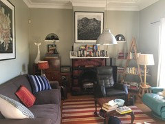
What wall paint color would go with this unusual living room?
Eve
5 years ago

Featured Answer
Sort by:Oldest
Comments (43)

V K
5 years agoRelated Discussions
What colors would go well with my walls?
Comments (1)I suggest you repost your question in Home Decorating forum..more people will see it...See Morewhat color to paint walls and what color to paint shelves to go with
Comments (3)I don't know what Revere Pewter would look like with the browns you have, but I've seen pictures of it with walnut and calacatta marble and it look very nice. Buy a sample and paint a board with several coats and set it in the room to see if you like it. It is a Benjamin Moore color....See MoreWhat paint colour would you recommend to go with these wallpapers?
Comments (3)Pull the background color from the wallpaper for the first paper This is the background from the second paper but it may be too light. This is the background from the black paper used next to the second wallpaper and this combination works well....See MoreWhat paint color would go well with a charcoal gray sectional?
Comments (3)Something light and slightly cool to work with your rug like Sherwin Williams Opaline is what comes to mind. And to look more pulled together consider adding that teal/green tone in accents in the living room (throw, pillows, art)....See More PRO
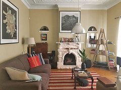
PROCelery. Visualization, Rendering images
5 years ago- PRO
Celery. Visualization, Rendering images
5 years ago 
Eve
5 years agoEve
5 years ago
groveraxle
5 years ago- PRO
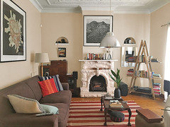
Celery. Visualization, Rendering images
5 years agolast modified: 5 years ago groveraxle
5 years agoEve
5 years agogroveraxle
5 years agogroveraxle
5 years agoEve
5 years agogroveraxle
5 years ago
cawaps
5 years ago
tartanmeup
5 years agolast modified: 5 years ago
Nicole R Dsp
5 years agoEve
5 years agotartanmeup
5 years ago- PRO
Patricia Colwell Consulting
5 years agolast modified: 5 years ago Eve
5 years agoEve
5 years agoEve
5 years agoEve
5 years agoEve
5 years agoEve
5 years agotartanmeup
5 years agoEve
5 years ago
clt3
5 years agoEve
5 years agocat_ky
5 years agoRuth
5 years agogroveraxle
5 years ago
Bette P
5 years agoBette P
5 years agoEve
5 years agolast modified: 5 years ago


Related Stories
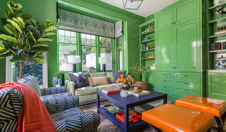
LIVING ROOMSRoom of the Day: Green Walls Raise the Energy in This Living Room
A vibrant paint color takes a pale yellow space to an upbeat place
Full Story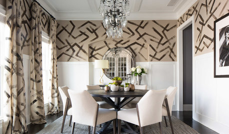
DINING ROOMSRoom of the Day: Hand-Painted Walls Set This Dining Room Apart
A bold design and small accents make this square room the perfect place to have fun
Full Story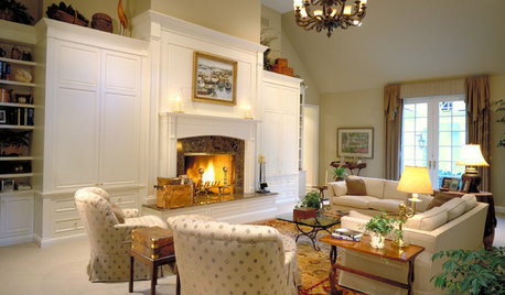
DECORATING GUIDESWall Art for Traditional Living Rooms Can Fit or Break the Mold
Tips on How to Pick a Piece That You Love, From Paintings to Mirrors, Classic to Contemporary
Full Story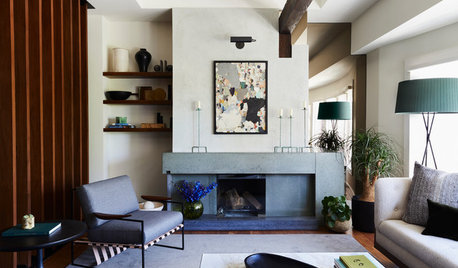
FIREPLACESNew This Week: 7 Living Rooms That Rethink the Fireplace Wall
Bold and adorned or streamlined and minimalist — which of these fireplaces would you want warming up your home?
Full Story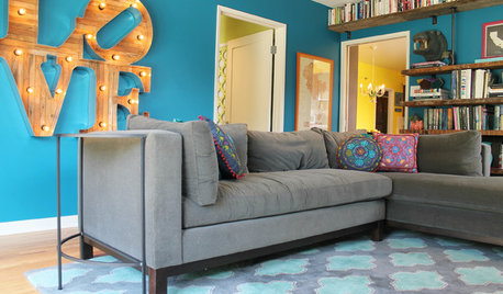
COLORFUL HOMESThe Best of My Houzz: 10 Living Rooms With Wall Colors to Love
Jet black, Meyer lemon yellow, mossy green — these spaces make a statement with bold color
Full Story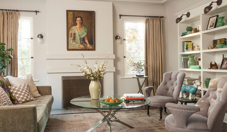
LIVING ROOMSNew This Week: 5 Fully Decorated Living Rooms That Don’t Go Overboard
See how designers filled these recently uploaded spaces with the right amount of furniture and accessories
Full Story
DECORATING GUIDES13 Ways to Upsize a Small Living Room Without Moving a Wall
A design pro shows how to use light, colour, layers and focal points to make a compact room look and feel more expansive
Full Story
DECORATING GUIDESLiving Room Features That Never Go Out of Style
These key pieces will help your living room keep its good looks, no matter what's in fashion
Full Story
LIGHTINGSmart Ways to Work Wall Lights Into Your Living Room
Mood-setting sconces cast light where it’s wanted while keeping horizontal surfaces clear
Full Story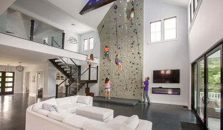
HOUZZ TVThis Family Put a 26-Foot Rock Climbing Wall in Their Living Room
This custom house has fort beds, a dance stage and other fun features that create a dream home for kids and adults
Full Story


Anglophilia