


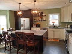
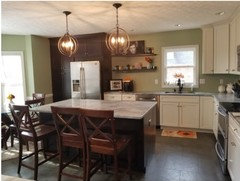
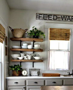
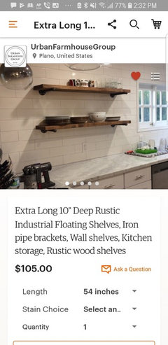
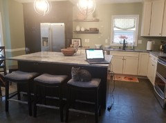
Something is missing
Kelly Gerstle
5 years ago

Featured Answer
Sort by:Oldest
Comments (59)

groveraxle
5 years ago
Manon Floreat
5 years agoRelated Discussions
Something is missing here.
Comments (7)Um, did you happen to notice the best by date? Maybe it isn't clear in the photo but it appears that the year is 2010. Hope you enjoyed them. Satine...See MoreI stopped chemical fertilizing but now something seems missing,...
Comments (71)"Persistent animations may be related to psychoactive consumables...especially if no one else is seeing them. :-o " Psychoactive Consumables, you mean virtual pot? Maybe it sounds as if you are suggesting a psychosis happening here, that I may be the only one who gets them... Hmmm conspiracy! Even if you don't believe in it doesn't mean that they are not out to get you. I refer to the ads that want to grab your attention using movement. For those with the dyslexic attribute, they are so distracting that the web page is rendered useless. I have to move that section of the page to be off the side of the monitor. It would be nice to have a switch to kill all animations. "Ying tong yiddle I po" Have you looked it up? (: Think Groucho Marx.......See MoreSomething is missing here...
Comments (39)It might also help to know which room in the house this area is in (living room, den, entry hall/foyer), as well as what/how the room and the area in the room are used for. Will this area actually be used or are you just trying to fill up a space you consider empty? And in either case, are you able to "shop" your home first before buying anything new?...See MoreNeed Help! Something is missing from this living room.
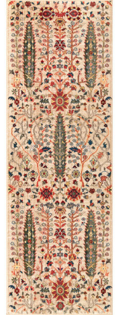
Comments (13)a bigger rug that fills the room so all the furniture is sitting on the rug in an accent color; the room seems to consistent. ....a larger lamp on the table between the two chairs, and small accent pillow in each chair. If possible a floor lamp in the corner behind the sofa. consider squaring up the tall radio ? cabinet between the fireplace and the window wall and adding a pretty big fern. Nothing on the mantel and a smaller gold or silver fireplace screen that just covers the opening of the firebox. A basket on the floor by the fireplace for firewood. Another small picture stacked above the one small square picture to the left of the chairs to fill the wall..... Pretty glass bowl on cocktail table in a clear glass accent color. A colorful throw in an accent color on the back of the sofa taking up about 2/3 of the sofa back....... Fabric roman shades in a pretty cloth pattern that has some of the leather color in it to soften the windows a bit. Just some ideas to consider as finishing touches for your room.....it is lovely proportions by the way!...See More
threers
5 years ago
mama goose_gw zn6OH
5 years ago
Hansen
5 years agoHansen
5 years agomimimomy
5 years agoerinsean
5 years agoAJ G
5 years agonjmomma
5 years agoAnne Duke
5 years agomimimomy
5 years agocpaul1
5 years agoWendy H
5 years ago PRO
PROBeverlyFLADeziner
5 years agolast modified: 5 years ago
Lynne Mysliwiec
5 years ago
Nidnay
5 years agohousegal200
5 years ago
Sunny
5 years ago
raee_gw zone 5b-6a Ohio
5 years ago
littlebug zone 5 Missouri
5 years agoTBL from CT
5 years agoHelen 72
5 years ago
miss lindsey (She/Her)
5 years agoMrs Pete
5 years ago
Susan Davis
5 years agoKelly Gerstle
5 years ago
Julie Anne
5 years ago
Ashley R
5 years ago PRO
PROBeth H. :
5 years agolast modified: 5 years ago
krottmann
5 years agolizbeth-gardener
5 years agoeverdebz
5 years ago
Nicole R Dsp
5 years agoeverdebz
5 years agoeverdebz
5 years agoeverdebz
5 years agoeverdebz
5 years ago
Shredder
5 years ago PRO
PROFinishing Touches
5 years agoHansen
5 years agodaneejela
5 years agoeverdebz
5 years ago PRO
PRODiane Kremer, ASID CID
5 years agolast modified: 5 years agoKelly Gerstle
5 years agoartemis_ma
5 years agolast modified: 5 years agogroveraxle
5 years agojudy1740
5 years ago
blubird
5 years agolast modified: 5 years ago
Miranda
5 years ago


Related Stories
DECORATING GUIDESRoom Doctor: 10 Things to Try When Your Room Needs a Little Something
Get a fresh perspective with these tips for improving your room’s design and decor
Full Story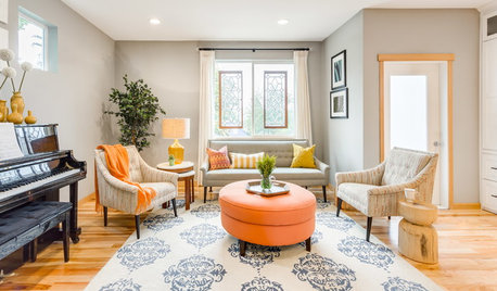
DECORATING GUIDESRoom of the Day: Something for Everyone in a Seattle Family Room
Family members downsize to a home that will shorten their commutes and give them more time together — much of it spent in this room
Full Story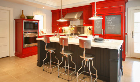
COLORReady to Try Something New? Houzz Guides to Color for Your Kitchen
If only mixing up a kitchen color palette were as easy as mixing batter. Here’s help for choosing wall, cabinet, island and backsplash hues
Full Story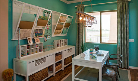
STUDIOS AND WORKSHOPS8 Rooms That Say 'Let's Make Something'
Stock up on ideas for craft room storage and workspaces from deluxe home workshops
Full Story
REMODELING GUIDES10 Features That May Be Missing From Your Plan
Pay attention to the details on these items to get exactly what you want while staying within budget
Full Story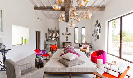
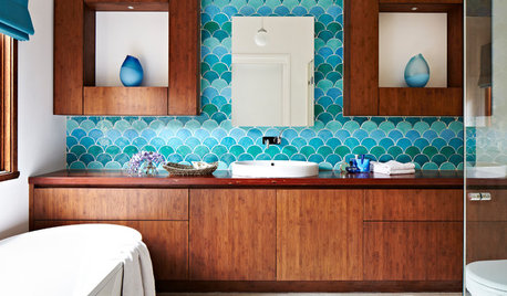
DECORATING GUIDESThe Missing Piece in Your Room Design
Decoration doesn’t have to stop at eye level. Look up and see the opportunities in the upper third of your rooms
Full Story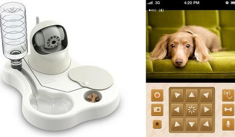
HOME TECHTo Feed and Protect: Care for Your Pet From Afar With New Devices
You might miss the nuzzles, but your dog or cat won't miss food, water or monitoring with these high-tech feeders and cameras
Full Story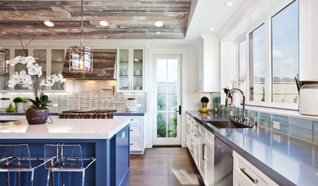
KITCHEN OF THE WEEKKitchen of the Week: Marrying Past and Present in Los Angeles
Something old, something new and all the rest make for a happy kitchen union in a tony L.A. neighborhood
Full Story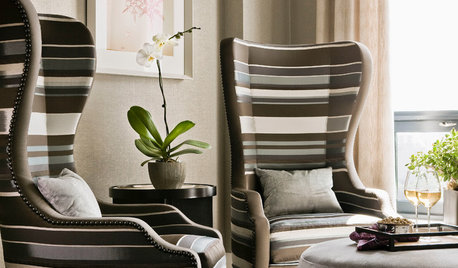
DECORATING GUIDES12 Smart Ideas for Decorating Empty Corners
Fill a neglected corner with something useful, attractive or both, using these dozen thoughtful decorating strategies
Full Story


Celery. Visualization, Rendering images