


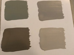
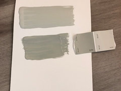
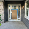
Paint color looks darker than in example photos
jaxo
5 years ago
last modified: 5 years ago
Featured Answer
Sort by:Oldest
Comments (10)

jaxo
5 years agolast modified: 5 years ago
aprilneverends
5 years agoRelated Discussions
Trim color: need a shade darker than S-W 7562 Roman Column
Comments (0)Good morning! I am very close to finalizing my paint selections for my new build. I love the wall colors I've selected but my trim color is still a little whiter than I'd like; I wanted something creamier. I do not want to do any antiquing. The trim will be used on doors, trim, crown molding, and most of the cabinetry in the house. The wall colors include: + S-W 6107 Nomadic Desert (same color card as Latte, just one shade lighter) + S-W 6105 Divine White (same color card as Latte, just three shades lighter) + S-W 7687 August Moon + S-W 7509 Tiki Hut The currently selected trim color is S-W 7562 Roman Column. It's a very nice white and looks creamy in most light, but now that I see it painted next to my wall colors on the sample boards, it looks too white. Most of our floors will be walnut stained red oak. The carpeted areas will be a regular ol' beige-brown carpet. Any suggestions? I do plan to call Sherwin-Williams today to see if they can recommend something 1 shade creamier. Thanks! try_hard ......See Morewhy does the cut in on walls look darker than the rolled walls?
Comments (17)I know Houzzers hate old posts with a new life, however Brian also commented this year and didn’t get a reply. And I’m not sure all the above posts are truly answering the issue that I, and others, experience. We have a room with a contrast wall where we have that weird banding from the cut in a couple years ago. We are re-painting the other 3 walls and while up on the ladder and cutting in I can see on the contrast wall it is shiny for the cut in, like semi-gloss while the rolling is eggshell. My husband rolls heavy, he cuts in 2 inches heavy, I cut in 3-4 inches not as heavy. We use Cashmere Sherwin Williams and Purdy brushes. In our case the look difference is sheen. It’s strange and searching the internet doesn’t answer the sheen issue. I get the color replies being heavy vs light, but that’s not our issue. Why the sheen difference using the same paint with the brush?...See Morewould you paint master bath lighter or darker than master bedroom?
Comments (2)I think it depends on how much light is in the bathroom. My bedroom is not very light so I went with a light green. After several years I decided to paint the adjoining bathroom but went with a darker shade of green. There is a skylight in the bathroom as well as a window so it is very light. I love the difference. I also painted a hall bathroom with a darker color. There are no windows, but do have excellent lights and it looks wonderful. Good luck on what ever you choose....See MoreWhat paint is slighty darker than Ballet white ?!?
Comments (8)Nature's Essentials 1521 by Benjamin Moore. A little darker than that is Feather Gray 32-27 by Pratt & Lambert. You don' have to know what all the numbers mean. Most important is they're very close in terms of hue family and chroma. Which means Feather Gray and Nature's Essentials are pretty much "just like" Ballet White only darker. Ballet White OC-9 Nature's Essentials 1521 Feather Gray 32-27...See Morejaxo
5 years ago
Bunny
5 years agojaxo
5 years agoaprilneverends
5 years ago
hoovb zone 9 sunset 23
5 years agojaxo
5 years agolast modified: 5 years agoaprilneverends
5 years ago

Related Stories
COLORWhy You Should Paint Your Walls More Than One Color
Using multiple colors can define zones, highlight features or just add that special something
Full Story
DIY PROJECTSTint Your Own Paint for New-Looking Walls
Dabbling in mixology means you can use up leftover paint and give your walls a custom look in one fell swoop
Full Story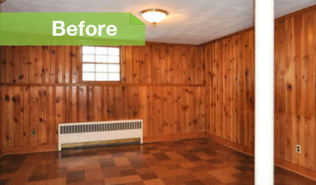
PAINTINGKnotty to Nice: Painted Wood Paneling Lightens a Room's Look
Children ran from the scary dark walls in this spare room, but white paint and new flooring put fears and style travesties to rest
Full Story
DECORATING PROJECTSGet a Wallpaper Look With a Hand-Painted Touch
Stencil a pattern for all the beauty of your favorite wallpaper at a fraction of the cost
Full Story
SELLING YOUR HOUSESelling? How to Make Your House Look Great in Photos
Improve your home’s shot at a sale by maximizing light, removing clutter and refreshing plants before the photo shoot
Full Story
FURNITURE6 Decades-Old Designs That Look Better Than Ever
After getting a few nips and tucks, some favorites from the ’60s and ’70s have made a stylish comeback
Full Story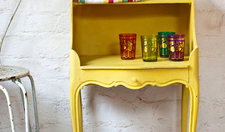
PAINTINGWhat to Know About Milk Paint and Chalk Paint — and How to Use Them
Learn the pros, cons, cost and more for these two easy-to-use paints that are great for giving furniture a vintage look
Full Story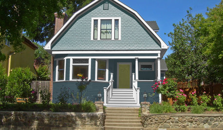
EXTERIOR COLORSee How 5 Color Palettes Look on 1 Charming Exterior
We used photo-rendering software to visually transform this home to show the dramatic power of paint
Full Story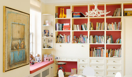
COLORPaint Your Bookcases to Transform Your Room
Give your shelves some color for a whole new look. Here are 10 examples, from subtle to bold, and some styling tips to try
Full Story
PAINTINGShare Your Biggest Paint Color Mistake
Did a shade that looked perfect in the store turn out to be less than perfect on your walls? Let’s swap stories!
Full Story

jaxoOriginal Author