


Help picking cabinet paint color to coordinate with SW Agreeable Gray
ihjah
5 years ago
Featured Answer
Sort by:Oldest
Comments (19)
 PRO
PROCelery. Visualization, Rendering images
5 years agoRelated Discussions
SW Agreeable Grey and SW Extra white together?
Comments (10)[extra white] cabinets may also look a little greenish against the agreeable grey as its such a large area? I doubt it. Anything can happen I suppose, but most 'just whites' are purposefully created from the yellow and green-yellow hue families because of the way we perceive certain wavelengths - the yellow/green-yellow region of the spectrum, low chroma whites will read as "just white" no strong overtones one way or the other on the color wheel. What about SW 7661 Reflection? I added it to the infographic so you can compare. I have color notations from SW, but I don't know to what standard they measured their colors. So, I always indicate that on images. I scanned Reflection with my colorimeter and did the conversion myself because the SW notation for Reflection put in too far in the green hue family, IMO. I mean it was within a reasonable range, but I trust my numbers more. The umber in the sample of Agreeable is 9 but in the Reflection it's only 1. Does that bring it over closer to the cool side on the wheel? I don't do the formula thing - reading the individual colorant components of a paint color is futile because of this thing called substance uncertainty. Substance uncertainty tells us that due to the physical make-up of colorants, it's impossible to know or predict what will happen when mixed together. Some colorants have big particles, some have small, some are more potently concentrated while others are thin and weaker. And these colorant characteristics vary from brand to brand. The only way to know is to mix the color and let it dry. So, could the factor of umber be the reason why Reflection is a green-yellow and Agreeable is a yellow? Maybe but there's no way to know that for sure. I am trying to find a greyish color that does not have the green or pink undertones. I don't subscribe to blogosphere's concept of undertone either. Undertones are about density of the paint film and how much, if any, of the substrate you can see thru the paint film. It goes masstone, midtone and undertone: Masstone is the thickest density and zero substrate shows thru. Midtone is the Goldilocks of paint film density. It's just right, zero substrate shows thru but the film is spread per manufacturer spread rate specification and is nice and even. Undertone is revealed when the paint (or other medium) is spread thinly so the substrate can be seen and light can reflect thru the thin film, off the substrate, and back up thru the thin film. You have to take some purposeful action to manipulate the paint (or other medium) to reveal undertone. How does one find out where in the wheel a color lives? Never, ever compare paint chips to a white background. White overpowers color swatches and makes them appear more grayed down, not so bright and intense. Underestimating a color’s brightness and intensity is the #1 mistake people make when choosing paint colors. “It’s too bright” is the #1 reason people give as to why they don’t like the color they chose. I use spectral data and math to calculate a color notation, hue family. If you don't know how to use spectral data to get a color notation, determine hue family, then you have to eyeball it. You have to visually assess your target color compared to a set of chromatic hue parents. If you want to discern what hue family a color belongs to sans color measurement data, then you compare it to hue family parents. Compare the uncategorized color to a big chip of red, blue, green, yellow, etc. Color responds to its context. Comparing one color to another is basic context. You do that because it is a that which is like unto itself is drawn kinda situation. Put the child color (your color) next to its hue parent and you can see the similarities and thus determine what hue parent/family a paint color belongs to. It is no different from human kids and parents. See a kid running around at the playground and he looks like any other kid. Put him in context with his family and suddenly you are able to recognize similar features and compare attributes, and it quickly becomes apparent that junior is a chip off the old block. Same thing happens with color. Through the process of comparison, you will see the hue family to which a color belongs. Here's a list from SW and BenM of saturated colors that can serve as hue parents for comparison purposes in order to determine a color's hue family. Download Hue Parents Infographic I think I got all you questions. Hope it helps....See MoreIs there a SW paint that is comparable to Agreeable Gray but lighter?
Comments (33)I was having a terrible problem picking a gray whole house color. I wanted something light and warm. I ended up with Pale Oak. It’s gorgeous in every room. Light and warm off white in a neutral ivory living room with afternoon sun. It never looks pink or purple. Just deeper warm gray or light gray/off white depending on lighting and time of day. It’s very neutral as I have mostly neutral surroundings. You can add color easily. I added a purple vase and some black accents in the living room. Benjamin Moore white for the trim....See MoreSW Agreeable Gray vs. BM Edgecomb Gray?
Comments (5)@mdefree So I ended up painting my living room Revere Pewter, and Edgecomb Gray for the rest of my first floor - kitchen/dining area, foyer, hall, stariway, guest room and master bedroom. The Revere Pewter is perfect in the living room - glad I decided to have a bit of contrast in that room. I am happy with the Edgecomb Gray, but it definately reads more beige than gray in my house (especially in the evening under artifical lighting) . It works because of all the existing hard elements, but I've had to rethink how I'm updating some of my accent pieces - I am finding that I have to be more intentional about the shades of gray I'm using to provide contrast against the Edgecomb Gray. I also choose SW Oyster Bay for my office - it's a prominent room off the foyer with french doors and it plays really nice with the Edgecome Gray walls that are adjacent to it....See MoreWhich tile flooring for SW Agreeable Gray?
Comments (10)Can you put the flooring samples next to the paint? Even if you just buy a small container and paint a large poster board, that will really help to see the wall color next to the floor color. It is hard to compare colors from two different photos....See More
luscious111
5 years ago
Alexandra Borowski
5 years ago
Sue
5 years agoryburns26
5 years agoAlexandra Borowski
5 years agoAlexandra Borowski
5 years ago
Mamaof4
5 years agoSuzanne Wright
5 years agoAlexandra Borowski
5 years agolast modified: 5 years agomichelle busch
2 years agoSue
2 years ago
Terri Turner
2 years agoSue
2 years ago
Jill Brewer
last yearSue
last yearnursekelly71
last yearnursekelly71
last year


Related Stories

GRAYChoosing Paint: How To Pick the Right Gray
Which Version of Today's 'It' Neutral Is For You?
Full Story
COLORPick-a-Paint Help: How to Quit Procrastinating on Color Choice
If you're up to your ears in paint chips but no further to pinning down a hue, our new 3-part series is for you
Full Story
COLORPick-a-Paint Help: How to Create a Whole-House Color Palette
Don't be daunted. With these strategies, building a cohesive palette for your entire home is less difficult than it seems
Full Story
COLORPaint-Picking Help and Secrets From a Color Expert
Advice for wall and trim colors, what to always do before committing and the one paint feature you should completely ignore
Full Story
GRAYDesigners Share Their Favorite Light Gray Paints
These versatile neutrals can help create a range of moods in any room
Full Story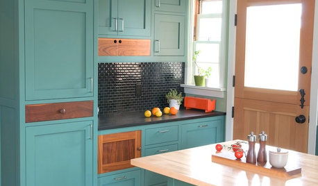
MOST POPULARFrom the Pros: How to Paint Kitchen Cabinets
Want a major new look for your kitchen or bathroom cabinets on a DIY budget? Don't pick up a paintbrush until you read this
Full Story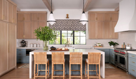
KITCHEN CABINETSPainted vs. Stained Kitchen Cabinets
Wondering whether to go for natural wood or a painted finish for your cabinets? These pros and cons can help
Full Story
WHITEHow to Pick the Right White Paint
White is white, right? Not quite. See 8 white paint picks for 8 very different effects
Full Story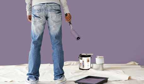
PAINTINGBulletproof Decorating: How to Pick the Right Kind of Paint
Choose a paint with some heft and a little sheen for walls and ceilings with long-lasting good looks. Here are some getting-started tips
Full Story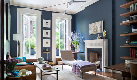
DECORATING GUIDESDesigner Picks: 9 Beautiful Saturated Blue Paints
Bold cobalt, inky indigo and moody midnight are just a few of the hues that can set a dramatic tone
Full Story

Lori A. Sawaya