


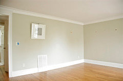
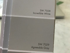
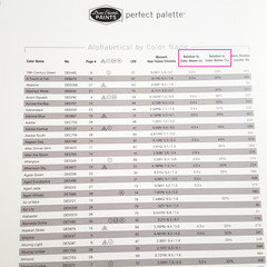
Agreeable grey overdone?
Kris Bruesehoff
5 years ago
last modified: 5 years ago
Featured Answer
Sort by:Oldest
Comments (32)
Related Discussions
Painter is almost here: SW Sedate Gray vs Agreeable Gray or just white
Comments (3)May be too late, but I have Gray Owl in my family room that is west facing. I don't see green. It is definitely a cool gray at least in my space and remember when I was choosing a gray BM Gray Owl was suppised to be a pretty 'clean' gray....See MoreWhat color is between SW Agreeable Gray and SW Anew Gray?
Comments (3)I should add that I had painted Agreeable Gray on a poster board first and thought I found the perfect color. Then it looked totally different actually up on my walls :(...See MoreWhat other colors go with agreeable gray and anew gray?
Comments (2)The concept of selecting neutrals as our main wall color in the major living spaces of our home is that many colors work with the neutrals and can be used as either accent colors in our main living space or main colors in adjoining spaces. Do you have any blues or greens in the adjoining spaces? I think the example below shows how they took accent colors from the living space into bathrooms and bedrooms. It is the same concept - repeat colors throughout to create harmony....See MoreHelp needed ASAP - agreeable gray/pure white/gauntlet gray
Comments (2)This is Gauntlet Grey and Agreeable Grey. I love the combo in my bedroom— hope this helps. It’s nighttime in my room now so the agreeable grey looks very taupey now. It’s a chameleon color depending on light and decor....See More
pink_peony
5 years ago
Kris Bruesehoff
5 years agoKris Bruesehoff
5 years agolast modified: 5 years agoKris Bruesehoff
5 years agolast modified: 5 years ago
always1stepbehind
5 years agoartistsharonva
5 years agolast modified: 5 years agoartistsharonva
5 years ago PRO
PROLori A. Sawaya
5 years agolast modified: 5 years agoKris Bruesehoff
5 years ago- PRO
Lori A. Sawaya
5 years ago

Related Stories

GRAYDesigners Share Their Favorite Light Gray Paints
These versatile neutrals can help create a range of moods in any room
Full Story
DECORATING GUIDESColor of the Week: Decorating With Warm Gray
Tired of tan? Getting gloomy from cool gray? Make warm gray your new go-to neutral
Full Story
MOST POPULARRethinking Beige in a World Gone Gray
Gray, the ‘it’ neutral of recent years, has left beige in the shade. But is it time to revisit this easy-on-the-eyes wall color?
Full Story
MOST POPULAR50 Shades of Gray
Gray is hotter than ever, thanks to a hit novel full of risks and dark secrets. Tell us: Which paint shade possesses you?
Full StoryKITCHEN OF THE WEEKKitchen of the Week: White and Gray and Storage-Packed
Open space, natural light and a palette of neutrals create a bright contemporary kitchen for a growing family
Full Story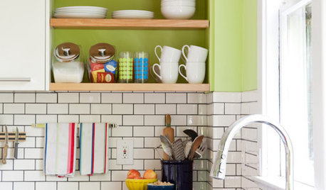
KITCHEN DESIGNSubway Tile Picks Up Gray Grout
Heading into darker territory, subway tile offers a graphic new look for kitchens, bathrooms and more
Full Story
HOMES AROUND THE WORLDHouzz Tour: Gray and Yellow Mix It Up in a London Apartment
A neutral palette gets a jolt of energy from sunny accessories and witty artwork in this new unit in an industrial area
Full Story
GRAYChoosing Paint: How To Pick the Right Gray
Which Version of Today's 'It' Neutral Is For You?
Full Story
DECORATING GUIDESHow to Combine Blue and Gray in Your Living Room
Let these 10 versions of the versatile color combination inspire you
Full Story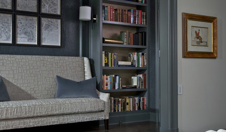
COLORHow to Layer Tones of Gray for Depth and Harmony
Use texture, pattern, contrast and more to create a subtle, sophisticated look with this popular color
Full Story

Lori A. Sawaya