


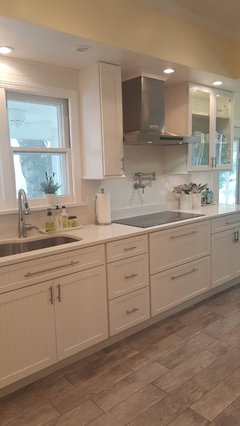
Need wall color and backsplash to calm ivory "yellow" cabinets! Pics
sandywjo93
5 years ago


Featured Answer
Comments (53)

sandywjo93
5 years agolast modified: 5 years agoRelated Discussions
Progress pics of kitchen--need backsplash ideas.
Comments (23)First off I like the granite! If you love it too, you can make it work. Do you love it? That is the questions. Do you love the granite? You said you were second guessing, I assume this was before you posted. If you do not love the granite but more like or say "eh sure", then I would say start a search for a granite that makes you really smile. Something that says "wow, I love this". Meanwhile you said you wanted to find a backsplash to go with this kitchen. Do you want to start with backsplash ideas and find a granite to go with them? Sometimes this is a great way to go. How modern do you want to go? How rustic or is the only rustic element the cabinetry? When I think of Rustic I think of.... �Leather or suede Pewter, zinc, orb, wrought iron, rust Wood floors, branches, bark, twigs cotton, hemp, linen, wool, Stone tile, even old brick, rocks, or concrete Rustic Modern is a lovely direction. I can see why the sales person recommended the white Botticino marble. Did the salesperson see the cabinets? Have you collected some favorite images for inspiration? Maybe clippings? What elements besides rustic, modern and plain come to mind? Colors? Textures? For now lets look at some rustic modern kitchens that might help and from there we can find out what you love and start a plan. Let me know the colors, textures, even granites or backsplashes that you love in any of the images below and we can search for more. Keep in mind I am simply guessing because all I have so far are these words. "rustic, Modern, Plain" ~boxer I am showing you this image with rustic cherry cabs and a warm backsplash and counter. The glass tiles lend a sense of modern in this space but it is not plain. rustic cabs but a more contemporary glass tile white with wood This makes me think of rustic modern. The modern feel of the cabinets but the rustic beams and the rustic earthy feel to the space. Lastly backsplashes, since this was after all your original question...See Morefinished kitchen pics -and i need a backsplash
Comments (68)I can vouch that Kate's kitchen (along with the entire house!) is even more gorgeous in person than it is in the pictures! Her kitchen is my favorite by far (including my own, which I love dearly). And that bathroom....there are no words for how stunning it is. The tile she chose is absolutely perfect for her countertops and the feel of the room and it's going to be a design home run. It is, as bee said, an excellent backup singer. I had never seen that sparkly grout before and it is fascinating. I shouldn't say sparkly because it sounds too My Little Pony and it's not like that at all; it's a hint of sparkle, just enough to intrigue the eye. Anyway, we had a great time; Kate's just as much fun IRL as she is here online. I am looking forward to a return trip to see it all finished!...See Morebacksplash - bold color or play it safe? (pics)
Comments (23)Remodel-Mama - I really like your choices. You have lovely taste and should trust your instincts. I know that feeling - you could stick with the simple and know it would look nice or take a risk and have your place look...wow. I LOVE what circus peanut posted. I don't know where you get stuff like that, but Jeffery Court carries some hand painted tiles that are interesting. http://www.jeffreycourt.com/chpt4_handpainted_tiles.asp Another route is something in the same color family but a little softer. Both Pratt and Larson (makes a "watercolor" glaze that I could not find on the website) and Winchester make a soft handmade glaze that has a little variability/interest but could be a softer treatment in the same color family that would compliment the walls and give a little punch without overwhelming. Here is a link to Winchester "Mars" - http://www.winchestertiles.com/range.php?c=28&r=35# The tile you posted looks strong with a flat color - with your antiqued island I would be looking for something with a little more variability and character like a watercolor finish or a crackle. Or even a real terracotta tile :) Looking forward to seeing your choice. The kitchen looks beautiful so far....See MoreAdvice on paint color for cabinets, backsplash and walls.
Comments (2)I think it can be done. There are products that can paint over plastic so I am sure it can be done. You may want to investigate the process first. Painting cabinets is time consuming and you would hate for all your hard work to peel or fall apart or pill like a sweater. So find the best products and find the process so you will be pleased with your results. And talk the folks at Benjamin Moore where you want to buy your paint. They will know and have products to help you. [peeling thermofoil cabinet[(https://www.houzz.com/discussions/peeling-thermofoil-cabinet-doors-yes-it-can-be-done-dsvw-vd~2466146) How to paint thermafoil...See MoreBri Bosh
5 years ago PRO
PROAnglophilia
5 years agosandywjo93
5 years agosandywjo93
5 years agosandywjo93
5 years agoNothing Left to Say
5 years agosandywjo93
5 years agosandywjo93
5 years agoBri Bosh
5 years agoNothing Left to Say
5 years ago
jhmarie
5 years agosandywjo93
5 years agosandywjo93
5 years agolast modified: 5 years agocat_ky
5 years agosandywjo93
5 years agosandywjo93
5 years agosandywjo93
5 years agoAunt Arctica
5 years agosandywjo93
5 years agosandywjo93
5 years ago
Jennifer Hogan
5 years agoJennifer Hogan
5 years agosandywjo93
5 years agolast modified: 5 years ago
raee_gw zone 5b-6a Ohio
5 years agosandywjo93
5 years agosandywjo93
5 years agosandywjo93
5 years agolast modified: 5 years ago
katinparadise
5 years agoraee_gw zone 5b-6a Ohio
5 years agosandywjo93
5 years agosandywjo93
5 years agolast modified: 5 years agosandywjo93
5 years agosandywjo93
5 years ago
Dianne Luke
2 years ago


Related Stories
KITCHEN DESIGNKitchen Color: 7 Sensational Yellow Backsplashes
Warm up a white kitchen or add some zing to wood tones with a backsplash that glows
Full Story
INSIDE HOUZZWhat’s Popular for Kitchen Counters, Backsplashes and Walls
White is the top pick for counters and backsplashes, and gray is the most popular color for walls, a Houzz study reveals
Full Story
REMODELING GUIDES11 Reasons to Love Wall-to-Wall Carpeting Again
Is it time to kick the hard stuff? Your feet, wallet and downstairs neighbors may be nodding
Full Story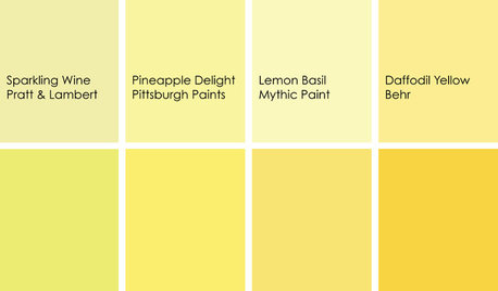
KITCHEN DESIGNCooking With Color: When to Use Yellow in the Kitchen
Perk up your kitchen with a burst of Pineapple Delight or a dollop of Top Banana on the walls, cabinets or countertops
Full Story
KITCHEN DESIGNHow to Lose Some of Your Upper Kitchen Cabinets
Lovely views, display-worthy objects and dramatic backsplashes are just some of the reasons to consider getting out the sledgehammer
Full Story
KITCHEN BACKSPLASHESWhere to Start and Stop Your Backsplash
Consider these designer tricks to work around cabinets, windows and other features for a finished look in your kitchen
Full Story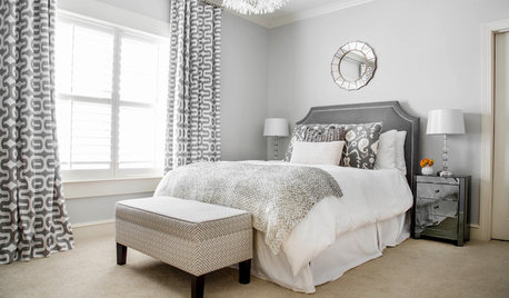
COLORSet the Mood: 5 Colors for a Calming Bedroom
Stressed? Can't sleep? Consider one of these cool, soothing hues for your walls
Full StoryWHITE KITCHENSWhite Cabinets Remain at the Top of Kitchen Wish Lists
Find out the most popular countertop, flooring, cabinet, backsplash and paint picks among homeowners who are renovating
Full Story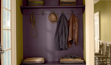
COLORWhat Goes With Purple Walls?
Make a plum wall come alive with art, warm metals, ivory, chartreuse, natural wood — and at least one wild card
Full Story
jhmarie