


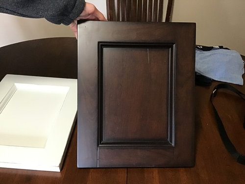
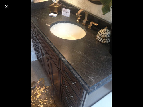
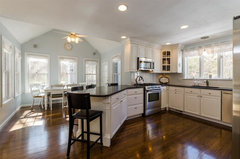
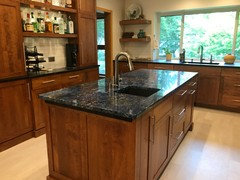
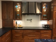
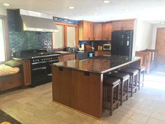
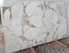
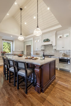
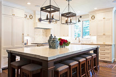
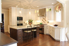
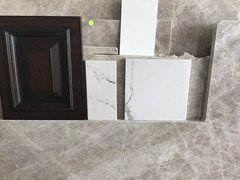
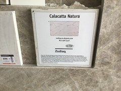
Dark cherry island..black countertop too dark?
ILoveRed
5 years ago
Featured Answer
Sort by:Oldest
Comments (55)
Related Discussions
Do dark counter tops make a room dark?
Comments (5)I have polished ubatuba counters and island, and cherry cabs, in a kitchen that gets no direct light at all. Yes, the dark counters, even though polished, really suck the light out. I'm sorry... and this is just a matter of taste, but the reflected light on the polished surface, to me, doesn't help, because it's very cold light. (Although it's probably worse with black like I have.) It sounds from the other colors you have picked that you like more warmth. If you love this counter you have picked and want to keep it, then maybe you could just pick something light for the island. In my kitchen that would make a big difference (and one of the things we're planning to do in an upcoming remodel). HTH...See Morewill this counter/cab run be too dark?
Comments (11)oh boxerpups, thanks so much! your photos make it so real to me!! the gustavian blue is coming from a giant aloe plant in my kd's showroom. the dark green with hints of blue and brown comes from a sample door. it's a custom place, naturally, and the door is eucalyptis--so very fine grained. the colour is so nice, i see different coloured highlights when i tilt it to the sun. that dark green base cab door sample next to the grey/blue/green dusky aloe frond is so perfect, but as soon as i pick the frond, the duskiness disappears-- i'm going to have to get an artist to come to the showroom with me to get it right! have no idea about backsplash, only that it needs to be solid behind the range, so no grout lines. floors will be dark wood or cork planks. the fireplace hearth will be painted light brick, with a couple of upholstered chairs in front of it. (blue toile and checks)? large rough textured wood beam for a mantel. (i'm dying to show you all the plans, but i cannot get to it atm)....See MoreDark cabinets - keep light countertops or go dark?
Comments (3)Welcome to the kitchen forum! About posting pictures -- have you seen the instructions in the "ReadMe" thread (link below)? The key is to understand that there is no photo hosting capability on this site; you can't "attach" photos the way you could in an email. You need a website like photobucket (or, my favorite, Google's picasa) where you can upload and store your photos. Then you can add in links to them in the messages you post here. About your countertop question: how much light is there in the kitchen? Are there multiple windows? If not, I'd be careful about going really dark with the counters... but that is a personal preference. It's not as if there are rules about how to make these choices. If only there were -- then it wouldn't be so hard to decide! Are you sticking with laminate for the counters, or considering other materials? Here is a link that might be useful: Read Me for GardenWeb kitchen forum...See MoreDark Countertop + Dark BS + Medium Wood Cabs: Bold or Crazy pants?
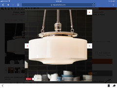
Comments (24)I'm totally forgetting about trying to create a modern aesthetic. This kitchen will be what it is. We're quirky and I guess it'll be the same. We ordered this light fixture for over the seating island: Fireclay sent me samples of Tusk and Gardenia tile and Supernova, Cotton, Vintage Blue, and Snow brick samples earlier this week. I love the brick! It's thicker than regular tile. I'm guessing that it's ~ 1/2" thick. I'm not sure if that's a concern or not. As with anything I'm sure there are pros and cons. My Fireclay rep offered to send me a full sized brick and was gracious enough to agree to send me two, one in Cotton and the other in Silk. FYI: Brick is 2.5" x 8" Cotton: With its hazy fine-spun finish infused with the slightest hint of gray, Cotton offers a soft and cloudy white. Silk: A creamy white glaze is infused with a warm ivory undertone for a soft and inviting backdrop, flecked with hints of texture. Here is an inspiration pic from their site where they mixed Cotton and Snow. Cotton has gray tones and the Snow is on the whiter end of the spectrum, so I thought maybe bringing in the warmer, creamy white of the Silk instead of Snow would be a good move. I'm unsure about the two-toned look, but thought I'd get input from you all. Other considerations are using Ceres and Silk. Ceres: Named for an asteroid barely visible from earth, this milky white glaze resonates with the same subtle beauty. So, two-toned look yay or nay? If yay, which two? If nay, which one? Because of townlakecakes' collages, we're going to revisit the color options for the LVP. Our GC sent out an email connecting us with his flooring guy this morning. Hopefully we'll be able to meet in the next few days to look at other options. Taken this morning: the rough plumbing is in. The window is boarded up for now. Starting to think I may have gone a tad too big with that window....See More
ILoveRed
5 years agoILoveRed
5 years agoILoveRed
5 years agoILoveRed
5 years agolast modified: 5 years agoILoveRed
5 years agoILoveRed
5 years agoILoveRed
5 years agoILoveRed
5 years agoILoveRed
5 years agoILoveRed
5 years agoILoveRed
5 years agoILoveRed
5 years agoILoveRed
5 years agoILoveRed
5 years agoILoveRed
5 years agoILoveRed
5 years agolast modified: 5 years ago
Rita / Bring Back Sophie 4 Real
5 years ago
chispa
5 years agoILoveRed
5 years agoILoveRed
5 years agolast modified: 5 years agoILoveRed
5 years agoILoveRed
5 years ago
cpartist
5 years agoRita / Bring Back Sophie 4 Real
5 years agowilson853
5 years agoILoveRed
5 years agoILoveRed
5 years agoILoveRed
5 years ago


Related Stories
KITCHEN CABINETS7 Ways to Pair Dark Kitchen Cabinets With Dark Counters
Dare to dive into the deep for a sophisticated look in your cooking space
Full Story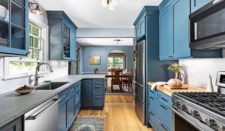
KITCHEN COUNTERTOPS5 Countertops That Look Beautiful in a Dark Blue Kitchen
Inky blue kitchen cabinetry is popular, but which countertops go with it? Here are 5 top options
Full Story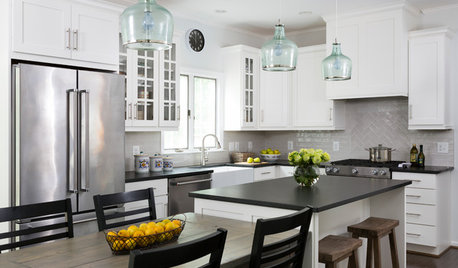
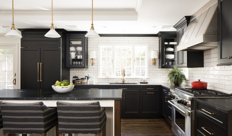
KITCHEN MAKEOVERSWhite Cabinets and Black Countertops Make a Winning Combination
The new pairing replaces dark cabinets and beige countertops for a bright and airy modern update
Full Story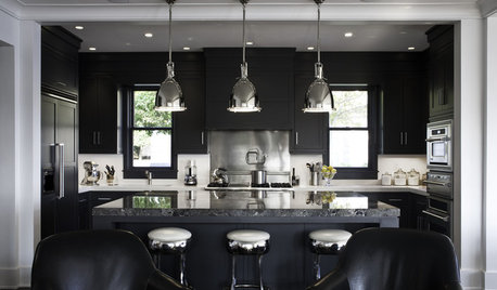
KITCHEN DESIGNDark and Regal Kitchen Designs
Black cabinets, islands and richly textured backsplashes bring surprise and sophistication to the kitchen
Full Story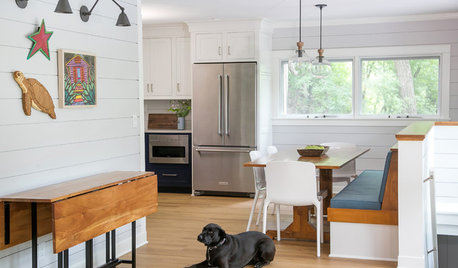
FARMHOUSESCottage Kitchen Goes From Dark and Gloomy to Light and Bright
Shiplap walls and light countertops replace dark wallpaper and avocado green countertops in this Wisconsin kitchen
Full Story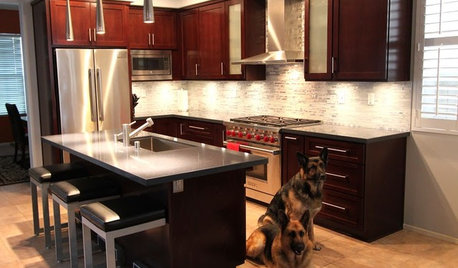
BEFORE AND AFTERSReader Project: California Kitchen Joins the Dark Side
Dark cabinets and countertops replace peeling and cracking all-white versions in this sleek update
Full Story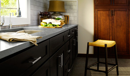
KITCHEN DESIGNAre You Ready for a Dark and Sophisticated Kitchen?
Black kitchen cabinets have a rich, timeless look. Get ideas for your next cabs — and how to paint the ones you have
Full Story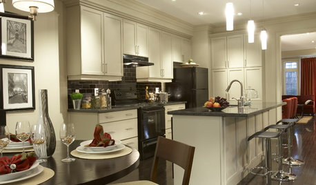
KITCHEN DESIGNCabinet Colors for Dark Appliances
See how to make your black kitchen appliances blend in and look great
Full Story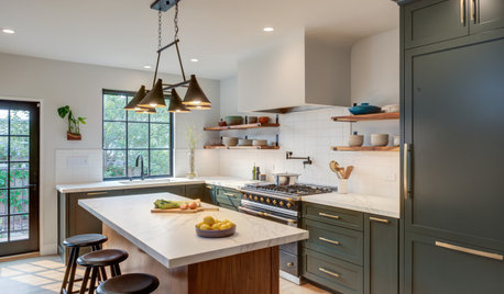
BEFORE AND AFTERSKitchen of the Week: Dark Green Cabinets and Family Function
A design-build firm found on Houzz updates a couple’s kitchen with rich color, a roomy island and a statement range
Full Story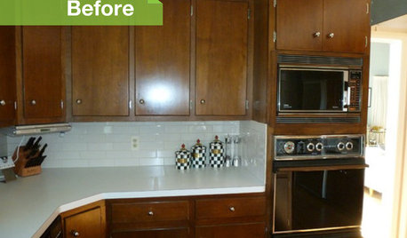
KITCHEN DESIGN3 Dark Kitchens, 6 Affordable Updates
Color advice: Three Houzzers get budget-friendly ideas to spruce up their kitchens with new paint, backsplashes and countertops
Full Story

mayflowers