


The color gray is depressing
susanzone5 (NY)
6 years ago
Featured Answer
Sort by:Oldest
Comments (92)

sloedjinn
6 years agoUser
6 years agoRelated Discussions
OT: Color and Moods, Depression
Comments (3)"Colors are often used as metaphors for moods, but no one had systematically researched color associations." I would argue that statement. Color's timeline starting in the 1930's is heavily dotted with clinical psychologists, researchers and color experts who have indeed systematically reaserched - and documented - color associations. Louis Cheskin, Heinrich Frieling (certain works later modified by Inge and Gerd Schilling), Faber Birren, Rudolph Mahnke, Frank Mahnke, and I've probably left a few off the list... Not to mention (for corn's sake!) Max Lüscher. From Wiki: "He is known for inventing the Lüscher color test, a tool for measuring the person's psychophysical state based on his or her color preferences. Besides research, teaching and practicing psychotherapy in Basel, Lüscher worked for international companies, amongst other things giving color advice. His book "The Lüscher Test" has been translated into more than 30 languages." So language is no excuse for not being aware of this color research. I mean doesn't Max's "psychophysical state" mean the same as their "metaphors for moods". From Luscher - "Therefore the patientÂs choice of color shows the state of their psychosomatic and emotional status and how they feel about themselves." The 'no one has systematically researched color association' business made it hard for me to take that new color wheel thing very seriously. However, I did go on to take a look at it. I do agree with the information and their associations - for the most part. Not because this is new and innovative information -- it's far from it -- I do appreciate how they have interpreted color associations and how they have managed to communicate that point of view via graphics and words. Their experiments, graphic developed, and intended application in the medical field is very interesting. I feel how they want to apply it is totally plausible....See Morenew kitchen doesn’t fit dining room
Comments (29)Orec3 - I actually really love your sideboard/hutch combo. I don’t think the brown-ness of the wood takes away from your kitchen. Your dining room is perfect as it is. If you want some whiteness from the kitchen and truly want wainscoting, the wainscoting alone should solve your problem. Everything else would just be gravy. Just my two cents!...See MoreDepressing exterior look - any solution?
Comments (14)That house is FABULOUS! If those shakes are in good enough shape, keep them. Replace the few that might be missing. The shakes add personality to your home: clapboard will turn it into plain vanilla. I'll be that yard can be great, too. It looks like you can make it into a very private retreat. Is the blue trim in good shape? I would consider painting it. That can be a budget DIY project. What happens around the front of the house? Is it shakes, too? What does it look like? Prolly decisions for the back should partly be determined by what you have on the front, so it's coherent....See MoreLiving room Feel
Comments (13)I like your wall art but there's a bit too much of it in this room IMO. I'd switch the 2 pieces above your cabinet, with the piece over the sofa. Space them a bit further apart and about 6" above the back of the sofa. Find another spot for the large piece to the right of the window, and put a big plant there to soften things up. For the plant between the sofa and desk, put it on a stand and let it fill the wall between the lamp and the corner. The collection of small pictures on the cabinet would look better in a hallway, set on a few long picture shelves. Maybe the shelf from the sofa wall would look good there too. Put one long low decor item on the cabinet. The candlesticks on the floor are heavy looking too and don't add to a light touch....See More
KD
6 years ago PRO
PROLars/J. Robert Scott
6 years ago
aprilneverends
6 years ago
mark_rachel
6 years agoaprilneverends
6 years agolast modified: 6 years agopalimpsest
6 years ago
carolb_w_fl_coastal_9b
6 years agocat_ky
6 years ago
Rita / Bring Back Sophie 4 Real
6 years agoaprilneverends
6 years agolast modified: 6 years ago27mh28
6 years agodragonflywings42
6 years agobabbs50
6 years agonosoccermom
6 years ago
iheartsix
6 years ago
Sasha Wertheim
6 years agopricklypearcactus
6 years agoartemis_ma
6 years agoDebbie Downer
6 years agolast modified: 6 years agoDebbie Downer
6 years agodreamdarrah
5 years agolast modified: 5 years ago
ingrid_vc so. CA zone 9
5 years agolast modified: 5 years ago
K R
5 years ago
Saypoint zone 6 CT
5 years agolast modified: 5 years agoUser
5 years agoiheartsix
5 years agoK R
5 years agoSaypoint zone 6 CT
5 years agoMrs Pete
5 years agolast modified: 5 years agotenamarie123
5 years agoUser
5 years agolast modified: 5 years agotenamarie123
5 years ago
just_terrilynn
5 years agolast modified: 5 years agoUser
5 years agolast modified: 5 years agojnfontenot
5 years agoingrid_vc so. CA zone 9
5 years ago
Home4Here
5 years agokendrabruce
5 years agoaprilneverends
5 years agoingrid_vc so. CA zone 9
5 years ago
Loren D
5 years ago
Esther
5 years ago
Rasoul Yari
3 years agolast modified: 3 years ago
Jeff Hines
3 years agoHU-734410279
3 years agoK Laurence
3 years agoHU-152350539
3 years ago
Lisa Collins
2 years ago

Related Stories

MOST POPULARRethinking Beige in a World Gone Gray
Gray, the ‘it’ neutral of recent years, has left beige in the shade. But is it time to revisit this easy-on-the-eyes wall color?
Full Story
GRAYDesigners Share Their Favorite Light Gray Paints
These versatile neutrals can help create a range of moods in any room
Full Story
KITCHEN DESIGNNew This Week: 3 Wonderful White-and-Gray Kitchens
See how playing with materials, tones and finishes can change this classic color palette
Full Story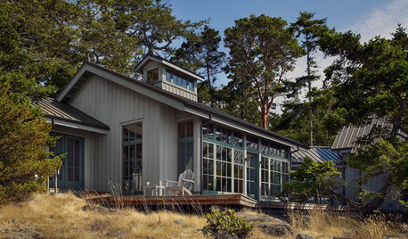
EXTERIOR COLORWhen to Paint Your Home Gray
This perfectly neutral and highly versatile color can create subtle distinctions among exterior architectural elements or stand on its own
Full Story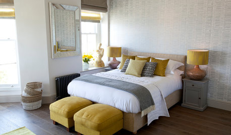
COLOR10 Pretty Ways to Refresh a Gray Palette
Energize your favorite gray shades with pick-me-up accents as fresh as a spring day
Full Story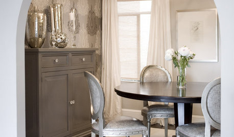
GRAYChoosing Color: Give Me More Gray Days
Layer On the Grays for a Sophisticated Look in Any Room
Full Story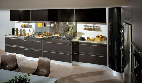

DECORATING GUIDESColor of the Week: Decorating With Warm Gray
Tired of tan? Getting gloomy from cool gray? Make warm gray your new go-to neutral
Full Story
FURNITURE11 Reasons to Love a Gray Sofa
See how a sofa in this neutral shade can take on anything you mix with it, from soft to sharp and everything in between
Full Story


cawaps